13 Inference with mathematical models
In Chapter 11 and Chapter 12 questions about population parameters were addressed using computational techniques. With randomization tests, the data were permuted assuming the null hypothesis. With bootstrapping, the data were resampled in order to measure the variability. In many cases (indeed, with sample proportions), the variability of the statistic can be described by the computational method (as in previous chapters) or by a mathematical formula (as in this chapter).
The normal distribution is presented here to describe the variability associated with sample proportions which are taken from either repeated samples or repeated experiments. The normal distribution is quite powerful in that it describes the variability of many different statistics, and we will encounter the normal distribution throughout the remainder of the book.
For now, however, focus is on the parallels between how data can provide insight about a research question either through computational methods or through mathematical models.
13.1 Central Limit Theorem
In recent chapters, we have encountered four case studies. While they differ in the settings, in their outcomes, and in the technique we have used to analyze the data, they all have something in common: the general shape of the distribution of the statistics (called the sampling distribution). You may have noticed that the distributions were symmetric and bell-shaped.
Sampling distribution.
A sampling distribution is the distribution of all possible values of a sample statistic from samples of a given sample size from a given population. We can think about the sample distribution as describing how sample statistics (e.g., the sample proportion \(\hat{p}\) or the sample mean \(\bar{x}\)) varies from one study to another. A sampling distribution is contrasted with a data distribution which shows the variability of the observed data values. The data distribution can be visualized from the observations themselves. However, because a sampling distribution describes sample statistics computed from many studies, it cannot be visualized directly from a single dataset. Instead, we use either computational or mathematical structures to estimate the sampling distribution and hence to describe the expected variability of the sample statistic in repeated studies.
Figure 13.1 shows the null distributions in each of the four case studies where we ran 10,000 simulations. Note that the null distribution is the sampling distribution of the statistic created under the setting where the null hypothesis is true. Therefore, the null distribution will always be centered at the value of the parameter given by the null hypothesis. In the case of the opportunity cost study, which originally had just 1,000 simulations, we have included an additional 9,000 simulations.
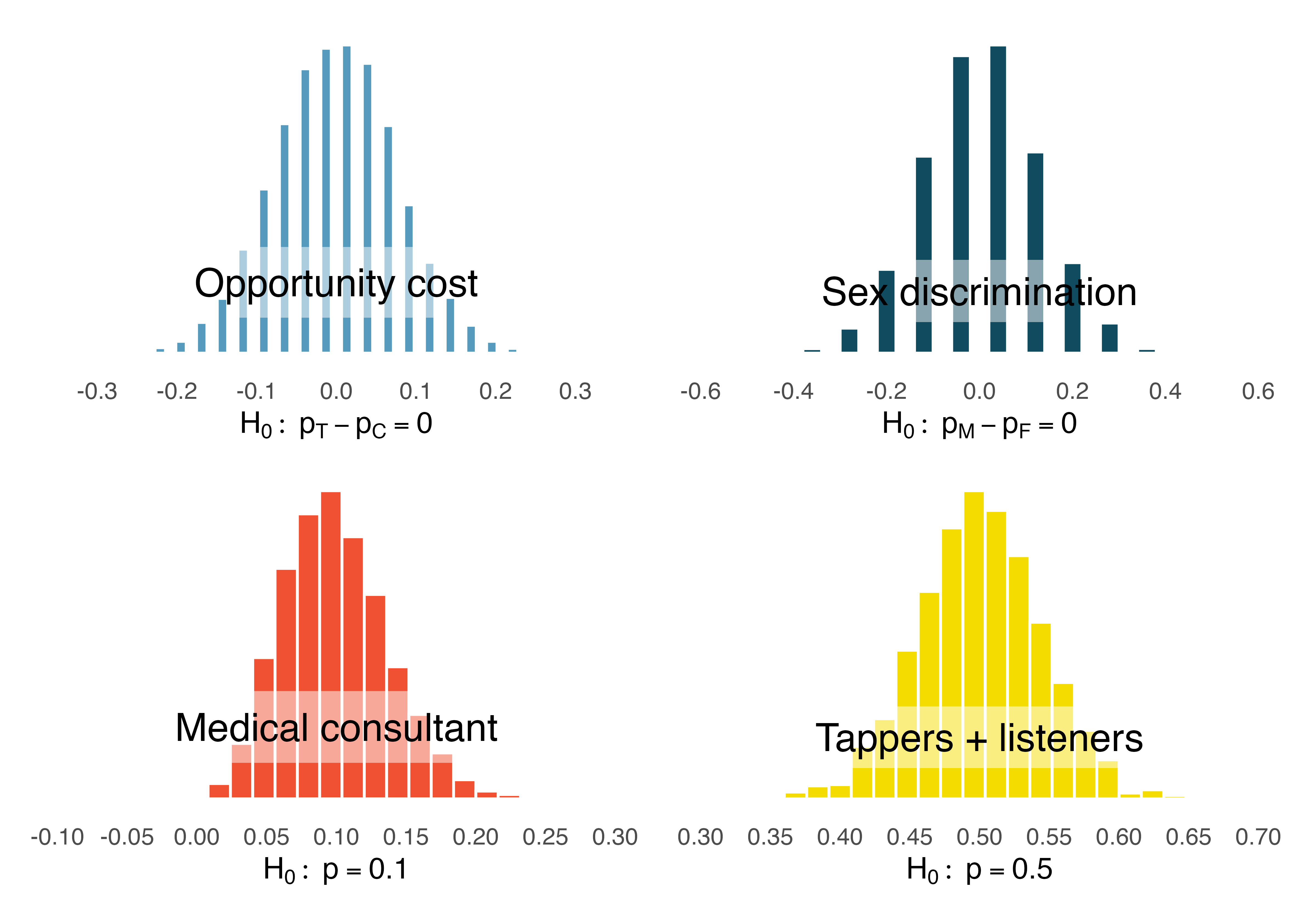
Describe the shape of the distributions and note anything that you find interesting.1
The case study for the medical consultant is the only distribution with any evident skew. As we observed in Chapter 1, it’s common for distributions to be skewed or contain outliers. However, the null distributions we have so far encountered have all looked somewhat similar and, for the most part, symmetric. They all resemble a bell-shaped curve. The bell-shaped curve similarity is not a coincidence, but rather, is guaranteed by mathematical theory.
Central Limit Theorem for proportions.
If we look at a proportion (or difference in proportions) and the scenario satisfies certain conditions, then the sample proportion (or difference in proportions) will appear to follow a bell-shaped curve called the normal distribution.
An example of a perfect normal distribution is shown in Figure 13.2. Imagine laying a normal curve over each of the four null distributions in Figure 13.1. While the mean (center) and standard deviation (width or spread) may change for each plot, the general shape remains roughly intact.
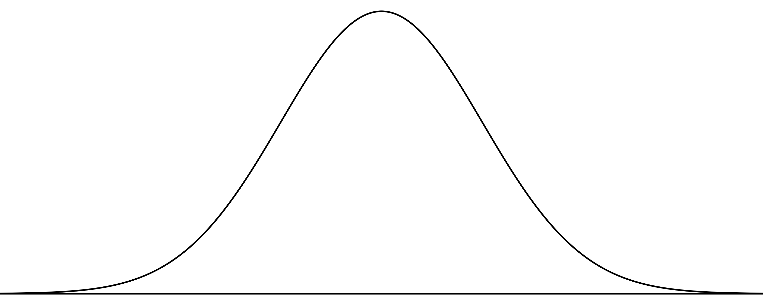
Mathematical theory guarantees that if repeated samples are taken a sample proportion or a difference in sample proportions will follow something that resembles a normal distribution when certain conditions are met. (Note: we typically only take one sample, but the mathematical model lets us know what to expect if we had taken repeated samples.) These conditions fall into two general categories describing the independence between observations and the need to take a sufficiently large sample size.
Observations in the sample are independent. Independence is guaranteed when we take a random sample from a population. Independence can also be guaranteed if we randomly divide individuals into treatment and control groups.
The sample is large enough. The sample size cannot be too small. What qualifies as “small” differs from one context to the next, and we’ll provide suitable guidelines for proportions in Chapter 16.
So far we have had no need for the normal distribution. We’ve been able to answer our questions somewhat easily using simulation techniques. However, soon this will change. Simulating data can be non-trivial. For example, some of the scenarios encountered in Chapter 8 where we introduced regression models with multiple predictors would require complex simulations in order to make inferential conclusions. Instead, the normal distribution and other distributions like it offer a general framework for statistical inference that applies to a very large number of settings.
Technical Conditions.
In order for the normal approximation to describe the sampling distribution of the sample proportion as it varies from sample to sample, two conditions must hold. If these conditions do not hold, it is unwise to use the normal distribution (and related concepts like Z scores, probabilities from the normal curve, etc.) for inferential analyses.
- Independent observations
- Large enough sample: For proportions, at least 10 expected successes and 10 expected failures in the sample.
13.2 Normal Distribution
Among all the distributions we see in statistics, one is overwhelmingly the most common. The symmetric, unimodal, bell curve is ubiquitous throughout statistics. It is so common that people know it as a variety of names including the normal curve, normal model, or normal distribution.2 Under certain conditions, sample proportions, sample means, and sample differences can be modeled using the normal distribution. Additionally, some variables such as SAT scores and heights of US adult males closely follow the normal distribution.
Normal distribution facts.
Distributions of many variables are nearly normal, but none are exactly normal. Thus, the normal distribution, while not perfect for any single problem, is very useful for a variety of problems.
In this section, we will discuss the normal distribution in the context of data to become familiar with normal distribution techniques. In the following sections and beyond, we’ll move our discussion to focus on applying the normal distribution and other related distributions to model point estimates for hypothesis tests and for constructing confidence intervals.
13.2.1 Normal distribution model
The normal distribution always describes a symmetric, unimodal, bell-shaped curve. However, normal curves can look different depending on the details of the model. Specifically, the normal model can be adjusted using two parameters: mean and standard deviation. As you can probably guess, changing the mean shifts the bell curve to the left or right, while changing the standard deviation stretches or constricts the curve. Figure 13.3 (a) shows the normal distribution with mean \(0\) and standard deviation \(1\) (which is commonly referred to as the standard normal distribution). A normal distribution with mean \(19\) and standard deviation \(4\) is shown on the right. Figure 13.4 shows the same two normal distributions on the same axis.
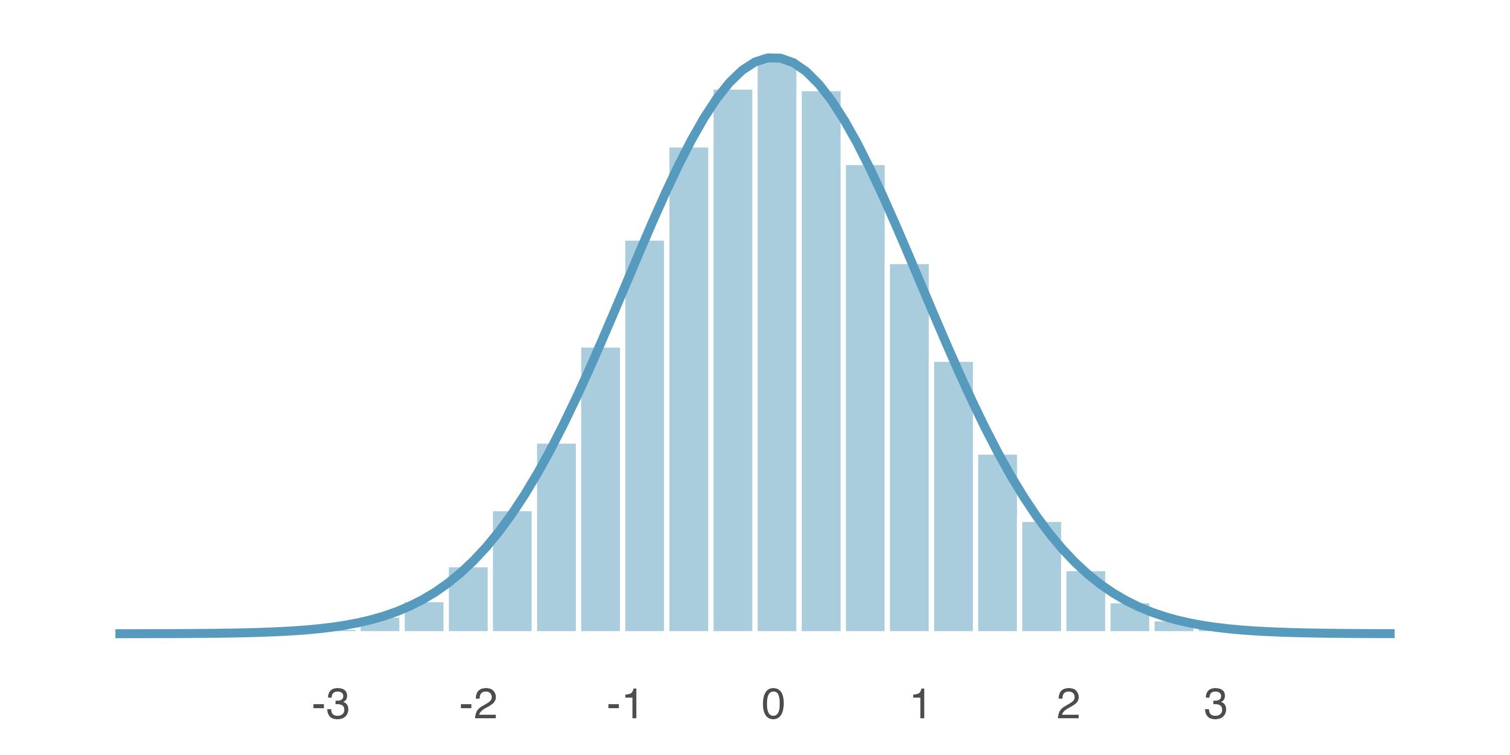
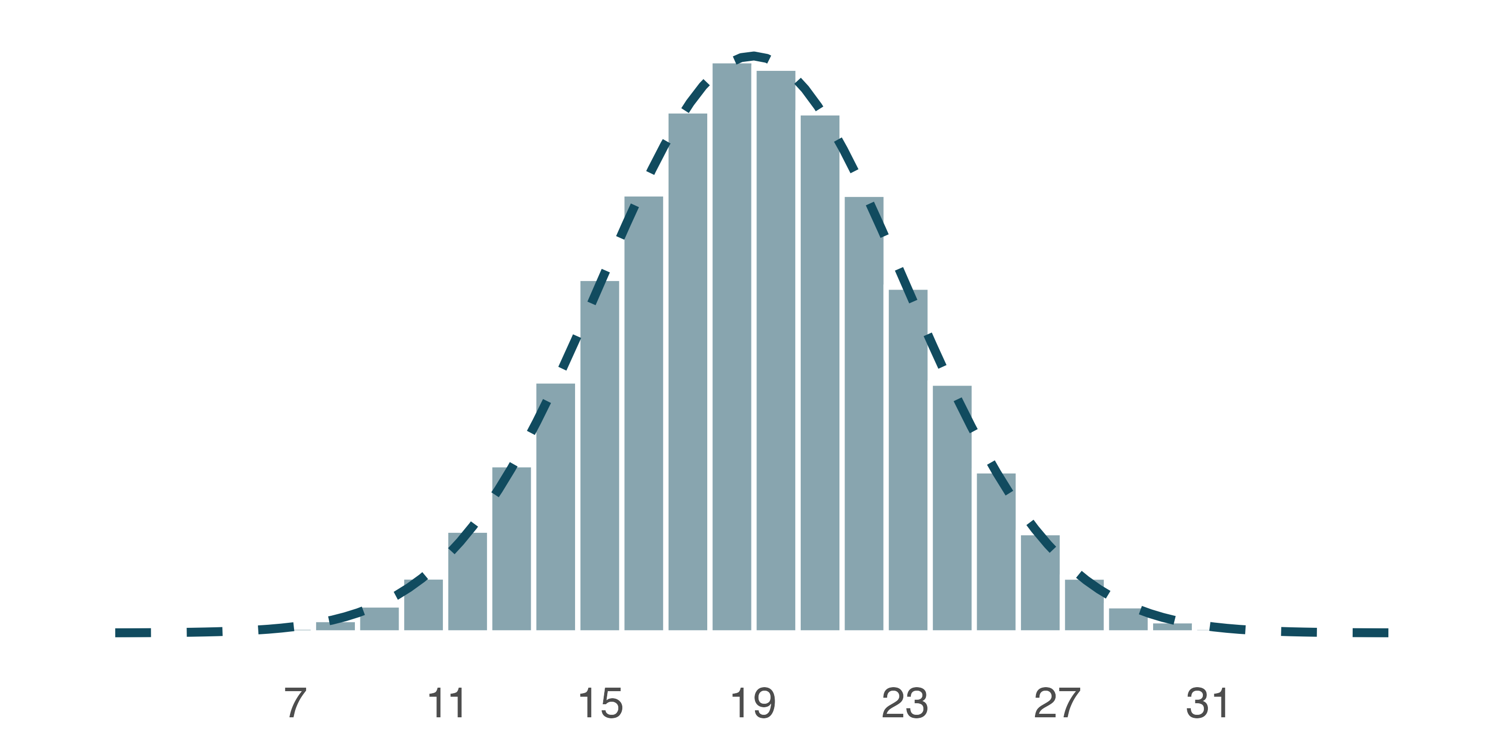
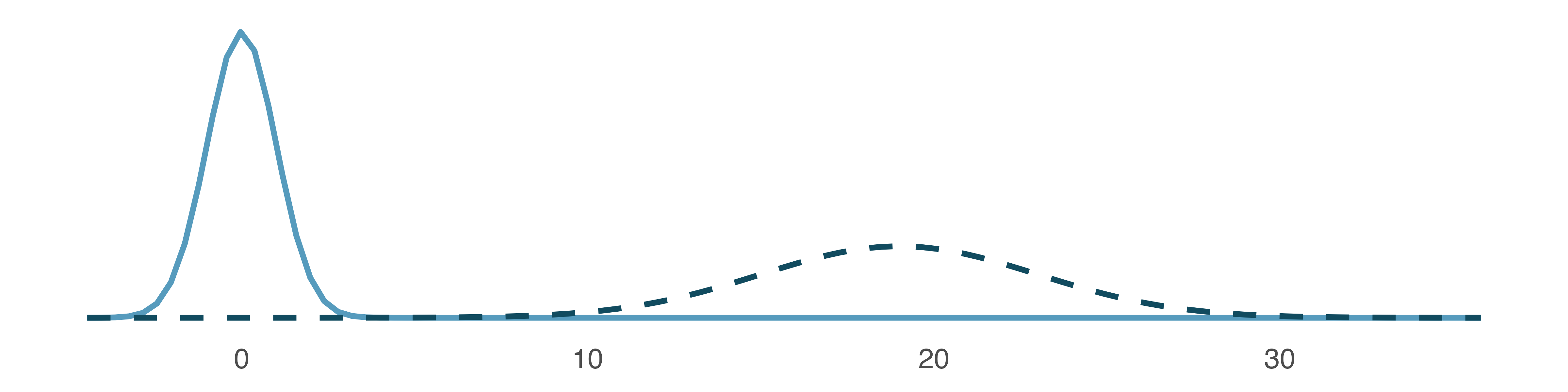
If a normal distribution has mean \(\mu\) and standard deviation \(\sigma,\) we may write the distribution as \(N(\mu, \sigma).\) The two distributions in Figure 13.4 can be written as
\[ N(\mu = 0, \sigma = 1)\quad\text{and}\quad N(\mu = 19, \sigma = 4) \]
Because the mean and standard deviation describe a normal distribution exactly, they are called the distribution’s parameters.
Write down the short-hand for a normal distribution with the following parameters.
- mean 5 and standard deviation 3
- mean -100 and standard deviation 10
- mean 2 and standard deviation 9
- \(N(\mu = 5,\sigma = 3)\)
- \(N(\mu = -100, \sigma = 10)\)
- \(N(\mu = 2, \sigma = 9)\)
13.2.2 Standardizing with Z scores
SAT scores follow a nearly normal distribution with a mean of 1500 points and a standard deviation of 300 points. ACT scores also follow a nearly normal distribution with mean of 21 points and a standard deviation of 5 points. Suppose Nel scored 1800 points on their SAT and Sian scored 24 points on their ACT. Who performed better?3
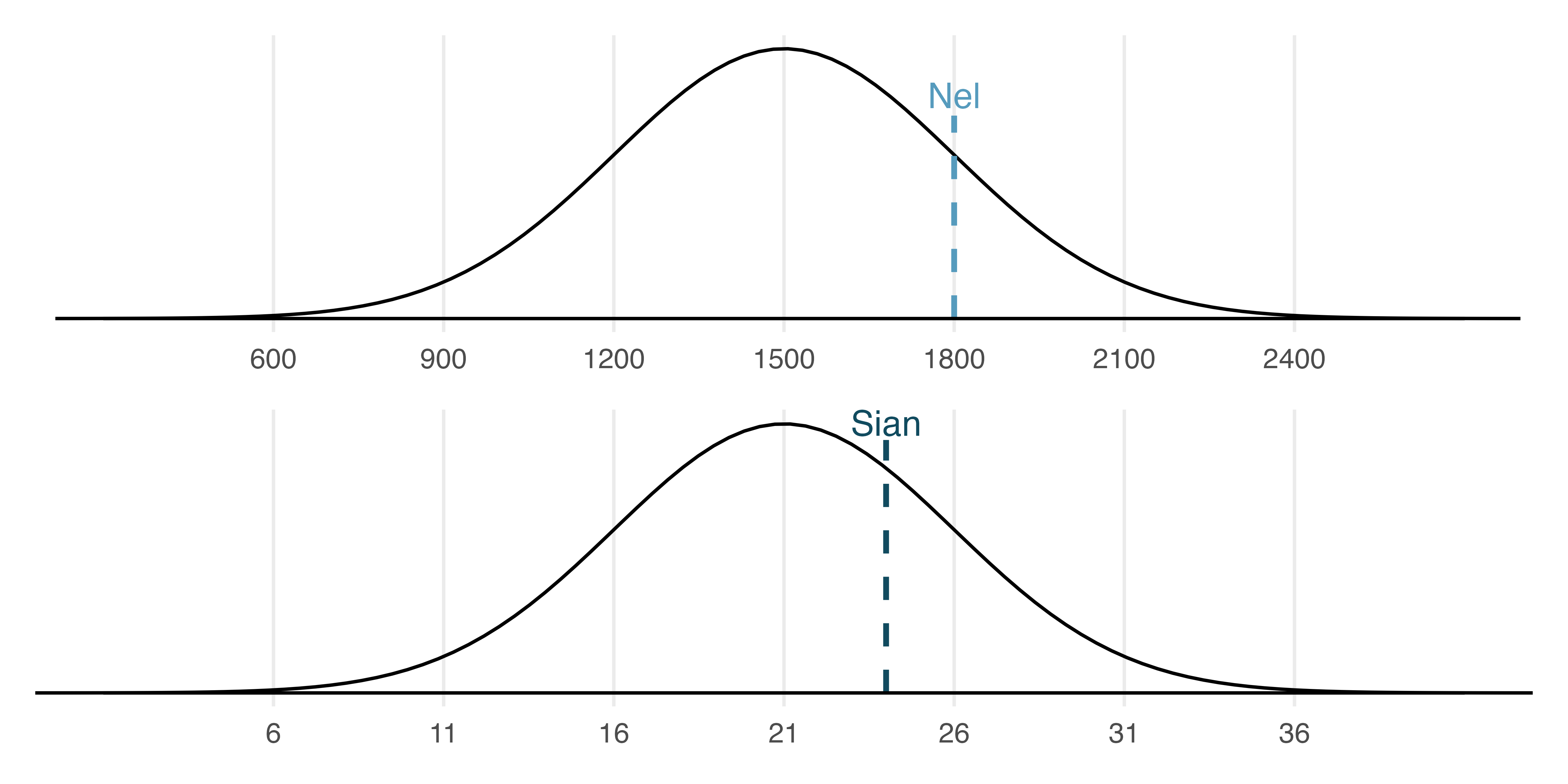
The solution to the previous example relies on a standardization technique called a Z score, a method most commonly employed for nearly normal observations (but that may be used with any distribution). The Z score of an observation is defined as the number of standard deviations it falls above or below the mean. If the observation is one standard deviation above the mean, its Z score is 1. If it is 1.5 standard deviations below the mean, then its Z score is -1.5. If \(x\) is an observation from a distribution \(N(\mu, \sigma),\) we define the Z score mathematically as
\[ Z = \frac{x-\mu}{\sigma} \]
Using \(\mu_{SAT}=1500,\) \(\sigma_{SAT}=300,\) and \(x_{Nel}=1800,\) we find Nel’s Z score:
\[ Z_{Nel} = \frac{x_{Nel} - \mu_{SAT}}{\sigma_{SAT}} = \frac{1800-1500}{300} = 1 \]
The Z score.
The Z score of an observation is the number of standard deviations it falls above or below the mean. We compute the Z score for an observation \(x\) that follows a distribution with mean \(\mu\) and standard deviation \(\sigma\) using
\[Z = \frac{x-\mu}{\sigma}\]
If the observation \(x\) comes from a normal distribution centered at \(\mu\) with standard deviation of \(\sigma\), then the Z score will be distributed according to a normal distribution with a center of 0 and a standard deviation of 1. That is, the normality remains when transforming from \(x\) to \(Z\) with a shift in both the center as well as the spread.
Use Sian’s ACT score, 24, along with the ACT mean and standard deviation to compute their Z score.4
Observations above the mean always have positive Z scores while those below the mean have negative Z scores. If an observation is equal to the mean (e.g., SAT score of 1500), then the Z score is \(0.\)
Let \(X\) represent a random variable from \(N(\mu=3, \sigma=2),\) and suppose we observe \(x=5.19.\) Find the Z score of \(x.\) Then, use the Z score to determine how many standard deviations above or below the mean \(x\) falls.
Its Z score is given by \(Z = \frac{x-\mu}{\sigma} = \frac{5.19 - 3}{2} = 2.19/2 = 1.095.\) The observation \(x\) is 1.095 standard deviations above the mean. We know it must be above the mean since \(Z\) is positive.
Head lengths of brushtail possums follow a nearly normal distribution with mean 92.6 mm and standard deviation 3.6 mm. Compute the Z scores for possums with head lengths of 95.4 mm and 85.8 mm.5
We can use Z scores to roughly identify which observations are more unusual than others. One observation \(x_1\) is said to be more unusual than another observation \(x_2\) if the absolute value of its Z score is larger than the absolute value of the other observation’s Z score: \(|Z_1| > |Z_2|.\) This technique is especially insightful when a distribution is symmetric.
Which of the two brushtail possum observations in the previous guided practice is more unusual?6
13.2.3 Normal probability calculations
Nel from the SAT Guided Practice earned a score of 1800 on their SAT with a corresponding \(Z=1.\) They would like to know what percentile they fall in among all SAT test-takers.
Nel’s percentile is the percentage of people who earned a lower SAT score than Nel. We shade the area representing those individuals in Figure 13.6. The total area under the normal curve is always equal to 1, and the proportion of people who scored below Nel on the SAT is equal to the area shaded in Figure 13.6: 0.8413. In other words, Nel is in the \(84^{th}\) percentile of SAT takers.
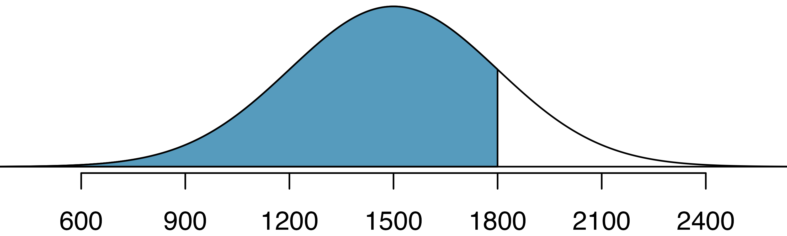
We can use the normal model to find percentiles or probabilities. A normal probability table, which lists Z scores and corresponding percentiles, can be used to identify a percentile based on the Z score (and vice versa). Statistical software can also be used.
Normal probabilities are most commonly found using statistical software which we will show here using R. We use the software to identify the percentile corresponding to any particular Z score. For instance, the percentile of \(Z=0.43\) is 0.6664, or the \(66.64^{th}\) percentile. The pnorm() function is available in default R and will provide the percentile associated with any cutoff on a normal curve. The normTail() function is available in the openintro R package and will draw the associated normal distribution curve.
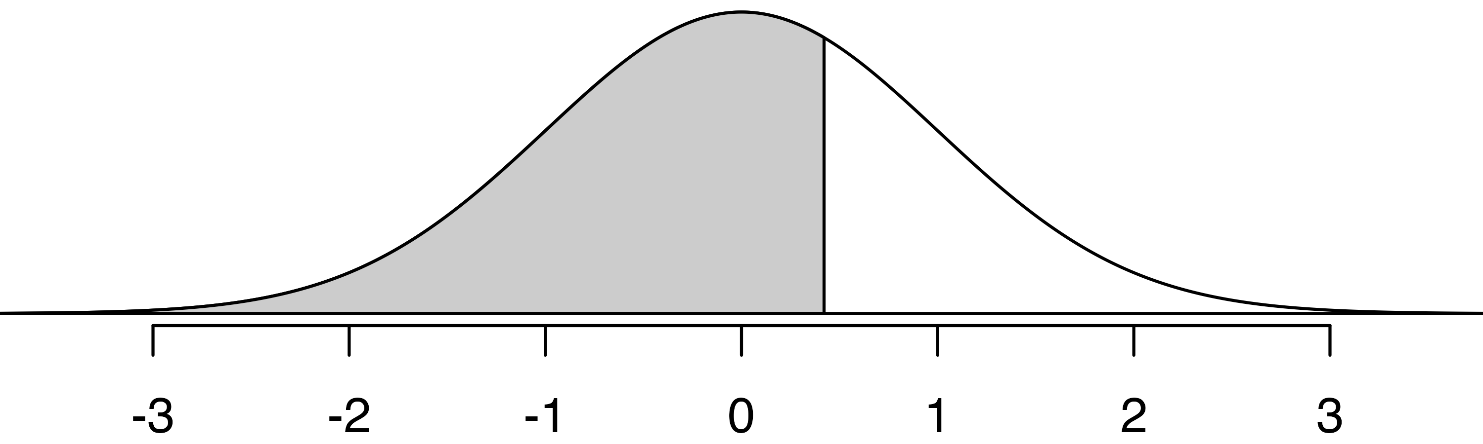
We can also find the Z score associated with a percentile. For example, to identify Z for the \(80^{th}\) percentile, we use qnorm() which identifies the quantile for a given percentage. The quantile represents the cutoff value. (To remember the function qnorm() as providing a cutoff, notice that both qnorm() and “cutoff” start with the sound “kuh”. To remember the pnorm() function as providing a probability from a given cutoff, notice that both pnorm() and probability start with the sound “puh”.) We determine the Z score for the \(80^{th}\) percentile using qnorm(): 0.84.
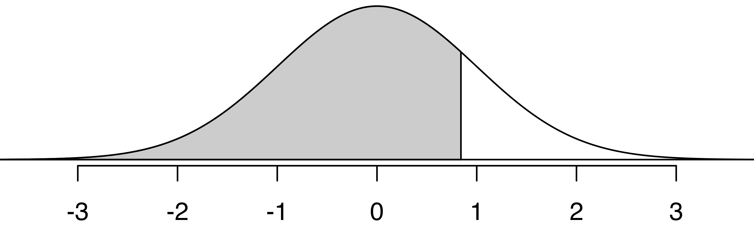
Determine the proportion of SAT test takers who scored better than Nel on the SAT.7
13.2.4 Normal probability examples
Cumulative SAT scores are approximated well by a normal model, \(N(\mu=1500, \sigma=300).\)
Shannon is a randomly selected SAT taker, and nothing is known about Shannon’s SAT aptitude. What is the probability that Shannon scores at least 1630 on their SATs?
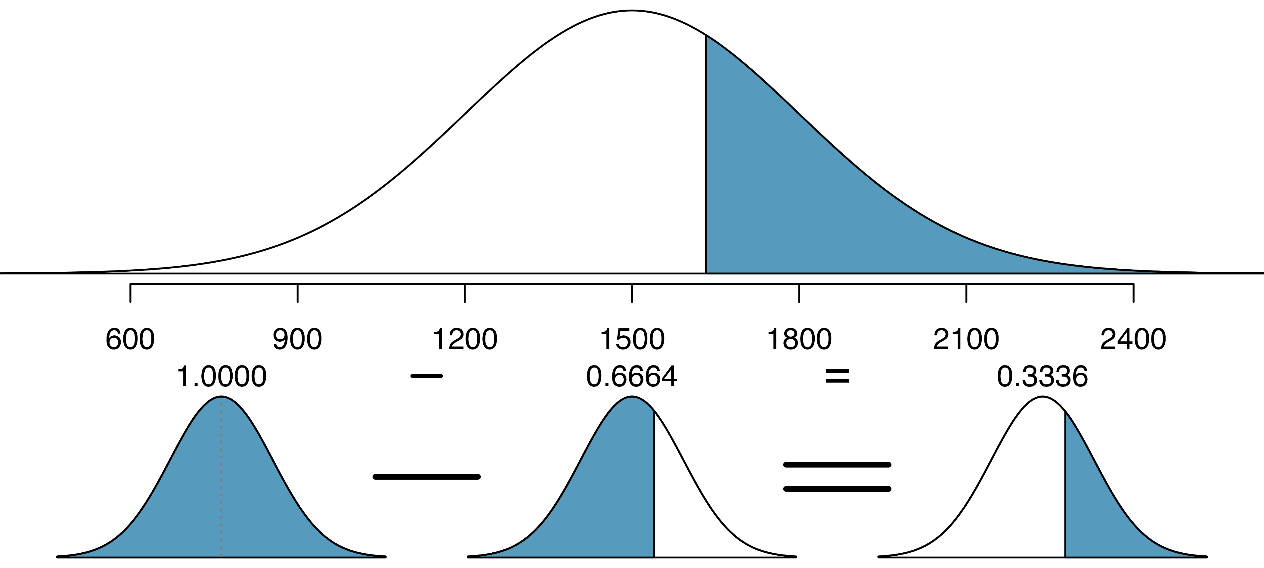
First, always draw and label a picture of the normal distribution. (Drawings need not be exact to be useful.) We are interested in the chance they score above 1630, so we shade the upper tail. See the normal curve below.
The \(x\)-axis identifies the mean and the values at 2 standard deviations above and below the mean. The simplest way to find the shaded area under the curve makes use of the Z score of the cutoff value. With \(\mu=1500,\) \(\sigma=300,\) and the cutoff value \(x=1630,\) the Z score is computed as
\[ Z = \frac{x - \mu}{\sigma} = \frac{1630 - 1500}{300} = \frac{130}{300} = 0.43 \]
We use software to find the percentile of \(Z=0.43,\) which yields 0.6664. However, the percentile describes those who had a Z score lower than 0.43. To find the area above \(Z=0.43,\) we compute one minus the area of the lower tail, as seen below.
The probability Shannon scores at least 1630 on the SAT is 0.3336. This calculation is visualized in Figure 13.7.
Always draw a picture first, and find the Z score second.
For any normal probability situation, always always always draw and label the normal curve and shade the area of interest first. The picture will provide an estimate of the probability.
After drawing a figure to represent the situation, identify the Z score for the observation of interest.
If the probability of Shannon scoring at least 1630 is 0.3336, then what is the probability they score less than 1630? Draw the normal curve representing this exercise, shading the lower region instead of the upper one.8
Edward earned a 1400 on their SAT. What is their percentile?
First, a picture is needed. Edward’s percentile is the proportion of people who do not get as high as a 1400. These are the scores to the left of 1400, as shown below.
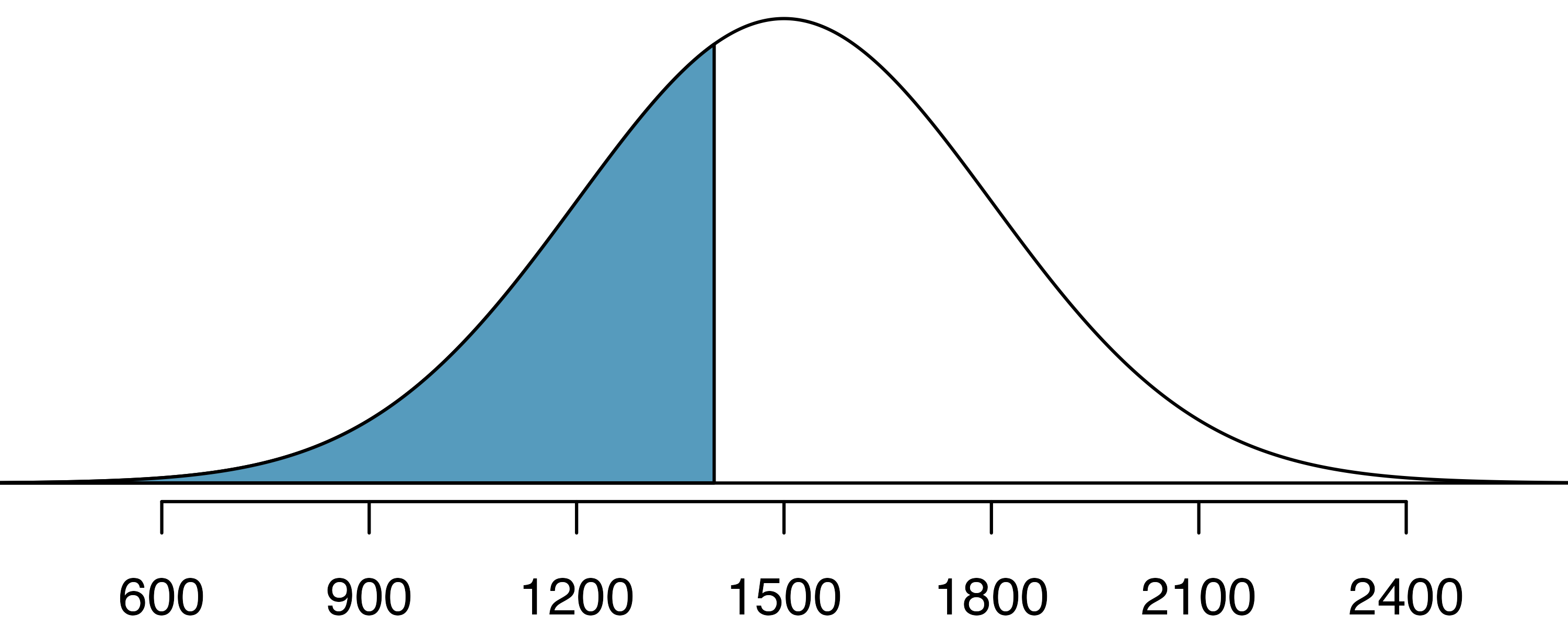
The mean \(\mu=1500,\) the standard deviation \(\sigma=300,\) and the cutoff for the tail area \(x=1400\) are used to compute the Z score:
\[ Z = \frac{x - \mu}{\sigma} = \frac{1400 - 1500}{300} = -0.33\]
Statistical software can be used to find the proportion of the \(N(0,1)\) curve to the left of \(-0.33\) which is 0.3707. Edward is at the \(37^{th}\) percentile.
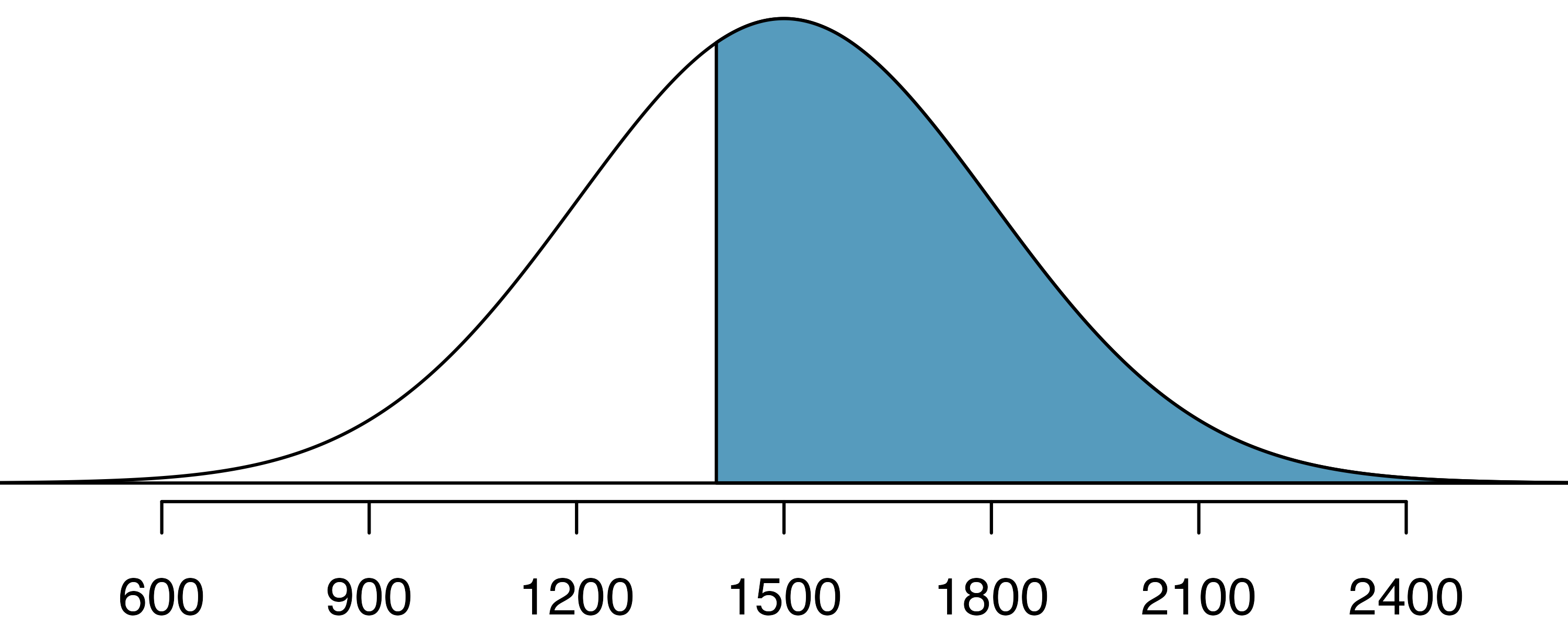
Use the results of the previous example to compute the proportion of SAT takers who did better than Edward. Also draw a new picture.
If Edward did better than 37% of SAT takers, then about 63% must have done better than them, as shown below.
Areas to the right.
Most statistical software, as well as normal probability tables in most books, give the area to the left. If you would like the area to the right, first find the area to the left and then subtract the amount from one.
Stuart earned an SAT score of 2100. Draw a picture for each part. (a) What is their percentile? (b) What percent of SAT takers did better than Stuart?9
Based on a sample of 100 men,10 the heights of adults who identify as male, between the ages 20 and 62 in the US is nearly normal with mean 70.0” and standard deviation 3.3”.
Kamron is 5’7” (67 inches) and Adrian is 6’4” (76 inches). (a) What is Kamron’s height percentile? (b) What is Adrian’s height percentile? Also draw one picture for each part.
Numerical answers, calculated using statistical software (e.g., pnorm() in R): (a) 18.17th percentile. (b) 96.55th percentile.
The last several problems have focused on finding the probability or percentile for a particular observation. What if you would like to know the observation corresponding to a particular percentile?
Yousef’s height is at the \(40^{th}\) percentile. How tall are they?
As always, first draw the picture.
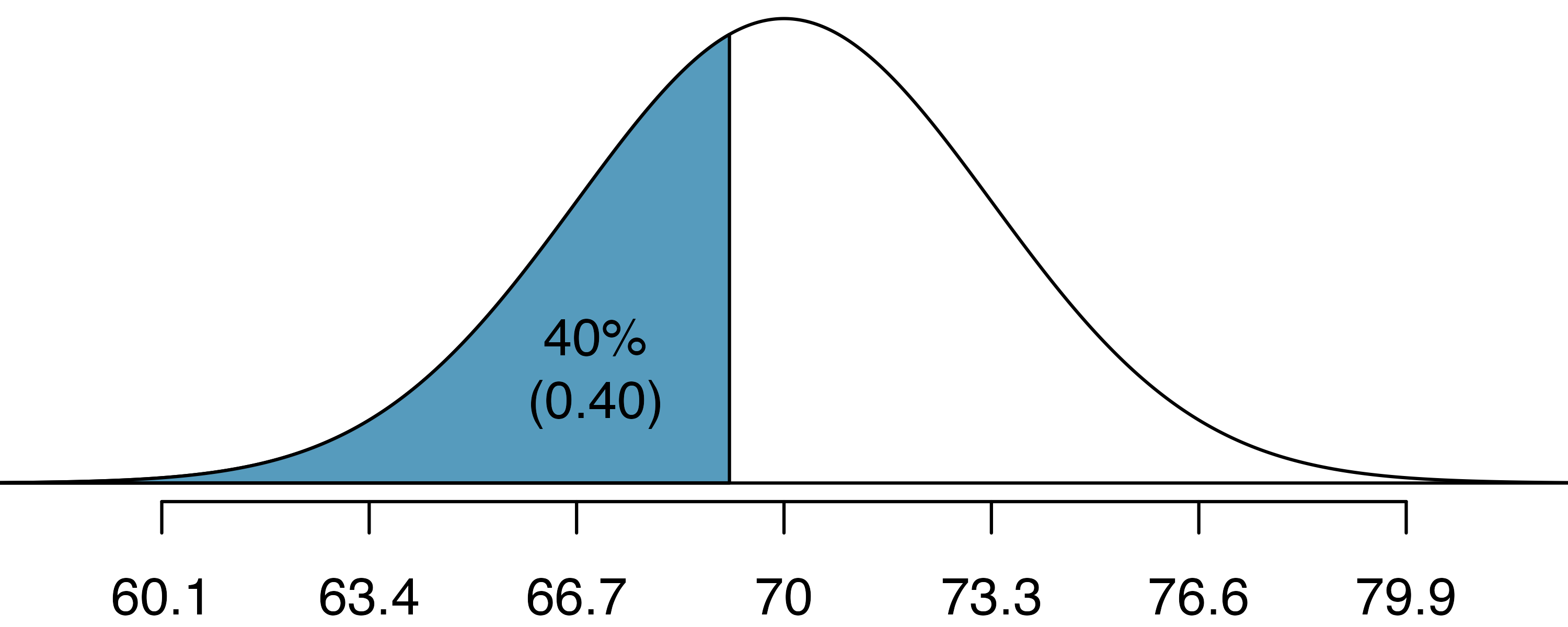
In this case, the lower tail probability is known (0.40), which can be shaded on the diagram. We want to find the observation that corresponds to the known probability of 0.4. We can find the observation in two different ways: using the height curve seen above or using the Z score associated with the standard normal curve centered at zero with a standard deviation of one.
If you have access to software (like R, code seen below) that allows you to specify the mean and standard deviation of the normal curve, you can calculate the observed value on the curve (i.e., Yousef’s height) directly.
[1] 69.2Yousef is 69.2 inches tall. That is, Yousef is about 5’9” (this is notation for 5-feet, 9-inches).
Without access to flexible software, you will need the information given by a standard normal curve (a normal curve centered at zero with a standard deviation of one). First, determine the Z score associated with the \(40^{th}\) percentile.
Because the percentile is below 50%, we know \(Z\) will be negative. Statistical software provides the \(Z\) value to be \(-0.25.\)
qnorm(0.4, mean = 0, sd = 1)[1] -0.253Knowing \(Z_{Yousef}=-0.25\) and the population parameters \(\mu=70\) and \(\sigma=3.3\) inches, the Z score formula can be set up to determine Yousef’s unknown height, labeled \(x_{Yousef}\):
\[ -0.253 = Z_{Yousef} = \frac{x_{Yousef} - \mu}{\sigma} = \frac{x_{Yousef} - 70}{3.3} \]
Solving for \(x_{Yousef}\) yields the height 69.2 inches. Again, Yousef is about 5’9”.
What is the adult male height at the \(82^{nd}\) percentile?
In order to practice using Z scores, we will use the standard normal curve to solve the problem.
Again, we draw the figure first.
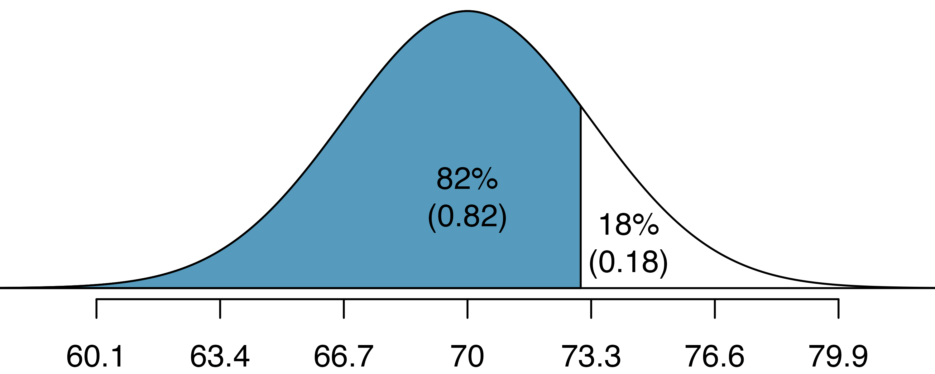
And calculate the Z value associated with the \(82^{nd}\) percentile:
qnorm(0.82, mean = 0, sd = 1)[1] 0.915Next, we want to find the Z score at the \(82^{nd}\) percentile, which will be a positive value (because the percentile is bigger than 50%). Using qnorm(), the \(82^{nd}\) percentile corresponds to \(Z=0.92.\) Finally, the height \(x\) is found using the Z score formula with the known mean \(\mu,\) standard deviation \(\sigma,\) and Z score \(Z=0.92\):
\[ 0.92 = Z = \frac{x-\mu}{\sigma} = \frac{x - 70}{3.3} \]
This yields 73.04 inches or about 6’1” as the height at the \(82^{nd}\) percentile.
Using Z scores, answer the following questions.
- What is the \(95^{th}\) percentile for SAT scores?
- What is the \(97.5^{th}\) percentile of the male heights? As always with normal probability problems, first draw a picture.11
Using Z scores, answer the following questions.
- What is the probability that a randomly selected male adult is at least 6’2” (74 inches)?
- What is the probability that a male adult is shorter than 5’9” (69 inches)?12
What is the probability that a randomly selected adult male is between 5’9” and 6’2”?
These heights correspond to 69 inches and 74 inches. First, draw the figure. The area of interest is no longer an upper or lower tail.
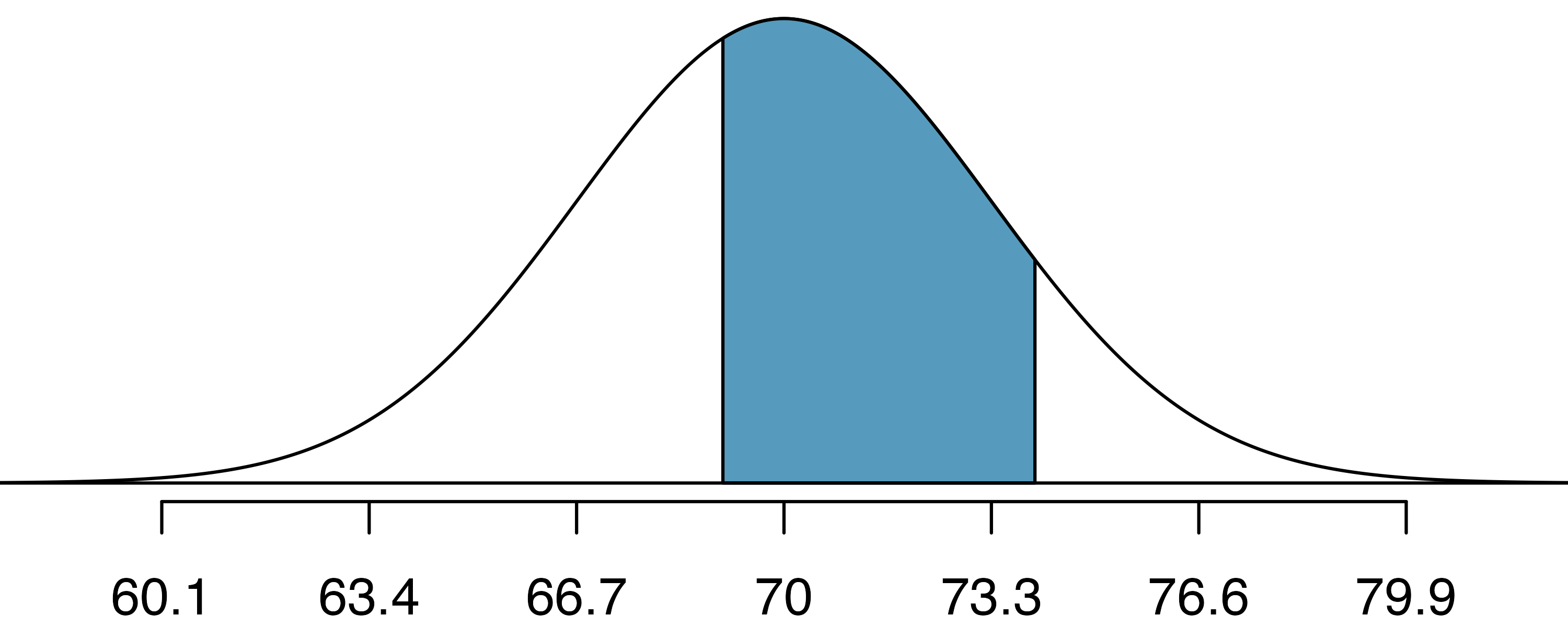
The total area under the curve is 1. If we find the area of the two tails that are not shaded (from the previous Guided Practice, these areas are \(0.3821\) and \(0.1131\)), then we can find the middle area:
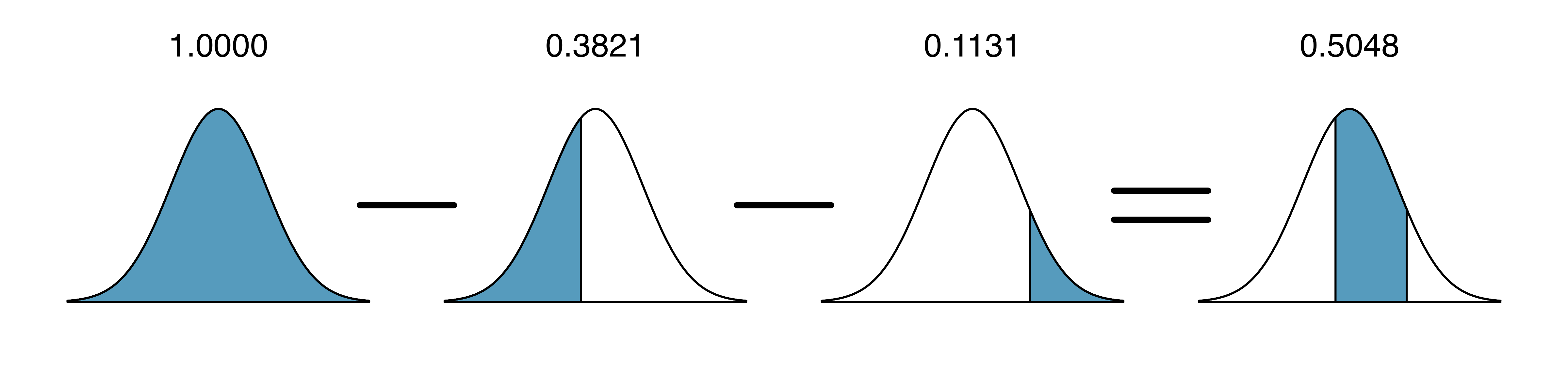
That is, the probability of being between 5’9” and 6’2” is 0.5048.
Find the percent of SAT takers who earn between 1500 and 2000.13
What percent of adult males are between 5’5” and 5’7”?14
13.3 Quantifying the variability of a statistic
As seen in later chapters, it turns out that many of the statistics used to summarize data (e.g., the sample proportion, the sample mean, differences in two sample proportions, differences in two sample means, the sample slope from a linear model, etc.) vary according to the normal distribution seen above. The mathematical models are derived from the normal theory, but even the computational methods (and the intuitive thinking behind both approaches) use the general bell-shaped variability seen in most of the distributions constructed so far.
13.3.1 68-95-99.7 rule
Here, we present a useful general rule for the probability of falling within 1, 2, and 3 standard deviations of the mean in the normal distribution. The rule will be useful in a wide range of practical settings, especially when trying to make a quick estimate without a calculator or Z table.
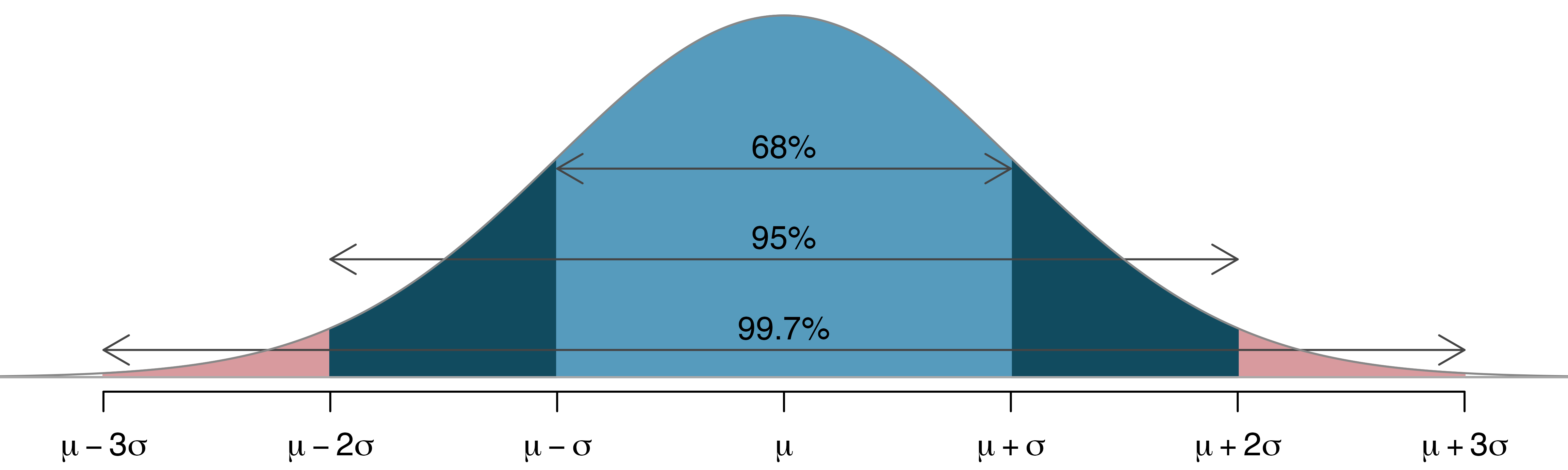
Use pnorm() (or a Z table) to confirm that about 68%, 95%, and 99.7% of observations fall within 1, 2, and 3, standard deviations of the mean in the normal distribution, respectively. For instance, first find the area that falls between \(Z=-1\) and \(Z=1,\) which should have an area of about 0.68. Similarly there should be an area of about 0.95 between \(Z=-2\) and \(Z=2.\)15
It is possible for a normal random variable to fall 4, 5, or even more standard deviations from the mean. However, these occurrences are very rare if the data are nearly normal. The probability of being further than 4 standard deviations from the mean is about 1-in-30,000. For 5 and 6 standard deviations, it is about 1-in-3.5 million and 1-in-1 billion, respectively.
SAT scores closely follow the normal model with mean \(\mu = 1500\) and standard deviation \(\sigma = 300.\) About what percent of test takers score 900 to 2100? What percent score between 1500 and 2100 ?16
13.3.2 Standard error
Point estimates vary from sample to sample, and we quantify this variability with what is called the standard error (SE). The standard error is equal to the standard deviation associated with the statistic. So, for example, to quantify the variability of a point estimate from one sample to the next, the variability is called the standard error of the point estimate. Almost always, the standard error is itself an estimate, calculated from the sample of data.
The way we determine the standard error varies from one situation to the next. However, typically it is determined using a formula based on the Central Limit Theorem.
13.3.3 Margin of error
Very related to the standard error is the margin of error. The margin of error describes how far away observations are from their mean.
For example, to describe where most (i.e., 95%) observations lie, we say that the margin of error is approximately \(2 \times SE\). That is, 95% of the observations are within two margins of error of the mean.
Margin of error for sample proportions.
The distance given by \(z^\star \times SE\) is called the margin of error.
\(z^\star\) is the cutoff value found on the normal distribution. The most common value of \(z^\star\) is 1.96 (often approximated to be 2) indicating that the margin of error describes the variability associated with 95% of the sampled statistics.
Notice that if the spread of the observations goes from some lower bound to some upper bound, a rough approximation of the SE is to divide the range by 4. That is, if you notice the sample proportions go from 0.1 to 0.4, the SE can be approximated to be 0.075.
13.4 Case Study (test): Opportunity cost
The approach for using the normal model in the context of inference is very similar to the practice of applying the model to individual observations that are nearly normal. We will replace null distributions we previously obtained using the randomization or simulation techniques and verify the results once again using the normal model. When the sample size is sufficiently large, the normal approximation generally provides us with the same conclusions as the simulation model.
13.4.1 Observed data
In Section 11.2 we were introduced to the opportunity cost study, which found that students became thriftier when they were reminded that not spending money now means the money can be spent on other things in the future. Let’s re-analyze the data in the context of the normal distribution and compare the results.
The opportunity_cost data can be found in the openintro R package.
13.4.2 Variability of the statistic
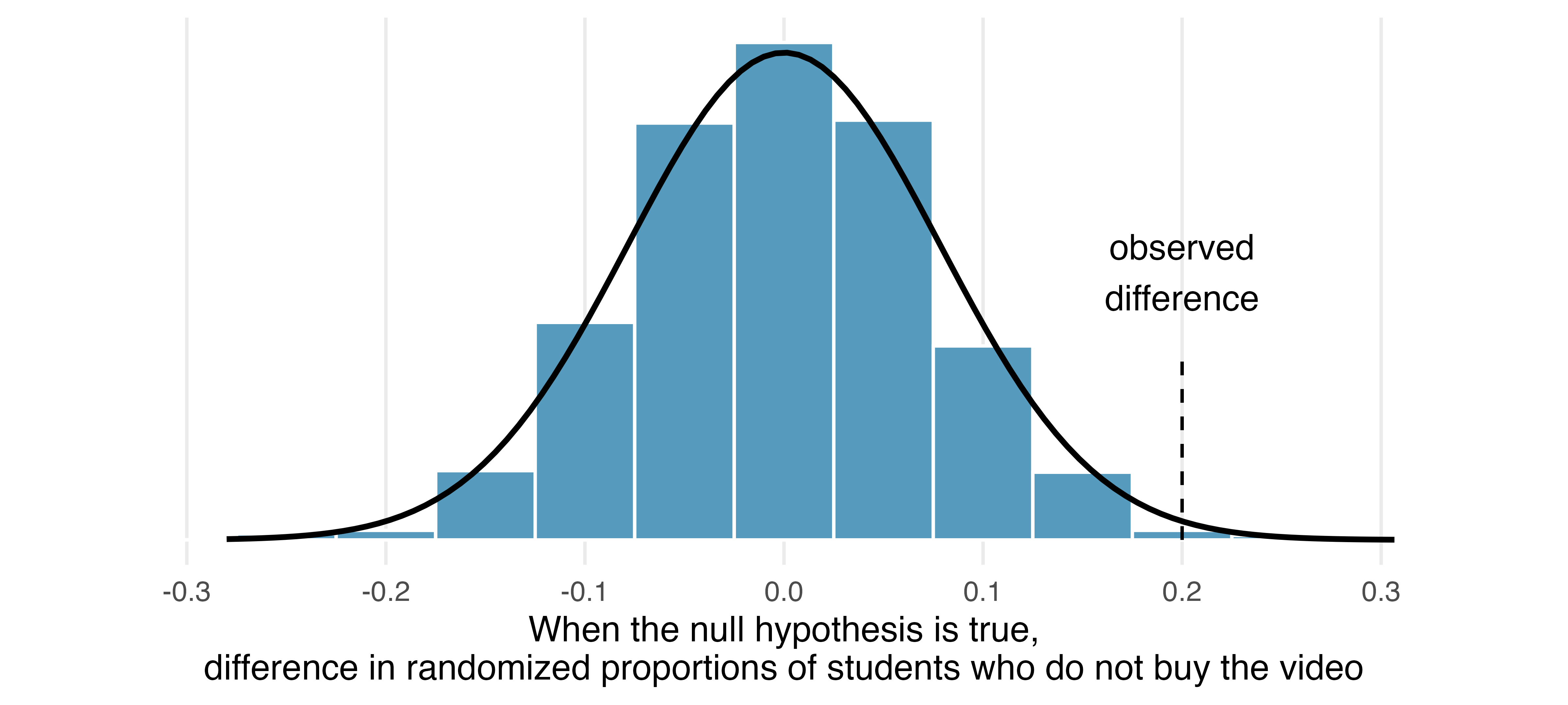
Figure 13.9 summarizes the null distribution as determined using the randomization method. The best fitting normal distribution for the null distribution has a mean of 0. We can calculate the standard error of this distribution by borrowing a formula that we will become familiar with in Chapter 17, but for now let’s just take the value \(SE = 0.078\) as a given. Recall that the point estimate of the difference was 0.20, as shown in Figure 13.9. Next, we’ll use the normal distribution approach to compute the p-value.
13.4.3 Observed statistic vs. null statistics
As we learned in Section 13.2, it is helpful to draw and shade a picture of the normal distribution so we know precisely what we want to calculate. Here we want to find the area of the tail beyond 0.2, representing the p-value.
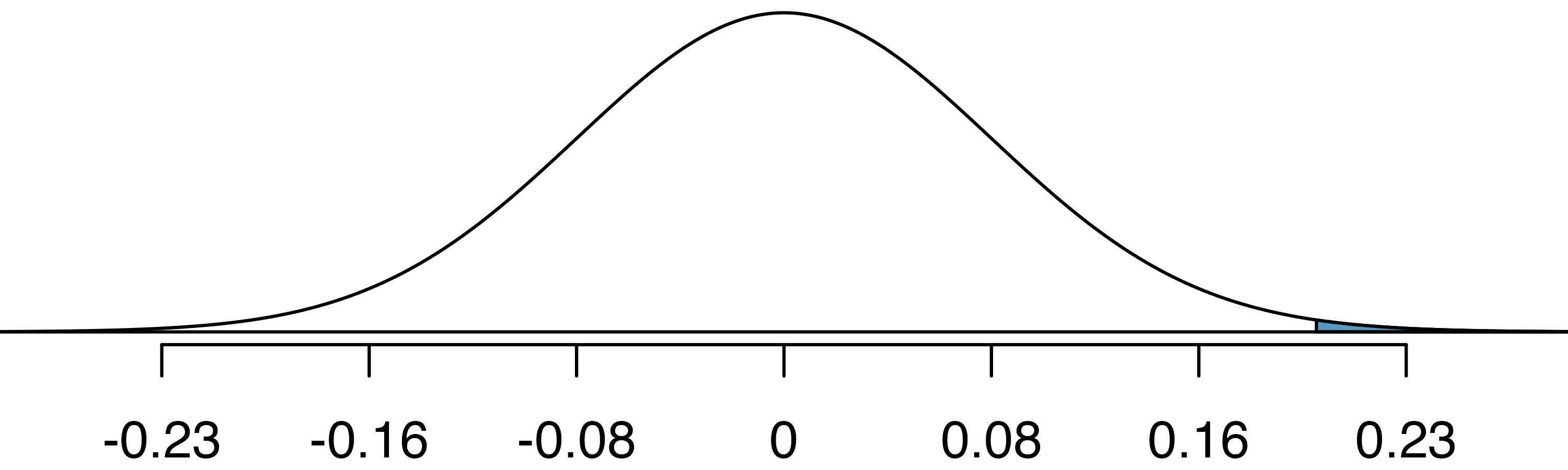
Next, we can calculate the Z score using the observed difference, 0.20, and the two model parameters. The standard error, \(SE = 0.078,\) is the equivalent of the model’s standard deviation.
\[Z = \frac{\text{observed difference} - 0}{SE} = \frac{0.20 - 0}{0.078} = 2.56\]
We can either use statistical software or look up \(Z = 2.56\) in the normal probability table to determine the right tail area: 0.0052, which is about the same as what we got for the right tail using the randomization approach (0.006). Using this area as the p-value, we see that the p-value is less than 0.05, we conclude that the treatment did indeed impact students’ spending.
Z score in a hypothesis test.
In the context of a hypothesis test, the Z score for a point estimate is
\[Z = \frac{\text{point estimate} - \text{null value}}{SE}\]
The standard error in this case is the equivalent of the standard deviation of the point estimate, and the null value comes from the claim made in the null hypothesis.
We have confirmed that the randomization approach we used earlier and the normal distribution approach provide almost identical p-values and conclusions in the opportunity cost case study. Next, let’s turn our attention to the medical consultant case study.
13.5 Case study (test): Medical consultant
13.5.1 Observed data
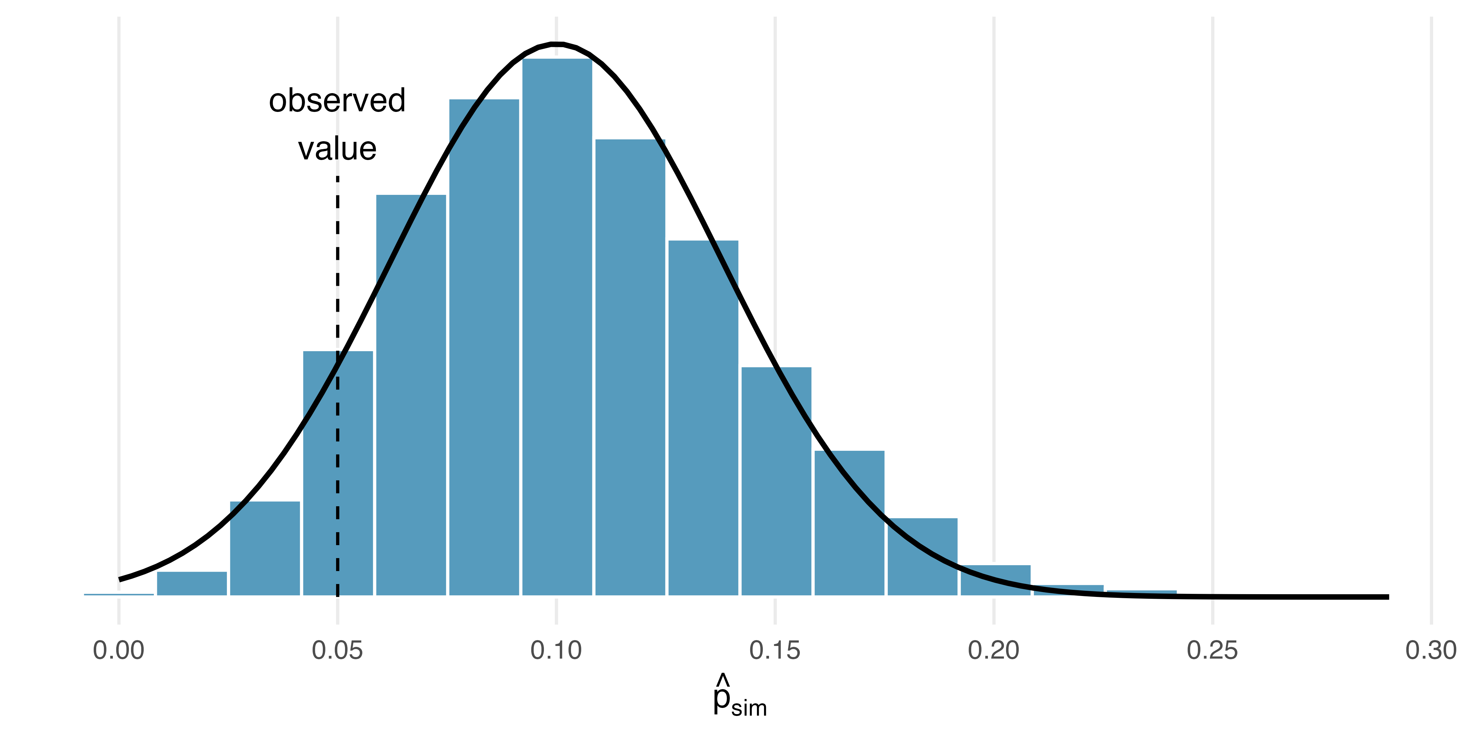
In Section 12.1 we learned about a medical consultant who reported that only 3 of their 62 clients who underwent a liver transplant had complications, which is less than the more common complication rate of 0.10. In that work, we did not model a null scenario, but we will discuss a simulation method for a one proportion null distribution in Section 16.1, such a distribution is provided in Figure 13.10. We have added the best-fitting normal curve to the figure, which has a mean of 0.10. Borrowing a formula that we’ll encounter in Chapter 16, the standard error of this distribution was also computed: \(SE = 0.038.\)
13.5.2 Variability of the statistic
Before we begin, we want to point out a simple detail that is easy to overlook: the null distribution we generated from the simulation is slightly skewed, and the histogram is not particularly smooth. In fact, the normal distribution only sort-of fits this model.
13.5.3 Observed statistic vs. null statistics
As always, we’ll draw a picture before finding the normal probabilities. Below is a normal distribution centered at 0.10 with a standard error of 0.038.
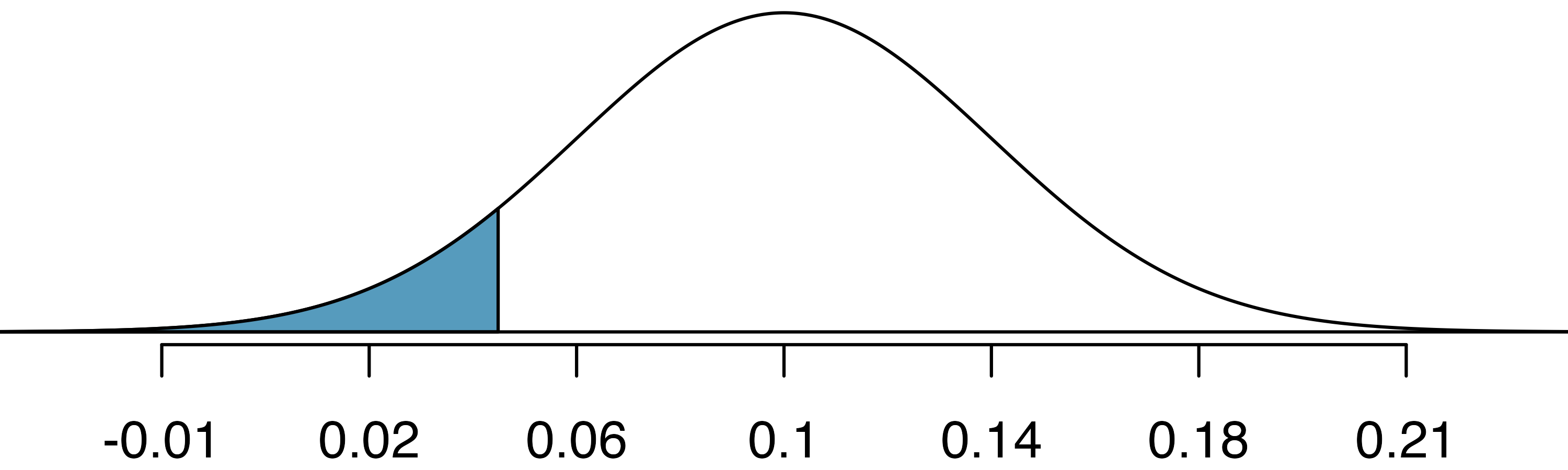
Next, we can calculate the Z score using the observed complication rate, \(\hat{p} = 0.048\) along with the mean and standard deviation of the normal model. Here again, we use the standard error for the standard deviation.
\[Z = \frac{\hat{p} - p_0}{SE_{\hat{p}}} = \frac{0.048 - 0.10}{0.038} = -1.37\]
Identifying \(Z = -1.37\) using statistical software or in the normal probability table, we can determine that the left tail area is 0.0853 which is the estimated p-value for the hypothesis test. There is a small problem: the p-value of 0.0853 is almost 30% smaller than the simulation p-value of 0.1222 which will be calculated in Section 16.1.
The discrepancy is explained by the normal model’s poor representation of the null distribution in Figure 13.10. As noted earlier, the null distribution from the simulations is not very smooth, and the distribution itself is slightly skewed. That’s the bad news. The good news is that we can foresee these problems using some simple checks. We’ll learn more about these checks in the following chapters.
In Section 13.1 we noted that the two common requirements to apply the Central Limit Theorem are (1) the observations in the sample must be independent, and (2) the sample must be sufficiently large. The guidelines for this particular situation – which we will learn in Chapter 16 – would have alerted us that the normal model was a poor approximation.
13.5.4 Conditions for applying the normal model
The success story in this section was the application of the normal model in the context of the opportunity cost data. However, the biggest lesson comes from the less successful attempt to use the normal approximation in the medical consultant case study.
Statistical techniques are like a carpenter’s tools. When used responsibly, they can produce amazing and precise results. However, if the tools are applied irresponsibly or under inappropriate conditions, they will produce unreliable results. For this reason, with every statistical method that we introduce in future chapters, we will carefully outline conditions when the method can reasonably be used. These conditions should be checked in each application of the technique.
After covering the introductory topics in this course, advanced study may lead to working with complex models which, for example, bring together many variables with different variability structure. Working with data that come from normal populations makes higher-order models easier to estimate and interpret. There are times when simulation, randomization, or bootstrapping are unwieldy in either structure or computational demand. Normality can often lead to excellent approximations of the data using straightforward modeling techniques.
13.6 Case study (interval): Stents
A point estimate is our best guess for the value of the parameter, so it makes sense to build the confidence interval around that value. The standard error, which is a measure of the uncertainty associated with the point estimate, provides a guide for how large we should make the confidence interval. The 68-95-99.7 rule tells us that, in general, 95% of observations are within 2 standard errors of the mean. Here, we use the value 1.96 to be slightly more precise.
Constructing a 95% confidence interval.
When the sampling distribution of a point estimate can reasonably be modeled as normal, the point estimate we observe will be within 1.96 standard errors of the true value of interest about 95% of the time. Thus, a 95% confidence interval for such a point estimate can be constructed:
\[\text{point estimate} \pm 1.96 \times SE\]
We can be 95% confident this interval captures the true value.
Compute the area between -1.96 and 1.96 for a normal distribution with mean 0 and standard deviation 1.17
The point estimate in the opportunity cost study was that 20% fewer students would buy a video if they were reminded that money not spent now could be spent later on something else. This point estimate can reasonably be modeled with a normal distribution with a standard error of \(SE = 0.078.\) Construct a 95% confidence interval for the point estimate.
Since we’re told the point estimate can be modeled with a normal distribution:
\[\text{point estimate} \pm 1.96 \times SE = 0.20 \pm 1.96 \times 0.078 = (0.047, 0.353)\]
We are 95% confident that the video purchase rate resulting from the treatment is between 4.7% and 35.3% lower than in the control group. Since this confidence interval does not contain 0, it is consistent with our earlier hypothesis test where we rejected the notion of “no difference”.
Note that we have used SE = 0.078 from the last section. However, it would more generally be appropriate to recompute the SE slightly differently for this confidence interval using sample proportions. Don’t worry about this detail for now since the two resulting standard errors are, in this case, almost identical.
13.6.1 Observed data
Consider an experiment that examined whether implanting a stent in the brain of a patient at risk for a stroke helps reduce the risk of a stroke. The results from the first 30 days of this study, which included 451 patients, are summarized in Table 13.1. These results are surprising! The point estimate suggests that patients who received stents may have a higher risk of stroke: \(p_{trmt} - p_{ctrl} = 0.090.\)
| Group | No event | Stroke | Total |
|---|---|---|---|
| control | 214 | 13 | 227 |
| treatment | 191 | 33 | 224 |
| Total | 405 | 46 | 451 |
13.6.2 Variability of the statistic
Consider the stent study and results. The conditions necessary to ensure the point estimate \(p_{trmt} - p_{ctrl} = 0.090\) is nearly normal have been verified for you, and the estimate’s standard error is \(SE = 0.028.\) Construct a 95% confidence interval for the change in 30-day stroke rates from usage of the stent.
The conditions for applying the normal model have already been verified, so we can proceed to the construction of the confidence interval:
\[\text{point estimate} \pm 1.96 \times SE = 0.090 \pm 1.96 \times 0.028 = (0.035, 0.145)\]
We are 95% confident that implanting a stent in a stroke patient’s brain increased the risk of stroke within 30 days by a rate of 0.035 to 0.145. This confidence interval can also be used in a way analogous to a hypothesis test: since the interval does not contain 0 (is completely above 0), it means the data provide convincing evidence that the stent used in the study changed the risk of stroke within 30 days.
As with hypothesis tests, confidence intervals are imperfect. About 1-in-20 properly constructed 95% confidence intervals will fail to capture the parameter of interest, simply due to natural variability in the observed data. Figure 13.11 shows 25 confidence intervals for a proportion that were constructed from 25 different datasets that all came from the same population where the true proportion was \(p = 0.3.\) However, 1 of these 25 confidence intervals happened not to include the true value. The interval which does not capture \(p=0.3\) is not due to bad science. Instead, it is due to natural variability, and we should expect some of our intervals to miss the parameter of interest. Indeed, over a lifetime of creating 95% intervals, you should expect 5% of your reported intervals to miss the parameter of interest (unfortunately, you will not ever know which of your reported intervals captured the parameter and which missed the parameter).
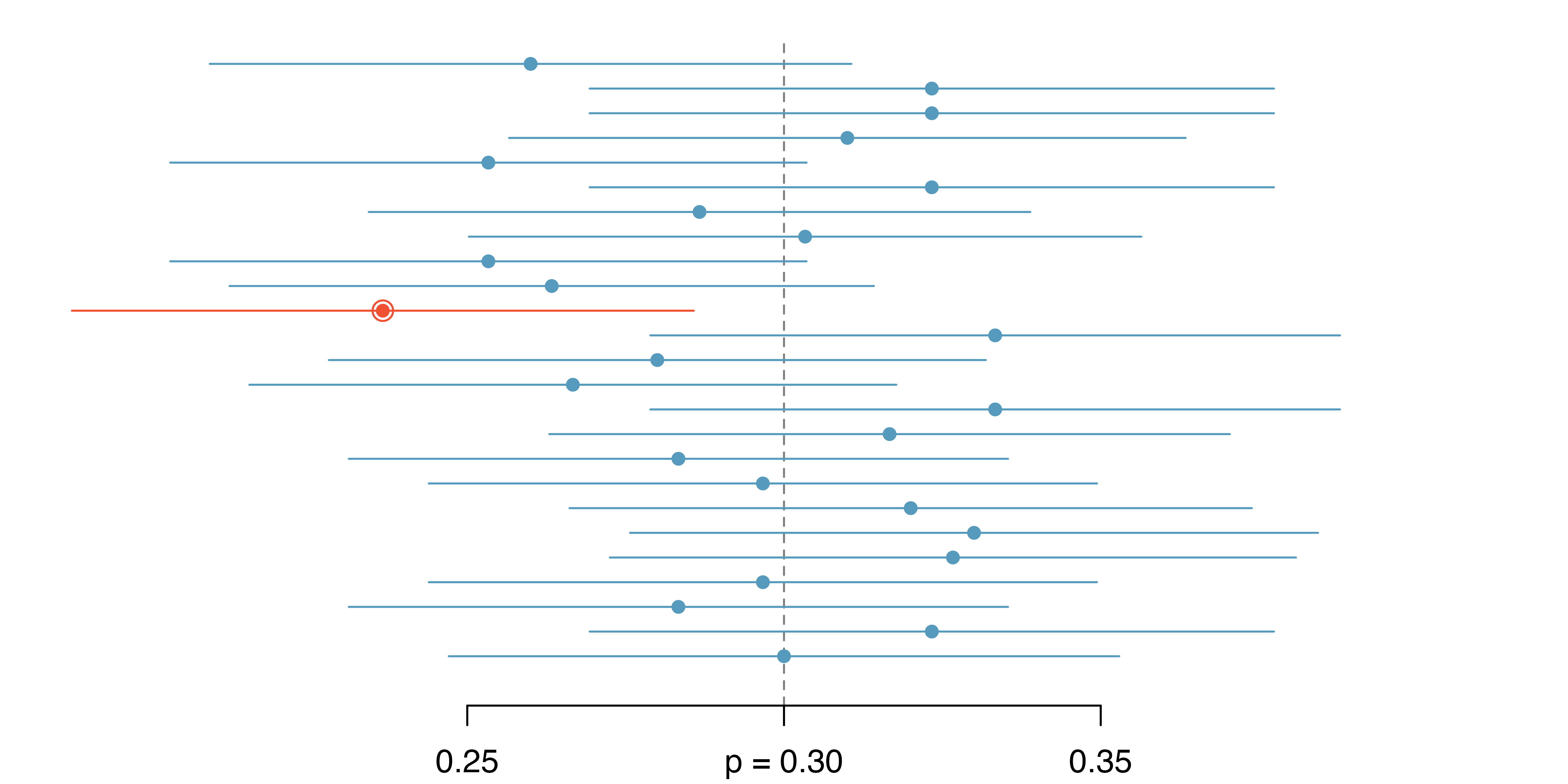
In Figure 13.11, one interval does not contain the true proportion, \(p = 0.3.\) Does this imply that there was a problem with the datasets that were selected?18
13.6.3 Interpreting confidence intervals
A careful eye might have observed the somewhat awkward language used to describe confidence intervals.
Correct confidence interval interpretation.
We are XX% confident that the population parameter is between lower and upper (where lower and upper are both numerical values).
Incorrect language might try to describe the confidence interval as capturing the population parameter with a certain probability.
This is one of the most common errors: while it might be useful to think of it as a probability, the confidence level only quantifies how plausible it is that the parameter is in the interval.
Another especially important consideration of confidence intervals is that they only try to capture the population parameter. Our intervals say nothing about the confidence of capturing individual observations, a proportion of the observations, or about capturing point estimates. Confidence intervals provide an interval estimate for and attempt to capture population parameters.
13.7 Chapter review
13.7.1 Summary
We can summarise the process of using the normal model as follows:
- Frame the research question. The mathematical model can be applied to both the hypothesis testing and the confidence interval framework. Make sure that your research question is being addressed by the most appropriate inference procedure.
- Collect data with an observational study or experiment. To address the research question, collect data on the variables of interest. Note that your data may be a random sample from a population or may be part of a randomized experiment.
- Model the randomness of the statistic. In many cases, the normal distribution will be an excellent model for the randomness associated with the statistic of interest. The Central Limit Theorem tells us that if the sample size is large enough, sample averages (which can be calculated as either a proportion or a sample mean) will be approximately normally distributed when describing how the statistics change from sample to sample.
- Calculate the variability of the statistic. Using formulas, come up with the standard deviation (or more typically, an estimate of the standard deviation called the standard error) of the statistic. The SE of the statistic will give information on how far the observed statistic is from the null hypothesized value (if performing a hypothesis test) or from the unknown population parameter (if creating a confidence interval).
- Use the normal distribution to quantify the variability. The normal distribution will provide a probability which measures how likely it is for your observed and hypothesized (or observed and unknown) parameter to differ by the amount measured. The unusualness (or not) of the discrepancy will form the conclusion to the research question.
- Form a conclusion. Using the p-value or the confidence interval from the analysis, report on the research question of interest. Also, be sure to write the conclusion in plain language so casual readers can understand the results.
Table 13.2 is another look at the mathematical model approach to inference.
| Question | Answer |
|---|---|
| What does it do? | Uses theory (primarily the Central Limit Theorem) to describe the hypothetical variability resulting from either repeated randomized experiments or random samples |
| What is the random process described? | Randomized experiment or random sampling |
| What other random processes can be approximated? | Can also be used to describe random sampling in an observational model or random allocation in an experiment |
| What is it best for? | Quick analyses through, for example, calculating a Z score |
| What physical object represents the simulation process? | Not applicable |
13.7.2 Terms
The terms introduced in this chapter are presented in Table 13.3. If you’re not sure what some of these terms mean, we recommend you go back in the text and review their definitions. You should be able to easily spot them as bolded text.
| 95% confidence interval | normal distribution | percentile |
| 95% confident | normal model | sampling distribution |
| Central Limit Theorem | normal probability table | standard error |
| margin of error | null distribution | standard normal distribution |
| normal curve | parameter | Z score |
13.8 Exercises
Answers to odd-numbered exercises can be found in Appendix A.13.
-
Area under the curve, Part I. What percent of a standard normal distribution \(N(\mu=0, \sigma=1)\) is found in each region denoted by a \(Z\) inequality below? Be sure to draw a graph. In the text above, we used R to calculate normal probabilities. You might choose to use a different source, such as a Shiny App or a normal table.
\(Z < -1.35\)
\(Z > 1.48\)
\(-0.4 < Z < 1.5\)
\(|Z| > 2\)
-
Area under the curve, Part II. What percent of a standard normal distribution \(N(\mu=0, \sigma=1)\) is found in each region denoted by a \(Z\) inequality below? Be sure to draw a graph. In the text above, we used R to calculate normal probabilities. You might choose to use a different source, such as a Shiny App or a normal table.
\(Z > -1.13\)
\(Z < 0.18\)
\(Z > 8\)
\(|Z| < 0.5\)
-
GRE scores, Z scores. Sophia who took the Graduate Record Examination (GRE) scored 160 on the Verbal Reasoning section and 157 on the Quantitative Reasoning section. The mean score for Verbal Reasoning section for all test takers was 151 with a standard deviation of 7, and the mean score for the Quantitative Reasoning was 153 with a standard deviation of 7.67. Suppose that both distributions are nearly normal. Use the information to compute each of the following. In the text above, we used R to calculate normal probabilities. You might choose to use a different source, such as a Shiny App or a normal table.
Write down the short-hand for each of the two normal distributions.
What is Sophia’s Z score on the Verbal Reasoning section? On the Quantitative Reasoning section? Draw a standard normal distribution curve and mark the two Z scores.
What do the Z scores tell you?
Relative to others, which section did Sophia do better on?
Find her percentile scores for each of the two exams.
What percent of the test takers did better than her on the Verbal Reasoning section? On the Quantitative Reasoning section?
Explain why simply comparing raw scores from the two sections could lead to an incorrect conclusion as to which section a student did better on.
If the distributions of the scores on these exams are not nearly normal, would your answers to parts (b) - (f) change? Explain your reasoning.
-
Triathlon times, Z scores. In triathlons, it is common for racers to be placed into age and gender groups. Two friends, Leo and Mary, both completed the Hermosa Beach Triathlon, where Leo competed in the “Men, Ages 30 - 34” group and Mary competed in the “Women, Ages 25 - 29” group. Leo completed the race in 1:22:28 (4948 seconds), while Mary completed the race in 1:31:53 (5513 seconds). We can see that Leo finished faster, but they are curious about how they did within their respective groups. Can you help them? Below is some information on the performance of their groups. Use the information to compute each of the following. In the text above, we used R to calculate normal probabilities. You might choose to use a different source, such as a Shiny App or a normal table.
The finishing times of the “Men, Ages 30 - 34” group has a mean of 4313 seconds with a standard deviation of 583 seconds.
The finishing times of the “Women, Ages 25 - 29” group has a mean of 5261 seconds with a standard deviation of 807 seconds.
The distributions of finishing times for both groups are approximately Normal.
Remember: a better performance corresponds to a faster finish.
Write down the short-hand for the two normal distributions.
What are the Z scores for each of Leo’s and Mary’s finishing times? What do the Z scores tell you?
Did Leo or Mary rank better in their respective group? Explain your reasoning.
What percent of the triathletes did Leo finish faster than in his group?
What percent of the triathletes did Mary finish faster than in her group?
If the distributions of finishing times are not nearly normal, would your answers to parts (b) – (e) change? Explain your reasoning.
-
GRE scores, cutoffs. Consider the previous two distributions for GRE scores: \(N(\mu=151, \sigma=7)\) for the Verbal Reasoning part of the exam and \(N(\mu=153, \sigma=7.67)\) for the Quantitative Reasoning part. Use the information to compute each of the following. In the text above, we used R to calculate normal probabilities. You might choose to use a different source, such as a Shiny App or a normal table.
The score of a student who scored in the \(80^{th}\) percentile on the Quantitative Reasoning section.
The score of a student who scored worse than 70% of test takers in the Verbal Reasoning section.
-
Triathlon times, cutoffs. Recall the two different distributions for triathlon times: \(N(\mu=4313, \sigma=583)\) for “Men, Ages 30 - 34” and \(N(\mu=5261, \sigma=807)\) for the “Women, Ages 25 - 29” group. Times are listed in seconds. Use this information to compute each of the following. In the text above, we used R to calculate normal probabilities. You might choose to use a different source, such as a Shiny App or a normal table.
The cutoff time for the fastest 5% of athletes in the men’s group, i.e., those who took the shortest 5% of time to finish.
The cutoff time for the slowest 10% of athletes in the women’s group.
-
LA weather, Fahrenheit. The average daily high temperature in June in LA is 77\(^\circ\) F with a standard deviation of 5\(^\circ\) F. Suppose that the temperatures in June closely follow a normal distribution. Use the information to compute each of the following. In the text above, we used R to calculate normal probabilities. You might choose to use a different source, such as a Shiny App or a normal table.
What is the probability of observing an 83\(^\circ\) F temperature or higher in LA during a randomly chosen day in June?
How cool are the coldest 10% of the days (days with lowest high temperature) during June in LA?
-
CAPM. The Capital Asset Pricing Model (CAPM) is a financial model that assumes returns on a portfolio are normally distributed. Suppose a portfolio has an average annual return of 14.7% (i.e., an average gain of 14.7%) with a standard deviation of 33%. A return of 0% means the value of the portfolio doesn’t change, a negative return means that the portfolio loses money, and a positive return means that the portfolio gains money.
What percent of years does this portfolio lose money, i.e., have a return less than 0%?
What is the cutoff for the highest 15% of annual returns with this portfolio?
-
LA weather, Celsius. Recall the set-up that average daily high temperature in June in LA is 77\(^\circ\) F with a standard deviation of 5\(^\circ\) F, and it can be assumed that the high temperatures follow a normal distribution. We use the following equation to convert \(^\circ\)F (Fahrenheit) to \(^\circ\)C (Celsius): \(C = (F - 32) \times \frac{5}{9}.\)
Write the probability model for the distribution of temperature in \(^\circ\)C in June in LA.
What is the probability of observing a 28\(^\circ\) C (which roughly corresponds to 83\(^\circ\) F) temperature or higher in June in LA? Calculate using the \(^\circ\)C model from part (a).
Did you get the same answer or different answers in part (b) of this question and part (a) of the previous question on the LA weather? Are you surprised? Explain.
Estimate the IQR of the temperatures (in \(^\circ\)C) in June in LA.
-
Find the SD. Find the standard deviation of the distribution in the following situations.
MENSA is an organization whose members have IQs in the top 2% of the population. IQs are normally distributed with mean 100, and the minimum IQ score required for admission to MENSA is 132.
Cholesterol levels for women aged 20 to 34 follow an approximately normal distribution with mean 185 milligrams per deciliter (mg/dl). Women with cholesterol levels above 220 mg/dl are considered to have high cholesterol and about 18.5% of women fall into this category.
-
Chronic illness. In 2013, the Pew Research Foundation reported that “45% of U.S. adults report that they live with one or more chronic conditions”. However, this value was based on a sample, so it may not be a perfect estimate for the population parameter of interest on its own. The study reported a standard error of about 1.2%, and a normal model may reasonably be used in this setting.
Create a 95% confidence interval for the proportion of U.S. adults who live with one or more chronic conditions. Also interpret the confidence interval in the context of the study. (Pew Research Center 2013)
-
Identify each of the following statements as true or false. Provide an explanation to justify each of your answers.
We can say with certainty that the confidence interval from part (a) contains the true percentage of U.S. adults who suffer from a chronic illness.
If we repeated this study 1,000 times and constructed a 95% confidence interval for each study, then approximately 950 of those confidence intervals would contain the true fraction of U.S. adults who suffer from chronic illnesses.
The poll provides statistically discernible evidence (at the \(\alpha = 0.05\) level) that the percentage of U.S. adults who suffer from chronic illnesses is below 50%.
Since the standard error is 1.2%, only 1.2% of people in the study communicated uncertainty about their answer.
-
Social media users and news, mathematical model. A poll conducted in 2022 found that 50% of U.S. adults (i.e., a proportion of 0.5) get news from social media sometimes or often. The standard error for this estimate was 0.5% (i.e., 0.005), and a normal distribution may be used to model the sample proportion. (Pew Research Center 2022)
Construct a 99% confidence interval for the fraction of U.S. adults who get news on social media sometimes or often, and interpret the confidence interval in context.
-
Identify each of the following statements as true or false. Provide an explanation to justify each of your answers.
The data provide statistically discernible evidence that more than half of U.S. adults users get news through social media sometimes or often. Use a discernibility level of \(\alpha = 0.01\).
Since the standard error is 0.5%, we can conclude that 99.5% of all U.S. adults users were included in the study.
If we want to reduce the standard error of the estimate, we should collect less data.
If we construct a 90% confidence interval for the percentage of U.S. adults who get news through social media sometimes or often, the resulting confidence interval will be wider than a corresponding 99% confidence interval.
-
Interpreting a Z score from a sample proportion. Suppose that you conduct a hypothesis test about a population proportion and calculate the Z score to be 0.47. Which of the following is the best interpretation of this value? For the problems which are not a good interpretation, indicate the statistical idea being described.19
The probability is 0.47 that the null hypothesis is true.
If the null hypothesis were true, the probability would be 0.47 of obtaining a sample proportion as far as observed from the hypothesized value of the population proportion.
The sample proportion is 0.47 standard errors greater than the hypothesized value of the population proportion.
The sample proportion is equal to 0.47 times the standard error.
The sample proportion is 0.47 away from the hypothesized value of the population.
The sample proportion is 0.47.
-
Mental health. The General Social Survey asked the question: “For how many days during the past 30 days was your mental health, which includes stress, depression, and problems with emotions, not good?” Based on responses from 1,151 US residents, the survey reported a 95% confidence interval of 3.40 to 4.24 days in 2010.
Interpret this interval in context of the data.
What does “95% confident” mean? Explain in the context of the application.
Suppose the researchers think a 99% confidence level would be more appropriate for this interval. Will this new interval be smaller or wider than the 95% confidence interval?
If a new survey were to be done with 500 Americans, do you think the standard error of the estimate be larger, smaller, or about the same.
-
Repeated water samples. A nonprofit wants to understand the fraction of households that have elevated levels of lead in their drinking water. They expect at least 5% of homes will have elevated levels of lead, but not more than about 30%. They randomly sample 800 homes and work with the owners to retrieve water samples, and they compute the fraction of these homes with elevated lead levels. They repeat this 1,000 times and build a distribution of sample proportions.
What is this distribution called?
Would you expect the shape of this distribution to be symmetric, right skewed, or left skewed? Explain your reasoning.
What is the name of the variability of this distribution.
Suppose the researchers’ budget is reduced, and they are only able to collect 250 observations per sample, but they can still collect 1,000 samples. They build a new distribution of sample proportions. How will the variability of this new distribution compare to the variability of the distribution when each sample contained 800 observations?
-
Repeated student samples. Of all freshman at a large college, 16% made the dean’s list in the current year. As part of a class project, students randomly sample 40 students and check if those students made the list. They repeat this 1,000 times and build a distribution of sample proportions.
What is this distribution called?
Would you expect the shape of this distribution to be symmetric, right skewed, or left skewed? Explain your reasoning.
What is the name of the variability of this distribution?
Suppose the students decide to sample again, this time collecting 90 students per sample, and they again collect 1,000 samples. They build a new distribution of sample proportions. How will the variability of this new distribution compare to the variability of the distribution when each sample contained 40 observations?
In general, the distributions are reasonably symmetric. The case study for the medical consultant is the only distribution with any evident skew (the distribution is skewed right).↩︎
It is also introduced as the Gaussian distribution after Frederic Gauss, the first person to formalize its mathematical expression.↩︎
We use the standard deviation as a guide. Nel is 1 standard deviation above average on the SAT: \(1500 + 300 = 1800.\) Sian is 0.6 standard deviations above the mean on the ACT: \(21+0.6 \times 5 = 24.\) In Figure 13.5, we can see that Nel did better compared to other test takers than Sian did, so their score was better.↩︎
\(Z_{Sian} = \frac{x_{Sian} - \mu_{ACT}}{\sigma_{ACT}} = \frac{24 - 21}{5} = 0.6\)↩︎
For \(x_1=95.4\) mm: \(Z_1 = \frac{x_1 - \mu}{\sigma} = \frac{95.4 - 92.6}{3.6} = 0.78.\) For \(x_2=85.8\) mm: \(Z_2 = \frac{85.8 - 92.6}{3.6} = -1.89.\)↩︎
Because the absolute value of Z score for the second observation is larger than that of the first, the second observation has a more unusual head length.↩︎
If 84% had lower scores than Nel, the number of people who had better scores must be 16%. (Generally ties are ignored when the normal model, or any other continuous distribution, is used.)↩︎
We found the probability to be 0.6664. A picture for this exercise is represented by the shaded area below “0.6664”.↩︎
Numerical answers: (a) 0.9772. (b) 0.0228.↩︎
This sample was taken from the USDA Food Commodity Intake Database.↩︎
Remember: draw a picture first, then find the Z score. (We leave the pictures to you.) The Z score can be found by using the percentiles and the normal probability table. (a) We look for 0.95 in the probability portion (middle part) of the normal probability table, which leads us to row 1.6 and (about) column 0.05, i.e., \(Z_{95}=1.65.\) Knowing \(Z_{95}=1.65,\) \(\mu = 1500,\) and \(\sigma = 300,\) we setup the Z score formula: \(1.65 = \frac{x_{95} - 1500}{300}.\) We solve for \(x_{95}\): \(x_{95} = 1995.\) (b) Similarly, we find \(Z_{97.5} = 1.96,\) again setup the Z score formula for the heights, and calculate \(x_{97.5} = 76.5.\)↩︎
Numerical answers: (a) 0.1131. (b) 0.3821.↩︎
This is an abbreviated solution. (Be sure to draw a figure!) First find the percent who get below 1500 and the percent that get above 2000: \(Z_{1500} = 0.00 \to 0.5000\) (area below), \(Z_{2000} = 1.67 \to 0.0475\) (area above). Final answer: \(1.0000-0.5000 - 0.0475 = 0.4525.\)↩︎
5’5” is 65 inches. 5’7” is 67 inches. Numerical solution: \(1.000 - 0.0649 - 0.8183 = 0.1168,\) i.e., 11.68%.↩︎
First draw the pictures. To find the area between \(Z=-1\) and \(Z=1,\) use
pnorm()or the normal probability table to determine the areas below \(Z=-1\) and above \(Z=1.\) Next verify the area between \(Z=-1\) and \(Z=1\) is about 0.68. Repeat this for \(Z=-2\) to \(Z=2\) and for \(Z=-3\) to \(Z=3.\)↩︎900 and 2100 represent two standard deviations above and below the mean, which means about 95% of test takers will score between 900 and 2100. Since the normal model is symmetric, then half of the test takers from part (a) (\(\frac{95\%}{2} = 47.5\%\) of all test takers) will score 900 to 1500 while 47.5% score between 1500 and 2100.↩︎
We will leave it to you to draw a picture. The Z scores are \(Z_{left} = -1.96\) and \(Z_{right} = 1.96.\) The area between these two Z scores is \(0.9750 - 0.0250 = 0.9500.\) This is where “1.96” comes from in the 95% confidence interval formula.↩︎
No. Just as some observations occur more than 1.96 standard deviations from the mean, some point estimates will be more than 1.96 standard errors from the parameter. A confidence interval only provides a plausible range of values for a parameter. While we might say other values are implausible based on the data, this does not mean they are impossible.↩︎
This exercise was inspired by discussion on Dr. Allan Rossman’s blog Ask Good Questions.↩︎