11 Hypothesis testing with randomization
Statistical inference is primarily concerned with understanding and quantifying the uncertainty of parameter estimates. While the equations and details change depending on the setting, the foundations for inference are the same throughout all of statistics.
We start with two case studies designed to motivate the process of making decisions about research claims. We formalize the process through the introduction of the hypothesis testing framework, which allows us to formally evaluate claims about the population.
Throughout the book so far, you have worked with data in a variety of contexts. You have learned how to summarize and visualize the data as well as how to model multiple variables at the same time. Sometimes the dataset at hand represents the entire research question. But more often than not, the data have been collected to answer a research question about a larger group of which the data are a (hopefully) representative subset.
You may agree that there is almost always variability in data – one dataset will not be identical to a second dataset even if they are both collected from the same population using the same methods. However, quantifying the variability in the data is neither obvious nor easy to do, i.e., answering the question “how different is one dataset from another?” is not trivial.
First, a note on notation. We generally use \(p\) to denote a population proportion and \(\hat{p}\) to denote a sample proportion. Similarly, we generally use \(\mu\) to denote a population mean and \(\bar{x}\) to denote a sample mean.
Suppose your professor splits the students in your class into two groups: students who sit on the left side of the classroom and students who sit on the right side of the classroom. If \(\hat{p}_{L}\) represents the proportion of students who prefer to read books on screen who sit on the left side of the classroom and \(\hat{p}_{R}\) represents the proportion of students who prefer to read books on screen who sit on the right side of the classroom, would you be surprised if \(\hat{p}_{L}\) did not exactly equal \(\hat{p}_{R}\)?
While the proportions \(\hat{p}_{L}\) and \(\hat{p}_{R}\) would probably be close to each other, it would be unusual for them to be exactly the same. We would probably observe a small difference due to chance.
If we do not think the side of the room a person sits on in class is related to whether they prefer to read books on screen, what assumption are we making about the relationship between these two variables?1
Studying randomness of this form is a key focus of statistics. Throughout this chapter, and those that follow, we provide three different approaches for quantifying the variability inherent in data: randomization, bootstrapping, and mathematical models. Using the methods provided in this chapter, we will be able to draw conclusions beyond the dataset at hand to research questions about larger populations that the samples come from.
The first type of variability we will explore comes from experiments where the explanatory variable (or treatment) is randomly assigned to the observational units. As you learned in Chapter 1, a randomized experiment can be used to assess whether one variable (the explanatory variable) causes changes in a second variable (the response variable). Every dataset has some variability in it, so to decide whether the variability in the data is due to (1) the causal mechanism (the randomized explanatory variable in the experiment) or instead (2) natural variability inherent to the data, we set up a sham randomized experiment as a comparison. That is, we assume that each observational unit would have gotten the exact same response value regardless of the treatment level. By reassigning the treatments many many times, we can compare the actual experiment to the sham experiment. If the actual experiment has more extreme results than any of the sham experiments, we are led to believe that it is the explanatory variable which is causing the result and not just variability inherent to the data. Using a few different case studies, let’s look more carefully at this idea of a randomization test.
11.1 Sex discrimination case study
We consider a study investigating sex discrimination in the 1970s, which is set in the context of personnel decisions within a bank. The research question we hope to answer is, “Are individuals who identify as female discriminated against in promotion decisions made by their managers who identify as male?” (Rosen and Jerdee 1974)
The sex_discrimination data can be found in the openintro R package.
This study considered sex roles, and only allowed for options of “male” and “female”. We should note that the identities being considered are not gender identities and that the study allowed only for a binary classification of sex.
11.1.1 Observed data
The participants in this study were 48 bank supervisors who identified as male, attending a management institute at the University of North Carolina in 1972. They were asked to assume the role of the personnel director of a bank and were given a personnel file to judge whether the person should be promoted to a branch manager position. The files given to the participants were identical, except that half of them indicated the candidate identified as male and the other half indicated the candidate identified as female. These files were randomly assigned to the bank managers.
Is this an observational study or an experiment? How does the type of study impact what can be inferred from the results?2
For each supervisor both the sex associated with the assigned file and the promotion decision were recorded. Using the results of the study summarized in Table 11.1, we would like to evaluate if individuals who identify as female are unfairly discriminated against in promotion decisions. In this study, a smaller proportion of female identifying applications were promoted than males (0.583 versus 0.875), but it is unclear whether the difference provides convincing evidence that individuals who identify as female are unfairly discriminated against.
| sex | promoted | not promoted | Total |
|---|---|---|---|
| male | 21 | 3 | 24 |
| female | 14 | 10 | 24 |
| Total | 35 | 13 | 48 |
The data are visualized in Figure 11.1 as a set of cards. Note that each card denotes a personnel file (an observation from our dataset) and the colors indicate the decision: red for promoted and white for not promoted. Additionally, the observations are broken up into groups of male and female identifying groups.
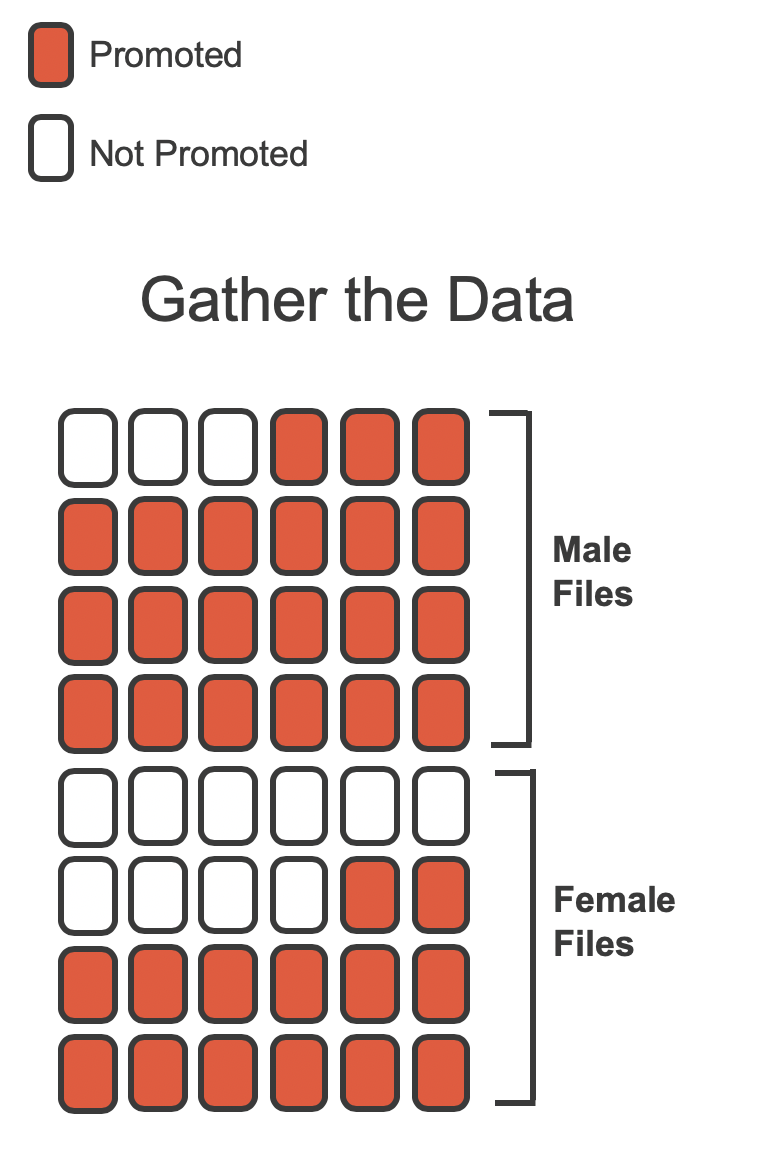
Statisticians are sometimes called upon to evaluate the strength of evidence. When looking at the rates of promotion in this study, why might we be tempted to immediately conclude that individuals identifying as female are being discriminated against?
The large difference in promotion rates (58.3% for female personnel versus 87.5% for male personnel) suggests there might be discrimination against women in promotion decisions. However, we cannot yet be sure if the observed difference represents discrimination or is just due to random chance when there is no discrimination occurring. Since we wouldn’t expect the sample proportions to be exactly equal, even if the truth was that the promotion decisions were independent of sex, we can’t rule out random chance as a possible explanation when simply comparing the sample proportions.
The previous example is a reminder that there will always be variability in data (making the groups differ), even if there are no underlying causes for that difference (e.g., even if there is no discrimination). Table 11.1 shows there were 7 fewer promotions for female identifying personnel than for the male personnel, a difference in promotion rates of 29.2% \(\left( \frac{21}{24} - \frac{14}{24} = 0.292 \right).\) This observed difference is what we call a point estimate of the true difference. The point estimate of the difference in promotion rate is large, but the sample size for the study is small, making it unclear if the observed difference represents discrimination or is simply due to chance. Chance can be thought of as the claim due to natural variability; discrimination can be thought of as the claim the researchers set out to demonstrate. We label these two competing claims, \(H_0\) and \(H_A:\)
-
\(H_0:\) Null hypothesis. The variables
sexanddecisionare independent. The difference in promotion rates of 29.2% was due to natural variability inherent in the population. -
\(H_A:\) Alternative hypothesis. The variables
sexanddecisionare not independent. The difference in promotion rates of 29.2% was not due to natural variability, and equally qualified female personnel are less likely to be promoted than male personnel.
Hypothesis testing.
These hypotheses are part of what is called a hypothesis test. A hypothesis test is a statistical technique used to evaluate competing claims using data. Often times, the null hypothesis takes a stance of no difference or no effect. This hypothesis assumes that any differences observed are due to the variability inherent in the population and could have occurred by random chance.
If the null hypothesis and the data notably disagree, then we reject the null hypothesis in favor of the alternative hypothesis.
There are many nuances to hypothesis testing, so do not worry if you don’t feel like a master of hypothesis testing at the end of this section. We’ll discuss these ideas and details many times in this chapter as well as in the chapters that follow.
What would it mean if the null hypothesis, which says the variables sex and decision are unrelated, was true? It would mean each banker would decide whether to promote the candidate without regard to the sex indicated on the personnel file. That is, the difference in the promotion percentages would be due to the natural variability in how the files were randomly allocated to different bankers, and this randomization just happened to give rise to a relatively large difference of 29.2%.
Consider the alternative hypothesis: bankers were influenced by which sex was listed on the personnel file. If this was true, and especially if this influence was substantial, we would expect to see some difference in the promotion rates of male and female candidates. If this sex bias was against female candidates, we would expect a smaller fraction of promotion recommendations for female personnel relative to the male personnel.
We will choose between the two competing claims by assessing if the data conflict so much with \(H_0\) that the null hypothesis cannot be deemed reasonable. If data and the null claim seem to be at odds with one another, and the data seem to support \(H_A,\) then we will reject the notion of independence and conclude that the data provide evidence of discrimination.
11.1.2 Variability of the statistic
Table 11.1 shows that 35 bank supervisors recommended promotion and 13 did not. Now, suppose the bankers’ decisions were independent of the sex of the candidate. Then, if we conducted the experiment again with a different random assignment of sex to the files, differences in promotion rates would be based only on random fluctuation in promotion decisions. We can perform this randomization, which simulates what would have happened if the bankers’ decisions had been independent of sex but we had distributed the file sexes differently.3
In the simulation, we thoroughly shuffle the 48 personnel files, 35 labelled promoted and 13 labelled not promoted, together and we deal files into two new stacks. Note that by keeping 35 promoted and 13 not promoted, we are assuming that 35 of the bank managers would have promoted the individual whose content is contained in the file independent of the sex indicated on their file. We will deal 24 files into the first stack, which will represent the 24 “female” files. The second stack will also have 24 files, and it will represent the 24 “male” files. Figure 11.2 highlights both the shuffle and the reallocation to the sham sex groups.
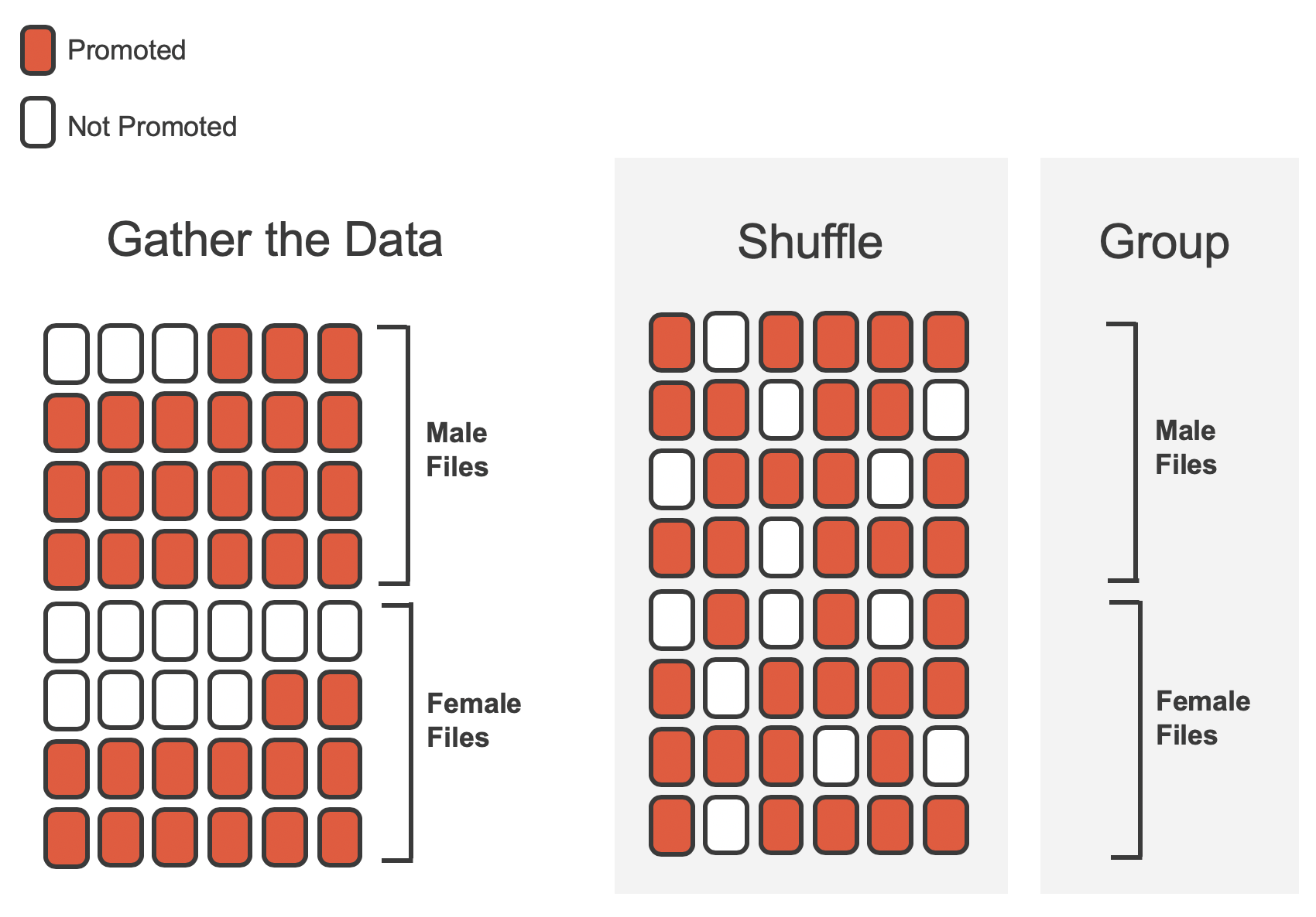
Then, as we did with the original data, we tabulate the results and determine the fraction of personnel files designated as “male” and “female” who were promoted.
Since the randomization of files in this simulation is independent of the promotion decisions, any difference in promotion rates is due to chance. Table 11.2 show the results of one such simulation.
| sex | promoted | not promoted | Total |
|---|---|---|---|
| male | 18 | 6 | 24 |
| female | 17 | 7 | 24 |
| Total | 35 | 13 | 48 |
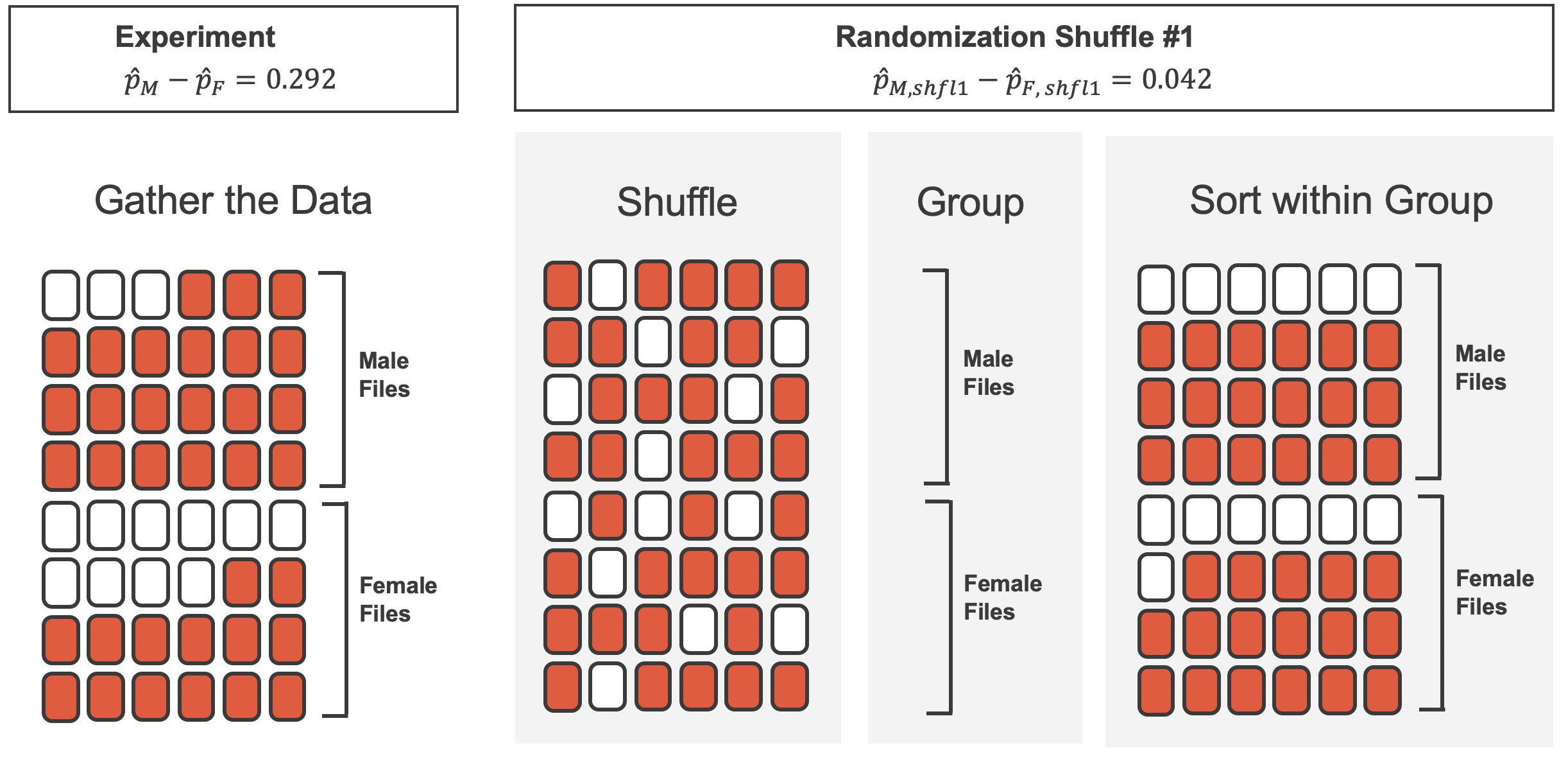
What is the difference in promotion rates between the two simulated groups in Table 11.2? How does this compare to the observed difference 29.2% from the actual study?4
Figure 11.3 shows that the difference in promotion rates is much larger in the original data than it is in the simulated groups (0.292 > 0.042). The quantity of interest throughout this case study has been the difference in promotion rates. We call the summary value the statistic of interest (or often the test statistic). When we encounter different data structures, the statistic is likely to change (e.g., we might calculate an average instead of a proportion), but we will always want to understand how the statistic varies from sample to sample.
11.1.3 Observed statistic vs. null statistics
We computed one possible difference under the null hypothesis in Guided Practice, which represents one difference due to chance when the null hypothesis is assumed to be true. While in this first simulation, we physically dealt out files, it is much more efficient to perform this simulation using a computer. Repeating the simulation on a computer, we get another difference due to chance under the same assumption: -0.042. And another: 0.208. And so on until we repeat the simulation enough times that we have a good idea of the shape of the distribution of differences under the null hypothesis. Figure 11.4 shows a plot of the differences found from 100 simulations, where each dot represents a simulated difference between the proportions of male and female files recommended for promotion.
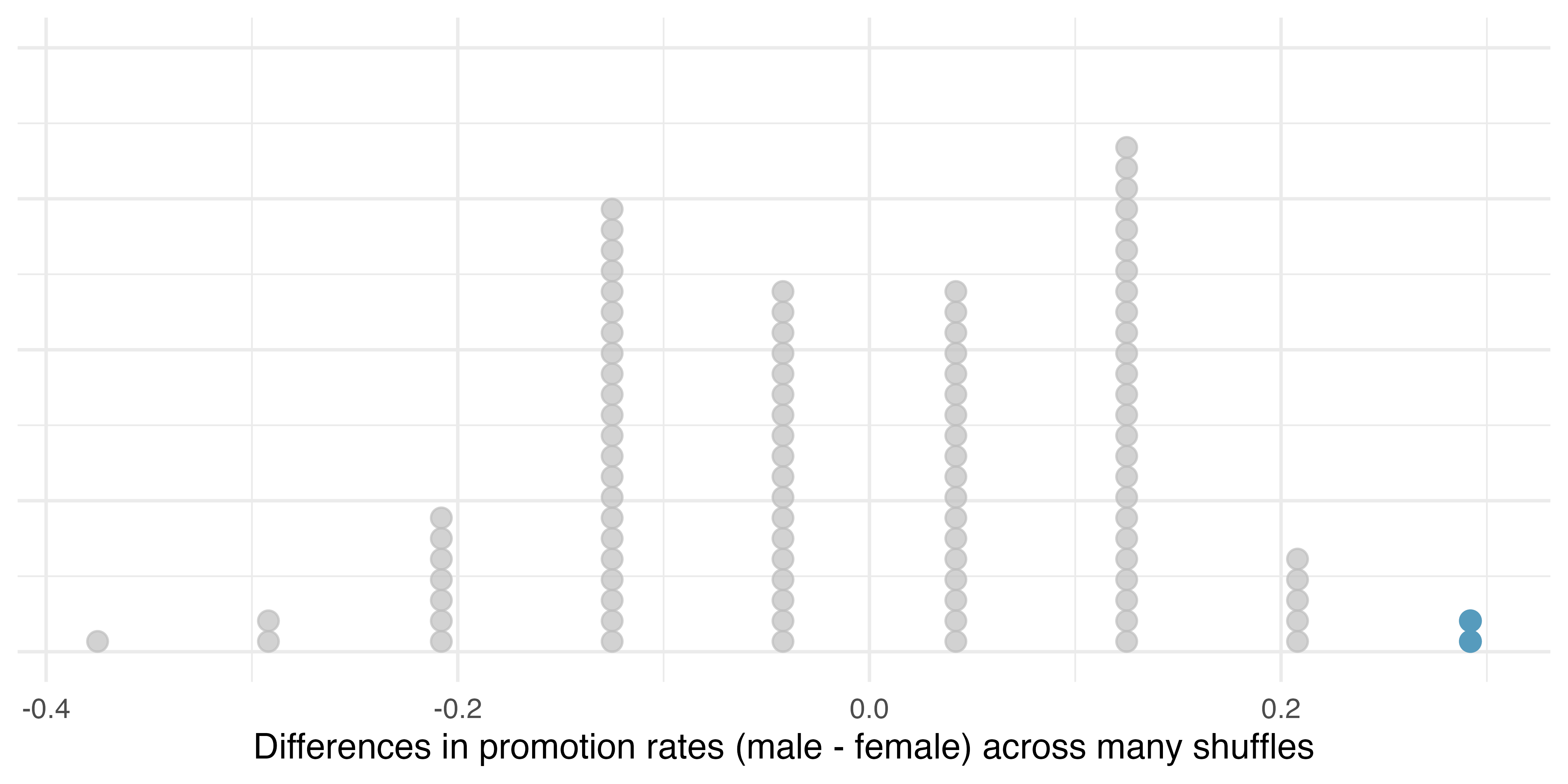
Note that the distribution of these simulated differences in proportions is centered around 0. Under the null hypothesis our simulations made no distinction between male and female personnel files. Thus, a center of 0 makes sense: we should expect differences from chance alone to fall around zero with some random fluctuation for each simulation.
How often would you observe a difference of at least 29.2% (0.292) according to Figure 11.4? Often, sometimes, rarely, or never?
It appears that a difference of at least 29.2% under the null hypothesis would only happen about 2% of the time according to Figure 11.4. Such a low probability indicates that observing such a large difference from chance alone is rare.
The difference of 29.2% is a rare event if there really is no impact from listing sex in the candidates’ files, which provides us with two possible interpretations of the study results:
If \(H_0,\) the Null hypothesis is true: Sex has no effect on promotion decision, and we observed a difference that is so large that it would only happen rarely.
If \(H_A,\) the Alternative hypothesis is true: Sex has an effect on promotion decision, and what we observed was actually due to equally qualified female candidates being discriminated against in promotion decisions, which explains the large difference of 29.2%.
When we conduct formal studies, we reject a null position (the idea that the data are a result of chance only) if the data strongly conflict with that null position.5 In our analysis, we determined that there was only a \(\approx\) 2% probability of obtaining a sample where \(\geq\) 29.2% more male candidates than female candidates get promoted under the null hypothesis, so we conclude that the data provide strong evidence of sex discrimination against female candidates by the male supervisors. In this case, we reject the null hypothesis in favor of the alternative.
Statistical inference is the practice of making decisions and conclusions from data in the context of uncertainty. Errors do occur, just like rare events, and the dataset at hand might lead us to the wrong conclusion. While a given dataset may not always lead us to a correct conclusion, statistical inference gives us tools to control and evaluate how often these errors occur. Before getting into the nuances of hypothesis testing, let’s work through another case study.
11.2 Opportunity cost case study
How rational and consistent is the behavior of the typical American college student? In this section, we’ll explore whether college student consumers always consider the following: money not spent now can be spent later.
In particular, we are interested in whether reminding students about this well-known fact about money causes them to be a little thriftier. A skeptic might think that such a reminder would have no impact. We can summarize the two different perspectives using the null and alternative hypothesis framework.
- \(H_0:\) Null hypothesis. Reminding students that they can save money for later purchases will not have any impact on students’ spending decisions.
- \(H_A:\) Alternative hypothesis. Reminding students that they can save money for later purchases will reduce the chance they will continue with a purchase.
In this section, we’ll explore an experiment conducted by researchers that investigates this very question for students at a university in the southwestern United States. (Frederick et al. 2009)
11.2.1 Observed data
One-hundred and fifty students were recruited for the study, and each was given the following statement:
Imagine that you have been saving some extra money on the side to make some purchases, and on your most recent visit to the video store you come across a special sale on a new video. This video is one with your favorite actor or actress, and your favorite type of movie (such as a comedy, drama, thriller, etc.). This particular video that you are considering is one you have been thinking about buying for a long time. It is available for a special sale price of $14.99. What would you do in this situation? Please circle one of the options below.6
Half of the 150 students were randomized into a control group and were given the following two options:
- Buy this entertaining video.
- Not buy this entertaining video.
The remaining 75 students were placed in the treatment group, and they saw a slightly modified option (B):
- Buy this entertaining video.
- Not buy this entertaining video. Keep the $14.99 for other purchases.
Would the extra statement reminding students of an obvious fact impact the purchasing decision? Table 11.3 summarizes the study results.
The opportunity_cost data can be found in the openintro R package.
| group | buy video | not buy video | Total |
|---|---|---|---|
| control | 56 | 19 | 75 |
| treatment | 41 | 34 | 75 |
| Total | 97 | 53 | 150 |
It might be a little easier to review the results using a visualization. Figure 11.5 shows that a higher proportion of students in the treatment group chose not to buy the video compared to those in the control group.
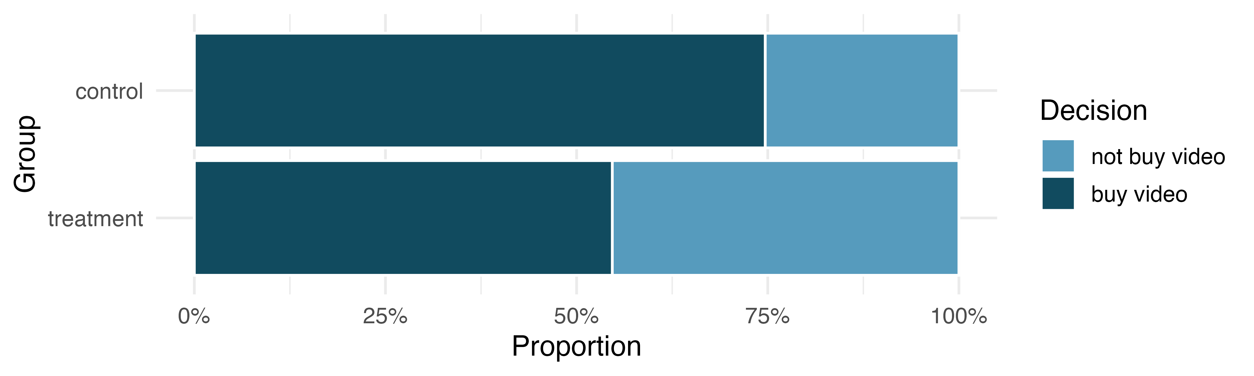
Another useful way to review the results from Table 11.3 is using row proportions, specifically considering the proportion of participants in each group who said they would buy or not buy the video. These summaries are given in Table 11.4.
| group | buy video | not buy video | Total |
|---|---|---|---|
| control | 0.747 | 0.253 | 1 |
| treatment | 0.547 | 0.453 | 1 |
We will define a success in this study as a student who chooses not to buy the video.7 Then, the value of interest is the change in video purchase rates that results by reminding students that not spending money now means they can spend the money later.
We can construct a point estimate for this difference as (\(T\) for treatment and \(C\) for control):
\[\hat{p}_{T} - \hat{p}_{C} = \frac{34}{75} - \frac{19}{75} = 0.453 - 0.253 = 0.200\]
The proportion of students who chose not to buy the video was 20 percentage points higher in the treatment group than the control group. Is this 20% difference between the two groups so prominent that it is unlikely to have occurred from chance alone, if there is no difference between the spending habits of the two groups?
11.2.2 Variability of the statistic
The primary goal in this data analysis is to understand what sort of differences we might see if the null hypothesis were true, i.e., the treatment had no effect on students. Because this is an experiment, we’ll use the same procedure we applied in Section 11.1: randomization.
Let’s think about the data in the context of the hypotheses. If the null hypothesis \((H_0)\) was true and the treatment had no impact on student decisions, then the observed difference between the two groups of 20% could be attributed entirely to random chance. If, on the other hand, the alternative hypothesis \((H_A)\) is true, then the difference indicates that reminding students about saving for later purchases actually impacts their buying decisions.
11.2.3 Observed statistic vs. null statistics
Just like with the sex discrimination study, we can perform a statistical analysis. Using the same randomization technique from the last section, let’s see what happens when we simulate the experiment under the scenario where there is no effect from the treatment.
While we would in reality do this simulation on a computer, it might be useful to think about how we would go about carrying out the simulation without a computer. We start with 150 index cards and label each card to indicate the distribution of our response variable: decision. That is, 53 cards will be labeled “not buy video” to represent the 53 students who opted not to buy, and 97 will be labeled “buy video” for the other 97 students. Then we shuffle these cards thoroughly and divide them into two stacks of size 75, representing the simulated treatment and control groups. Because we have shuffled the cards from both groups together, assuming no difference in their purchasing behavior, any observed difference between the proportions of “not buy video” cards (what we earlier defined as success) can be attributed entirely to chance.
If we are randomly assigning the cards into the simulated treatment and control groups, how many “not buy video” cards would we expect to end up in each simulated group? What would be the expected difference between the proportions of “not buy video” cards in each group?
Since the simulated groups are of equal size, we would expect \(53 / 2 = 26.5,\) i.e., 26 or 27, “not buy video” cards in each simulated group, yielding a simulated point estimate of the difference in proportions of 0%. However, due to random chance, we might also expect to sometimes observe a number a little above or below 26 and 27.
The results of a single randomization is shown in Table 11.5.
| group | buy video | not buy video | Total |
|---|---|---|---|
| control | 46 | 29 | 75 |
| treatment | 51 | 24 | 75 |
| Total | 97 | 53 | 150 |
From this table, we can compute a difference that occurred from the first shuffle of the data (i.e., from chance alone):
\[\hat{p}_{T, shfl1} - \hat{p}_{C, shfl1} = \frac{24}{75} - \frac{29}{75} = 0.32 - 0.387 = - 0.067\]
Just one simulation will not be enough to get a sense of what sorts of differences would happen from chance alone.
We’ll simulate another set of simulated groups and compute the new difference: 0.04.
And again: 0.12.
And again: -0.013.
We’ll do this 1,000 times.
The results are summarized in a dot plot in Figure 11.6, where each point represents the difference from one randomization.
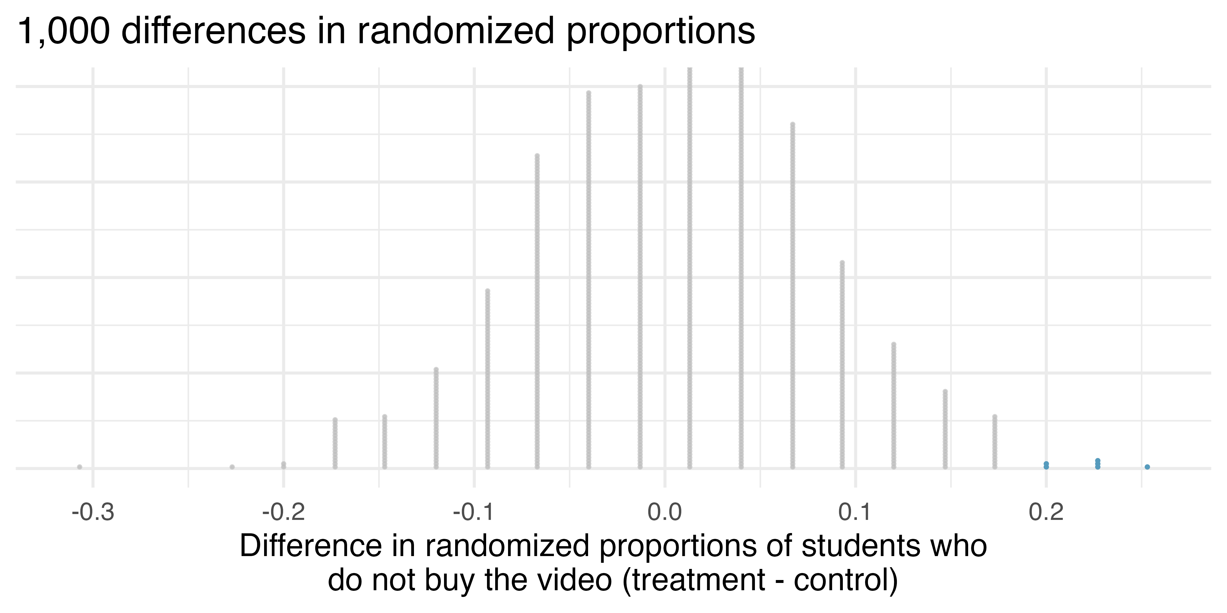
Since there are so many points and it is difficult to discern one point from the other, it is more convenient to summarize the results in a histogram such as the one in Figure 11.7, where the height of each histogram bar represents the number of simulations resulting in an outcome of that magnitude.
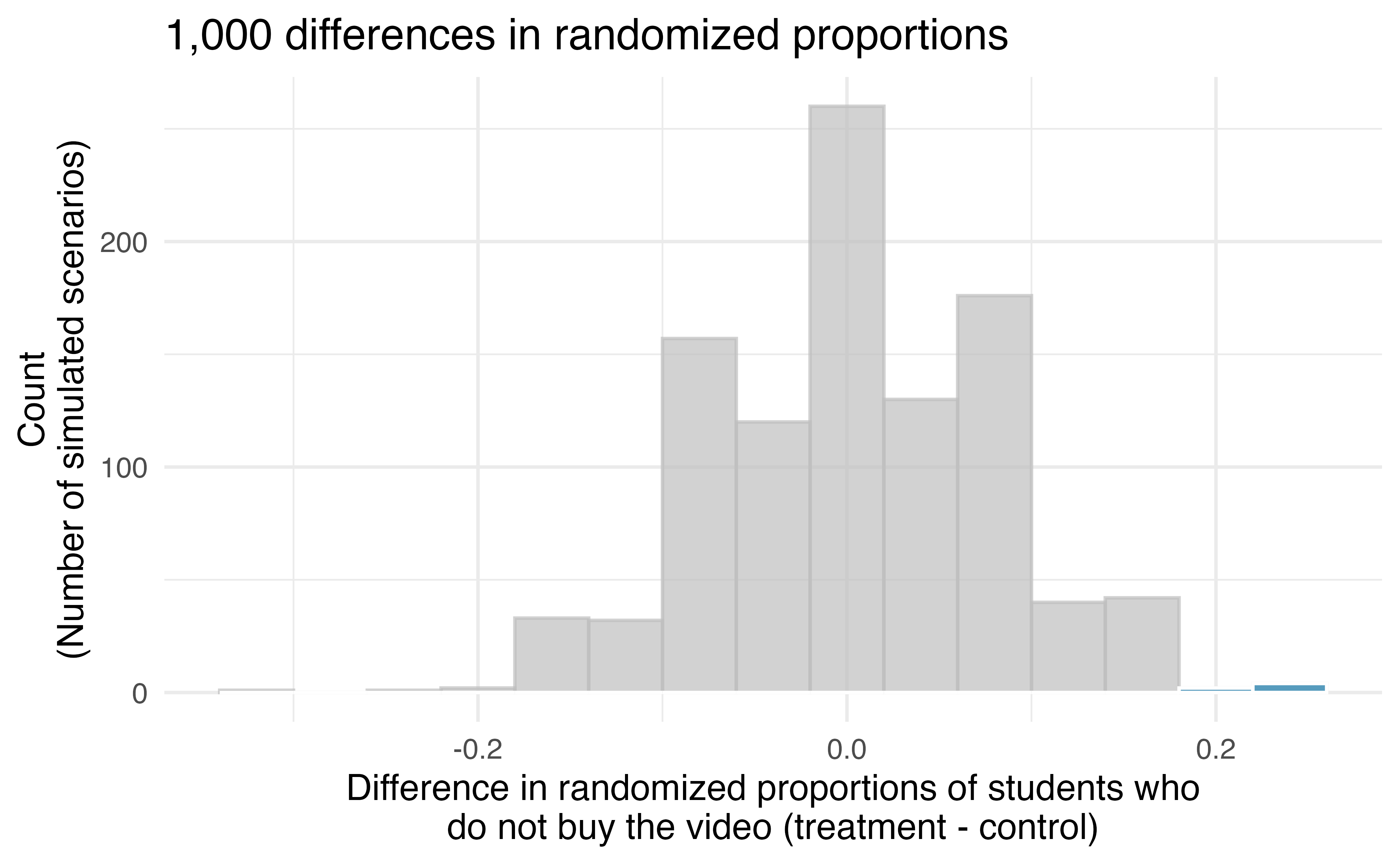
Under the null hypothesis (no treatment effect), we would observe a difference of at least +20% about 0.6% of the time. That is really rare! Instead, we will conclude the data provide strong evidence there is a treatment effect: reminding students before a purchase that they could instead spend the money later on something else lowers the chance that they will continue with the purchase. Notice that we are able to make a causal statement for this study since the study is an experiment, although we do not know why the reminder induces a lower purchase rate.
11.3 Hypothesis testing
In the last two sections, we utilized a hypothesis test, which is a formal technique for evaluating two competing possibilities. In each scenario, we described a null hypothesis, which represented either a skeptical perspective or a perspective of no difference. We also laid out an alternative hypothesis, which represented a new perspective such as the possibility of a relationship between two variables or a treatment effect in an experiment. The alternative hypothesis is usually the reason the scientists set out to do the research in the first place.
Null and alternative hypotheses.
The null hypothesis \((H_0)\) often represents either a skeptical perspective or a claim of “no difference” to be tested.
The alternative hypothesis \((H_A)\) represents an alternative claim under consideration and is often represented by a range of possible values for the value of interest.
If a person makes a somewhat unbelievable claim, we are initially skeptical. However, if there is sufficient evidence that supports the claim, we set aside our skepticism. The hallmarks of hypothesis testing are also found in the US court system.
11.3.1 The US court system
In the US court system, jurors evaluate the evidence to see whether it convincingly shows a defendant is guilty. Defendants are considered to be innocent until proven otherwise.
The US court considers two possible claims about a defendant: they are either innocent or guilty.
If we set these claims up in a hypothesis framework, which would be the null hypothesis and which the alternative?
The jury considers whether the evidence is so convincing (strong) that there is no reasonable doubt regarding the person’s guilt. That is, the skeptical perspective (null hypothesis) is that the person is innocent until evidence is presented that convinces the jury that the person is guilty (alternative hypothesis).
Jurors examine the evidence to see whether it convincingly shows a defendant is guilty. Notice that if a jury finds a defendant not guilty, this does not necessarily mean the jury is confident in the person’s innocence. They are simply not convinced of the alternative, that the person is guilty. This is also the case with hypothesis testing: even if we fail to reject the null hypothesis, we do not accept the null hypothesis as truth.
Failing to find evidence in favor of the alternative hypothesis is not equivalent to finding evidence that the null hypothesis is true. We will see this idea in greater detail in Chapter 14.
11.3.2 p-value and statistical discernibility
In Section 11.1 we encountered a study from the 1970’s that explored whether there was strong evidence that female candidates were less likely to be promoted than male candidates. The research question – are female candidates discriminated against in promotion decisions? – was framed in the context of hypotheses:
\(H_0:\) Sex has no effect on promotion decisions.
\(H_A:\) Female candidates are discriminated against in promotion decisions.
The null hypothesis \((H_0)\) was a perspective of no difference in promotion. The data on sex discrimination provided a point estimate of a 29.2% difference in recommended promotion rates between male and female candidates. We determined that such a difference from chance alone, assuming the null hypothesis was true, would be rare: it would only happen about 2 in 100 times. When results like these are inconsistent with \(H_0,\) we reject \(H_0\) in favor of \(H_A.\) Here, we concluded there was discrimination against female candidates.
The 2-in-100 chance is what we call a p-value, which is a probability quantifying the strength of the evidence against the null hypothesis, given the observed data.
p-value.
The p-value is the probability of observing data at least as favorable to the alternative hypothesis as our current dataset, if the null hypothesis were true. We typically use a summary statistic of the data, such as a difference in proportions, to help compute the p-value and evaluate the hypotheses. This summary value that is used to compute the p-value is often called the test statistic.
In the sex discrimination study, the difference in discrimination rates was our test statistic. What was the test statistic in the opportunity cost study covered in Section 11.2)?
The test statistic in the opportunity cost study was the difference in the proportion of students who decided against the video purchase in the treatment and control groups. In each of these examples, the point estimate of the difference in proportions was used as the test statistic.
When the p-value is small, i.e., less than a previously set threshold, we say the results are statistically discernible. This means the data provide such strong evidence against \(H_0\) that we reject the null hypothesis in favor of the alternative hypothesis.8 The threshold is called the discernibility level and often represented by \(\alpha\) (the Greek letter alpha). 9 The value of \(\alpha\) represents how rare an event needs to be in order for the null hypothesis to be rejected. Historically, many fields have set \(\alpha = 0.05,\) if the null hypothesis is to be rejected. The value of \(\alpha\) can vary depending on the the field or the application.
Note that you may have heard the phrase “statistically significant” as a way to describe “statistically discernible.” Although in everyday language “significant” would indicate that a difference is large or meaningful, that is not necessarily the case here. The term “statistically discernible” indicates that the p-value from a study fell below the chosen discernibility level. For example, in the sex discrimination study, the p-value was found to be approximately 0.02. Using a discernibility level of \(\alpha = 0.05,\) we would say that the data provided statistically discernible evidence against the null hypothesis. However, this conclusion gives us no information regarding the size of the difference in promotion rates!
Statistical discernibility.
We say that the data provide statistically discernible evidence against the null hypothesis if the p-value is less than some predetermined threshold (e.g., 0.01, 0.05, 0.1).
In the opportunity cost study in Section 11.2, we analyzed an experiment where study participants had a 20% drop in likelihood of continuing with a video purchase if they were reminded that the money, if not spent on the video, could be used for other purchases in the future. We determined that such a large difference would only occur 6-in-1,000 times if the reminder actually had no influence on student decision-making. What is the p-value in this study? Would you classify the result as “statistically discernible”?
The p-value was 0.006. Since the p-value is less than 0.05, the data provide statistically discernible evidence that US college students were actually influenced by the reminder.
What’s so special about 0.05?
We often use a threshold of 0.05 to determine whether a result is statistically discernible. But why 0.05? Maybe we should use a bigger number, or maybe a smaller number. If you’re a little puzzled, that probably means you’re reading with a critical eye – good job! We’ve made a video to help clarify why 0.05:
https://www.openintro.org/book/stat/why05/
Sometimes it’s also a good idea to deviate from the standard. We’ll discuss when to choose a threshold different than 0.05 in Chapter 14.
11.4 Chapter review
11.4.1 Summary
Figure 11.8 provides a visual summary of the randomization testing procedure.
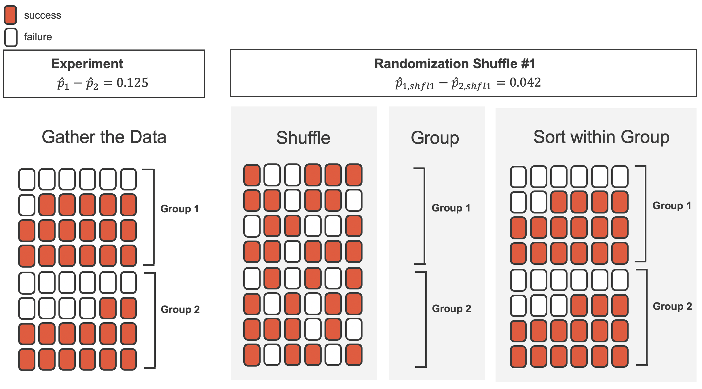
We can summarize the randomization test procedure as follows:
- Frame the research question in terms of hypotheses. Hypothesis tests are appropriate for research questions that can be summarized in two competing hypotheses. The null hypothesis \((H_0)\) usually represents a skeptical perspective or a perspective of no relationship between the variables. The alternative hypothesis \((H_A)\) usually represents a new view or the existence of a relationship between the variables.
- Collect data with an observational study or experiment. If a research question can be formed into two hypotheses, we can collect data to run a hypothesis test. If the research question focuses on associations between variables but does not concern causation, we would use an observational study. If the research question seeks a causal connection between two or more variables, then an experiment should be used.
- Model the randomness that would occur if the null hypothesis was true. In the examples above, the variability has been modeled as if the treatment (e.g., sexual identity, opportunity) allocation was independent of the outcome of the study. The computer generated null distribution is the result of many different randomizations and quantifies the variability that would be expected if the null hypothesis was true.
- Analyze the data. Choose an analysis technique appropriate for the data and identify the p-value. So far, we have only seen one analysis technique: randomization. Throughout the rest of this textbook, we’ll encounter several new methods suitable for many other contexts.
- Form a conclusion. Using the p-value from the analysis, determine whether the data provide evidence against the null hypothesis. Also, be sure to write the conclusion in plain language so casual readers can understand the results.
Table 11.6 is another look at the randomization test summary.
| Question | Answer |
|---|---|
| What does it do? | Shuffles the explanatory variable to mimic the natural variability found in a randomized experiment |
| What is the random process described? | Randomized experiment |
| What other random processes can be approximated? | Can also be used to describe random sampling in an observational model |
| What is it best for? | Hypothesis testing (can also be used for confidence intervals, but not covered in this text) |
| What physical object represents the simulation process? | Shuffling cards |
11.4.2 Terms
The terms introduced in this chapter are presented in Table 11.7. If you’re not sure what some of these terms mean, we recommend you go back in the text and review their definitions. You should be able to easily spot them as bolded text.
| alternative hypothesis | permutation test | statistical inference |
| discernibility level | point estimate | statistically discernible |
| hypothesis test | randomization test | statistically significant |
| independent | significance level | success |
| null hypothesis | simulation | test statistic |
| p-value | statistic |
11.5 Exercises
Answers to odd-numbered exercises can be found in Appendix A.11.
-
Identify the parameter, I. For each of the following situations, state whether the parameter of interest is a mean or a proportion. It may be helpful to examine whether individual responses are numerical or categorical.
In a survey, 100 college students are asked how many hours per week they spend on the Internet.
In a survey, 100 college students are asked: “What percentage of the time you spend on the Internet is part of your course work?”
In a survey, 100 college students are asked whether they cited information from Wikipedia in their papers.
In a survey, 100 college students are asked what percentage of their total weekly spending is on alcoholic beverages.
In a sample of 100 recent college graduates, it is found that 85 percent expect to get a job within one year of their graduation date.
-
Identify the parameter, II. For each of the following situations, state whether the parameter of interest is a mean or a proportion.
A poll shows that 64% of Americans personally worry a great deal about federal spending and the budget deficit.
A survey reports that local TV news has shown a 17% increase in revenue within a two year period while newspaper revenues decreased by 6.4% during this time period.
In a survey, high school and college students are asked whether they use geolocation services on their smart phones.
In a survey, smart phone users are asked whether they use a web-based taxi service.
In a survey, smart phone users are asked how many times they used a web-based taxi service over the last year.
-
Hypotheses. For each of the research statements below, note whether it represents a null hypothesis claim or an alternative hypothesis claim.
The number of hours that grade-school children spend doing homework predicts their future success on standardized tests.
King cheetahs on average run the same speed as standard spotted cheetahs.
For a particular student, the probability of correctly answering a 5-option multiple choice test is larger than 0.2 (i.e., better than guessing).
The mean length of African elephant tusks has changed over the last 100 years.
The risk of facial clefts is equal for babies born to mothers who take folic acid supplements compared with those from mothers who do not.
Caffeine intake during pregnancy affects mean birth weight.
The probability of getting in a car accident is the same if using a cell phone than if not using a cell phone.
-
True null hypothesis. Unbeknownst to you, let’s say that the null hypothesis is actually true in the population. You plan to run a study anyway.
If the level of discernibility you choose (i.e., the cutoff for your p-value) is 0.05, how likely is it that you will mistakenly reject the null hypothesis?
If the level of discernibility you choose (i.e., the cutoff for your p-value) is 0.01, how likely is it that you will mistakenly reject the null hypothesis?
If the level of discernibility you choose (i.e., the cutoff for your p-value) is 0.10, how likely is it that you will mistakenly reject the null hypothesis?
-
Identify hypotheses, I. Write the null and alternative hypotheses in words and then symbols for each of the following situations.
New York is known as “the city that never sleeps”. A random sample of 25 New Yorkers were asked how much sleep they get per night. Do these data provide convincing evidence that New Yorkers on average sleep less than 8 hours a night?
Employers at a firm are worried about the effect of March Madness, a basketball championship held each spring in the US, on employee productivity. They estimate that on a regular business day employees spend on average 15 minutes of company time checking personal email, making personal phone calls, etc. They also collect data on how much company time employees spend on such non- business activities during March Madness. They want to determine if these data provide convincing evidence that employee productivity decreases during March Madness.
-
Identify hypotheses, II. Write the null and alternative hypotheses in words and using symbols for each of the following situations.
Since 2008, chain restaurants in California have been required to display calorie counts of each menu item. Prior to menus displaying calorie counts, the average calorie intake of diners at a restaurant was 1100 calories. After calorie counts started to be displayed on menus, a nutritionist collected data on the number of calories consumed at this restaurant from a random sample of diners. Do these data provide convincing evidence of a difference in the average calorie intake of a diners at this restaurant?
Based on the performance of those who took the GRE exam between July 1, 2004 and June 30, 2007, the average Verbal Reasoning score was calculated to be 462. In 2021 the average verbal score was slightly higher. Do these data provide convincing evidence that the average GRE Verbal Reasoning score has changed since 2021?
-
Side effects of Avandia. Rosiglitazone is the active ingredient in the controversial type 2 diabetes medicine Avandia and has been linked to an increased risk of serious cardiovascular problems such as stroke, heart failure, and death. A common alternative treatment is Pioglitazone, the active ingredient in a diabetes medicine called Actos. In a nationwide retrospective observational study of 227,571 Medicare beneficiaries aged 65 years or older, it was found that 2,593 of the 67,593 patients using Rosiglitazone and 5,386 of the 159,978 using Pioglitazone had serious cardiovascular problems. These data are summarized in the contingency table below.10 (Graham et al. 2010)
Treatment No Yes Total Pioglitazone 154,592 5,386 159,978 Rosiglitazone 65,000 2,593 67,593 Total 219,592 7,979 227,571 -
Determine if each of the following statements is true or false. If false, explain why. Be careful: The reasoning may be wrong even if the statement’s conclusion is correct. In such cases, the statement should be considered false.
Since more patients on Pioglitazone had cardiovascular problems (5,386 vs. 2,593), we can conclude that the rate of cardiovascular problems for those on a Pioglitazone treatment is higher.
The data suggest that diabetic patients who are taking Rosiglitazone are more likely to have cardiovascular problems since the rate of incidence was (2,593 / 67,593 = 0.038) 3.8% for patients on this treatment, while it was only (5,386 / 159,978 = 0.034) 3.4% for patients on Pioglitazone.
The fact that the rate of incidence is higher for the Rosiglitazone group proves that Rosiglitazone causes serious cardiovascular problems.
Based on the information provided so far, we cannot tell if the difference between the rates of incidences is due to a relationship between the two variables or due to chance.
What proportion of all patients had cardiovascular problems?
If the type of treatment and having cardiovascular problems were independent, how many patients in the Rosiglitazone group would we expect to have had cardiovascular problems?
-
We can investigate the relationship between outcome and treatment in this study using a randomization technique. While in reality we would carry out the simulations required for randomization using statistical software, suppose we actually simulate using index cards. In order to simulate from the independence model, which states that the outcomes were independent of the treatment, we write whether each patient had a cardiovascular problem on cards, shuffled all the cards together, then deal them into two groups of size 67,593 and 159,978. We repeat this simulation 100 times and each time record the difference between the proportions of cards that say “Yes” in the Rosiglitazone and Pioglitazone groups. Use the histogram of these differences in proportions to answer the following questions.
What are the claims being tested?
Compared to the number calculated in part (b), which would provide more support for the alternative hypothesis, higher or lower proportion of patients with cardiovascular problems in the Rosiglitazone group?
What do the simulation results suggest about the relationship between taking Rosiglitazone and having cardiovascular problems in diabetic patients?
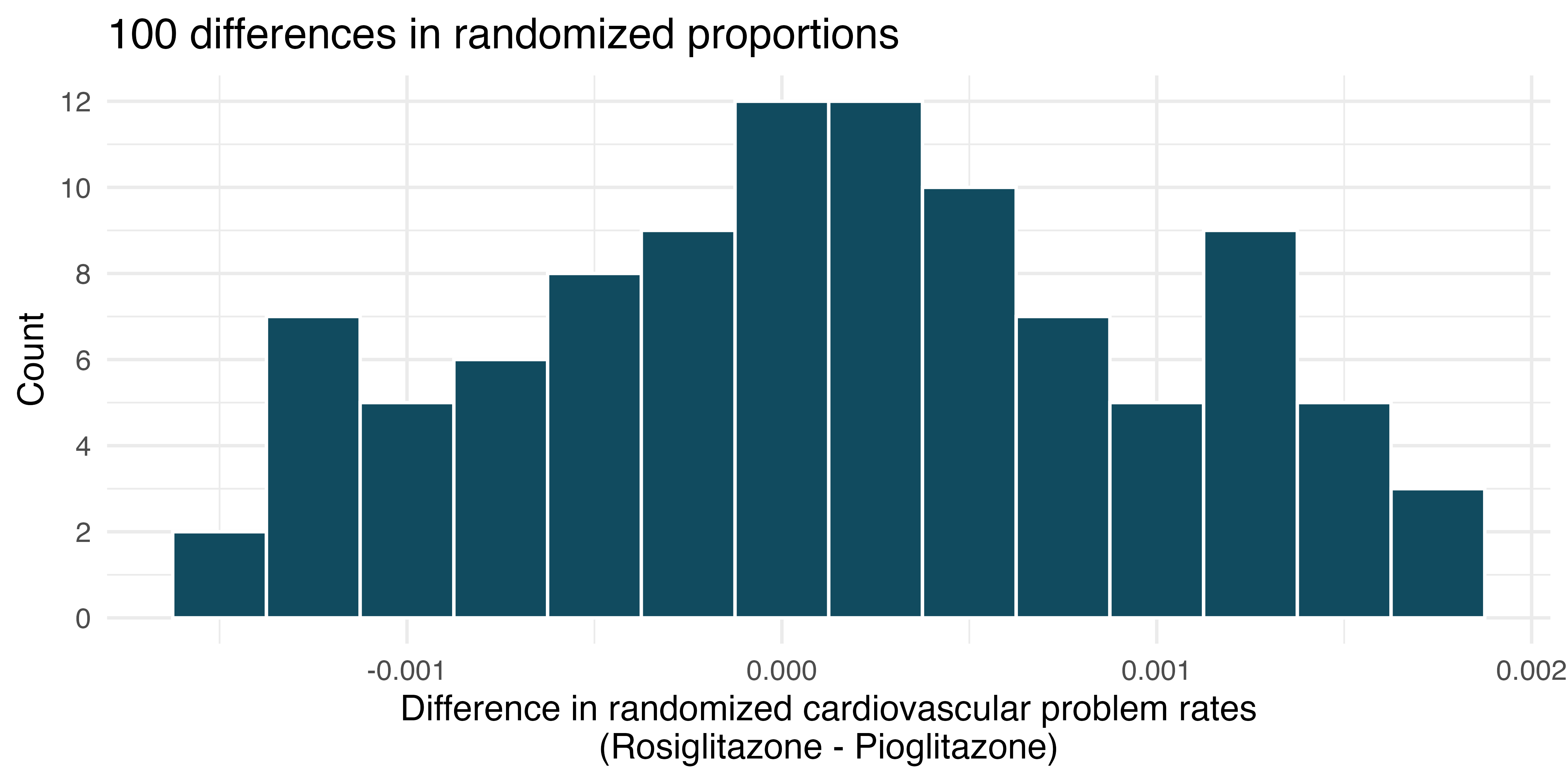
-
-
Heart transplants. The Stanford University Heart Transplant Study was conducted to determine whether an experimental heart transplant program increased lifespan. Each patient entering the program was designated an official heart transplant candidate, meaning that they were gravely ill and would most likely benefit from a new heart. Some patients got a transplant and some did not. The variable
transplantindicates which group the patients were in; patients in the treatment group got a transplant and those in the control group did not. Of the 34 patients in the control group, 30 died. Of the 69 people in the treatment group, 45 died. Another variable calledsurvivedwas used to indicate whether the patient was alive at the end of the study.11 (Turnbull et al. 1974)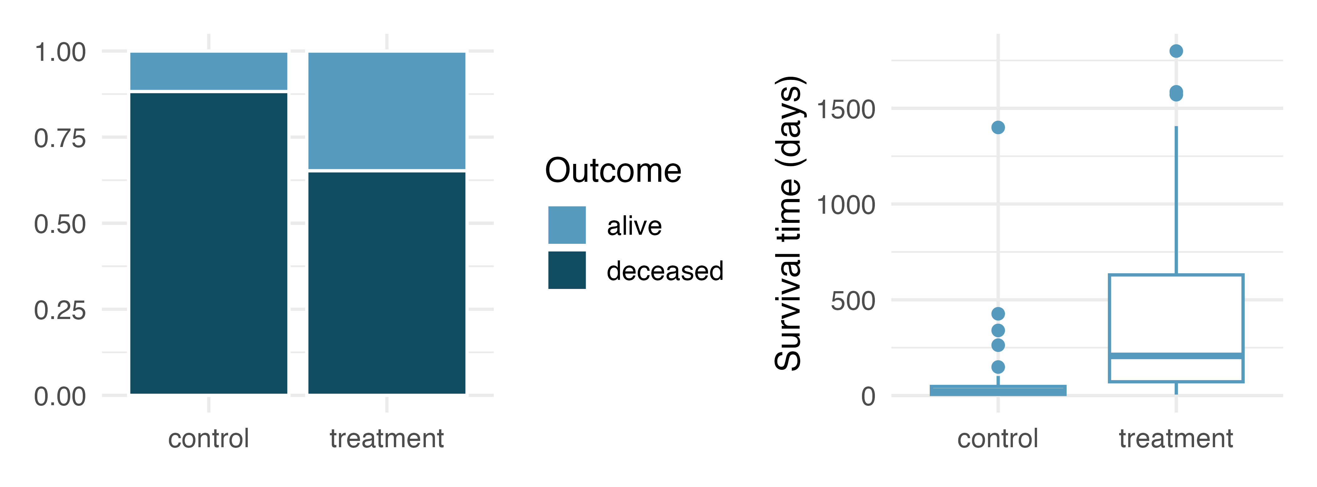
Does the stacked bar plot indicate that survival is independent of whether the patient got a transplant? Explain your reasoning.
What do the box plots suggest about the efficacy of heart transplants.
What proportions of patients in the treatment and control groups died?
-
One approach for investigating whether the treatment is discernably effective is randomization testing.
What are the claims being tested?
The paragraph below describes the set up for a randomization test, if we were to do it without using statistical software. Fill in the blanks with a number or phrase.
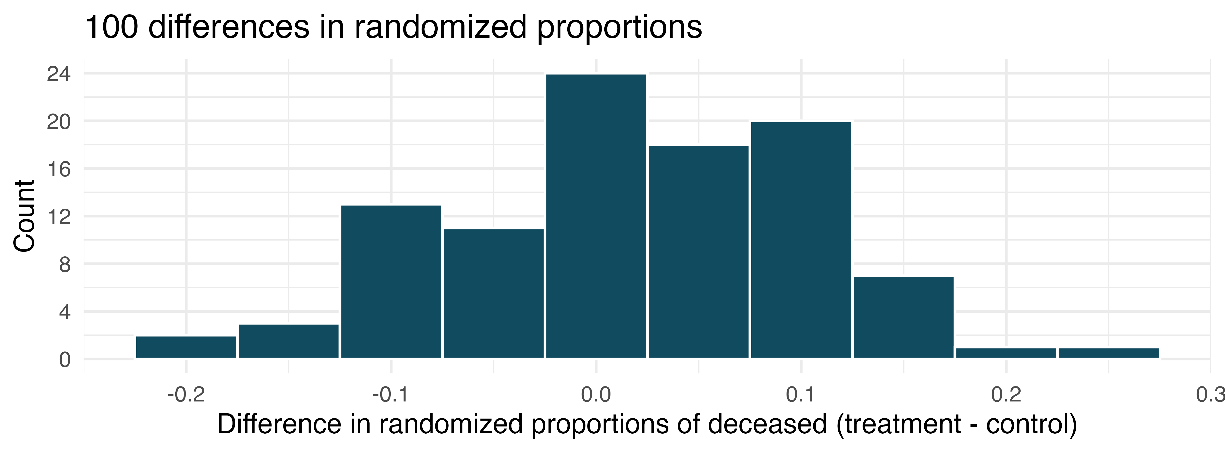
We write alive on \(\rule{1.25cm}{0.5pt}\) cards representing patients who were alive at the end of the study, and deceased on \(\rule{1.25cm}{0.5pt}\) cards representing patients who were not. Then, we shuffle these cards and split them into two groups: one group of size \(\rule{1.25cm}{0.5pt}\) representing treatment, and another group of size \(\rule{1.25cm}{0.5pt}\) representing control. We calculate the difference between the proportion of cards in the treatment and control groups (treatment - control) and record this value. We repeat this 100 times to build a distribution centered at \(\rule{1.25cm}{0.5pt}\). Lastly, we calculate the proportion of simulations where the simulated differences in proportions are \(\rule{1.25cm}{0.5pt}\). If this proportion is low, we conclude that it is unlikely to have observed such an outcome by chance and that the null hypothesis should be rejected in favor of the alternative.
- What do the simulation results shown below suggest about the effectiveness of heart transplants?
We would be assuming that these two variables are independent.↩︎
The study is an experiment, as subjects were randomly assigned a “male” file or a “female” file (remember, all the files were actually identical in content). Since this is an experiment, the results can be used to evaluate a causal relationship between the sex of a candidate and the promotion decision.↩︎
The test procedure we employ in this section is sometimes referred to as a randomization test. If the explanatory variable had not been randomly assigned, as in an observational study, the procedure would be referred to as a permutation test. Permutation tests are used for observational studies, where the explanatory variable was not randomly assigned.↩︎
\(18/24 - 17/24=0.042\) or about 4.2% in favor of the male personnel. This difference due to chance is much smaller than the difference observed in the actual groups.↩︎
This reasoning does not generally extend to anecdotal observations. Each of us observes incredibly rare events every day, events we could not possibly hope to predict. However, in the non-rigorous setting of anecdotal evidence, almost anything may appear to be a rare event, so the idea of looking for rare events in day-to-day activities is treacherous. For example, we might look at the lottery: there was only a 1 in 176 million chance that the Mega Millions numbers for the largest jackpot in history (October 23, 2018) would be (5, 28, 62, 65, 70) with a Mega ball of (5), but nonetheless those numbers came up! However, no matter what numbers had turned up, they would have had the same incredibly rare odds. That is, any set of numbers we could have observed would ultimately be incredibly rare. This type of situation is typical of our daily lives: each possible event in itself seems incredibly rare, but if we consider every alternative, those outcomes are also incredibly rare. We should be cautious not to misinterpret such anecdotal evidence.↩︎
This context might feel strange if physical video stores predate you. If you’re curious about what those were like, look up “Blockbuster”.↩︎
Success is often defined in a study as the outcome of interest, and a “success” may or may not actually be a positive outcome. For example, researchers working on a study on COVID prevalence might define a “success” in the statistical sense as a patient who has COVID-19. A more complete discussion of the term success will be given in Chapter 16.↩︎
Many texts use the phrase “statistically significant” instead of “statistically discernible”. We have chosen to use “discernible” to indicate that a precise statistical event has happened, as opposed to a notable effect which may or may not fit the statistical definition of discernible or significant.↩︎
Here, too, we have chosen “discernibility level” instead of “significance level” which you will see in some texts.↩︎
The
avandiadata used in this exercise can be found in the openintro R package.↩︎The
heart_transplantdata used in this exercise can be found in the openintro R package.↩︎