5 Exploring numerical data
This chapter focuses on exploring numerical data using summary statistics and visualizations. The summaries and graphs presented in this chapter are created using statistical software; however, since this might be your first exposure to the concepts, we take our time in this chapter to detail how to create them. Mastery of the content presented in this chapter will be crucial for understanding the methods and techniques introduced in the rest of the book.
Consider the loan_amount variable from the loan50 dataset, which represents the loan size for each of 50 loans in the dataset.
This variable is numerical since we can sensibly discuss the numerical difference of the size of two loans. On the other hand, area codes and zip codes are not numerical, but rather they are categorical variables.
Throughout this chapter, we will apply numerical methods using the loan50 and county datasets, which were introduced in Section 1.2. If you’d like to review the variables from either dataset, see Tables Table 1.4 and Table 1.6.
The county data can be found in the usdata R package and the loan50 data can be found in the openintro R package.
5.1 Scatterplots for paired data
A scatterplot provides a case-by-case view of data for two numerical variables. In Figure 1.2, a scatterplot was used to examine the homeownership rate against the percentage of housing units that are in multi-unit structures (e.g., apartments) in the county dataset. Another scatterplot is shown in Figure 5.1, comparing the total income of a borrower total_income and the amount they borrowed loan_amount for the loan50 dataset. In any scatterplot, each point represents a single case. Since there are 50 cases in loan50, there are 50 points in Figure 5.1.
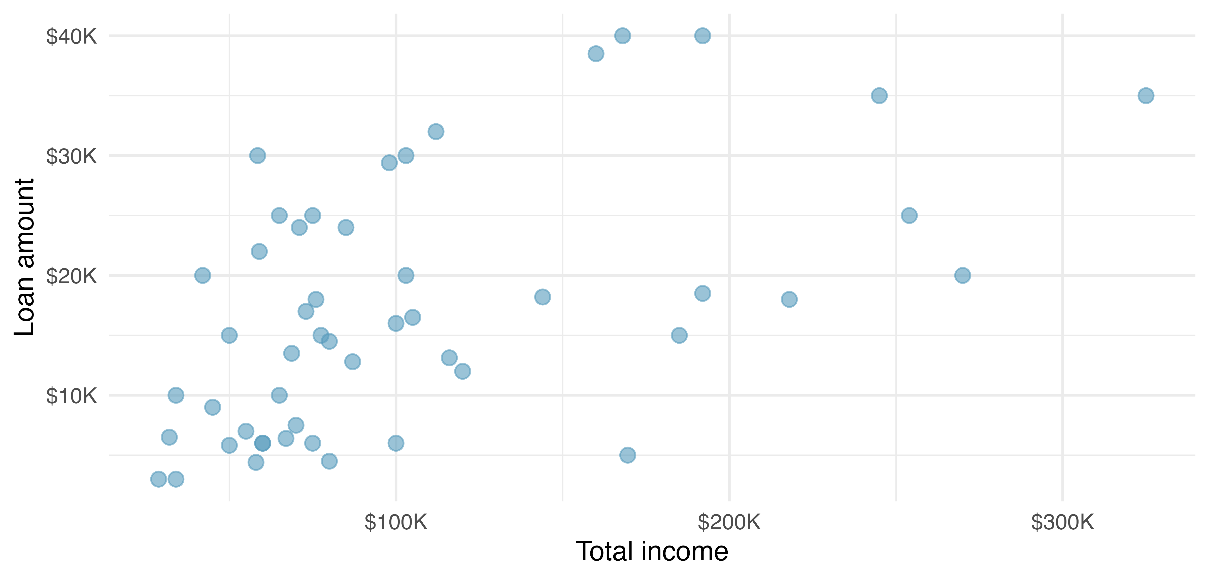
loan50 dataset.
Looking at Figure 5.1, we see that there are many borrowers with income below $100,000 on the left side of the graph, while there are a handful of borrowers with income above $250,000.
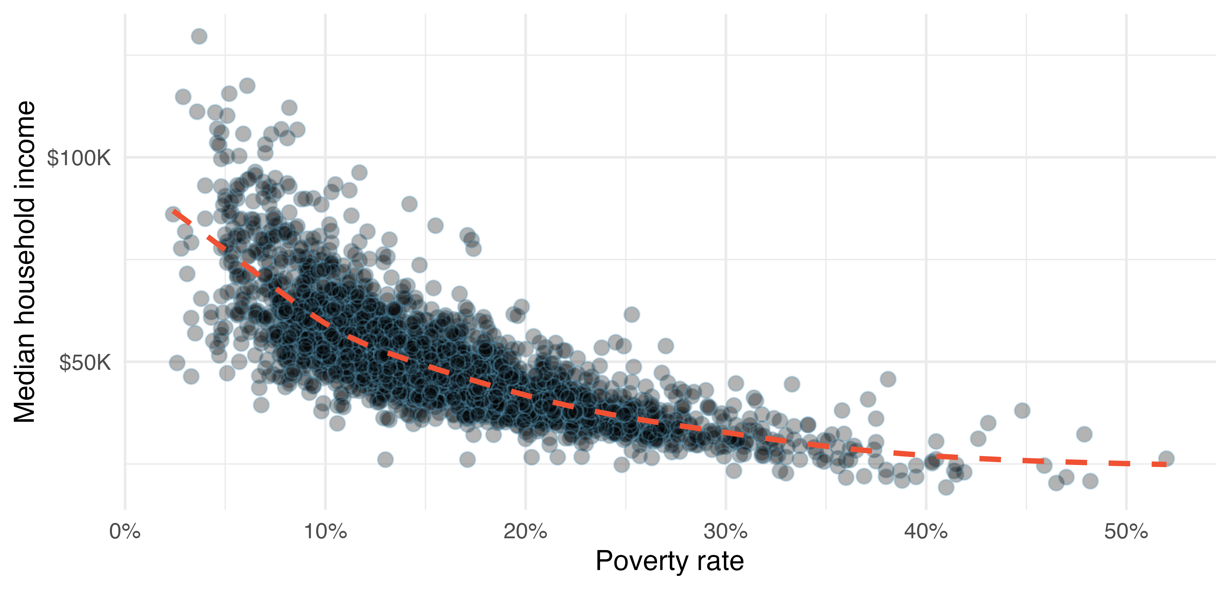
county dataset. Data are from 2017. A statistical model has also been fit to the data and is shown as a dashed line.
Figure 5.2 shows a plot of median household income against the poverty rate for 3142 counties in the US. What can be said about the relationship between these variables?
The relationship is evidently nonlinear, as highlighted by the dashed line. This is different from previous scatterplots we have seen, which indicate very little, if any, curvature in the trend.
What do scatterplots reveal about the data, and how are they useful?1
Describe two variables that would have a horseshoe-shaped association in a scatterplot \((\cap\) or \(\frown).\)2
5.2 Dot plots and the mean
Sometimes we are interested in the distribution of a single variable. In these cases, a dot plot provides the most basic of displays. A dot plot is a one-variable scatterplot; an example using the interest rate of 50 loans is shown in Figure 5.3.
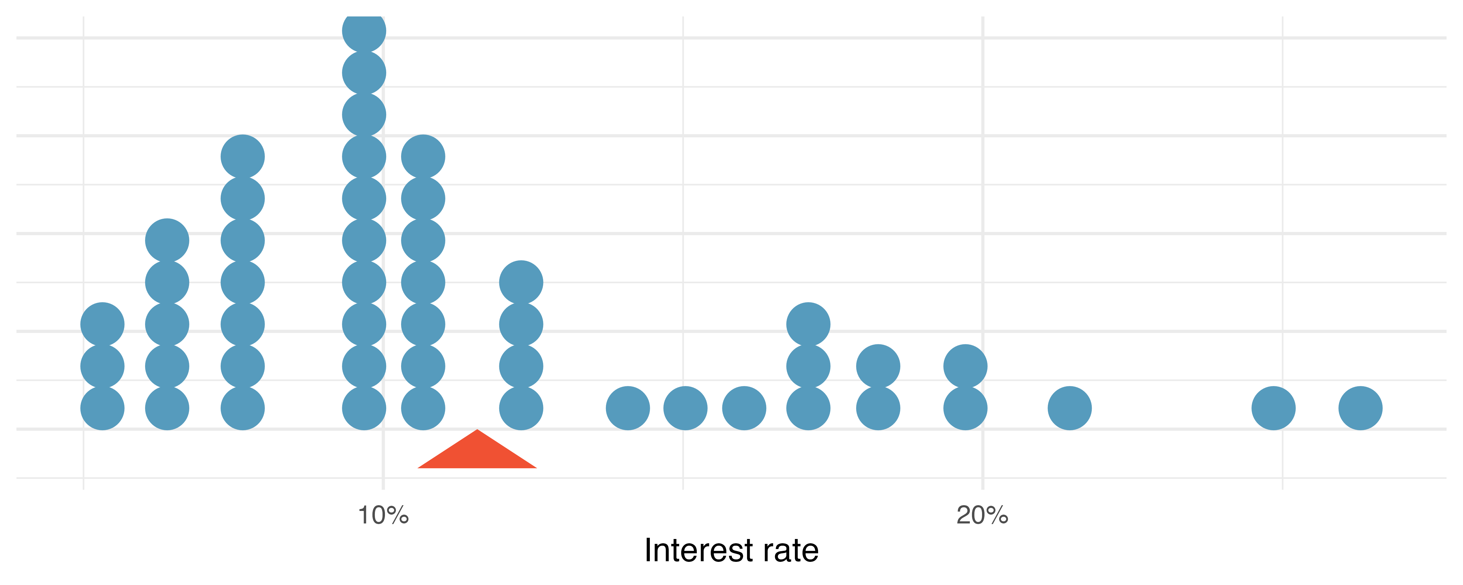
loan50 dataset. The rates have been rounded to the nearest percent in this plot, and the distribution’s mean is shown as a red triangle.
The mean, often called the average is a common way to measure the center of a distribution of data. To compute the mean interest rate, we add up all the interest rates and divide by the number of observations.
The sample mean is often labeled \(\bar{x}.\) The letter \(x\) is being used as a generic placeholder for the variable of interest and the bar over the \(x\) communicates we are looking at the average interest rate, which for these 50 loans is 11.57%. It’s useful to think of the mean as the balancing point of the distribution, and it’s shown as a triangle in Figure 5.3.
Mean.
The sample mean can be calculated as the sum of the observed values divided by the number of observations:
\[ \bar{x} = \frac{x_1 + x_2 + \cdots + x_n}{n} \]
Examine the equation for the mean. What does \(x_1\) correspond to? And \(x_2\)? Can you infer a general meaning to what \(x_i\) might represent?3
What was \(n\) in this sample of loans?4
The loan50 dataset represents a sample from a larger population of loans made through Lending Club. We could compute a mean for the entire population in the same way as the sample mean. However, the population mean has a special label: \(\mu.\) The symbol \(\mu\) is the Greek letter mu and represents the average of all observations in the population. Sometimes a subscript, such as \(_x,\) is used to represent which variable the population mean refers to, e.g., \(\mu_x.\) Oftentimes it is too expensive to measure the population mean precisely, so we often estimate \(\mu\) using the sample mean, \(\bar{x}.\)
The Greek letter \(\mu\) is pronounced mu, listen to the pronunciation here.
Although we do not have an ability to calculate the average interest rate across all loans in the populations, we can estimate the population value using the sample data. Based on the sample of 50 loans, what would be a reasonable estimate of \(\mu_x,\) the mean interest rate for all loans in the full dataset?
The sample mean, 11.57, provides a rough estimate of \(\mu_x.\) While it is not perfect, this is our single best guess point estimate of the average interest rate of all the loans in the population under study. In Chapter 11 and beyond, we will develop tools to characterize the accuracy of point estimates, like the sample mean. As you might have guessed, point estimates based on larger samples tend to be more accurate than those based on smaller samples.
The mean is useful because it allows us to rescale or standardize a metric into something more easily interpretable and comparable. Suppose we would like to understand if a new drug is more effective at treating asthma attacks than the standard drug. A trial of 1,500 adults is set up, where 500 receive the new drug, and 1000 receive a standard drug in the control group. Results of this trial are summarized in Table 5.1.
| New drug | Standard drug | |
|---|---|---|
| Number of patients | 500 | 1000 |
| Total asthma attacks | 200 | 300 |
Comparing the raw counts of 200 to 300 asthma attacks would make it appear that the new drug is better, but this is an artifact of the imbalanced group sizes.
Instead, we should look at the average number of asthma attacks per patient in each group:
- New drug: \(200 / 500 = 0.4\) asthma attacks per patient
- Standard drug: \(300 / 1000 = 0.3\) asthma attacks per patient
The standard drug has a lower average number of asthma attacks per patient than the average in the treatment group.
Come up with another example where the mean is useful for making comparisons.
Emilio opened a food truck last year where he sells burritos, and his business has stabilized over the last 3 months. Over that 3-month period, he has made $11,000 while working 625 hours. Emilio’s average hourly earnings provides a useful statistic for evaluating whether his venture is, at least from a financial perspective, worth it:
\[ \frac{\$11000}{625\text{ hours}} = \$17.60\text{ per hour} \]
By knowing his average hourly wage, Emilio now has put his earnings into a standard unit that is easier to compare with many other jobs that he might consider.
Suppose we want to compute the average income per person in the US. To do so, we might first think to take the mean of the per capita incomes across the 3,142 counties in the county dataset. What would be a better approach?
The county dataset is special in that each county actually represents many individual people. If we were to simply average across the income variable, we would be treating counties with 5,000 and 5,000,000 residents equally in the calculations. Instead, we should compute the total income for each county, add up all the counties’ totals, and then divide by the number of people in all the counties. If we completed these steps with the county data, we would find that the per capita income for the US is $30,861. Had we computed the simple mean of per capita income across counties, the result would have been just $26,093!
This example used what is called a weighted mean. For more information on this topic, check out the following online supplement regarding weighted means.
5.3 Histograms and shape
Dot plots show the exact value for each observation. They are useful for small datasets but can become hard to read with larger samples. Rather than showing the value of each observation, we prefer to think of the value as belonging to a bin. For example, in the loan50 dataset, we created a table of counts for the number of loans with interest rates between 5.0% and 7.5%, then the number of loans with rates between 7.5% and 10.0%, and so on. Observations that fall on the boundary of a bin (e.g., 10.00%) are allocated to the lower bin. The tabulation is shown in Table 5.2, and the binned counts are plotted as bars in Figure 5.4 into what is called a histogram. Note that the histogram resembles a more heavily binned version of the stacked dot plot shown in Figure 5.3.
| Interest rate | Count |
|---|---|
| (5% - 7.5%] | 11 |
| (7.5% - 10%] | 15 |
| (10% - 12.5%] | 8 |
| (12.5% - 15%] | 4 |
| (15% - 17.5%] | 5 |
| (17.5% - 20%] | 4 |
| (20% - 22.5%] | 1 |
| (22.5% - 25%] | 1 |
| (25% - 27.5%] | 1 |
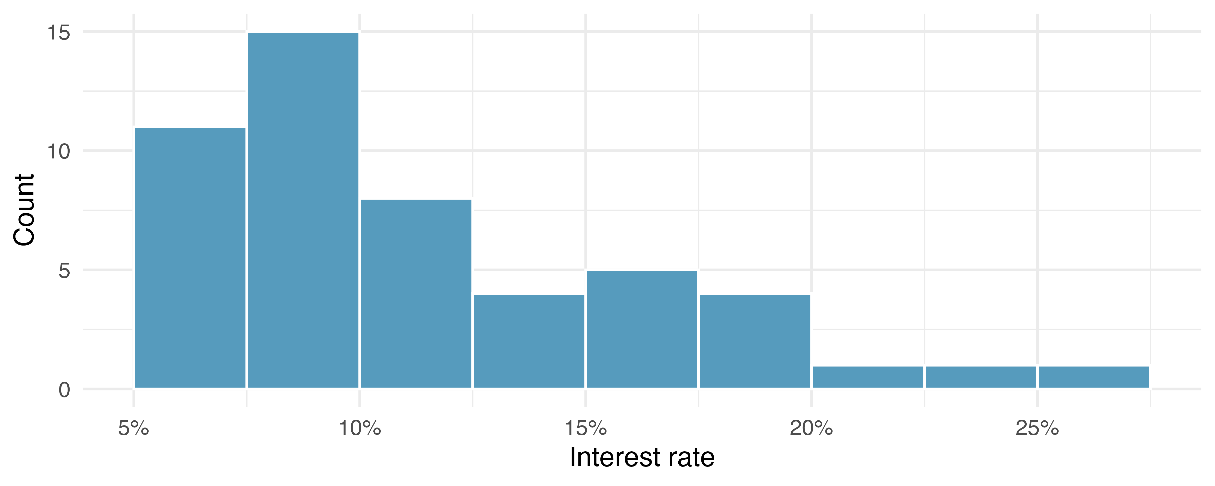
Histograms provide a view of the data density. Higher bars represent where the data are relatively more common. For instance, there are many more loans with rates between 5% and 10% than loans with rates between 20% and 25% in the dataset. The bars make it easy to see how the density of the data changes relative to the interest rate.
Histograms are especially convenient for understanding the shape of the data distribution. Figure 5.4 suggests that most loans have rates under 15%, while only a handful of loans have rates above 20%. When the distribution of a variable trails off to the right in this way and has a longer right tail, the shape is said to be right skewed.5
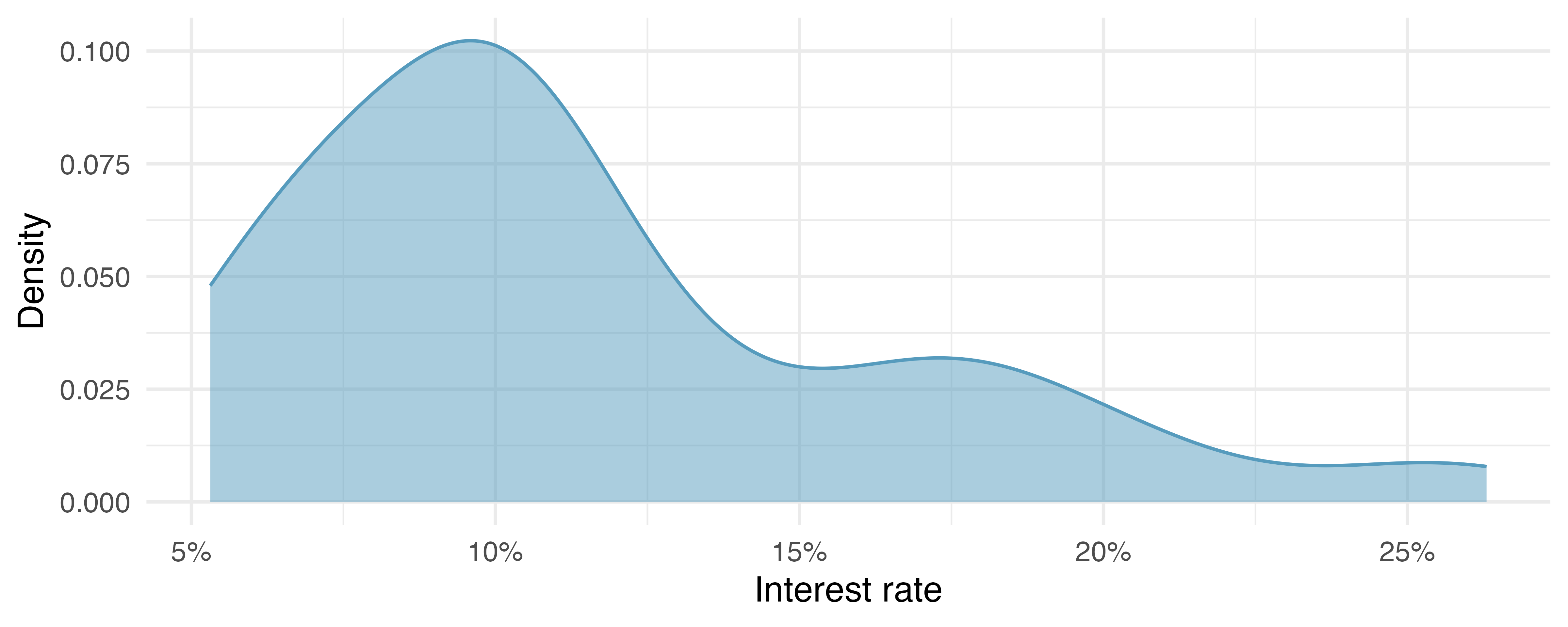
Figure 5.5 shows a density plot which is a smoothed out histogram. The technical details for how to draw density plots (precisely how to smooth out the histogram) are beyond the scope of this text, but you will note that the shape, scale, and spread of the observations are displayed similarly in a histogram as in a density plot.
Variables with the reverse characteristic – a long, thinner tail to the left – are said to be left skewed. We also say that such a distribution has a long left tail. Variables that show roughly equal trailing off in both directions are called symmetric.
When data trail off in one direction, the distribution has a long tail. If a distribution has a long left tail, it is left skewed. If a distribution has a long right tail, it is right skewed.
Besides the mean (since it was labeled), what can you see in the dot plot in Figure 5.3 that you cannot see in the histogram in Figure 5.4?6
In addition to looking at whether a distribution is skewed or symmetric, histograms can be used to identify modes. A mode is represented by a prominent peak in the distribution. There is only one prominent peak in the histogram of interest_rate.
A definition of mode sometimes taught in math classes is the value with the most occurrences in the dataset. However, for many real-world datasets, it is common to have no observations with the same value in a dataset, making this definition impractical in data analysis.
Figure 5.6 shows histograms that have one, two, or three prominent peaks. Such distributions are called unimodal, bimodal, and multimodal, respectively. Any distribution with more than two prominent peaks is called multimodal. Notice that there was one prominent peak in the unimodal distribution with a second less prominent peak that was not counted since it only differs from its neighboring bins by a few observations.
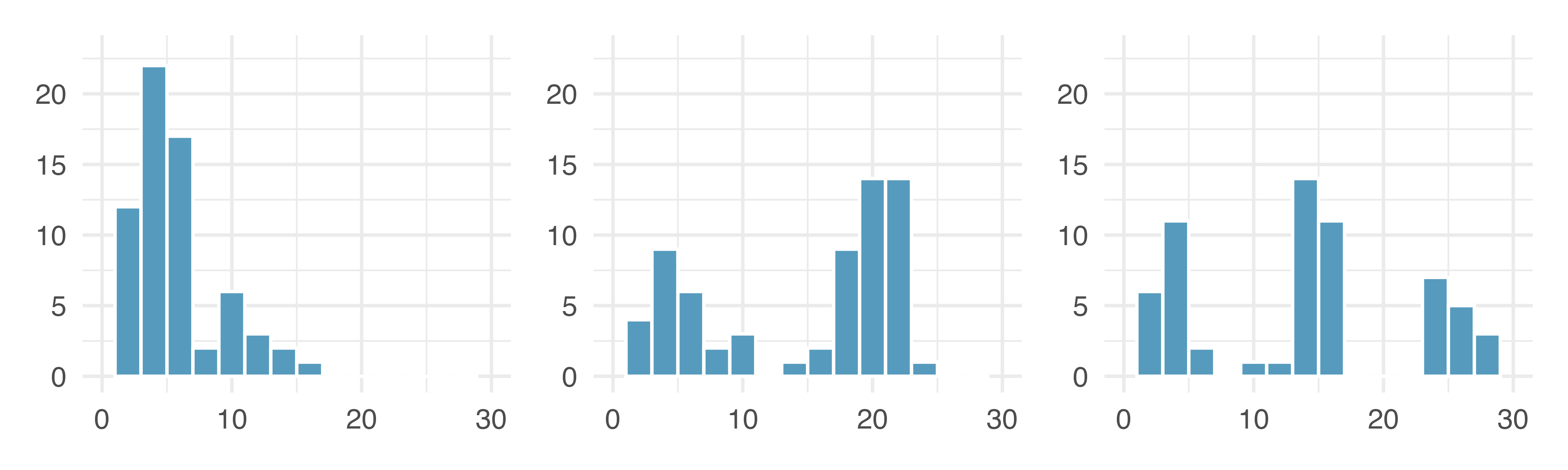
Figure 5.4 reveals only one prominent mode in the interest rate. Is the distribution unimodal, bimodal, or multimodal?
Remember that uni stands for 1 (think unicycles), and bi stands for 2 (think bicycles).
Height measurements of young students and adult teachers at an elementary school were taken. How many modes would you expect in this height dataset?7
Looking for modes isn’t about finding a clear and correct answer about the number of modes in a distribution, which is why prominent is not rigorously defined in this book. The most important part of this examination is to better understand your data.
5.4 Variance and standard deviation
The mean was introduced as a method to describe the center of a variable, and variability in the data is also important. Here, we introduce two measures of variability: the variance and the standard deviation. Both of these are very useful in data analysis, even though their formulas are a bit tedious to calculate by hand. The standard deviation is the easier of the two to comprehend, as it roughly describes how far away the typical observation is from the mean.
We call the distance of an observation from its mean its deviation. Below are the deviations for the \(1^{st},\) \(2^{nd},\) \(3^{rd},\) and \(50^{th}\) observations in the interest_rate variable:
\[ \begin{aligned} x_1 - \bar{x} &= 10.9 - 11.57 = -0.67 \\ x_2 - \bar{x} &= 9.92 - 11.57 = -1.65 \\ x_3 - \bar{x} &= 26.3 - 11.57 = 14.73 \\ &\vdots \\ x_{50} - \bar{x} &= 6.08 - 11.57 = -5.49 \\ \end{aligned} \]
If we square these deviations and then take an average, the result is equal to the sample variance, denoted by \(s^2\):
\[ s^2 = \frac{(-0.67)^2 + (-1.65)^2 + (14.73)^2 + \cdots + (-5.49)^2}{50 - 1} = \frac{0.45 + 2.72 + \cdots + 30.14}{49} = 25.52 \]
We divide by \(n - 1,\) rather than dividing by \(n,\) when computing a sample’s variance. There’s some mathematical nuance here, but the end result is that doing this makes this statistic slightly more reliable and useful.
Notice that squaring the deviations does two things. First, it makes large values relatively much larger. Second, it gets rid of any negative signs.
Standard deviation.
The sample standard deviation can be calculated as the square root of the sum of the squared distance of each value from the mean divided by the number of observations minus one:
\[s = \sqrt{\frac{\sum_{i=1}^n (x_i - \bar{x})^2}{n-1}}\]
The standard deviation is defined as the square root of the variance:
\[s = \sqrt{25.52} = 5.05\]
While often omitted, a subscript of \(_x\) may be added to the variance and standard deviation, i.e., \(s_x^2\) and \(s_x^{},\) if it is useful as a reminder that these are the variance and standard deviation of the observations represented by \(x_1,\) \(x_2,\) …, \(x_n.\)
Variance and standard deviation.
The variance is the average squared distance from the mean. The standard deviation is the square root of the variance. The standard deviation is useful when considering how far the data are distributed from the mean.
The standard deviation represents the typical deviation of observations from the mean. Often about 68% of the data will be within one standard deviation of the mean and about 95% will be within two standard deviations. However, these percentages are not strict rules.
Like the mean, the population values for variance and standard deviation have special symbols: \(\sigma^2\) for the variance and \(\sigma\) for the standard deviation.
The Greek letter \(\sigma\) is pronounced sigma, listen to the pronunciation here.
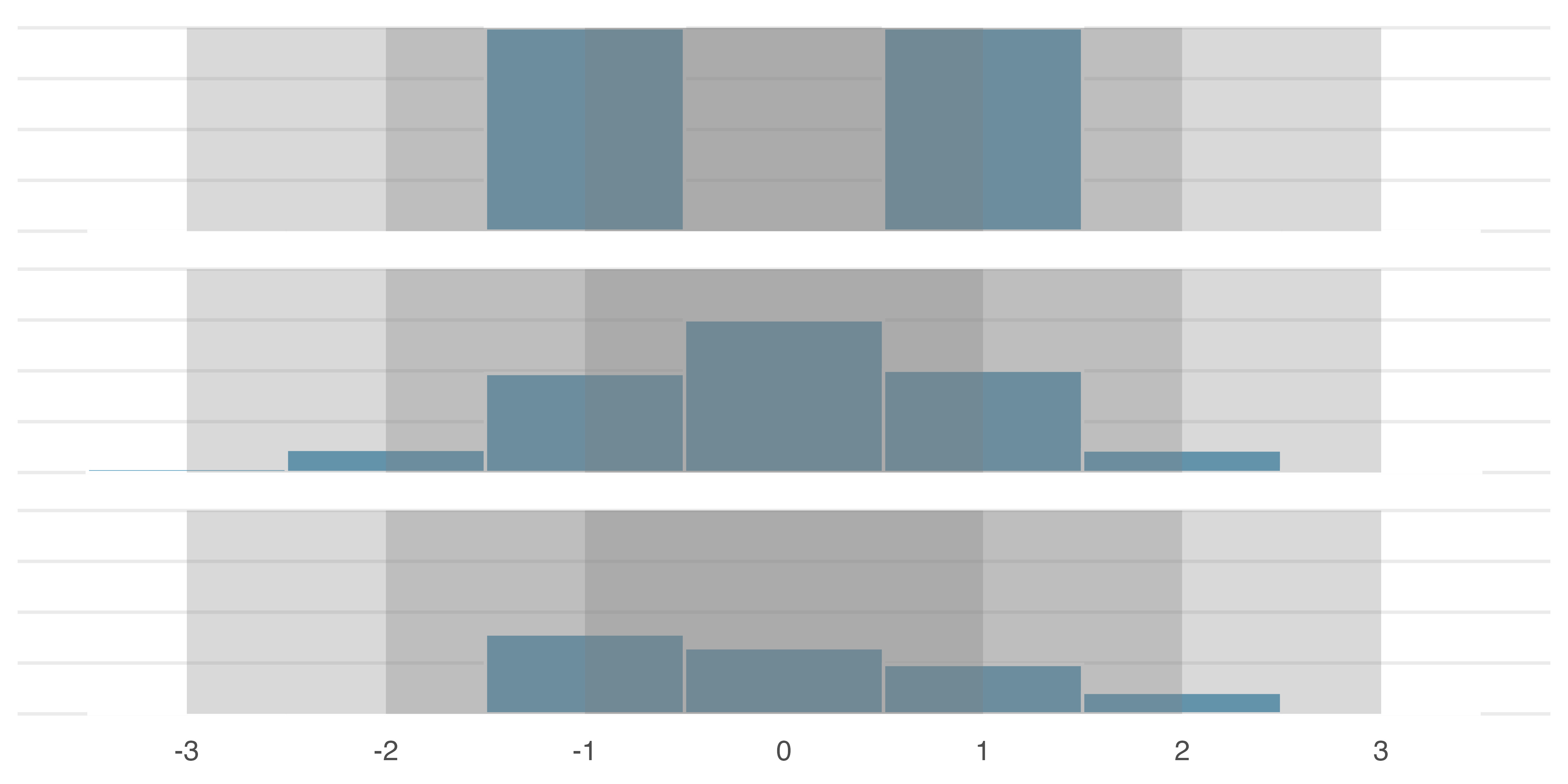
A good description of the shape of a distribution should include modality and whether the distribution is symmetric or skewed to one side. Using Figure 5.7 as an example, explain why such a description is important.8
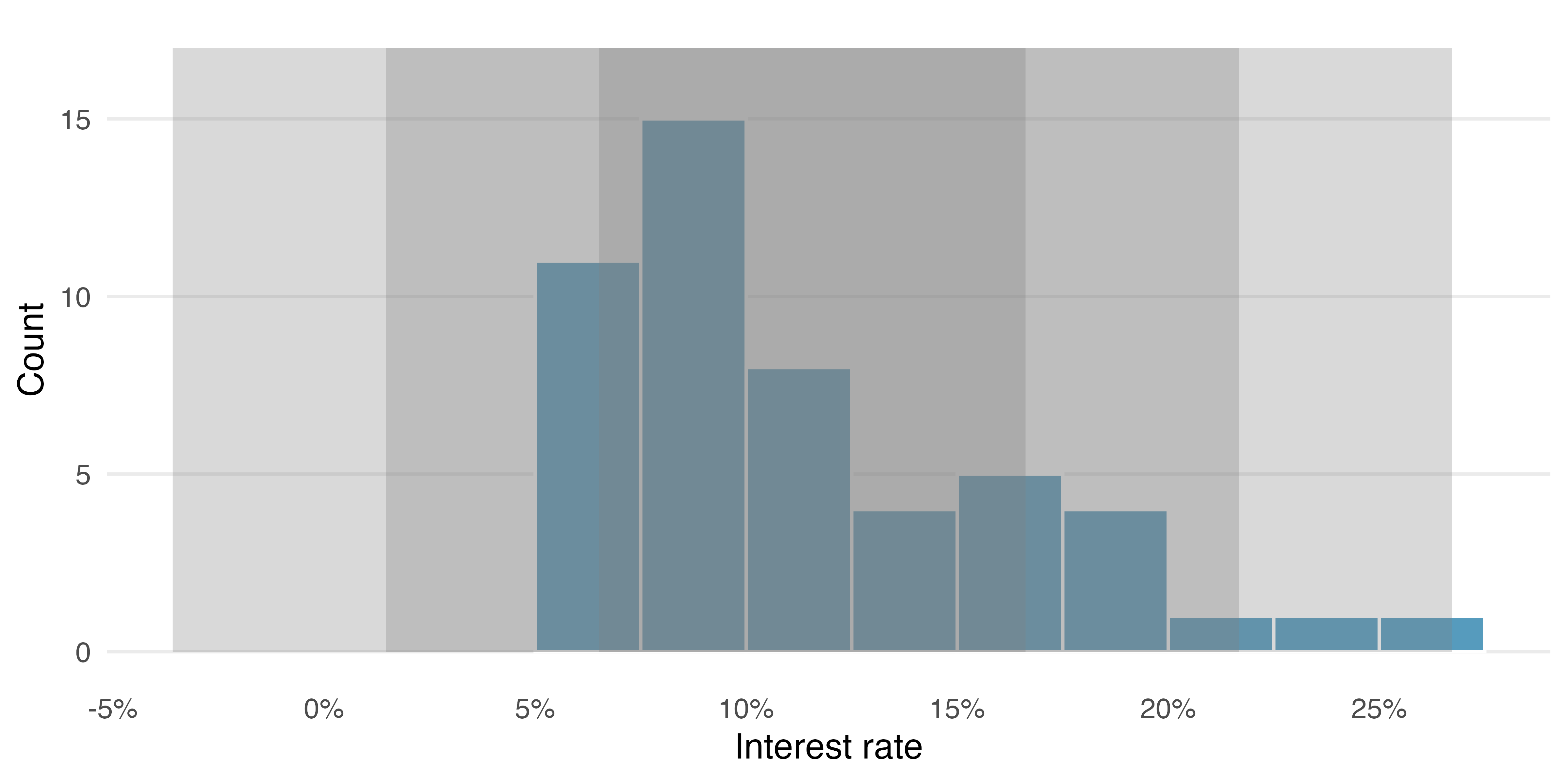
Describe the distribution of the interest_rate variable using the histogram in Figure 5.4. The description should incorporate the center, variability, and shape of the distribution, and it should also be placed in context. Also note any especially unusual cases.
The distribution of interest rates is unimodal and skewed to the high end. Many of the rates fall near the mean at 11.57%, and most fall within one standard deviation (5.05%) of the mean. There are a few exceptionally large interest rates in the sample that are above 20%.
In practice, the variance and standard deviation are sometimes used as a means to an end, where the “end” is being able to accurately estimate the uncertainty associated with a sample statistic. For example, in Chapter 13 the standard deviation is used in calculations that help us understand how much a sample mean varies from one sample to the next.
5.5 Box plots, quartiles, and the median
A box plot summarizes a dataset using five statistics while also identifying unusual observations. Figure 5.8 provides a dot plot and a box plot of the interest_rate variable from the loan50 dataset.9
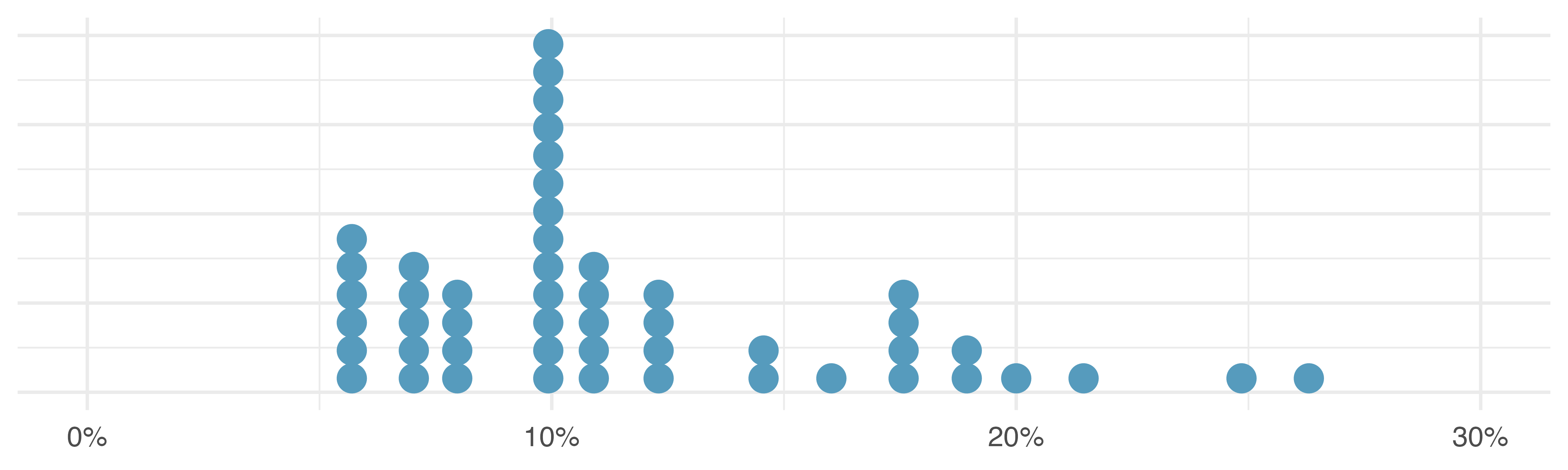
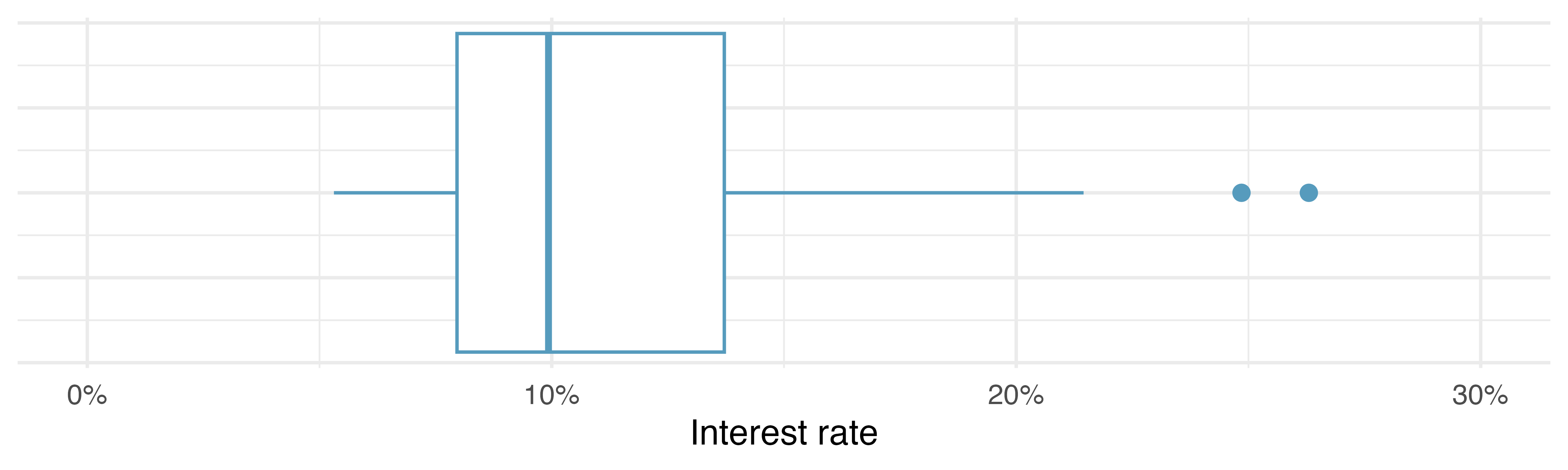
loan50 dataset.
The dark line inside the box represents the median, which splits the data in half. 50% of the data fall below this value and 50% fall above it. Since in the loan50 dataset there are 50 observations (an even number), the median is defined as the average of the two observations closest to the \(50^{th}\) percentile. Table 5.3 shows all interest rates, arranged in ascending order. We can see that the \(25^{th}\) and the \(26^{th}\) values are both 9.93, which corresponds to the thick line in Figure 5.8 (b).
loan50 dataset, arranged in ascending order.
| 1 | 2 | 3 | 4 | 5 | 6 | 7 | 8 | 9 | 10 | |
|---|---|---|---|---|---|---|---|---|---|---|
| 1 | 5.31 | 5.31 | 5.32 | 6.08 | 6.08 | 6.08 | 6.71 | 6.71 | 7.34 | 7.35 |
| 10 | 7.35 | 7.96 | 7.96 | 7.96 | 7.97 | 9.43 | 9.43 | 9.44 | 9.44 | 9.44 |
| 20 | 9.92 | 9.92 | 9.92 | 9.92 | 9.93 | 9.93 | 10.42 | 10.42 | 10.90 | 10.90 |
| 30 | 10.91 | 10.91 | 10.91 | 11.98 | 12.62 | 12.62 | 12.62 | 14.08 | 15.04 | 16.02 |
| 40 | 17.09 | 17.09 | 17.09 | 18.06 | 18.45 | 19.42 | 20.00 | 21.45 | 24.85 | 26.30 |
When there are an odd number of observations, there will be exactly one observation that splits the data into two halves, and in such a case that observation is the median (no average needed).
Median: the number in the middle.
If the data are ordered from smallest to largest, the median is the observation right in the middle. If there are an even number of observations, there will be two values in the middle, and the median is taken as their average.
The second step in building a box plot is drawing a rectangle to represent the middle 50% of the data. The length of the box is called the interquartile range, or IQR for short. It, like the standard deviation, is a measure of variability in data. The more variable the data, the larger the standard deviation and IQR tend to be. The two boundaries of the box are called the first quartile (the \(25^{th}\) percentile, i.e., 25% of the data fall below this value) and the third quartile (the \(75^{th}\) percentile, i.e., 75% of the data fall below this value), and these are often labeled \(Q_1\) and \(Q_3,\) respectively.
Interquartile range (IQR).
The IQR interquartile range is the length of the box in a box plot. It is computed as \(IQR = Q_3 - Q_1,\) where \(Q_1\) and \(Q_3\) are the \(25^{th}\) and \(75^{th}\) percentiles, respectively.
A \(\alpha\) percentile is a number with \(\alpha\)% of the observations below and \(100-\alpha\)% of the observations above. For example, the \(90^{th}\) percentile of SAT scores is the value of the SAT score with 90% of students below that value and 10% of students above that value.
What percent of the data fall between \(Q_1\) and the median? What percent is between the median and \(Q_3\)?10
Extending out from the box, the whiskers attempt to capture the data outside of the box. The whiskers of a box plot reach to the minimum and the maximum values in the data, unless there are points that are considered unusually high or unusually low, which are identified as potential outliers by the box plot. These are labeled with a dot on the box plot. The purpose of labeling the outlying points – instead of extending the whiskers to the minimum and maximum observed values – is to help identify any observations that appear to be unusually distant from the rest of the data. There are a variety of formulas for determining whether a particular data point is considered an outlier, and different statistical software use different formulas. A commonly used formula is that any observation beyond \(1.5\times IQR\) away from the first or the third quartile is considered an outlier. In a sense, the box is like the body of the box plot and the whiskers are like its arms trying to reach the rest of the data, up to the outliers.
Outliers are extreme.
An outlier is an observation that appears extreme relative to the rest of the data. Examining data for outliers serves many useful purposes, including
- identifying strong skew in the distribution,
- identifying possible data collection or data entry errors, and
- providing insight into interesting properties of the data.
Keep in mind, however, that some datasets have a naturally long skew and outlying points do not represent any sort of problem in the dataset.
Using the box plot in Figure 5.8 (b), estimate the values of the \(Q_1,\) \(Q_3,\) and IQR for interest_rate in the loan50 dataset.11
5.6 Robust statistics
How are the sample statistics of the interest_rate dataset affected by the observation, 26.3%? What would have happened if this loan had instead been only 15%? What would happen to these summary statistics if the observation at 26.3% had been even larger, say 35%? The three conjectured scenarios are plotted alongside the original data in Figure 5.9, and sample statistics are computed under each scenario in Table 5.4.
| Scenario | Median | IQR | Mean | SD |
|---|---|---|---|---|
| Original data | 9.93 | 5.75 | 11.6 | 5.05 |
| Move 26.3% to 15% | 9.93 | 5.75 | 11.3 | 4.61 |
| Move 26.3% to 35% | 9.93 | 5.75 | 11.7 | 5.68 |
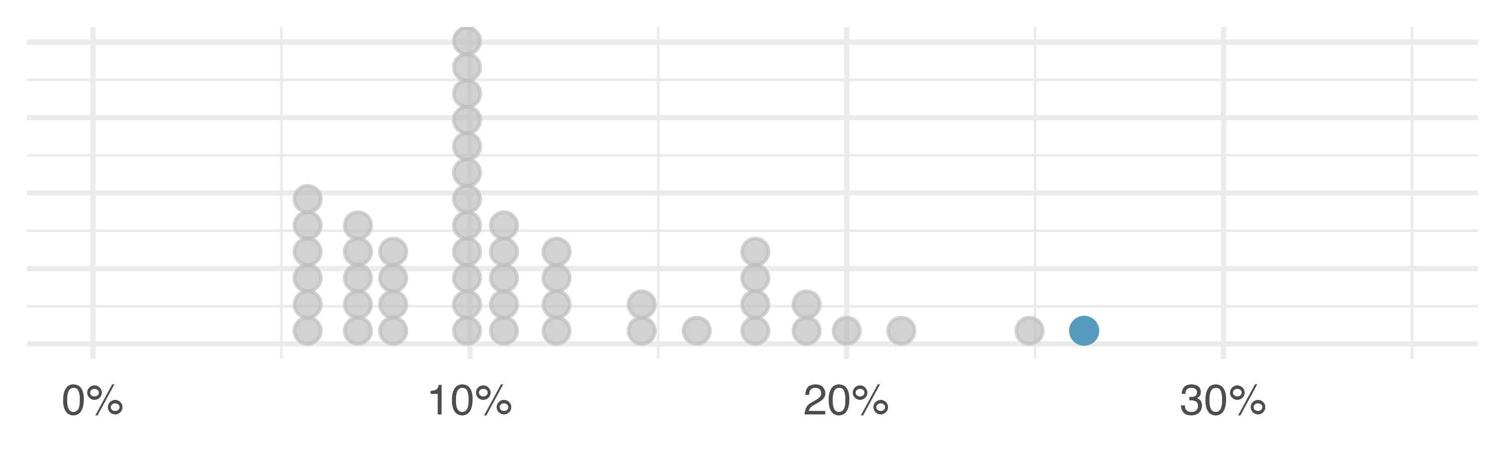
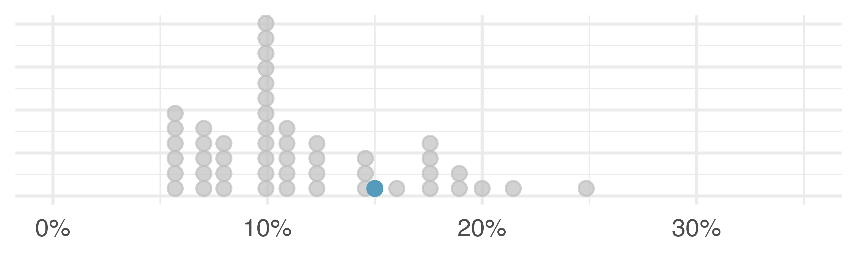
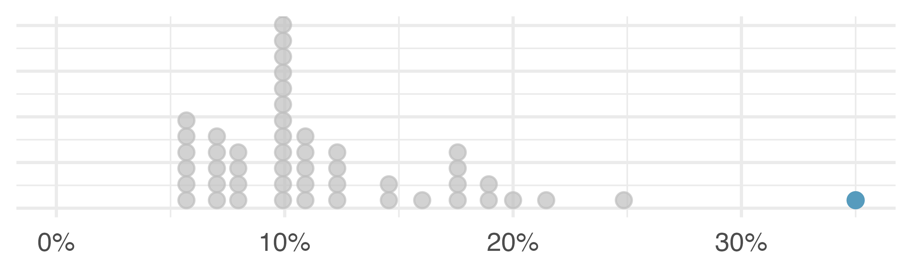
Which is more affected by extreme observations, the mean or median? Is the standard deviation or IQR more affected by extreme observations?12
The median and IQR are called robust statistics because extreme observations have little effect on their values: moving the most extreme value generally has little influence on these statistics. On the other hand, the mean and standard deviation are more heavily influenced by changes in extreme observations, which can be important in some situations.
The median and IQR did not change under the three scenarios in Table 5.4. Why might this be the case?
The median and IQR are only sensitive to numbers near \(Q_1,\) the median, and \(Q_3.\) Since values in these regions are stable in the three datasets, the median and IQR estimates are also stable.
You might not be surprised that the answer to the question “which is better, the mean or the median?” is: it depends. The two statistics measure different things, and so their use is dependent on the context in the analysis. Consider the following scenarios:
- Is it better to measure the average profit per customer or the median profit per customer?
- If concern is about the overall profit margin of the company, the mean is a better measure to assess what is happening across the company. The company could have a positive median profit per customer and still be unprofitable.
- If concern is around understanding the profit per typical customer, possibly to understand the growth headroom for the company’s profit, the median profit per customer would tell you more about individual customer profits.
- If you operate an app and want to know how long it takes for the app to open on your customers’ phones, do you want the mean amount of time or the median amount of time?
- The mean leads to an understanding of the overall amount of time being wasted in opening the app.
- The median tells you about the typical user experience.
- However, if the app takes less than 5 milliseconds to launch for 50% of the users but more than 10 seconds to launch for 10% of the users, the median doesn’t give the information you need. In that scenario, you might want an upper percentile, like the 95th percentile.
The distribution of loan amounts in the loan50 dataset is right skewed, with a few large loans lingering out into the right tail. If you were wanting to understand the typical loan size, should you be more interested in the mean or median?13
Regardless of the choice of centrality statistic (either mean or median), for most analyses, it is important to consider more than just the centrality. Other statistics like upper and lower percentiles, IQR, or standard deviation provide information about the variability of the observations. And visualizing the data through a graphical representation will typically provide a wealth of information necessary for understanding the full data picture associated with the research question.
5.7 Transforming data
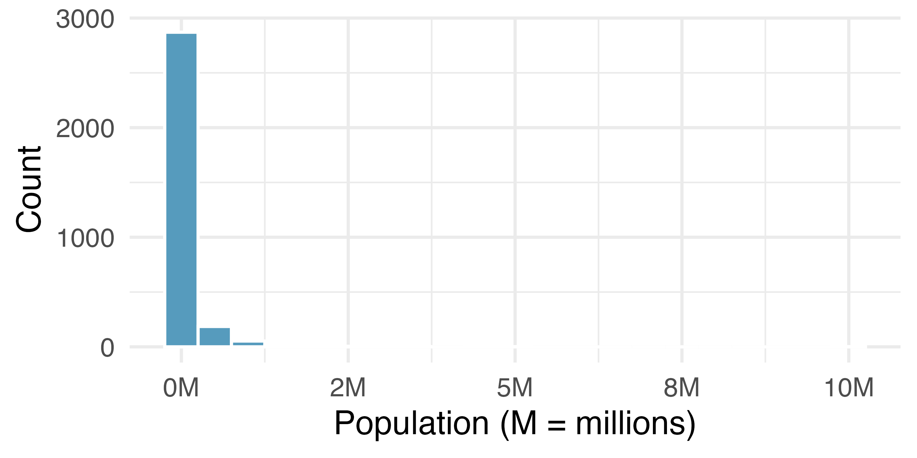
When data are very strongly skewed, we sometimes transform them, so they are easier to model. Figure 5.10 (a) and Figure 5.10 (b) show right-skewed distributions: distribution of the percentage of unemployed people and the distribution of the population in all counties in the United States. The distribution of population is more strongly skewed than the distribution of percentage unemployed, hence the log transformation results in a much bigger change in the shape of the distribution.
Consider the histogram of county populations shown in Figure 5.10 (c), which shows extreme skew. What characteristics of the plot keep it from being useful?
Nearly all of the data fall into the left-most bin, and the extreme skew obscures many of the potentially interesting details at the low values.
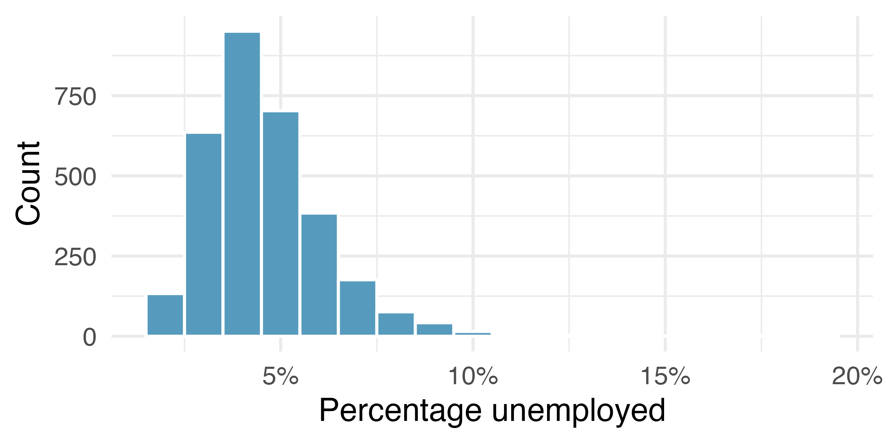
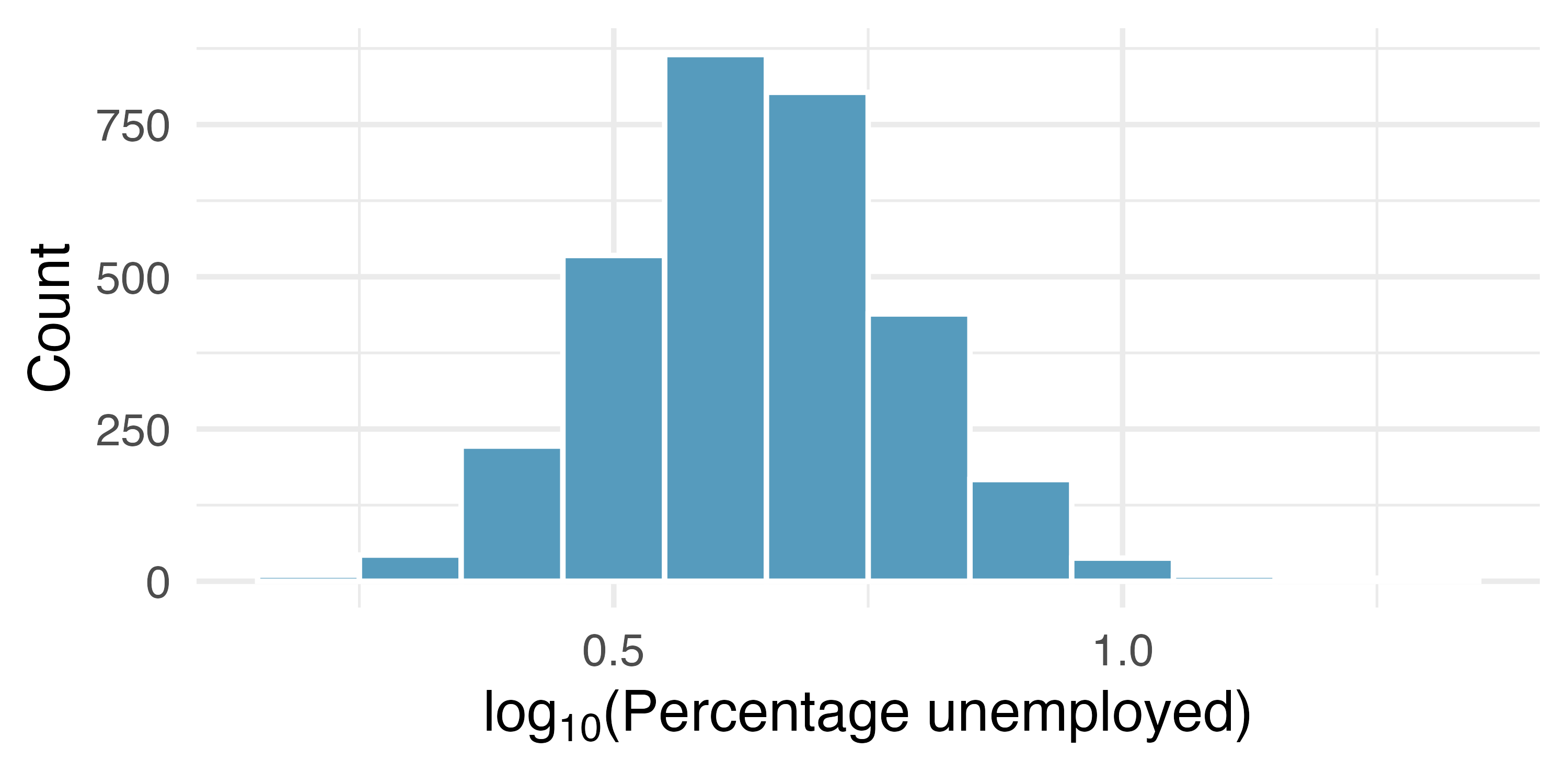
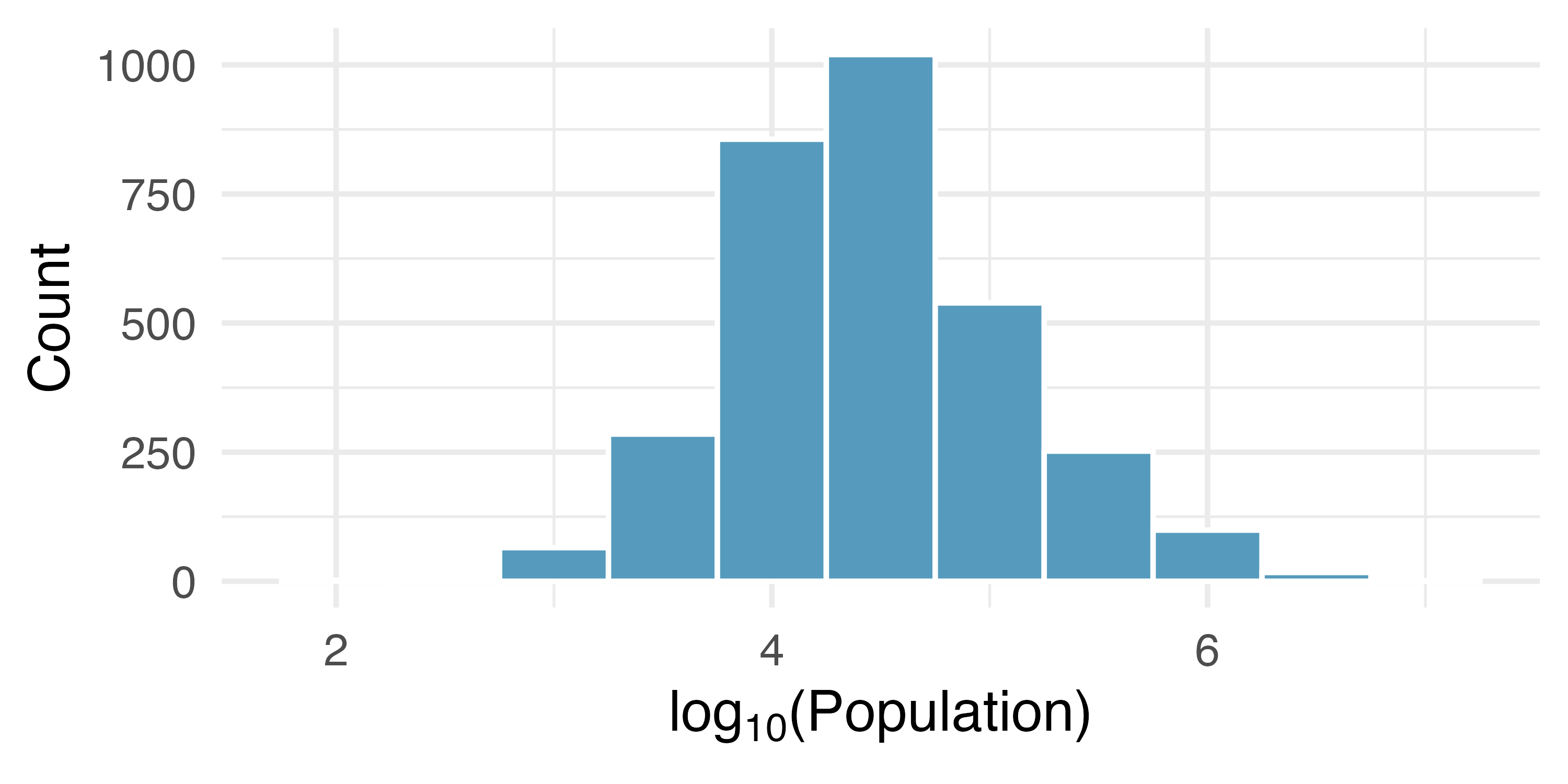
There are some standard transformations that may be useful for strongly right skewed data where much of the data is positive but clustered near zero. A transformation is a rescaling of the data using a function. For instance, a plot of the logarithm (base 10) of unemployment rates and county populations results in the new histograms in Figure 5.10 (b). The transformed data are symmetric, and any potential outliers appear much less extreme than in the original dataset. By reigning in the outliers and extreme skew, transformations often make it easier to build statistical models for the data.
Transformations can also be applied to one or both variables in a scatterplot. A scatterplot of the population change from 2010 to 2017 against the population in 2010 is shown in Figure 5.11 (a). It’s difficult to decipher any interesting patterns because the population variable is so strongly skewed. However, if we apply a log\(_{10}\) transformation to the population variable, as shown in Figure 5.11 (b), a positive association between the variables is revealed. In fact, we may be interested in fitting a trend line to the data when we explore methods around fitting regression lines in Chapter 7.
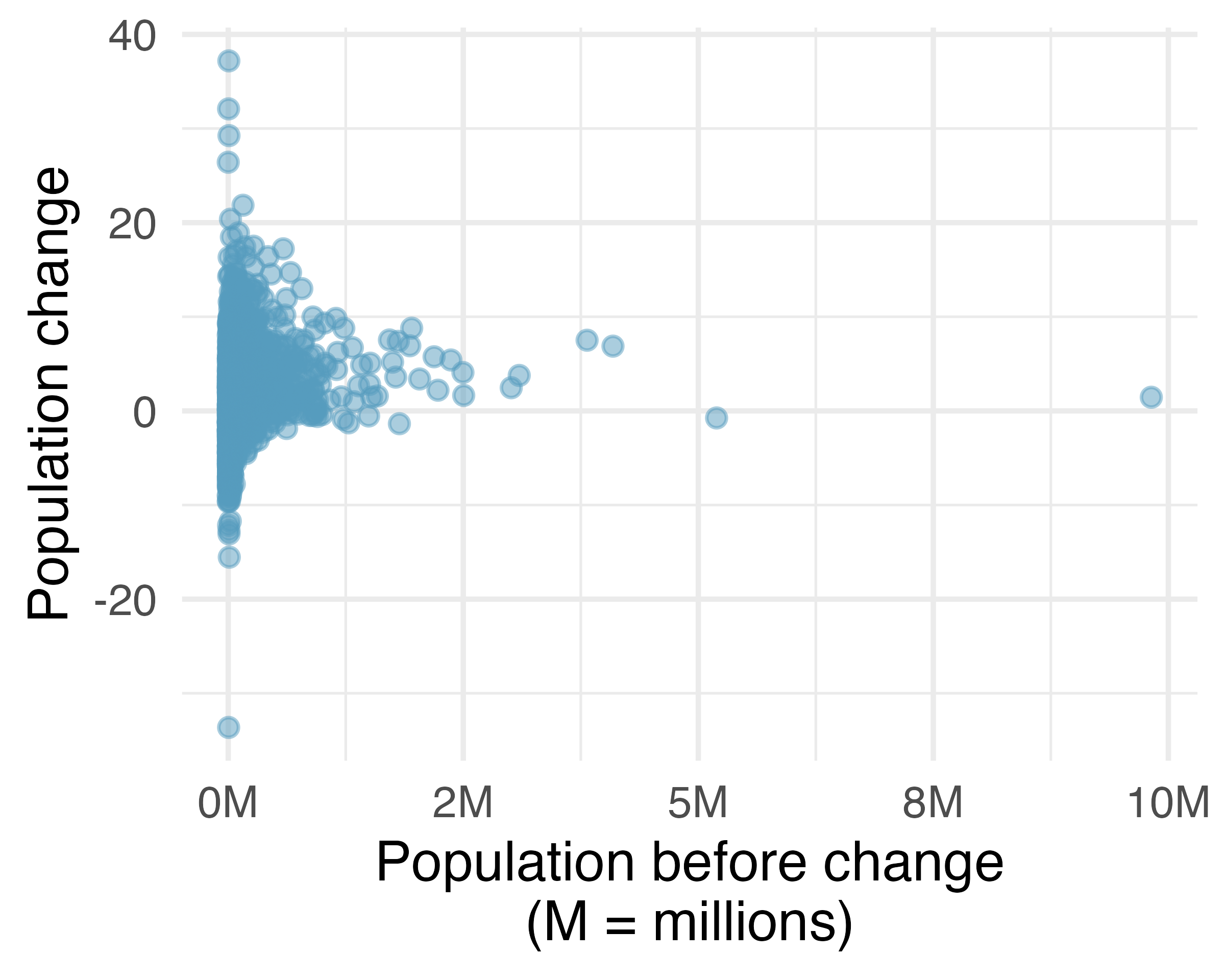
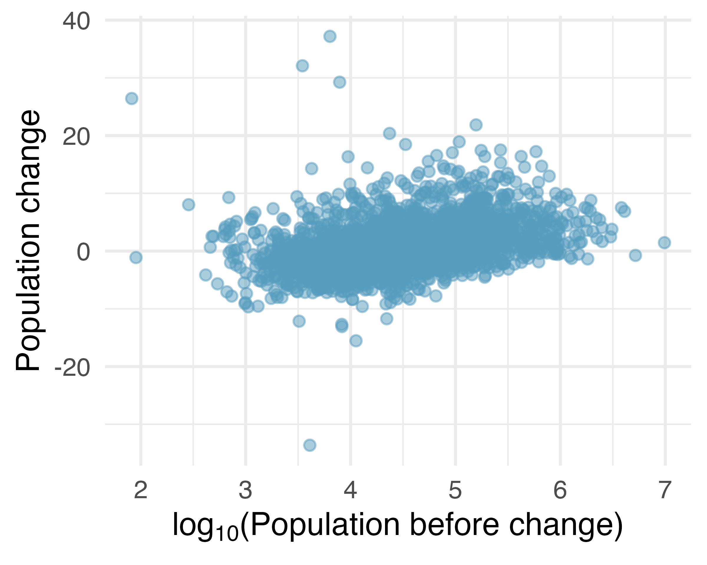
Transformations other than the logarithm can be useful, too. For instance, the square root \((\sqrt{\text{original observation}})\) and inverse \(\bigg ( \frac{1}{\text{original observation}} \bigg )\) are commonly used by data scientists. Common goals in transforming data are to see the data structure differently, reduce skew, assist in modeling, or straighten a nonlinear relationship in a scatterplot.
5.8 Mapping data
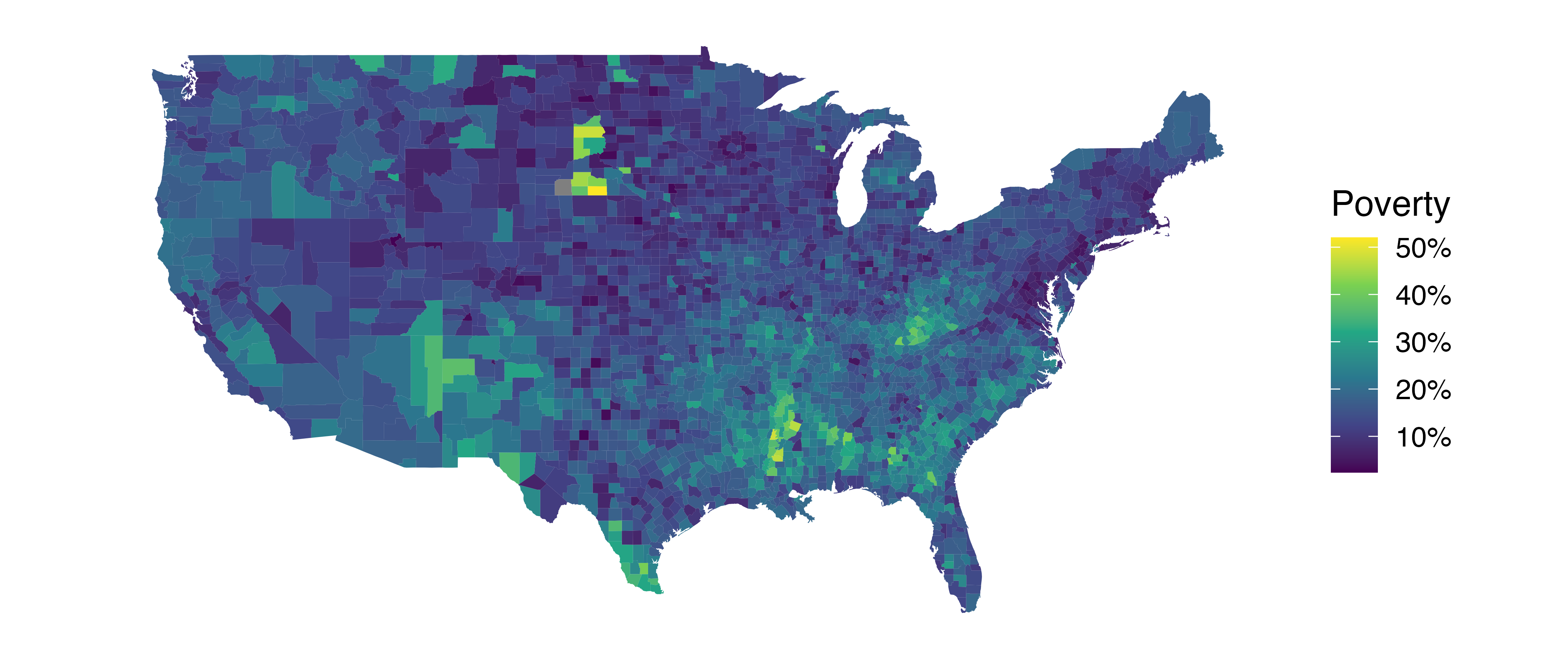
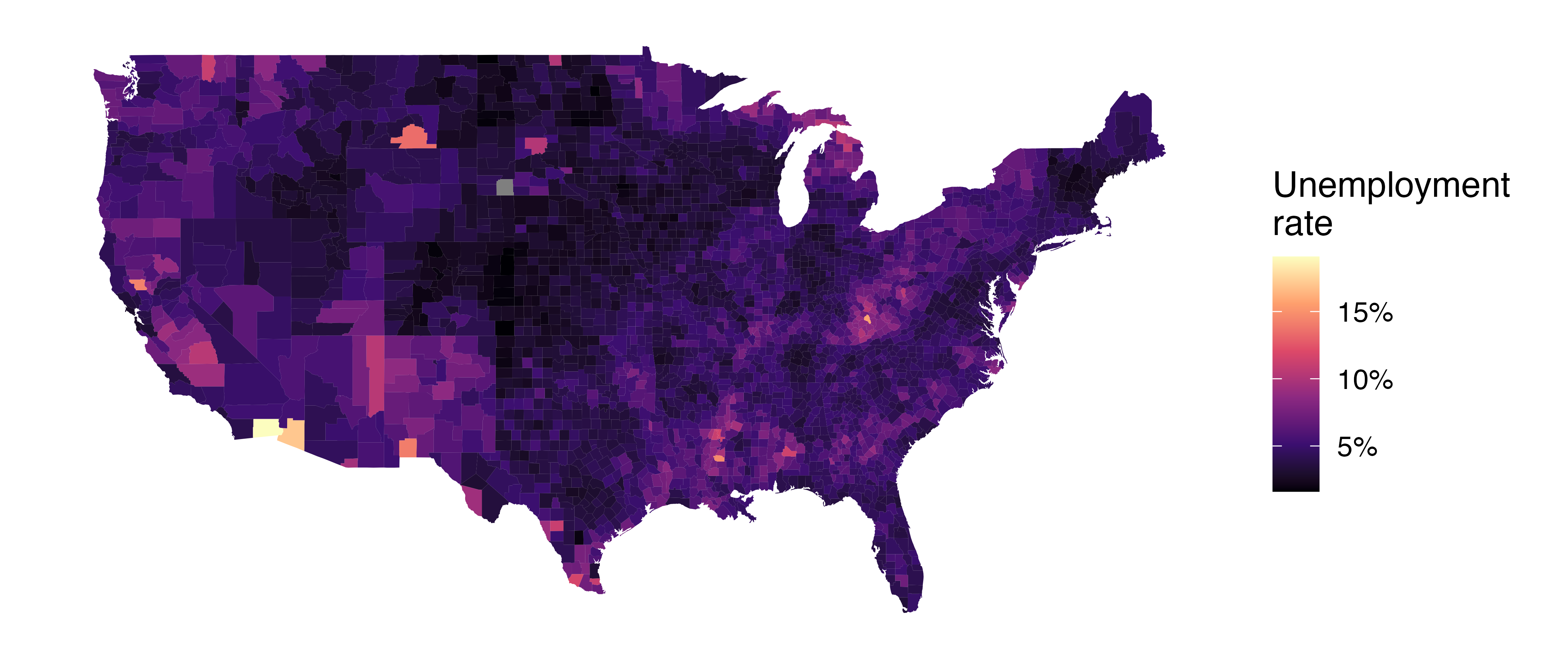
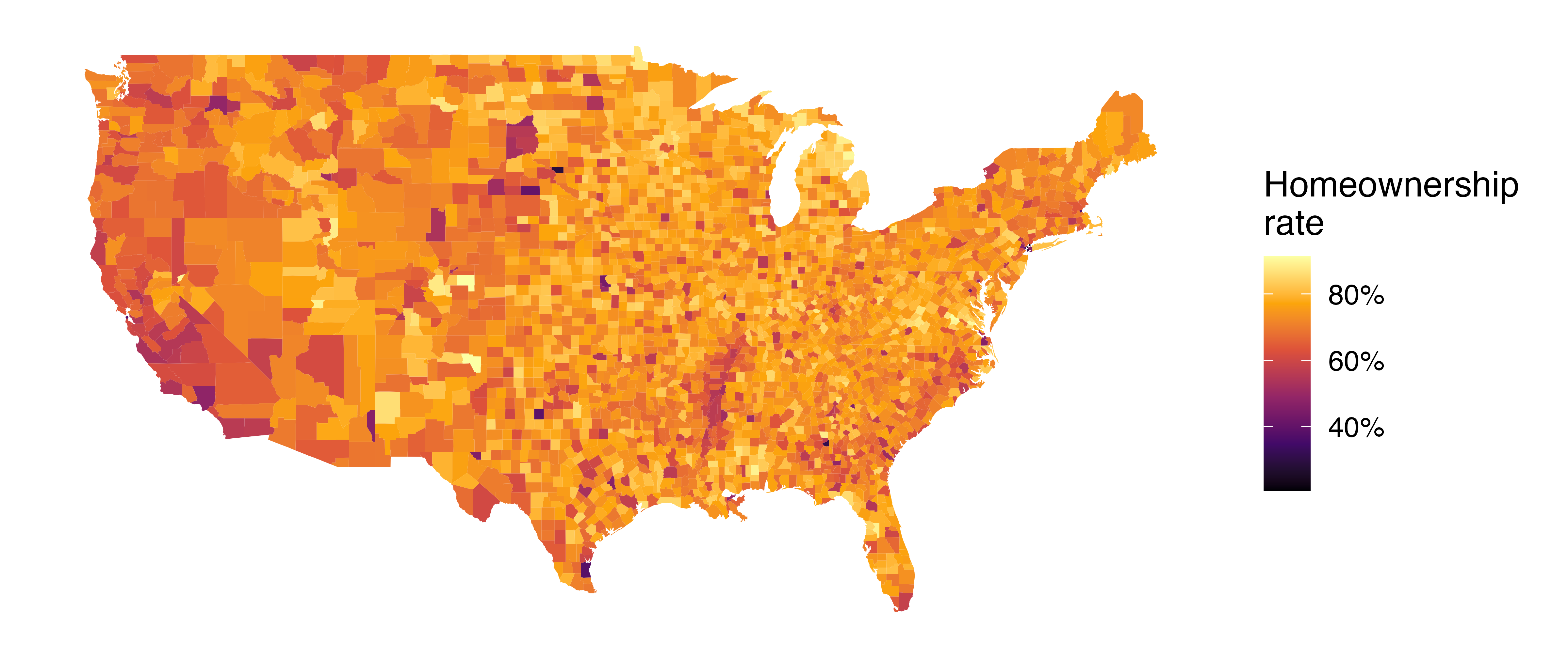
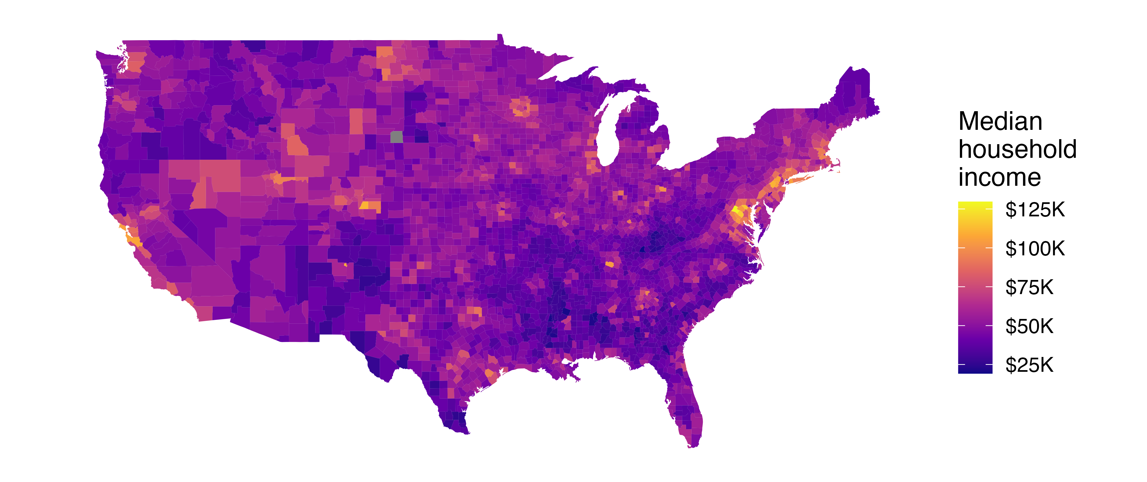
The county dataset offers many numerical variables that we could plot using dot plots, scatterplots, or box plots, but they can miss the true nature of the data as geographic. When we encounter geographic data, we should create an intensity map, where colors are used to show higher and lower values of a variable. Figure 5.12 shows intensity maps for poverty rate in percent (poverty), unemployment rate in percent (unemployment_rate), homeownership rate in percent (homeownership), and median household income in $1000s (median_hh_income). The color key indicates which colors correspond to which values. The intensity maps are not generally very helpful for getting precise values in any given county, but they are very helpful for seeing geographic trends and generating interesting research questions or hypotheses.
What interesting features are evident in the poverty and unemployment rate intensity maps in Figure 5.12 (a) and Figure 5.12 (b)?
Poverty rates are evidently higher in a few locations. Notably, the deep south shows higher poverty rates, as does much of Arizona and New Mexico. High poverty rates are evident in the Mississippi flood plains a little north of New Orleans and in a large section of Kentucky.
The unemployment rate follows similar trends, and we can see correspondence between the two variables. In fact, it makes sense for higher rates of unemployment to be closely related to poverty rates. One observation that stands out when comparing the two maps: the poverty rate is much higher than the unemployment rate, meaning while many people may be working, they are not making enough to break out of poverty.
What interesting features are evident in the median household income intensity map in Figure 5.12 (d)?14
5.9 Chapter review
5.9.1 Summary
Fluently working with numerical variables is an important skill for data analysts. In this chapter we have introduced different visualizations and numerical summaries applied to numeric variables. The graphical visualizations are even more descriptive when two variables are presented simultaneously. We presented scatterplots, dot plots, histograms, and box plots. Numerical variables can be summarized using the mean, median, quartiles, standard deviation, and variance.
5.9.2 Terms
The terms introduced in this chapter are presented in Table 5.5. If you’re not sure what some of these terms mean, we recommend you go back in the text and review their definitions. You should be able to easily spot them as bolded text.
| average | IQR | standard deviation |
| bimodal | left skewed | symmetric |
| box plot | mean | tail |
| data density | median | third quartile |
| density plot | multimodal | transformation |
| deviation | nonlinear | unimodal |
| distribution | outlier | variability |
| dot plot | percentile | variance |
| first quartile | point estimate | weighted mean |
| histogram | right skewed | whiskers |
| intensity map | robust statistics | |
| interquartile range | scatterplot |
5.10 Exercises
Answers to odd-numbered exercises can be found in Appendix A.5.
-
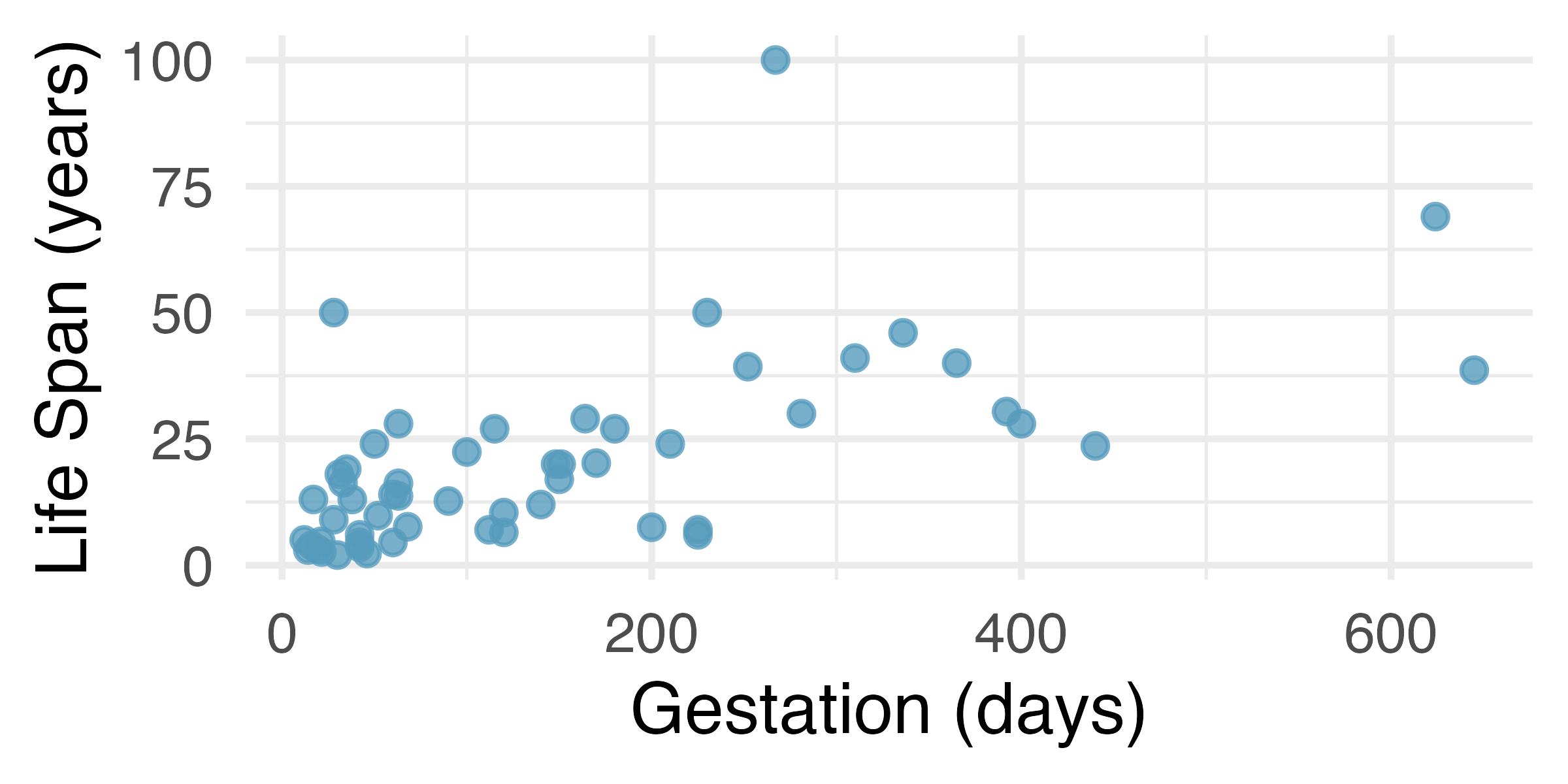
Mammal life spans. Data were collected on life spans (in years) and gestation lengths (in days) for 62 mammals. A scatterplot of life span versus length of gestation is shown below.15 (Allison and Cicchetti 1975)
What type of an association is apparent between life span and length of gestation?
What type of an association would you expect to see if the axes of the plot were reversed, i.e., if we plotted length of gestation versus life span?
Are life span and length of gestation independent? Explain your reasoning.
-
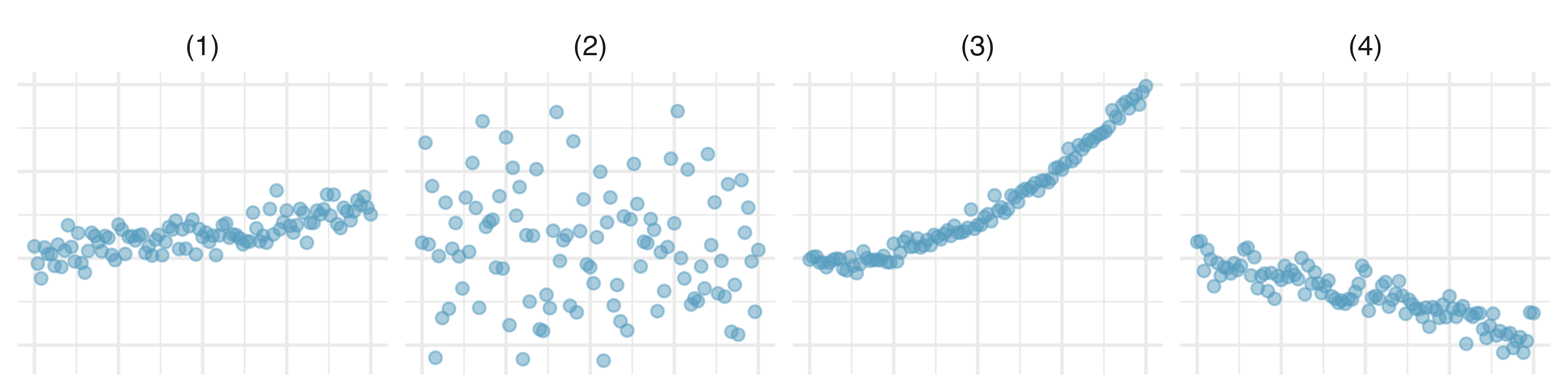
Associations. Indicate which of the plots show (a) a positive association, (b) a negative association, or (c) no association. Also determine if the positive and negative associations are linear or nonlinear. Each part may refer to more than one plot.
- Reproducing bacteria. Suppose that there is only sufficient space and nutrients to support one million bacterial cells in a petri dish. You place a few bacterial cells in this petri dish, allow them to reproduce freely, and record the number of bacterial cells in the dish over time. Sketch a plot representing the relationship between number of bacterial cells and time.
- Office productivity. Office productivity is relatively low when the employees feel no stress about their work or job security. However, high levels of stress can also lead to reduced employee productivity. Sketch a plot to represent the relationship between stress and productivity.
-
Make-up exam. In a class of 25 students, 24 of them took an exam in class and 1 student took a make-up exam the following day. The professor graded the first batch of 24 exams and found an average score of 74 points with a standard deviation of 8.9 points. The student who took the make-up the following day scored 64 points on the exam.
Does the new student’s score increase or decrease the average score?
What is the new average?
Does the new student’s score increase or decrease the standard deviation of the scores?
-
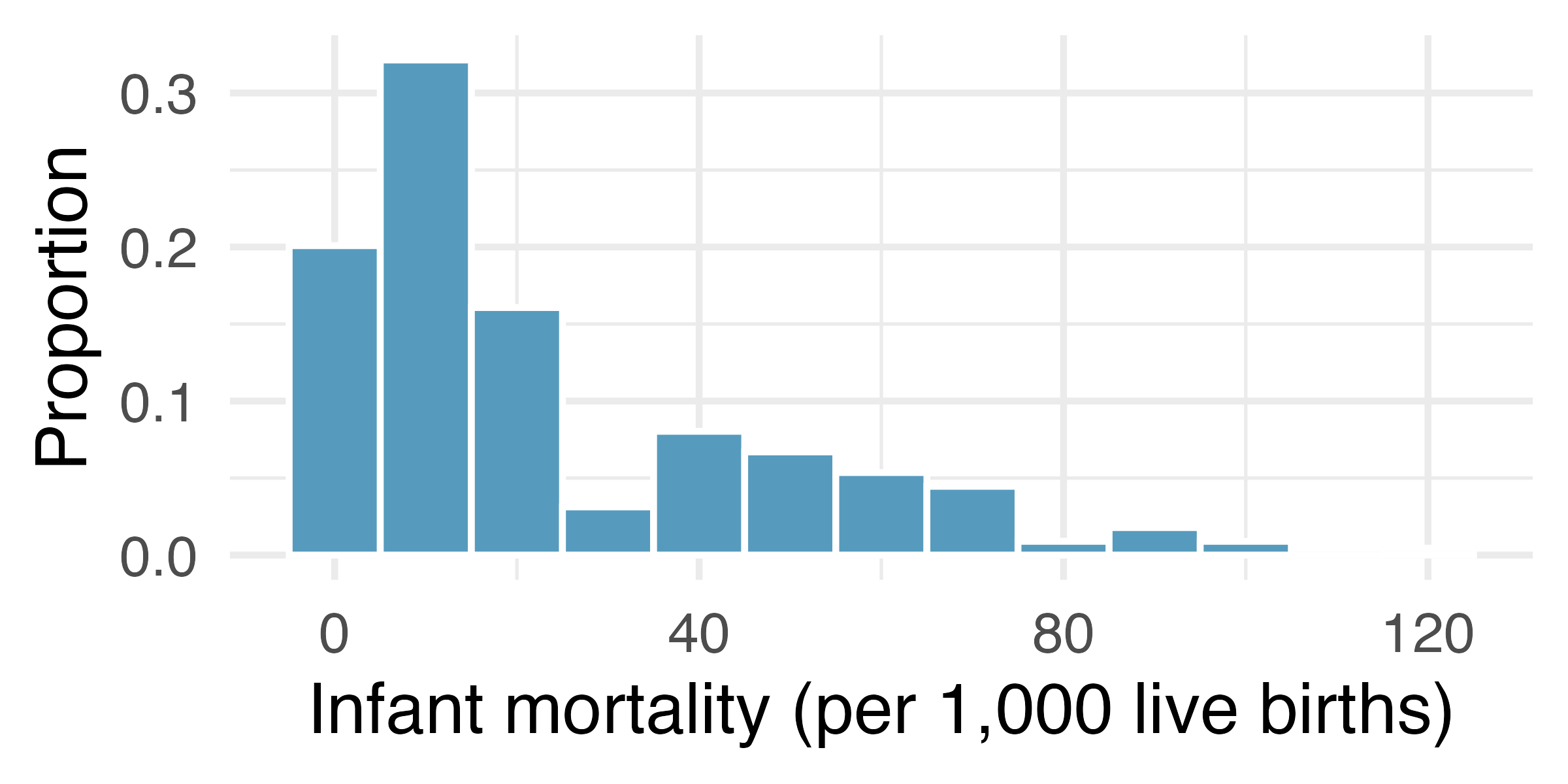
Infant mortality. The infant mortality rate is defined as the number of infant deaths per 1,000 live births. This rate is often used as an indicator of the level of health in a country. The relative frequency histogram below shows the distribution of estimated infant death rates for 224 countries for which such data were available in 2014.16
Estimate Q1, the median, and Q3 from the histogram.
Would you expect the mean of this dataset to be smaller or larger than the median? Explain your reasoning.
Days off at a mining plant. Workers at a particular mining site receive an average of 35 days paid vacation, which is lower than the national average. The manager of this plant is under pressure from a local union to increase the amount of paid time off. However, he does not want to give more days off to the workers because that would be costly. Instead he decides he should fire 10 employees in such a way as to raise the average number of days off that are reported by his employees. In order to achieve this goal, should he fire employees who have the most number of days off, least number of days off, or those who have about the average number of days off?
-
Medians and IQRs. For each part, compare distributions A and B based on their medians and IQRs. You do not need to calculate these statistics; simply state how the medians and IQRs compare. Make sure to explain your reasoning. Hint: It may be useful to sketch dot plots of the distributions.
A: 3, 5, 6, 7, 9; B: 3, 5, 6, 7, 20
A: 3, 5, 6, 7, 9; B: 3, 5, 7, 8, 9
A: 1, 2, 3, 4, 5; B: 6, 7, 8, 9, 10
A: 0, 10, 50, 60, 100; B: 0, 100, 500, 600, 1000
-
Means and SDs. For each part, compare distributions A and B based on their means and standard deviations. You do not need to calculate these statistics; simply state how the means and the standard deviations compare. Make sure to explain your reasoning. Hint: It may be useful to sketch dot plots of the distributions.
A: 3, 5, 5, 5, 8, 11, 11, 11, 13; B: 3, 5, 5, 5, 8, 11, 11, 11, 20
A: -20, 0, 0, 0, 15, 25, 30, 30; B: -40, 0, 0, 0, 15, 25, 30, 30
A: 0, 2, 4, 6, 8, 10; B: 20, 22, 24, 26, 28, 30
A: 100, 200, 300, 400, 500; B: 0, 50, 300, 550, 600
-
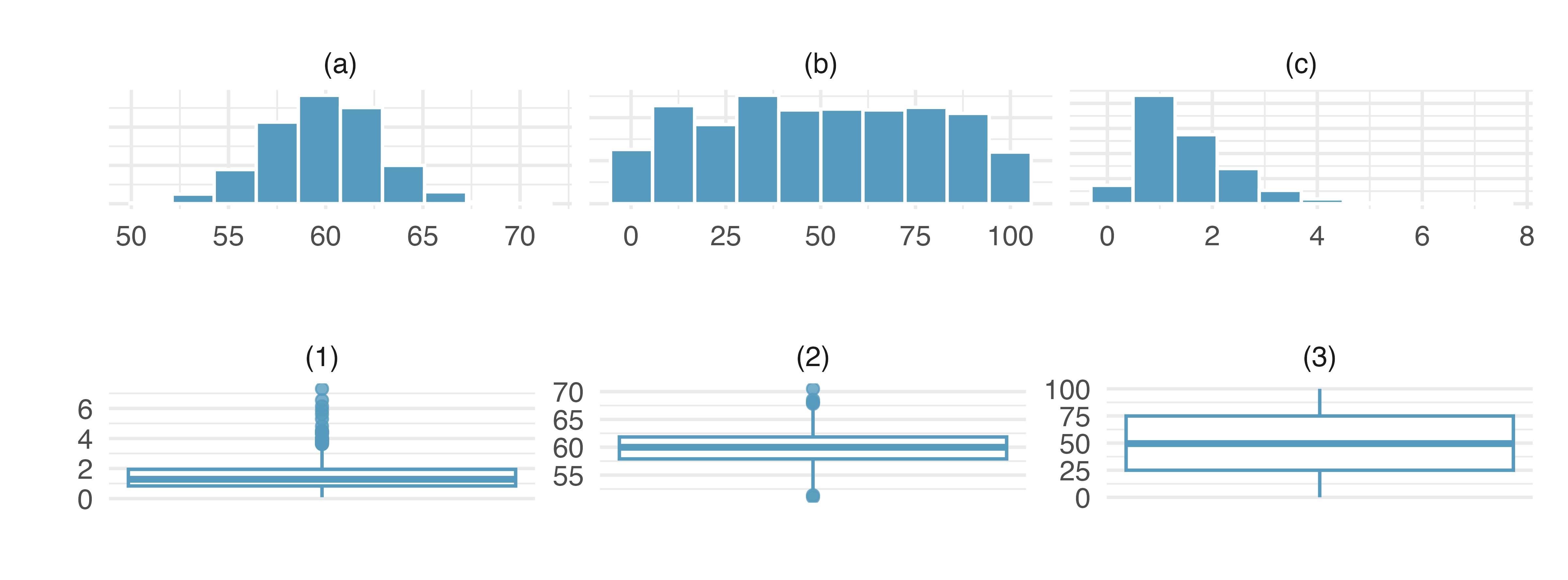
Histograms and box plots. Describe (in words) the distribution in the histograms below and match them to the box plots.
-
Air quality. Daily air quality is measured by the air quality index (AQI) reported by the Environmental Protection Agency. This index reports the pollution level and what associated health effects might be a concern. The index is calculated for five major air pollutants regulated by the Clean Air Act and takes values from 0 to 300, where a higher value indicates lower air quality. AQI was reported for a 356 days in 2022 in Durham, NC. The histogram below shows the distribution of the AQI values on these days.17
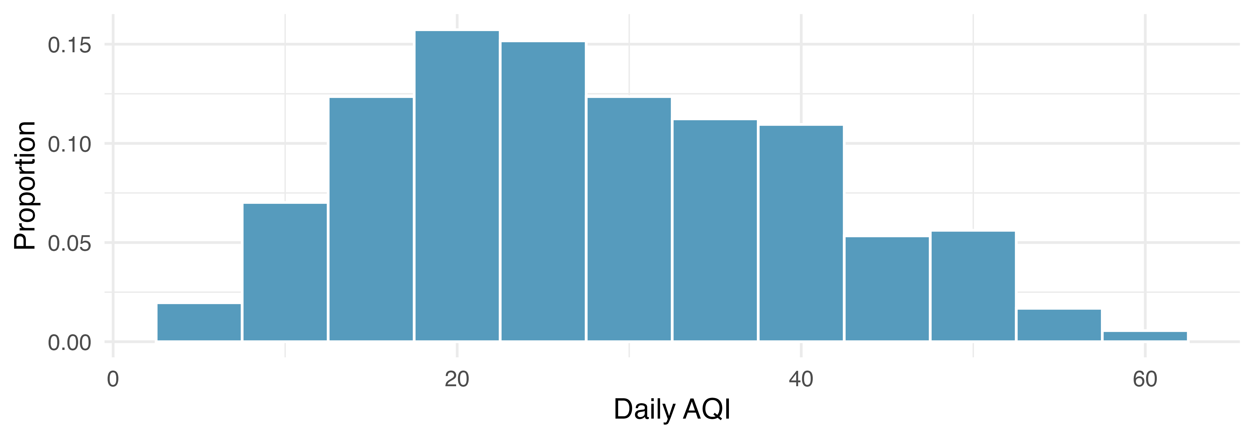
Estimate the median AQI value of this sample.
Would you expect the mean AQI value of this sample to be higher or lower than the median? Explain your reasoning.
Estimate Q1, Q3, and IQR for the distribution.
Would any of the days in this sample be considered to have an unusually low or high AQI? Explain your reasoning.
-
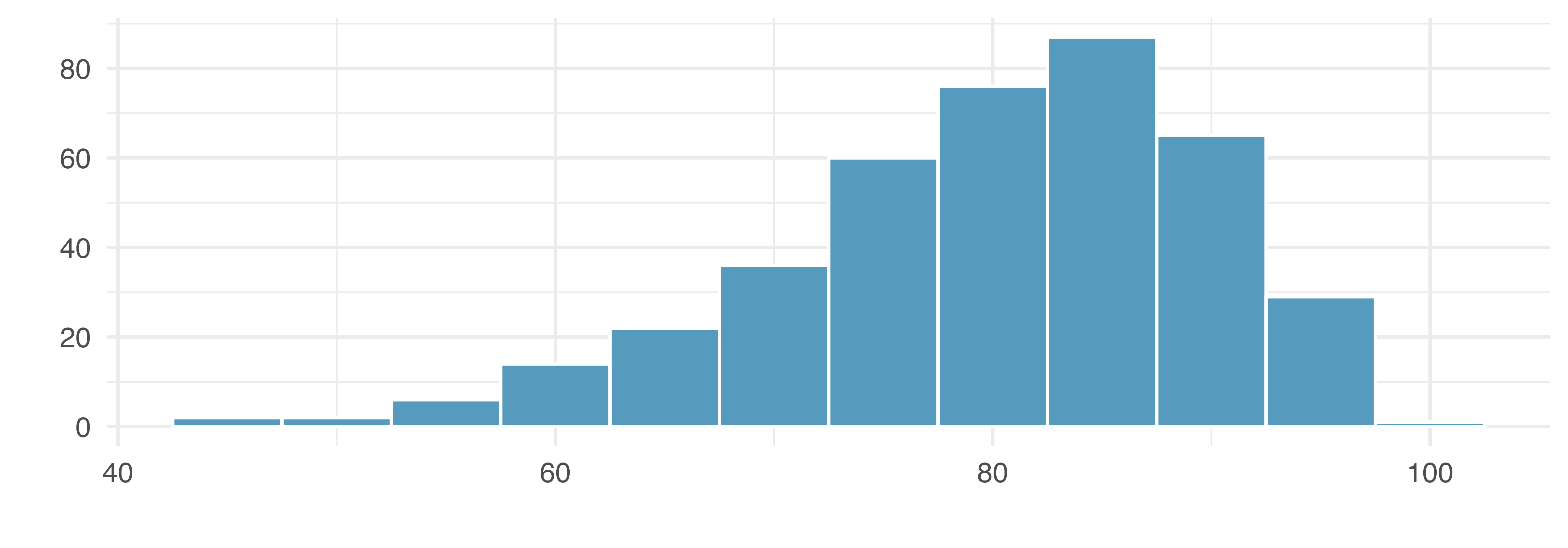
Median vs. mean. Estimate the median for the 400 observations shown in the histogram, and note whether you expect the mean to be higher or lower than the median.
-
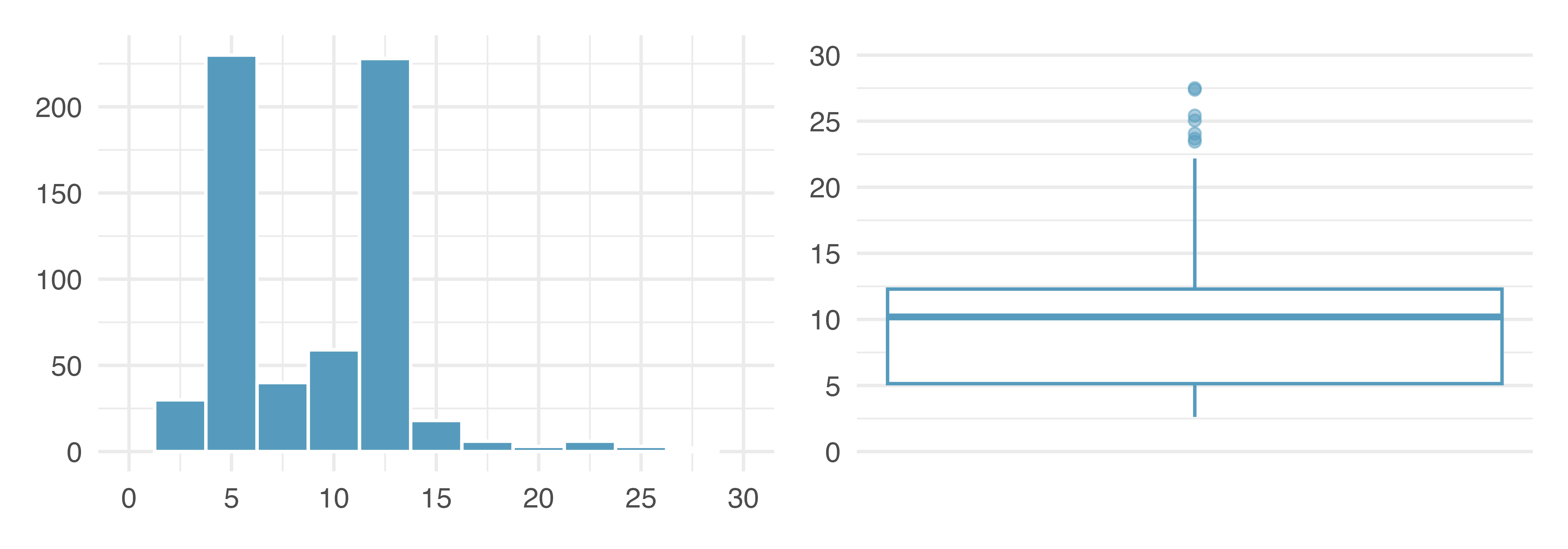
Histograms vs. box plots. Compare the two plots below. What characteristics of the distribution are apparent in the histogram and not in the box plot? What characteristics are apparent in the box plot but not in the histogram?
- Facebook friends. Facebook data indicate that 50% of Facebook users have 100 or more friends, and that the average friend count of users is 190. What do these findings suggest about the shape of the distribution of number of friends of Facebook users? (Backstrom 2011)
-
Distributions and appropriate statistics. For each of the following, state whether you expect the distribution to be symmetric, right skewed, or left skewed. Also specify whether the mean or median would best represent a typical observation in the data, and whether the variability of observations would be best represented using the standard deviation or IQR. Explain your reasoning.
Number of pets per household.
Distance to work, i.e., number of miles between work and home.
Heights of adult males.
Age at death.
Exam grade on an easy test.
-
Distributions and appropriate statistics. For each of the following, state whether you expect the distribution to be symmetric, right skewed, or left skewed. Also specify whether the mean or median would best represent a typical observation in the data, and whether the variability of observations would be best represented using the standard deviation or IQR. Explain your reasoning.
Housing prices in a country where 25% of the houses cost below $350,000, 50% of the houses cost below $450,000, 75% of the houses cost below $1,000,000, and there are a meaningful number of houses that cost more than $6,000,000.
Housing prices in a country where 25% of the houses cost below $300,000, 50% of the houses cost below $600,000, 75% of the houses cost below $900,000, and very few houses that cost more than $1,200,000.
Number of alcoholic drinks consumed by college students in a given week. Assume that most of these students don’t drink since they are under 21 years old, and only a few drink excessively.
Annual salaries of the employees at a Fortune 500 company where only a few high level executives earn much higher salaries than all the other employees.
Gestation time in humans where 25% of the babies are born by 38 weeks of gestation, 50% of the babies are born by 39 weeks, 75% of the babies are born by 40 weeks, and the maximum gestation length is 46 weeks.
- TV watchers. College students in a statistics class were asked how many hours of television they watch per week, including online streaming services. This sample yielded an average of 8.28 hours, with a standard deviation of 7.18 hours. Is the distribution of number of hours students watch television weekly symmetric? If not, what shape would you expect this distribution to have? Explain your reasoning.
- Exam scores. The average on a history exam (scored out of 100 points) was 85, with a standard deviation of 15. Is the distribution of the scores on this exam symmetric? If not, what shape would you expect this distribution to have? Explain your reasoning.
- Midrange. The midrange of a distribution is defined as the average of the maximum and the minimum of that distribution. Is this statistic robust to outliers and extreme skew? Explain your reasoning.
-
Oscar winners. The first Oscar awards for best actor and best actress were given out in 1929. The histograms below show the age distribution for all of the best actor and best actress winners from 1929 to 2019. Summary statistics for these distributions are also provided. Compare the distributions of ages of best actor and actress winners.18
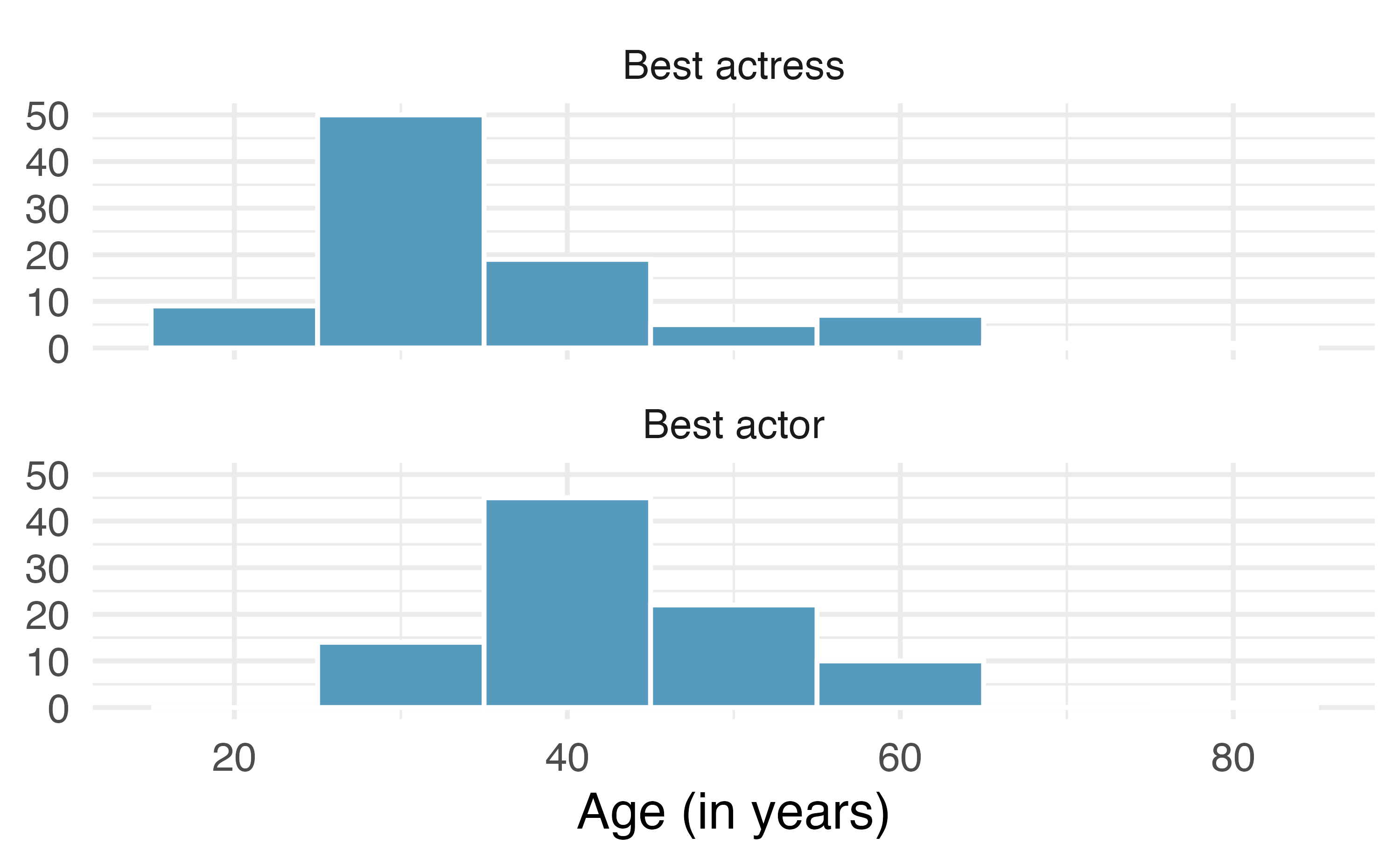
Mean SD n Best actor 43.8 8.8 92 Best actress 36.2 11.9 92
- Stats scores. The final exam scores of twenty introductory statistics students, arranged in ascending order, as as follows: 57, 66, 69, 71, 72, 73, 74, 77, 78, 78, 79, 79, 81, 81, 82, 83, 83, 88, 89, 94. Suppose students who score above the 75th percentile on the final exam get an A in the class. How many students will get an A in this class?
-
Income at the coffee shop. The first histogram below shows the distribution of the yearly incomes of 40 patrons at a college coffee shop. Suppose two new people walk into the coffee shop: one making $225,000 and the other $250,000. The second histogram shows the new income distribution. Summary statistics are also provided, rounded to the nearest whole number.
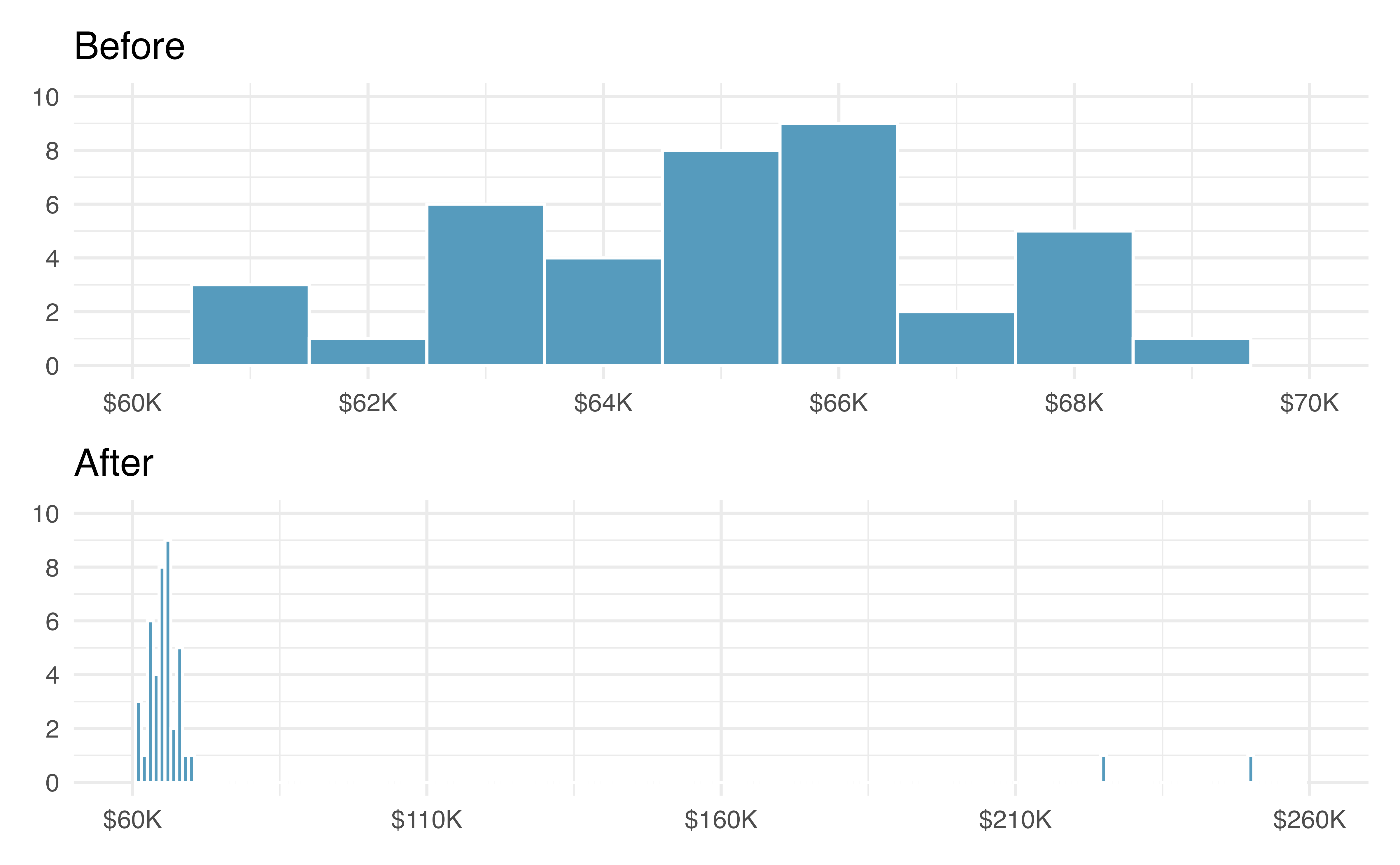
n Min Q1 Median Mean Max SD Before 40 $60,679 $60,818 $65,238 $65,089 $69,885 $2,122 After 42 $60,679 $60,838 $65,352 $73,299 $250,000 $37,321 Would the mean or the median best represent what we might think of as a typical income for the 42 patrons at this coffee shop? What does this say about the robustness of the two measures?
Would the standard deviation or the IQR best represent the amount of variability in the incomes of the 42 patrons at this coffee shop? What does this say about the robustness of the two measures?
-
A new statistic. The statistic \(\frac{\bar{x}}{median}\) can be used as a measure of skewness. Suppose we have a distribution where all observations are greater than 0, \(x_i > 0\). What is the expected shape of the distribution under the following conditions? Explain your reasoning.
\(\frac{\bar{x}}{median} = 1\)
\(\frac{\bar{x}}{median} < 1\)
\(\frac{\bar{x}}{median} > 1\)
-
Commute times. The US census collects data on the time it takes Americans to commute to work, among many other variables. The histogram below shows the distribution of mean commute times in 3,142 US counties in 2017. Also shown below is a spatial intensity map of the same data.19
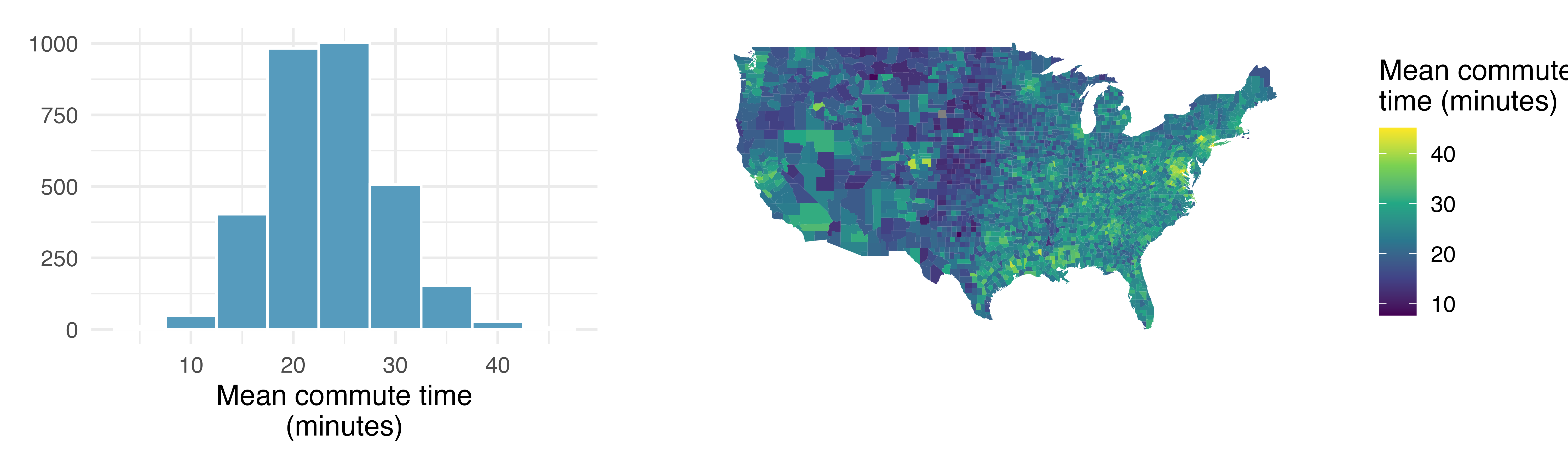
Describe the numerical distribution and comment on whether a log transformation may be advisable for these data.
Describe the spatial distribution of commuting times using the map.
-
Hispanic population. The US census collects data on race and ethnicity of Americans, among many other variables. The histogram below shows the distribution of the percentage of the population that is Hispanic in 3,142 counties in the US in 2010. Also shown is a histogram of logs of these values.20
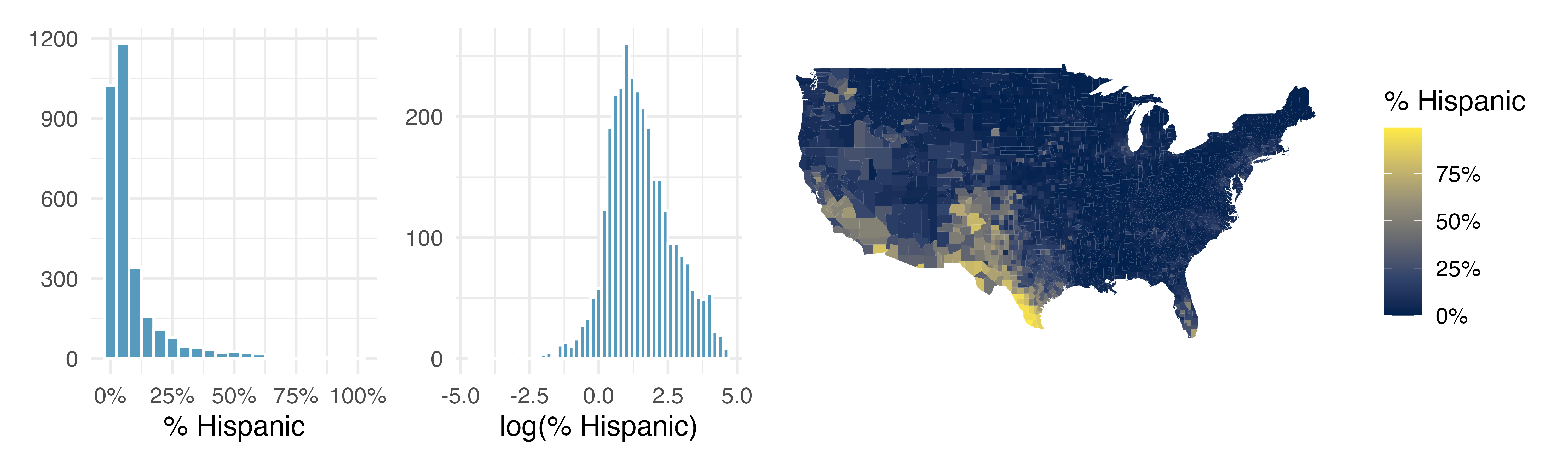
Describe the numerical distribution and comment on why we might want to use log-transformed values in analyzing or modeling these data.
What features of the distribution of the Hispanic population in US counties are apparent in the map but not in the histogram? What features are apparent in the histogram but not the map?
Is one visualization more appropriate or helpful than the other? Explain your reasoning.
-
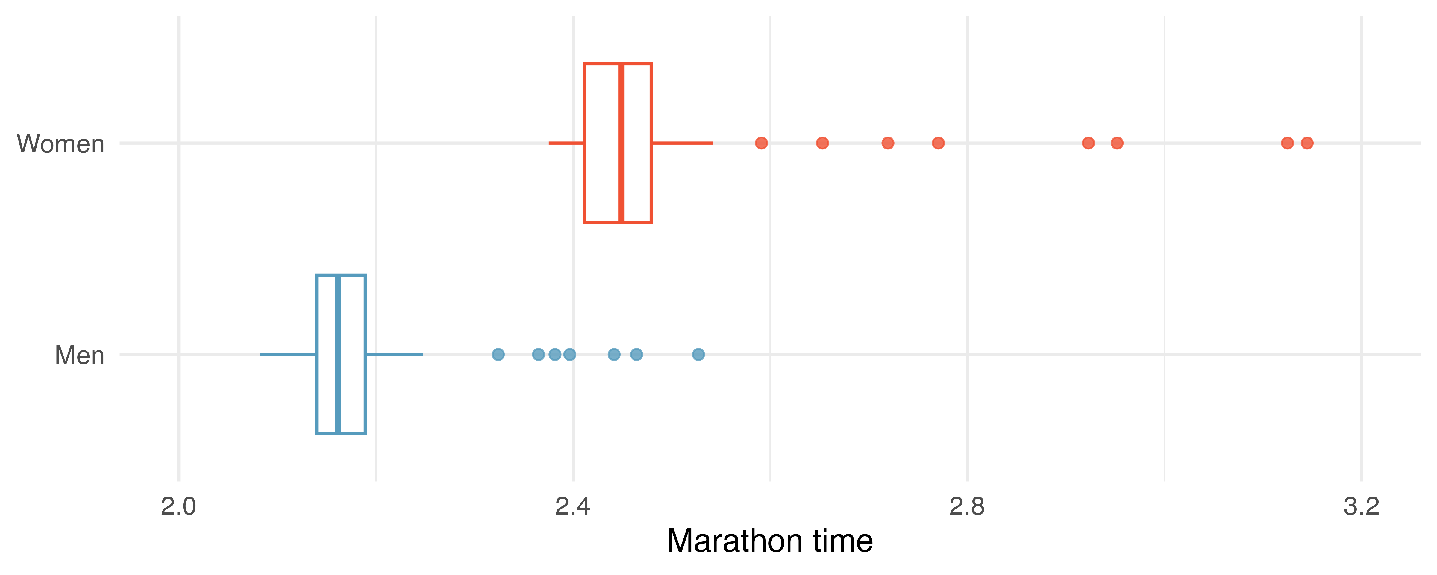
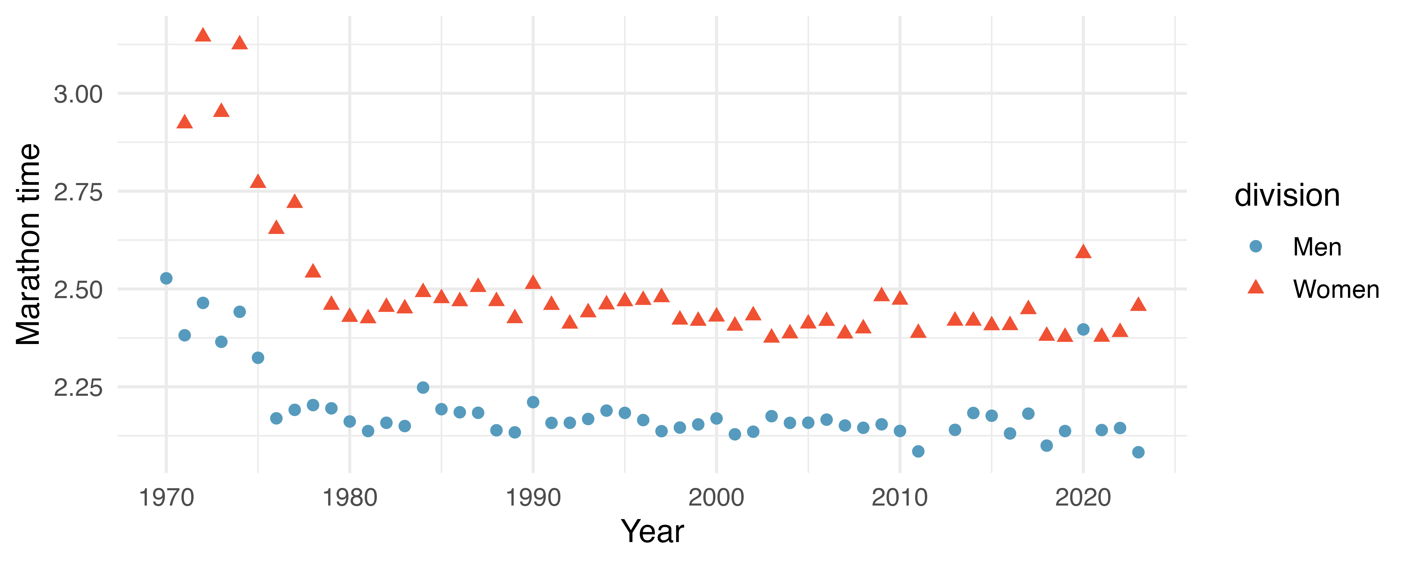
NYC marathon winners. The histogram and box plots below show the distribution of finishing times for male and female (combined) winners of the New York City Marathon between 1970 and 2023.21
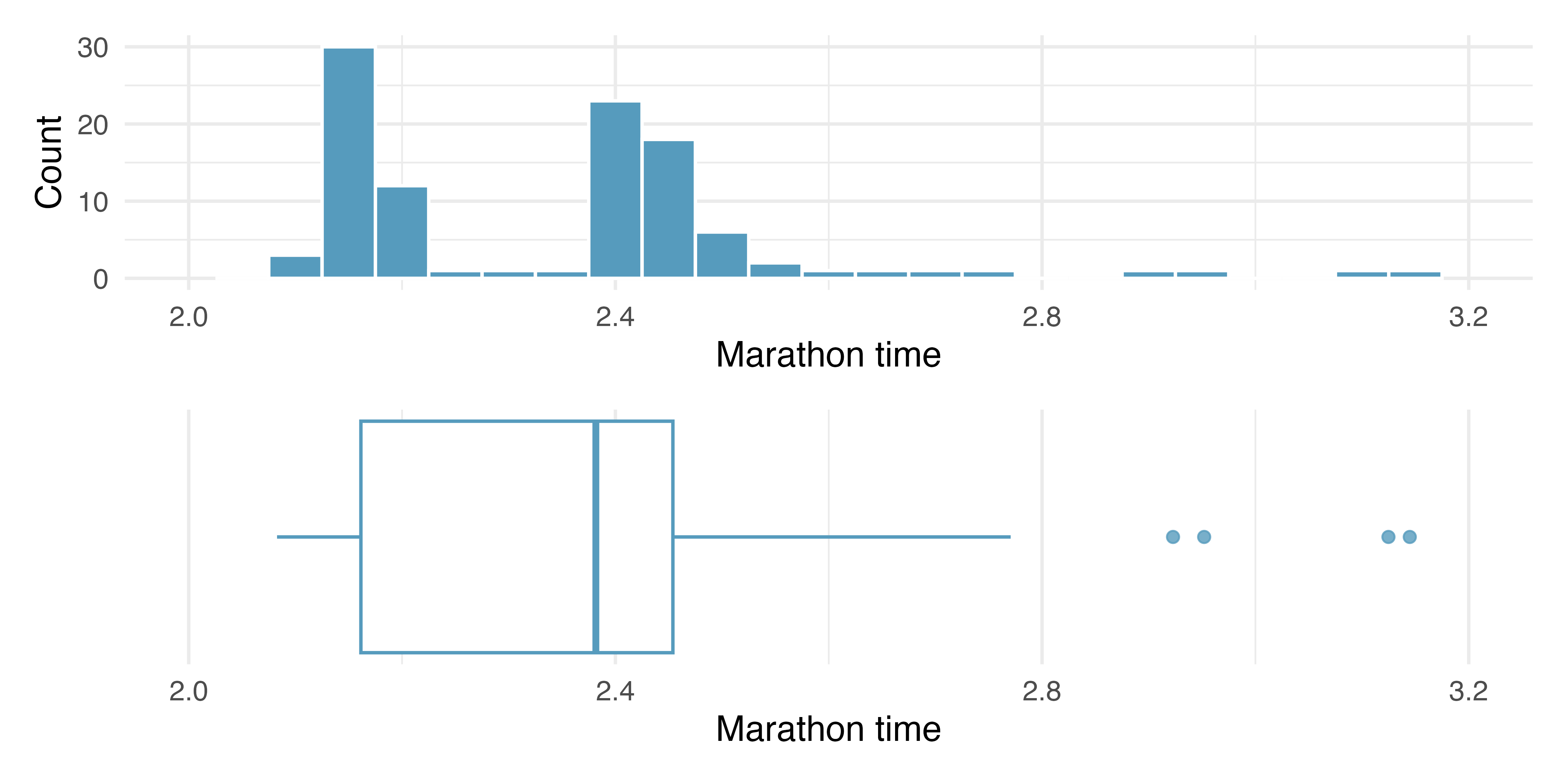
What features of the distribution are apparent in the histogram and not the box plot? What features are apparent in the box plot but not in the histogram?
What may be the reason for the bimodal distribution? Explain.
Compare the distribution of marathon times for men and women based on the box plot shown below.
- The time series plot shown below is another way to look at these data. Describe what is visible in this plot but not in the others.
Answers may vary. Scatterplots are helpful in quickly spotting associations relating variables, whether those associations come in the form of simple trends or whether those relationships are more complex.↩︎
Consider the case where your vertical axis represents something “good” and your horizontal axis represents something that is only good in moderation. Health and water consumption fit this description: we require some water to survive, but consume too much and it becomes toxic and can kill a person.↩︎
\(x_1\) corresponds to the interest rate for the first loan in the sample, \(x_2\) to the second loan’s interest rate, and \(x_i\) corresponds to the interest rate for the \(i^{th}\) loan in the dataset. For example, if \(i = 4,\) then we are examining \(x_4,\) which refers to the fourth observation in the dataset.↩︎
The sample size was \(n = 50.\)↩︎
Other ways to describe data that are right skewed: skewed to the right, skewed to the high end, or skewed to the positive end.↩︎
The interest rates for individual loans.↩︎
There might be two height groups visible in the dataset: the children (students) and the adults (teachers). That is, the data are probably bimodal.↩︎
Figure 5.7 shows three distributions that look quite different, but all have the same mean, variance, and standard deviation. Using modality, we can distinguish between the first plot (bimodal) and the last two (unimodal). Using skewness, we can distinguish between the last plot (right skewed) and the first two. While a picture, like a histogram, tells a more complete story, we can use modality and shape (symmetry/skew) to characterize basic information about a distribution.↩︎
Box plots were introducted by Mary Eleanor Spear who considered them to be a particular type of bar plot, see page 166 of Spear (1952). Mistakenly, box plots are often attributed to John Tukey who was the first person to call them “box-and-whisker plots.”↩︎
Since \(Q_1\) and \(Q_3\) capture the middle 50% of the data and the median splits the data in the middle, 25% of the data fall between \(Q_1\) and the median, and another 25% falls between the median and \(Q_3.\)↩︎
These visual estimates will vary a little from one person to the next: \(Q_1 \approx\) 8%, \(Q_3 \approx\) 14%, IQR \(\approx\) 14 - 8 = 6%.↩︎
Mean is affected more than the median. Standard deviation is affected more than the IQR.↩︎
If we are looking to simply understand what a typical individual loan looks like, the median is probably more useful. However, if the goal is to understand something that scales well, such as the total amount of money we might need to have on hand if we were to offer 1,000 loans, then the mean would be more useful.↩︎
Answers will vary. There is some correspondence between high earning and metropolitan areas, where we can see darker spots (higher median household income), though there are several exceptions. You might look for large cities you are familiar with and try to spot them on the map as dark spots.↩︎
The
mammalsdata used in this exercise can be found in the openintro R package.↩︎The
cia_factbookdata used in this exercise can be found in the openintro R package.↩︎The
pm25_2022_durhamdata used in this exercise can be found in the openintro R package.↩︎The
oscarsdata used in this exercise can be found in the openintro R package.↩︎The
county_completedata used in this exercise can be found in the usdata R package.↩︎The
county_completedata used in this exercise can be found in the usdata R package.↩︎The
nyc_marathondata used in this exercise can be found in the openintro R package.↩︎