7 Linear regression with a single predictor
Linear regression is a very powerful statistical technique. Many people have some familiarity with regression models just from reading the news, where straight lines are overlaid on scatterplots. Linear models can be used for prediction or to describe the relationship between two numerical variables, assuming there is a linear relationship between them.
7.1 Fitting a line, residuals, and correlation
When considering linear regression, it’s helpful to think deeply about the line fitting process. In this section, we define the form of a linear model, explore criteria for what makes a good fit, and introduce a new statistic called correlation.
7.1.1 Fitting a line to data
Figure 7.1 shows two variables whose relationship can be modeled perfectly with a straight line. The equation for the line is \(y = 5 + 64.96 x.\) Consider what a perfect linear relationship means: we know the exact value of \(y\) just by knowing the value of \(x.\) A perfect linear relationship is unrealistic in almost any natural process. For example, if we took family income \((x),\) this value would provide some useful information about how much financial support a college may offer a prospective student \((y.)\) However, the prediction would be far from perfect, since other factors play a role in financial support beyond a family’s finances.
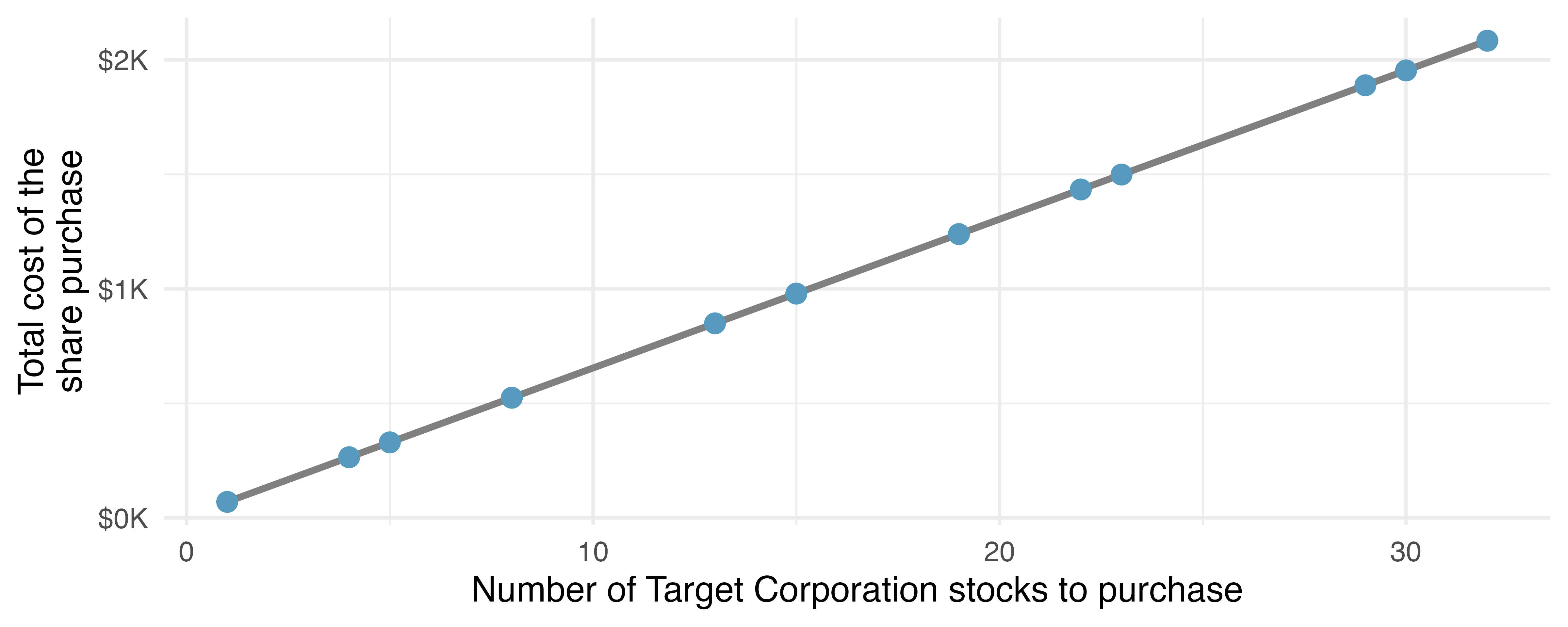
Linear regression is the statistical method for fitting a line to data where the relationship between two variables, \(x\) and \(y,\) can be modeled by a straight line with some error:
\[ y = b_0 + b_1 \ x + e \]
The values \(b_0\) and \(b_1\) represent the model’s intercept and slope, respectively, and the error is represented by \(e.\) These values are calculated based on the data, i.e., they are sample statistics. If the observed data is a random sample from a target population that we are interested in making inferences about, these values are considered to be point estimates for the population parameters \(\beta_0\) and \(\beta_1.\) We will discuss how to make inferences about parameters of a linear model based on sample statistics in Chapter 24.
The Greek letter \(\beta\) is pronounced beta, listen to the pronunciation here.
When we use \(x\) to predict \(y,\) we usually call \(x\) the predictor variable and we call \(y\) the outcome. We also often drop the \(e\) term when writing down the model since our main focus is often on the prediction of the average outcome.
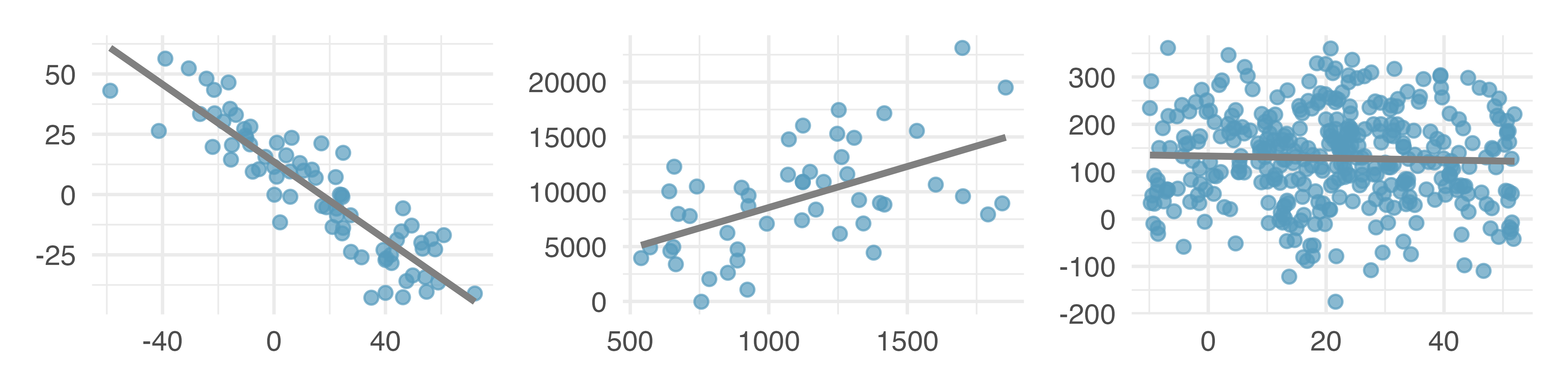
It is rare for all of the data to fall perfectly on a straight line. Instead, it’s more common for data to appear as a cloud of points, such as those examples shown in Figure 7.2. In each case, the data fall around a straight line, even if none of the observations fall exactly on the line. The first plot shows a relatively strong downward linear trend, where the remaining variability in the data around the line is minor relative to the strength of the relationship between \(x\) and \(y.\) The second plot shows an upward trend that, while evident, is not as strong as the first. The last plot shows a very weak downward trend in the data, so slight we can hardly notice it. In each of these examples, we will have some uncertainty regarding our estimates of the model parameters, \(\beta_0\) and \(\beta_1.\) For instance, we might wonder, should we move the line up or down a little, or should we tilt it more or less? As we move forward in this chapter, we will learn about criteria for line-fitting, and we will also learn about the uncertainty associated with estimates of model parameters.
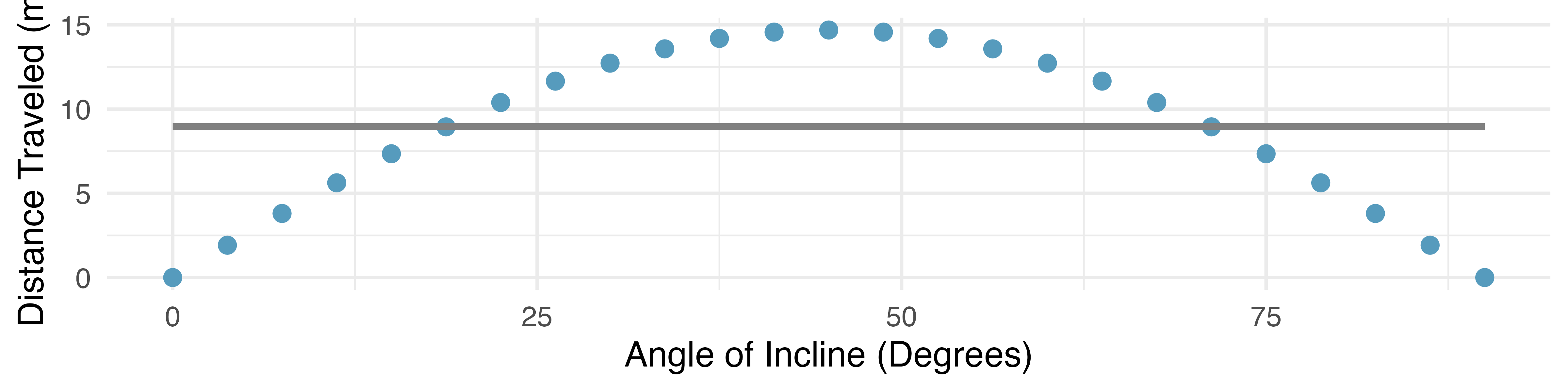
There are also cases where fitting a straight line to the data, even if there is a clear relationship between the variables, is not helpful. One such case is shown in Figure 7.3 where there is a very clear relationship between the variables even though the trend is not linear. We discuss nonlinear trends in this chapter and the next, but details of fitting nonlinear models are saved for a later course.
7.1.2 Using linear regression to predict possum head lengths
Brushtail possums are marsupials that live in Australia, and a photo of one is shown in Figure 7.4. Researchers captured 104 of these animals and took body measurements before releasing the animals back into the wild. We consider two of these measurements: the total length of each possum, from head to tail, and the length of each possum’s head.
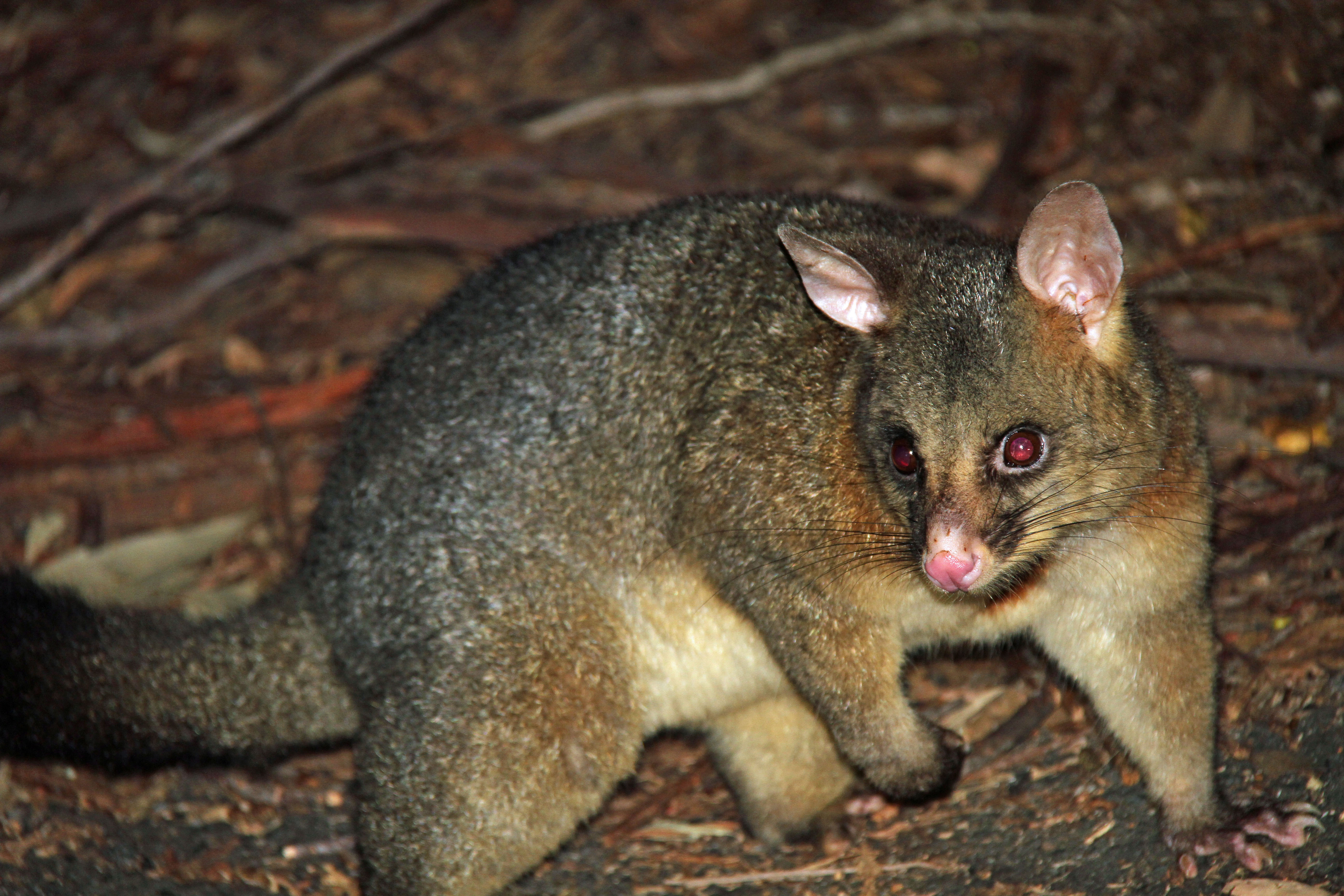
Figure 7.5 shows a scatterplot for the head length (mm) and total length (cm) of the possums. Each point represents a single possum from the data. The head and total length variables are associated: possums with an above average total length also tend to have above average head lengths. While the relationship is not perfectly linear, it could be helpful to partially explain the connection between these variables with a straight line.
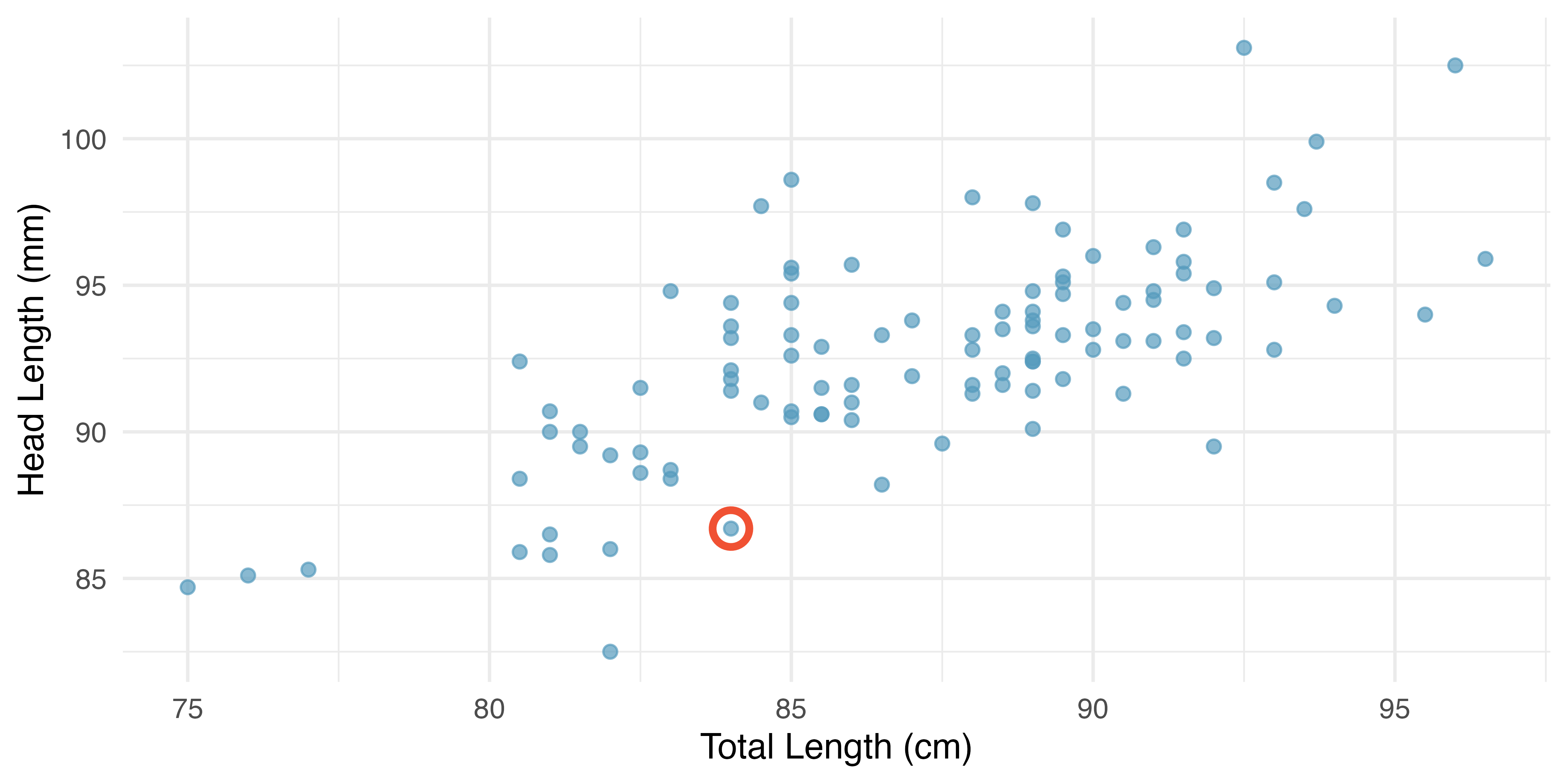
We want to describe the relationship between head and total length of possums with a line. In this example, we will use the total length as the predictor variable, \(x,\) to predict a possum’s head length, \(y.\) We could fit the linear relationship by eye, as in Figure 7.6.
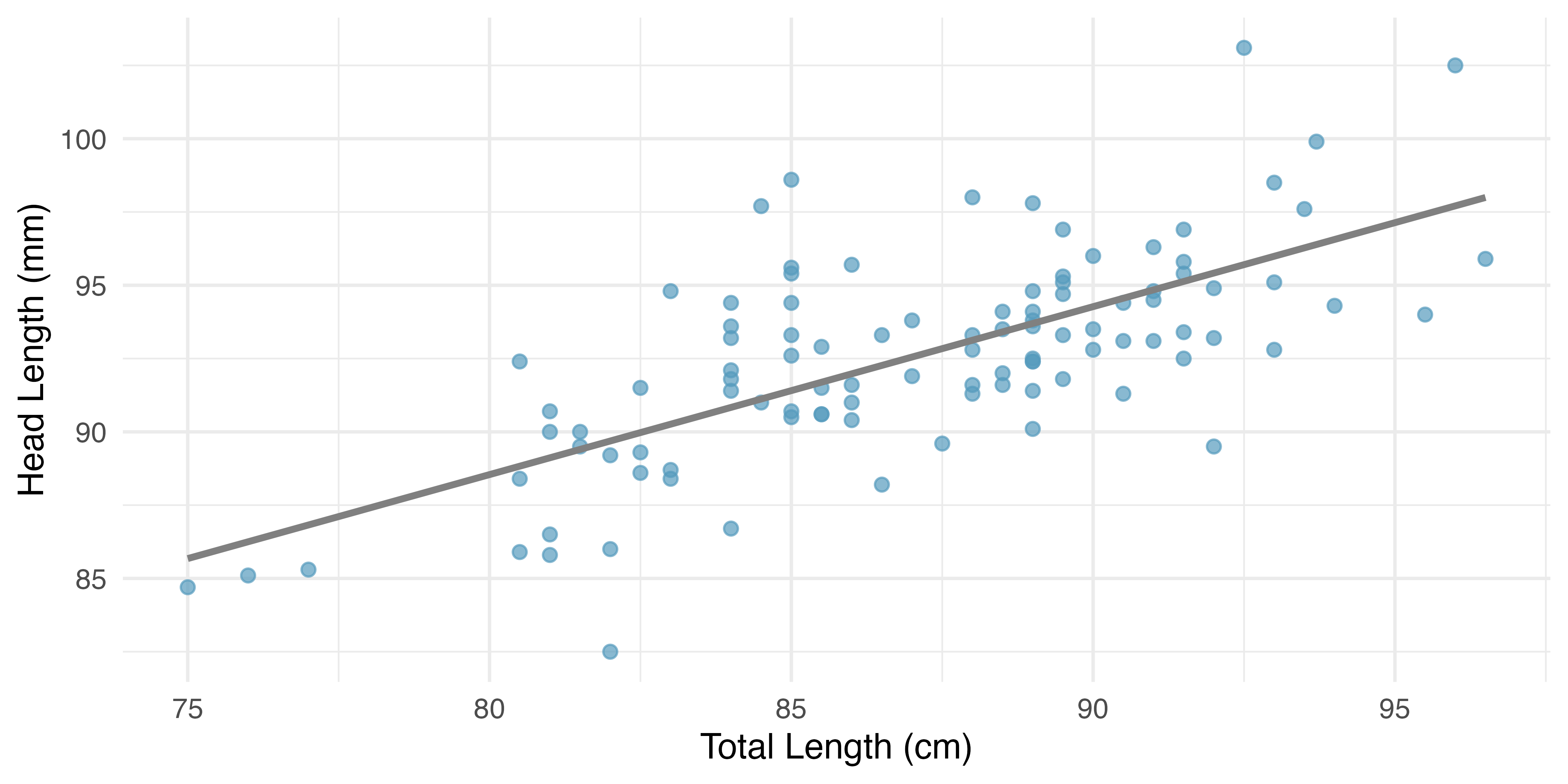
The equation for this line is
\[ \hat{y} = 41 + 0.59x \]
A “hat” on \(y\) is used to signify that this is an estimate. We can use this line to discuss properties of possums. For instance, the equation predicts a possum with a total length of 80 cm will have a head length of
\[ \hat{y} = 41 + 0.59 \times 80 = 88.2 \]
The estimate may be viewed as an average: the equation predicts that possums with a total length of 80 cm will have an average head length of 88.2 mm. Absent further information about an 80 cm possum, the prediction for head length that uses the average is a reasonable estimate.
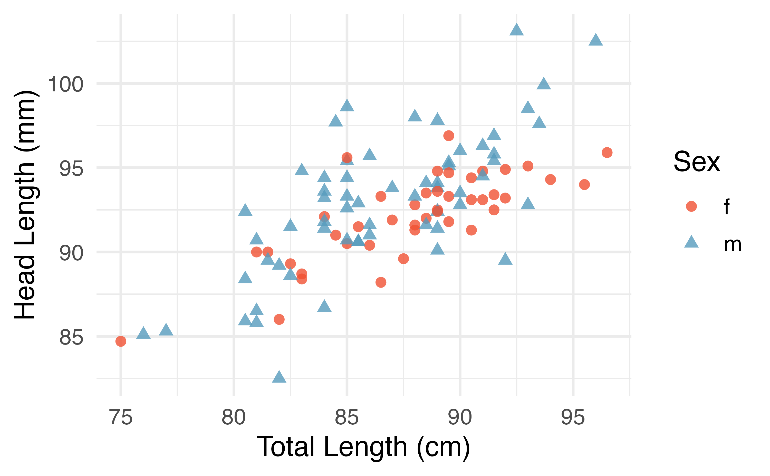
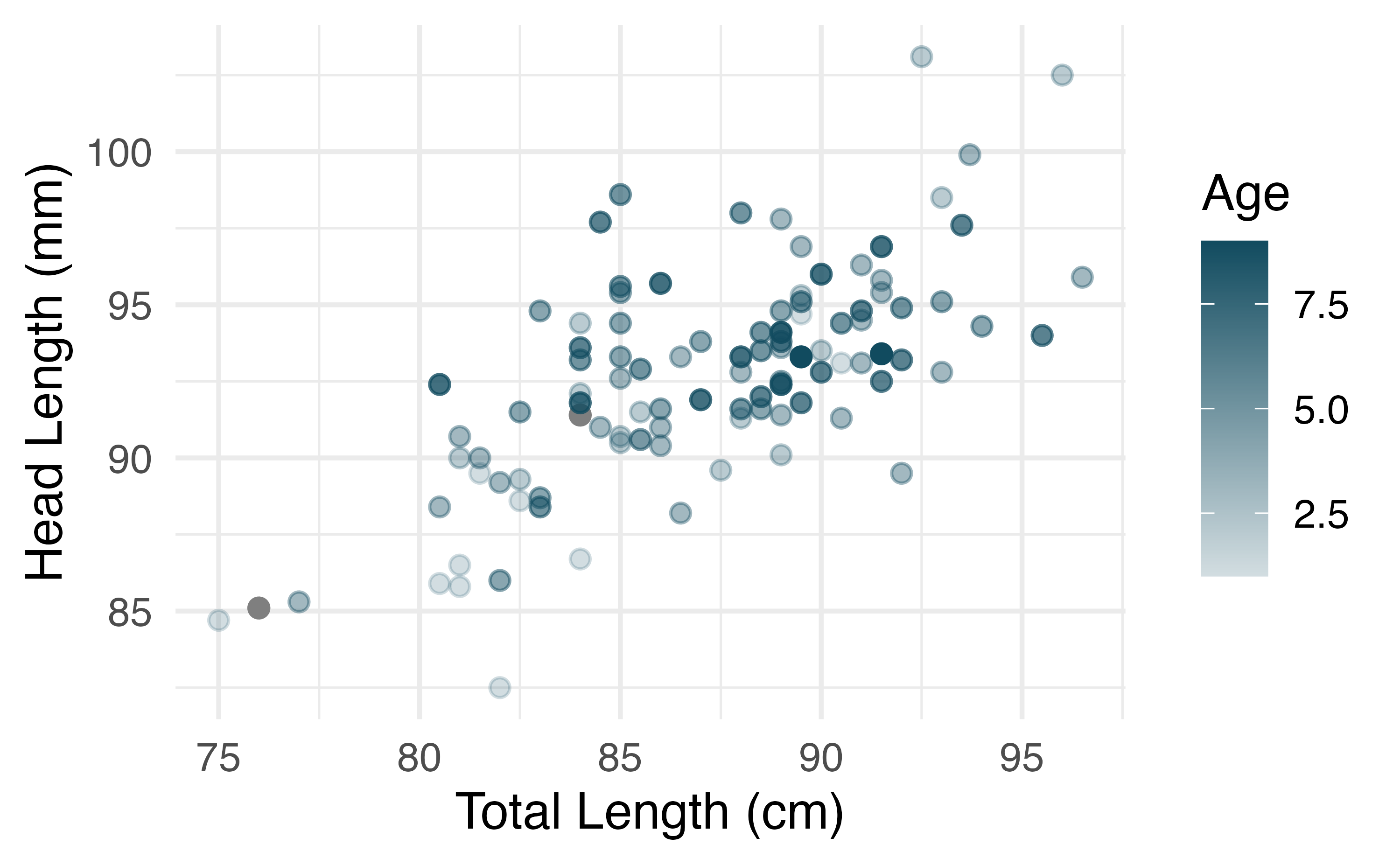
There may be other variables that could help us predict the head length of a possum besides its length. Perhaps the relationship would be a little different for male possums than female possums, or perhaps it would differ for possums from one region of Australia versus another region. Figure 7.7 (a) shows the relationship between total length and head length of brushtail possums, taking into consideration their sex. Male possums (represented by blue triangles) seem to be larger in terms of total length and head length than female possums (represented by red circles). Figure 7.7 (b) shows the same relationship, taking into consideration their age. It’s harder to tell if age changes the relationship between total length and head length for these possums.
In Chapter 8, we’ll learn about how we can include more than one predictor in our model. Before we get there, we first need to better understand how to best build a linear model with one predictor.
7.1.3 Residuals
Residuals are the leftover variation in the data after accounting for the model fit:
\[ \text{Data} = \text{Fit} + \text{Residual} \]
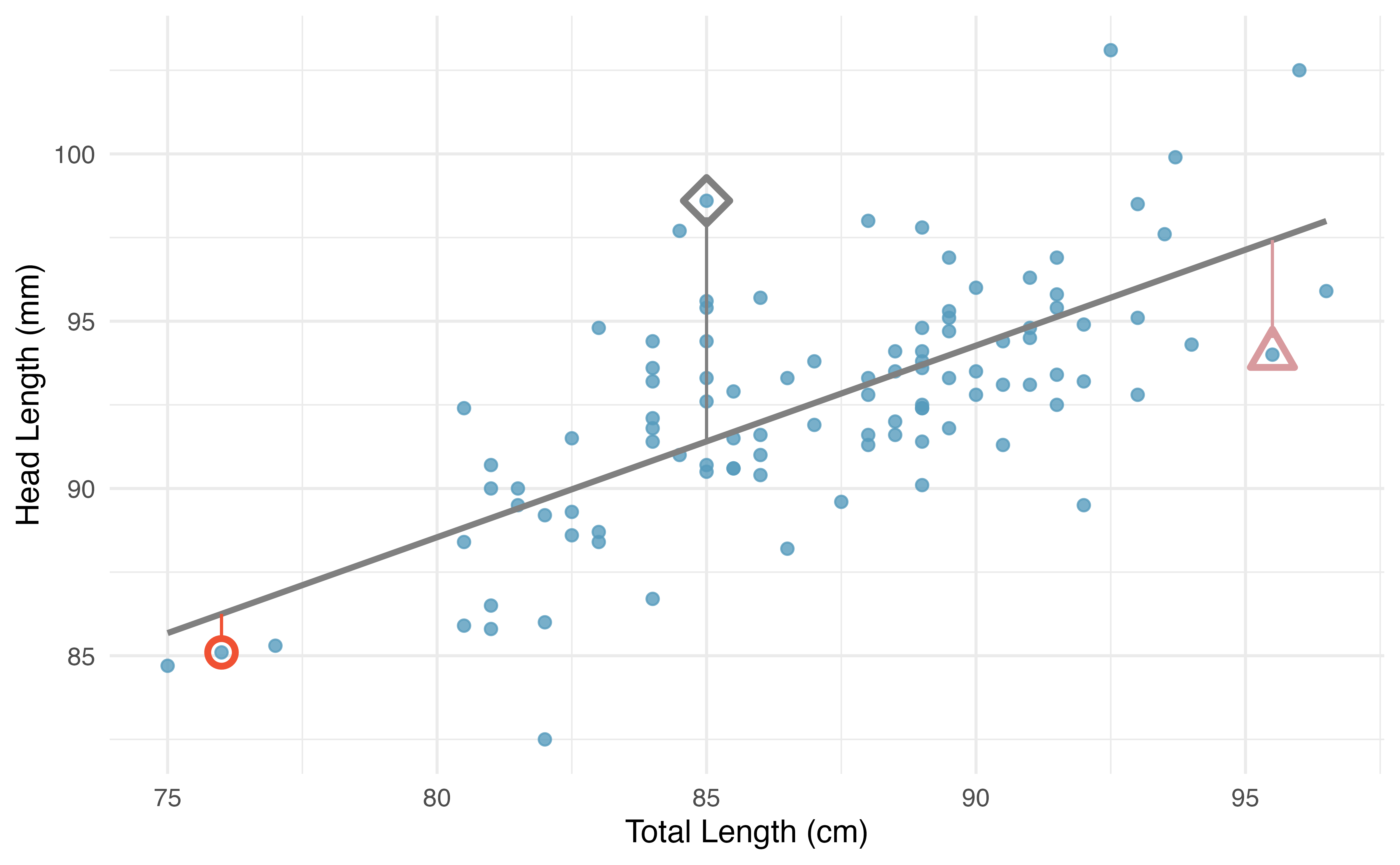
Each observation will have a residual, and three of the residuals for the linear model we fit for the possum data are shown in Figure 7.8. If an observation is above the regression line, then its residual, the vertical distance from the observation to the line, is positive. Observations below the line have negative residuals. One goal in picking the right linear model is for residuals to be as small as possible.
Figure 7.8 is almost a replica of Figure 7.6, with three points from the data highlighted. The observation marked by a red circle has a small, negative residual of about -1; the observation marked by a gray diamond has a large positive residual of about +7; and the observation marked by a pink triangle has a moderate negative residual of about -4. The size of a residual is usually discussed in terms of its absolute value. For example, the residual for the observation marked by a pink triangle is larger than that of the observation marked by a red circle because \(|-4|\) is larger than \(|-1|.\)
Residual: Difference between observed and expected.
The residual of the \(i^{th}\) observation \((x_i, y_i)\) is the difference of the observed outcome \((y_i)\) and the outcome we would predict based on the model fit \((\hat{y}_i):\)
\[ e_i = y_i - \hat{y}_i \]
We typically identify \(\hat{y}_i\) by plugging \(x_i\) into the model.
The linear fit shown in Figure 7.8 is given as \(\hat{y} = 41 + 0.59x.\) Based on this line, compute the residual of the observation \((76.0, 85.1).\) This observation is marked by a red circle in Figure 7.8. Check it against the earlier visual estimate, -1.
We first compute the predicted value of the observation marked by a red circle based on the model: \(\hat{y} = 41+0.59x = 41+0.59\times 76.0 = 85.84\). Next we compute the difference of the actual head length and the predicted head length: \(e = y - \hat{y} = 85.1 - 85.84 = -0.74\). The model’s error is \(e = -0.74\) mm, which is very close to the visual estimate of -1 mm. The negative residual indicates that the linear model overpredicted head length for this possum.
If a model underestimates an observation, will the residual be positive or negative? What about if it overestimates the observation?1
Compute the residuals for the observation marked by a blue diamond, \((85.0, 98.6),\) and the observation marked by a pink triangle, \((95.5, 94.0),\) in the figure using the linear relationship \(\hat{y} = 41 + 0.59x.\)2
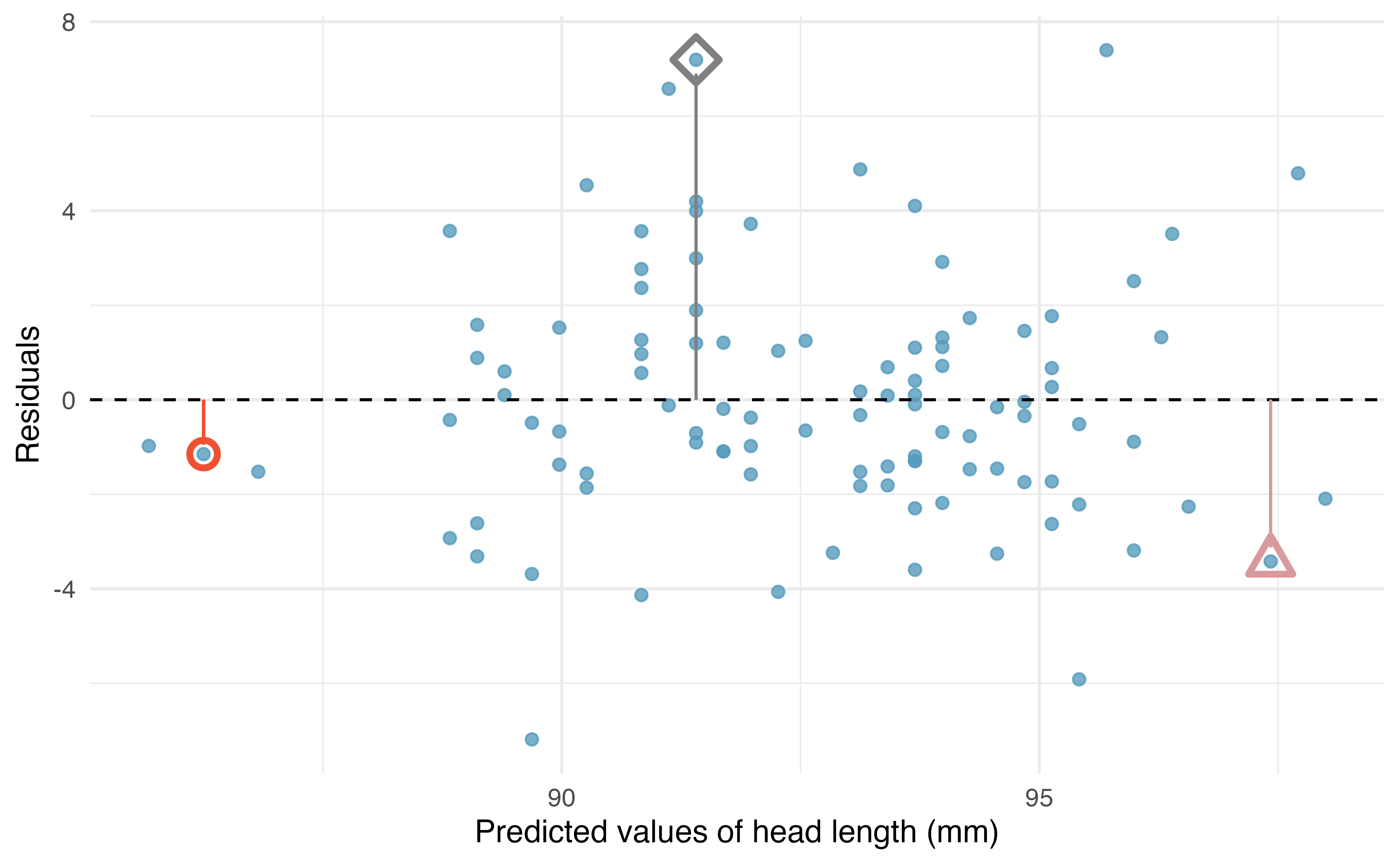
Residuals are helpful in evaluating how well a linear model fits a dataset. We often display them in a scatterplot such as the one shown in Figure 7.9 for the regression line in Figure 7.8. The residuals are plotted with their predicted outcome variable value as the horizontal coordinate, and the vertical coordinate as the residual. For instance, the point \((85.0, 98.6)\) (marked by the blue diamond) had a predicted value of 91.4 mm and had a residual of 7.45 mm, so in the residual plot it is placed at \((91.4, 7.45).\) Creating a residual plot is sort of like tipping the scatterplot over so the regression line is horizontal, as indicated by the dashed line.
One purpose of residual plots is to identify characteristics or patterns still apparent in the data after fitting a model. The figure below shows three scatterplots with linear models in the first row and residual plots in the second row. Can you identify any patterns in the residuals?
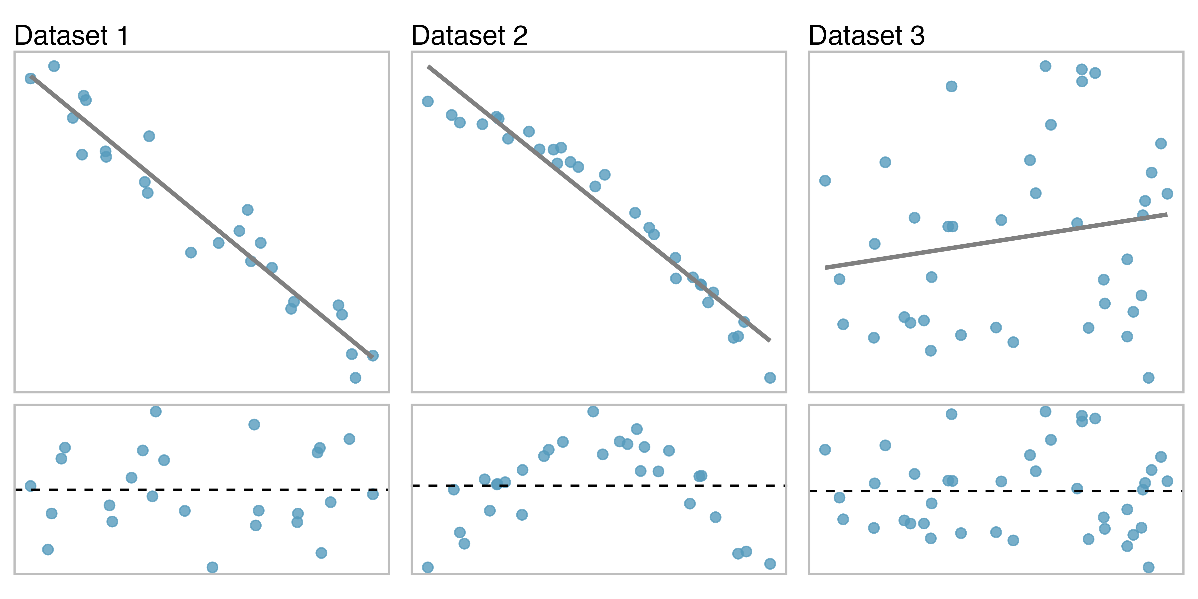
Dataset 1: the residuals show no obvious patterns. The residuals are scattered randomly around 0, represented by the dashed line.
Dataset 2: The second dataset shows a pattern in the residuals. There is some curvature in the scatterplot, which is more obvious in the residual plot. We should not use a straight line to model these data. Instead, a more advanced technique should be used to model the curved relationship, such as the variable transformations discussed in Section 5.7.
Dataset 3: The last plot shows very little upwards trend, and the residuals also show no obvious patterns. It is reasonable to try to fit a linear model to the data. However, it is unclear whether there is evidence that the slope parameter is different from zero. The point estimate of the slope parameter is not zero, but we might wonder if this could just be due to chance. We will address this scenario in Chapter 24.
7.1.4 Describing linear relationships with correlation
We’ve seen plots with strong linear relationships and others with very weak linear relationships. It would be useful if we could quantify the strength of these linear relationships with a statistic.
Correlation: strength of a linear relationship.
Correlation which always takes values between -1 and 1, describes the strength and direction of the linear relationship between two variables. We denote the correlation by \(r.\)
The correlation value has no units and will not be affected by a linear change in the units (e.g., going from inches to centimeters).
We can compute the correlation using a formula, just as we did with the sample mean and standard deviation. The formula for correlation, however, is rather complex3, and like with other statistics, we generally perform the calculations on a computer or calculator.
\[ r = \frac{1}{n-1} \sum_{i=1}^{n} \frac{x_i-\bar{x}}{s_x}\frac{y_i-\bar{y}}{s_y} \]
where \(\bar{x},\) \(\bar{y},\) \(s_x,\) and \(s_y\) are the sample means and standard deviations for each variable.
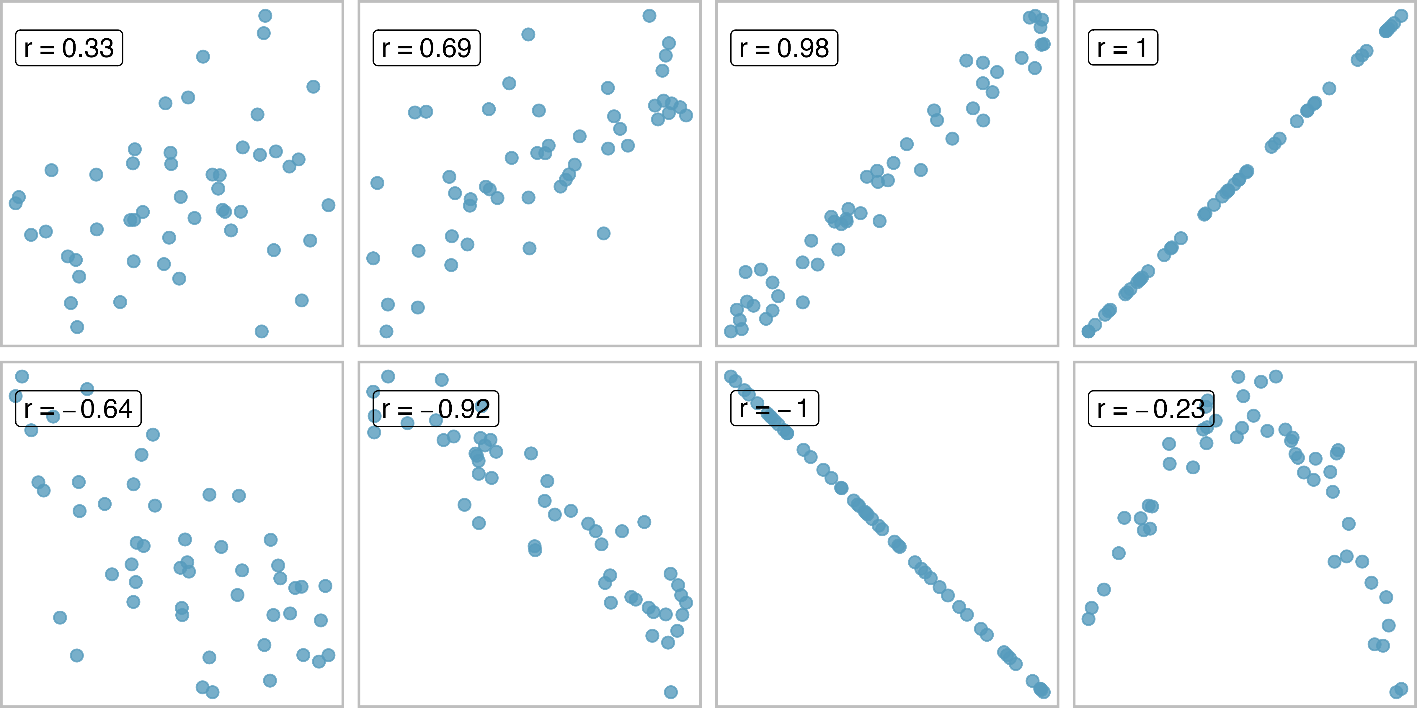
Figure 7.10 shows eight plots and their corresponding correlations. Only when the relationship is perfectly linear is the correlation either -1 or +1. If the relationship is strong and positive, the correlation will be near +1. If it is strong and negative, it will be near -1. If there is no apparent linear relationship between the variables, then the correlation will be near zero.
The correlation is intended to quantify the strength of a linear trend. Nonlinear trends, even when strong, sometimes produce correlations that do not reflect the strength of the relationship; see three such examples in Figure 7.11.
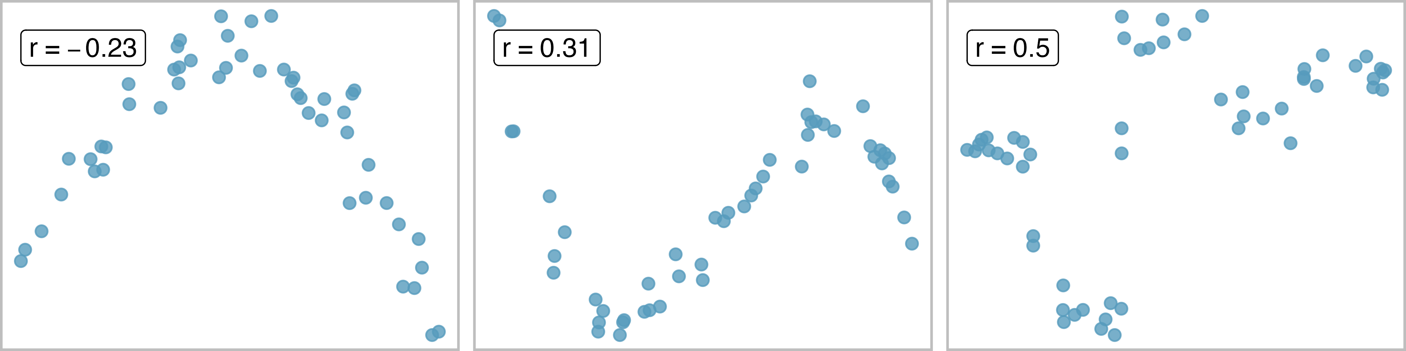
No straight line is a good fit for any of the datasets represented in Figure 7.11. Try drawing nonlinear curves on each plot. Once you create a curve for each, describe what is important in your fit.4
The plot below displays the relationships between various crop yields in countries. In the plots, each point represents a different country. The x and y variables represent the proportion of total yield in the last 50 years which is due to that crop type. If a country did not produce a particular crop, it has been removed from the plot (so different plots may have different numbers of dots, each corresponding to one country).
Order the six scatterplots from strongest negative to strongest positive linear relationship.
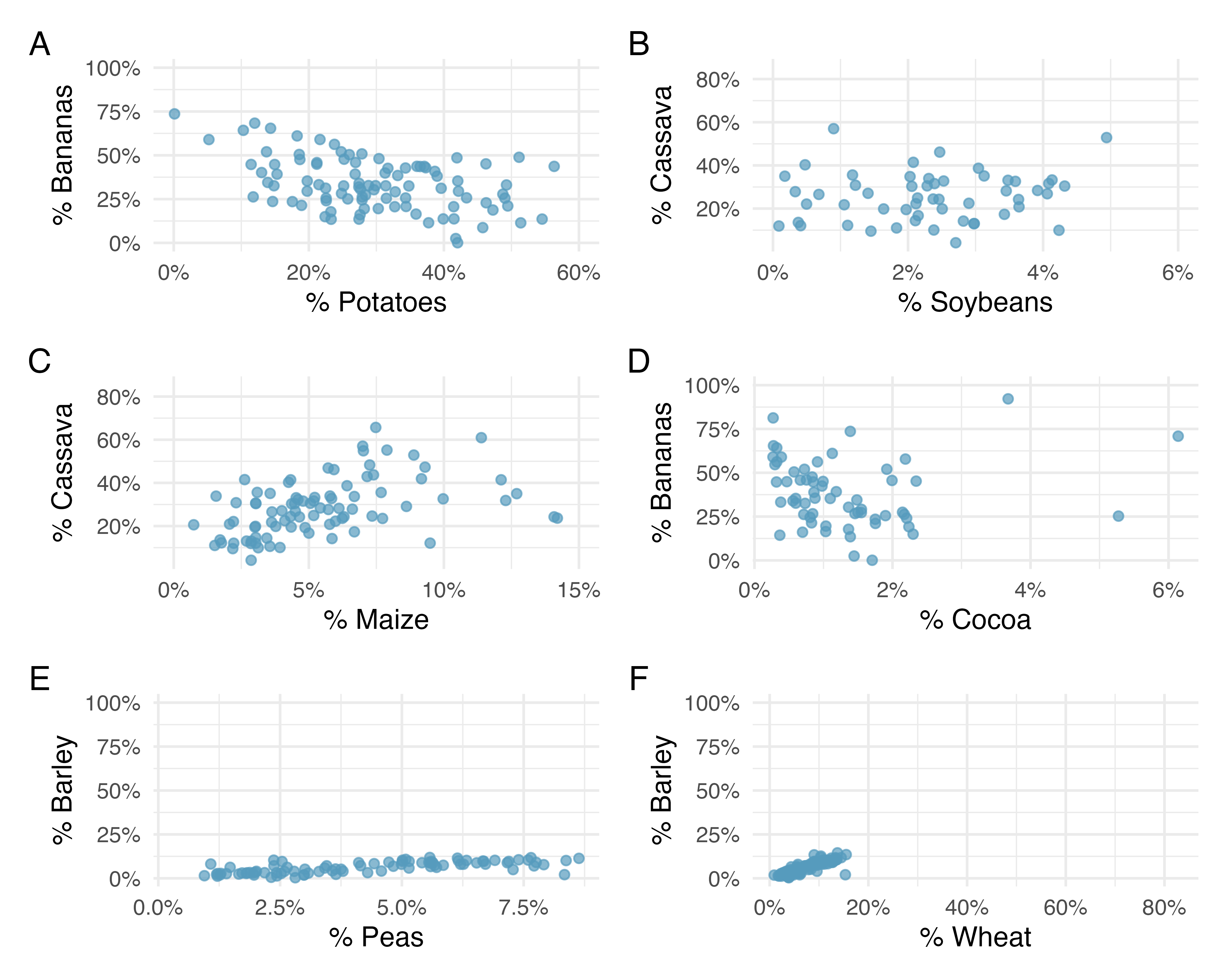
The order of most negative correlation to most positive correlation is:
\[ A \rightarrow D \rightarrow B \rightarrow C \rightarrow E \rightarrow F \]
- Plot A - bananas vs. potatoes: -0.45
- Plot B - cassava vs. soybeans: 0.19
- Plot C - cassava vs. maize: 0.41
- Plot D - cocoa vs. bananas: 0.01
- Plot E - peas vs. barley: 0.71
- Plot F - wheat vs. barley: 0.86
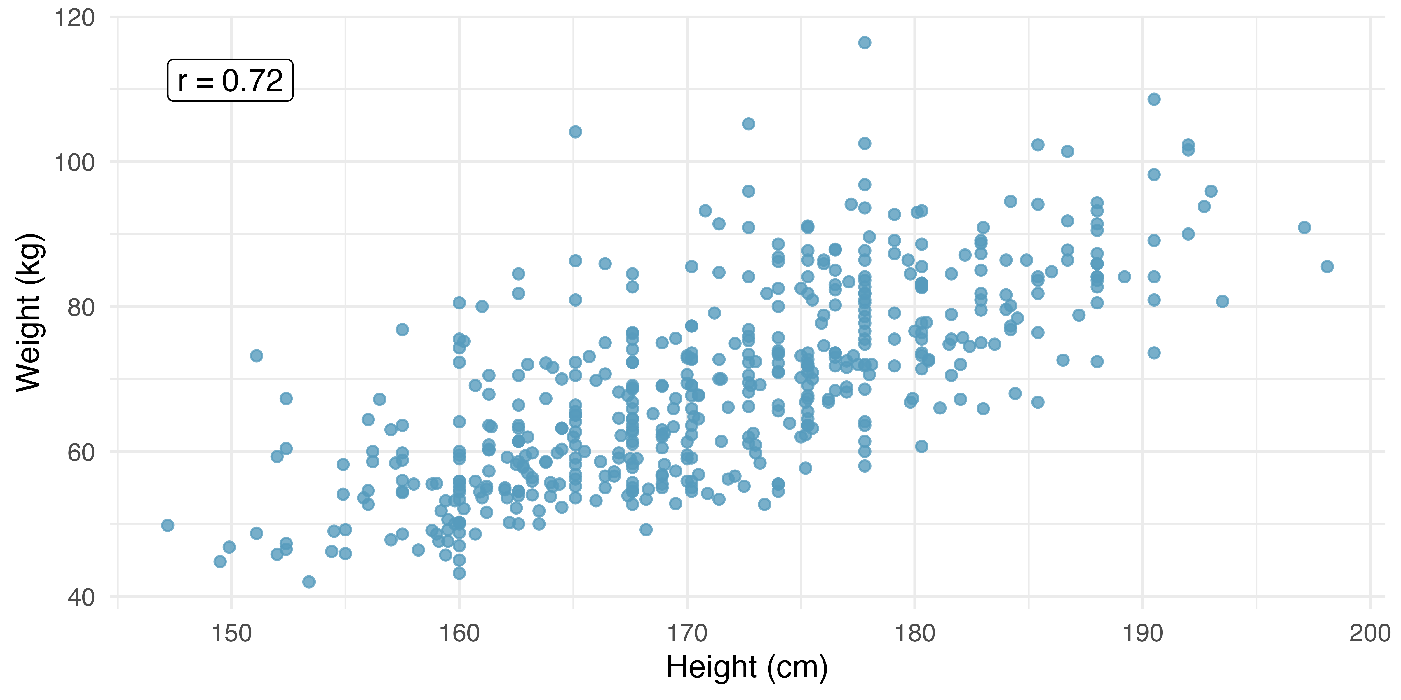
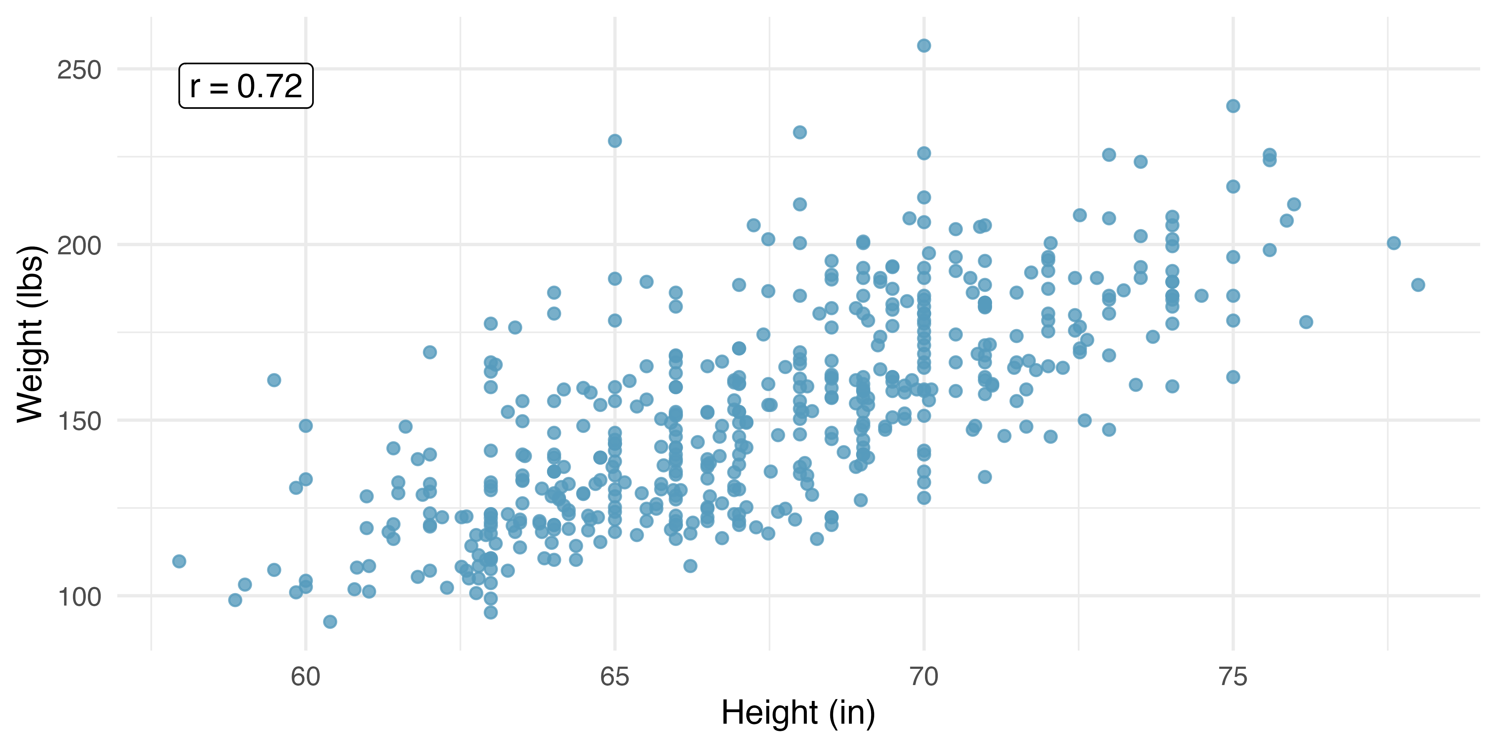
One important aspect of the correlation is that it’s unitless. That is, unlike a measurement of the slope of a line (see the next section) which provides an increase in the y-coordinate for a one unit increase in the x-coordinate (in units of the x and y variable), there are no units associated with the correlation of x and y. Figure 7.12 shows the relationship between weights and heights of 507 physically active individuals. In Figure 7.12 (a), weight is measured in kilograms (kg) and height in centimeters (cm). In Figure 7.12 (b), weight has been converted to pounds (lbs) and height to inches (in). The correlation coefficient (\(r = 0.72\)) is also noted on both plots. We can see that the shape of the relationship has not changed, and neither has the correlation coefficient. The only visual change to the plot is the axis labeling of the points.
7.2 Least squares regression
Fitting linear models by eye is open to criticism since it is based on an individual’s preference. In this section, we use least squares regression as a more rigorous approach to fitting a line to a scatterplot.
7.2.1 Gift aid for first-year at Elmhurst College
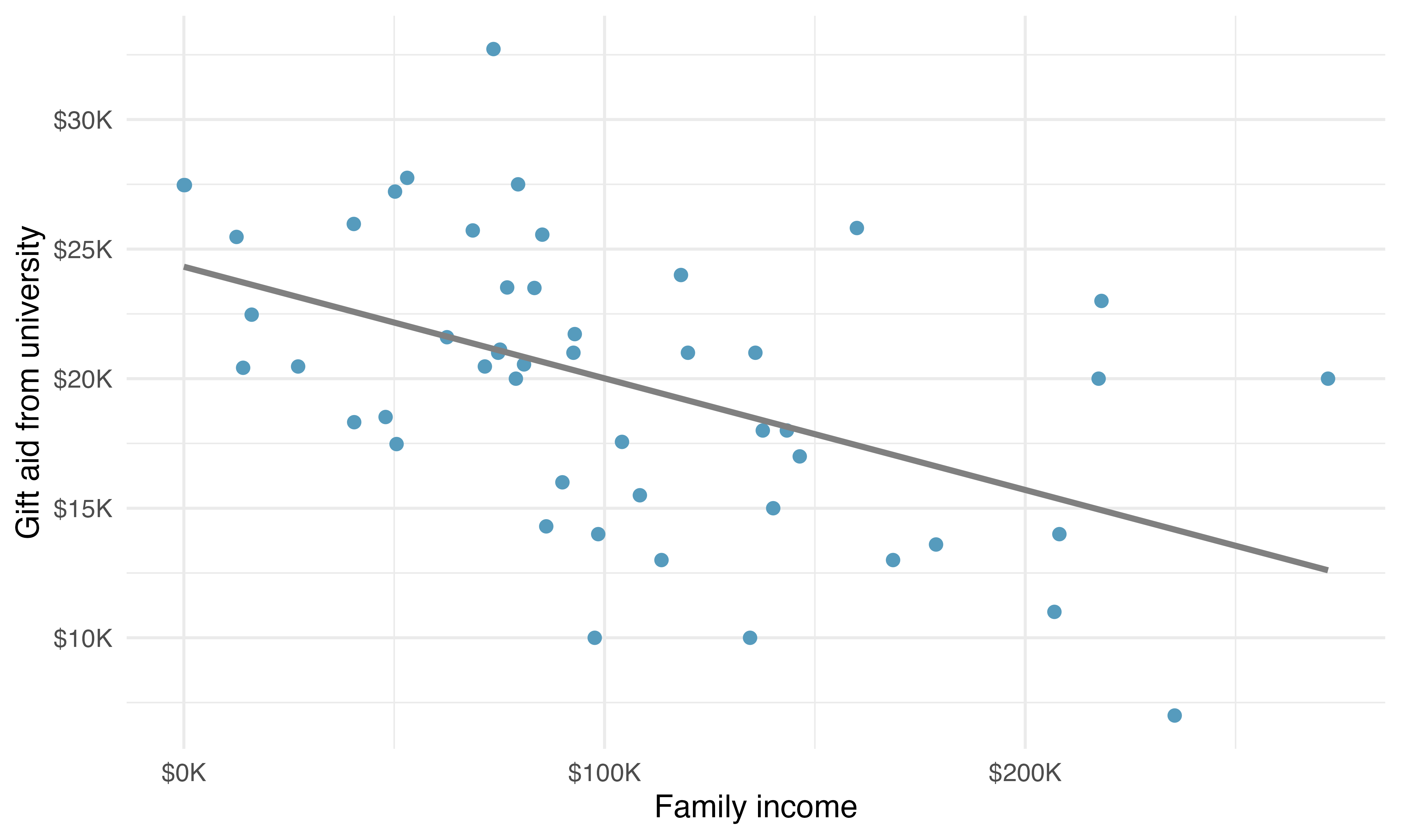
This section considers a dataset on family income and gift aid data from a random sample of fifty students in the first-year class of Elmhurst College in Illinois. Gift aid is financial aid that does not need to be paid back, as opposed to a loan. A scatterplot of these data is shown in Figure 7.13 along with a linear fit. The line follows a negative trend in the data; students who have higher family incomes tended to have lower gift aid from the university.
Is the correlation positive or negative in Figure 7.13?5
7.2.2 An objective measure for finding the best line
We begin by thinking about what we mean by the “best” line. Mathematically, we want a line that has small residuals. But beyond the mathematical reasons, hopefully it also makes sense intuitively that whatever line we fit, the residuals should be small (i.e., the points should be close to the line). The first option that may come to mind is to minimize the sum of the residual magnitudes:
\[ |e_1| + |e_2| + \dots + |e_n| \]
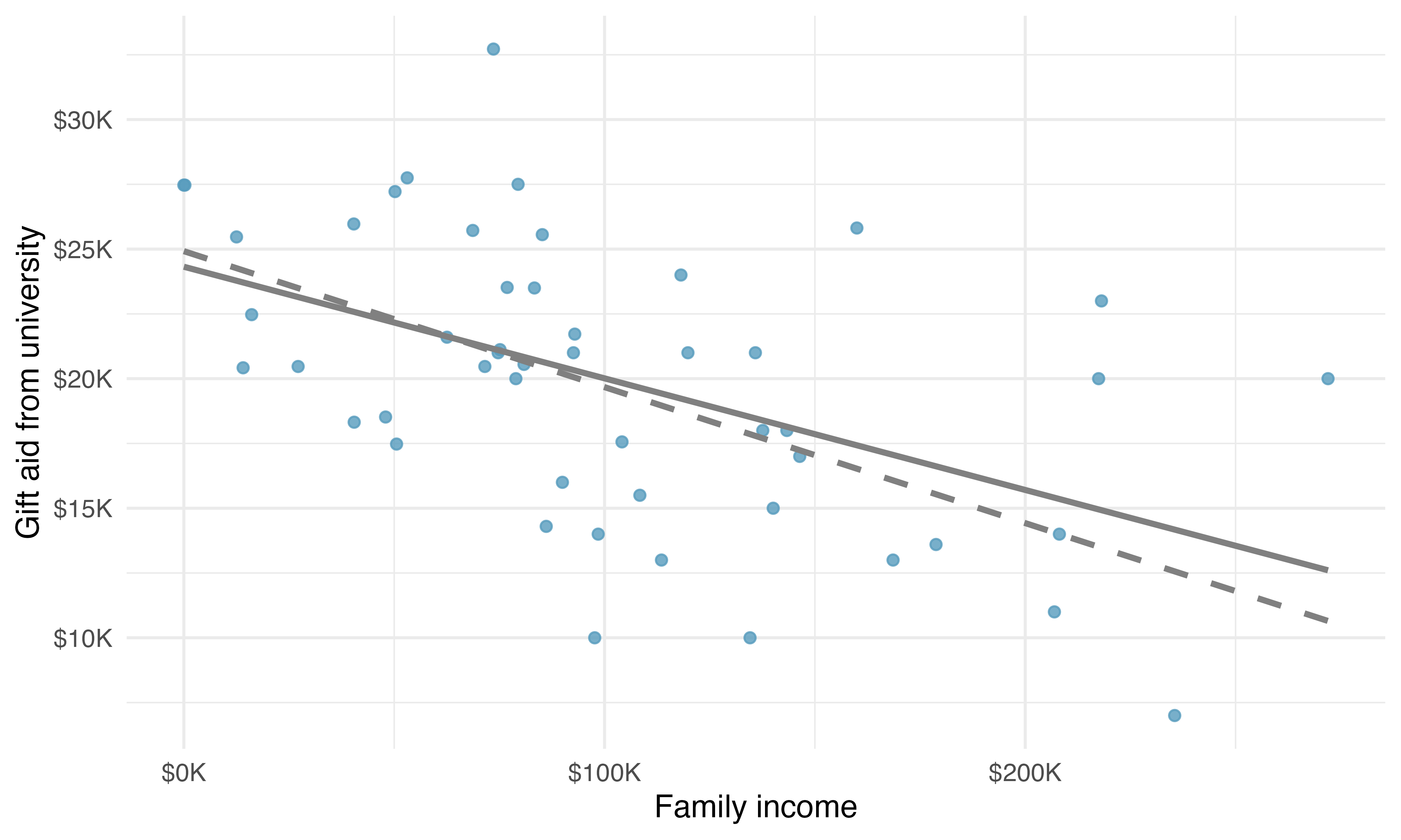
which we could accomplish with a computer program. The resulting dashed line shown in Figure 7.14 demonstrates this fit can be quite reasonable.
However, a more common practice is to choose the line that minimizes the sum of the squared residuals:
\[ e_{1}^2 + e_{2}^2 + \dots + e_{n}^2 \]
The line that minimizes this least squares criterion is represented as the solid line in Figure 7.14 and is commonly called the least squares line. The following are four possible reasons to choose the least squares option instead of trying to minimize the sum of residual magnitudes without any squaring:
- It is the most commonly used method.
- Computing the least squares line is widely supported in statistical software.
- In many applications, a residual twice as large as another residual is more than twice as bad. For example, being off by 4 is usually more than twice as bad as being off by 2. Squaring the residuals accounts for this discrepancy.
- The analyses which link the model to inference about a population are most straightforward when the line is fit through least squares.
The first two reasons are largely for tradition and convenience; the third and fourth reasons explain why the least squares criterion is typically most helpful when working with real data.6
7.2.3 Finding and interpreting the least squares line
For the Elmhurst data, we could write the equation of the least squares regression line as
\[ \widehat{\texttt{aid}} = \beta_0 + \beta_{1}\times \texttt{family\_income} \]
Here the equation is set up to predict gift aid based on a student’s family income, which would be useful to students considering Elmhurst. These two values, \(\beta_0\) and \(\beta_1,\) are the parameters of the regression line.
The parameters are estimated using the observed data. In practice, this estimation is done using a computer in the same way that other estimates, like a sample mean, can be estimated using a computer or calculator.
The dataset where these data are stored is called elmhurst. The first 5 rows of this dataset are given in Table 7.1.
elmhurst dataset.
| family_income | gift_aid | price_paid |
|---|---|---|
| 92.92 | 21.7 | 14.28 |
| 0.25 | 27.5 | 8.53 |
| 53.09 | 27.8 | 14.25 |
| 50.20 | 27.2 | 8.78 |
| 137.61 | 18.0 | 24.00 |
We can see that family income is recorded in a variable called family_income and gift aid from university is recorded in a variable called gift_aid. For now, we won’t worry about the price_paid variable. We should also note that these data are from the 2011-2012 academic year, and all monetary amounts are given in $1,000s, i.e., the family income of the first student in the data shown in Table 7.1 is $92,920 and they received a gift aid of $21,700. (The data source states that all numbers have been rounded to the nearest whole dollar.)
Statistical software is usually used to compute the least squares line and the typical output generated as a result of fitting regression models looks like the one shown in Table 7.2. For now we will focus on the first column of the output, which lists \({b}_0\) and \({b}_1.\) In Chapter 24 we will dive deeper into the remaining columns which give us information on how accurate and precise these values of intercept and slope that are calculated from a sample of 50 students are in estimating the population parameters of intercept and slope for all students.
| term | estimate | std.error | statistic | p.value |
|---|---|---|---|---|
| (Intercept) | 24.32 | 1.29 | 18.83 | <0.0001 |
| family_income | -0.04 | 0.01 | -3.98 | 2e-04 |
The model output tells us that the intercept is approximately 24.319 and the slope on family_income is approximately -0.043.
But what do these values mean? Interpreting parameters in a regression model is often one of the most important steps in the analysis.
The intercept and slope estimates for the Elmhurst data are \(b_0\) = 24.319 and \(b_1\) = -0.043. What do these numbers really mean?
Interpreting the slope parameter is helpful in almost any application. For each additional $1,000 of family income, we would expect a student to receive a net difference of 1,000 \(\times\) (-0.0431) = -$43.10 in aid on average, i.e., $43.10 less. Note that a higher family income corresponds to less aid because the coefficient of family income is negative in the model. We must be cautious in this interpretation: while there is a real association, we cannot interpret a causal connection between the variables because these data are observational. That is, increasing a particular student’s family income may not cause the student’s aid to drop. (Although it would be reasonable to contact the college and ask if the relationship is causal, i.e., if Elmhurst College’s aid decisions are partially based on students’ family income.)
The estimated intercept \(b_0\) = 24.319 describes the average aid if a student’s family had no income, $24,319. The meaning of the intercept is relevant to this application since the family income for some students at Elmhurst is $0. In other applications, the intercept may have little or no practical value if there are no observations where \(x\) is near zero.
Interpreting parameters estimated by least squares.
The slope describes the estimated difference in the predicted average outcome of \(y\) if the predictor variable \(x\) happened to be one unit larger. The intercept describes the average outcome of \(y\) if \(x = 0\) and the linear model is valid all the way to \(x = 0\) (values of \(x = 0\) are not observed or relevant in many applications).
If you would like to learn more about using R to fit linear models, see Section 10.2 for the interactive R tutorials. An alternative way of calculating the values of intercept and slope of a least squares line is manual calculations using formulas. While manual calculations are not commonly used by practicing statisticians and data scientists, it is useful to work through the first time you’re learning about the least squares line and modeling in general. Calculating the values by hand leverages two properties of the least squares line:
- The slope of the least squares line can be estimated by
\[ b_1 = \frac{s_y}{s_x} r \]
where \(r\) is the correlation between the two variables, and \(s_x\) and \(s_y\) are the sample standard deviations of the predictor and outcome, respectively.
- If \(\bar{x}\) is the sample mean of the predictor variable and \(\bar{y}\) is the sample mean of the outcome variable, then the point \((\bar{x}, \bar{y})\) falls on the least squares line.
Table 7.3 shows the sample means for the family income and gift aid as $101,780 and $19,940, respectively. We could plot the point \((102, 19.9)\) on Figure 7.13 to verify it falls on the least squares line (the solid line).
| mean | sd | mean | sd | r |
|---|---|---|---|---|
| 102 | 63.2 | 19.9 | 5.46 | -0.499 |
Next, we find the point estimates \(b_0\) and \(b_1\) of the parameters \(\beta_0\) and \(\beta_1.\)
Using the summary statistics in Table 7.3, compute the slope for the regression line of gift aid against family income.
Compute the slope using the summary statistics from Table 7.3:
\[ b_1 = \frac{s_y}{s_x} r = \frac{5.46}{63.2}(-0.499) = -0.0431 \]
You might recall the form of a line from math class, which we can use to find the model fit, including the estimate of \(b_0.\) Given the slope of a line and a point on the line, \((x_0, y_0),\) the equation for the line can be written as
\[ y - y_0 = slope\times (x - x_0) \]
Identifying the least squares line from summary statistics.
To identify the least squares line from summary statistics:
- Estimate the slope parameter, \(b_1 = (s_y / s_x) r.\)
- Note that the point \((\bar{x}, \bar{y})\) is on the least squares line, use \(x_0 = \bar{x}\) and \(y_0 = \bar{y}\) with the point-slope equation: \(y - \bar{y} = b_1 (x - \bar{x}).\)
- Simplify the equation, we get \(y = \bar{y} - b_1 \bar{x} + b_1 x,\) which reveals that \(b_0 = \bar{y} - b_1 \bar{x}.\)
Using the point (102, 19.9) from the sample means and the slope estimate \(b_1 = -0.0431,\) find the least-squares line for predicting aid based on family income.
Apply the point-slope equation using \((102, 19.9)\) and the slope \(b_1 = -0.0431\):
\[ \begin{aligned} y - y_0 &= b_1 (x - x_0) \\ y - 19.9 &= -0.0431 (x - 102) \end{aligned} \]
Expanding the right side and then adding 19.9 to each side, the equation simplifies:
\[ \widehat{\texttt{aid}} = 24.3 - 0.0431 \times \texttt{family\_income} \]
Here we have replaced \(y\) with \(\widehat{\texttt{aid}}\) and \(x\) with \(\texttt{family\_income}\) to put the equation in context. The final least squares equation should always include a “hat” on the variable being predicted, whether it is a generic \(``y"\) or a named variable like \(``aid"\).
Suppose a high school senior is considering Elmhurst College. Can they simply use the linear equation that we have estimated to calculate her financial aid from the university?
She may use it as an estimate, though some qualifiers on this approach are important. First, all data come from one first-year class, and the way aid is determined by the university may change from year to year. Second, the equation will provide an imperfect estimate. While the linear equation is good at modeling the trend in the data, no individual student’s aid will be perfectly predicted (as can be seen from the individual data points around the line).
7.2.4 Extrapolation is treacherous
Linear models can be used to approximate the relationship between two variables. However, like any model, they have real limitations. Linear regression is simply a modeling framework. The truth is almost always much more complex than a simple line. For example, we do not know how the data outside of our limited window will behave.
Use the model \(\widehat{\texttt{aid}} = 24.3 - 0.0431 \times \texttt{family\_income}\) to estimate the aid of another first-year student whose family had income of $1 million.
We want to calculate the aid for a family with $1 million income. Note that in our model this will be represented as 1,000 since the data are in $1,000s.
\[ 24.3 - 0.0431 \times 1000 = -18.8 \]
The model predicts this student will have -$18,800 in aid (!). However, Elmhurst College does not offer negative aid where they select some students to pay extra on top of tuition to attend.
Applying a model estimate to values outside of the realm of the original data is called extrapolation. Generally, a linear model is only an approximation of the real relationship between two variables. If we extrapolate, we are making an unreliable bet that the approximate linear relationship will be valid in places where it has not been analyzed.
7.2.5 Describing the strength of a fit
We evaluated the strength of the linear relationship between two variables earlier using the correlation, \(r.\) However, it is more common to explain the strength of a linear fit using \(R^2,\) called R-squared. If provided with a linear model, we might like to describe how closely the data cluster around the linear fit.
The \(R^2\) of a linear model describes the amount of variation in the outcome variable that is explained by the least squares line. For example, consider the Elmhurst data, shown in Figure 7.13). The variance of the outcome variable, aid received, is about \(s_{aid}^2 \approx 29.8\) million (calculated from the data, some of which is shown in Table 7.1). However, if we apply our least squares line, then this model reduces our uncertainty in predicting aid using a student’s family income. The variability in the residuals describes how much variation remains after using the model: \(s_{_{RES}}^2 \approx 22.4\) million. In short, there was a reduction of
\[ \frac{s_{aid}^2 - s_{_{RES}}^2}{s_{aid}^2} = \frac{29800 - 22400}{29800} = \frac{7500}{29800} \approx 0.25, \]
or about 25%, of the outcome variable’s variation by using information about family income for predicting aid using a linear model. It turns out that \(R^2\) corresponds exactly to the squared value of the correlation:
\[ r = -0.499 \rightarrow R^2 = 0.25 \]
If a linear model has a very strong negative relationship with a correlation of -0.97, how much of the variation in the outcome is explained by the predictor?7
\(R^2\) is also called the coefficient of determination.
Coefficient of determination: proportion of variability in the outcome variable explained by the model.
Since \(r\) is always between -1 and 1, \(R^2\) will always be between 0 and 1. This statistic is called the coefficient of determination, and it measures the proportion of variation in the outcome variable, \(y,\) that can be explained by the linear model with predictor \(x.\)
More generally, \(R^2\) can be calculated as a ratio of a measure of variability around the line divided by a measure of total variability.
Sums of squares to measure variability in \(y.\)
We can measure the variability in the \(y\) values by how far they tend to fall from their mean, \(\bar{y}.\) We define this value as the total sum of squares, calculated using the formula below, where \(y_i\) represents each \(y\) value in the sample, and \(\bar{y}\) represents the mean of the \(y\) values in the sample.
\[ SST = (y_1 - \bar{y})^2 + (y_2 - \bar{y})^2 + \cdots + (y_n - \bar{y})^2. \]
Left-over variability in the \(y\) values if we know \(x\) can be measured by the sum of squared errors, or sum of squared residuals, calculated using the formula below, where \(\hat{y}_i\) represents the predicted value of \(y_i\) based on the least squares regression.8,
\[ \begin{aligned} SSE &= (y_1 - \hat{y}_1)^2 + (y_2 - \hat{y}_2)^2 + \cdots + (y_n - \hat{y}_n)^2\\ &= e_{1}^2 + e_{2}^2 + \dots + e_{n}^2 \end{aligned} \]
The coefficient of determination can then be calculated as
\[ R^2 = \frac{SST - SSE}{SST} = 1 - \frac{SSE}{SST} \]
Among 50 students in the elmhurst dataset, the total variability in gift aid is \(SST = 1461\).9 The sum of squared residuals is \(SSE = 1098.\) Find \(R^2.\)
Since we know \(SSE\) and \(SST,\) we can calculate \(R^2\) as
\[ R^2 = 1 - \frac{SSE}{SST} = 1 - \frac{1098}{1461} = 0.25, \]
the same value we found when we squared the correlation: \(R^2 = (-0.499)^2 = 0.25.\)
7.2.6 Categorical predictors with two levels
Categorical variables are also useful in predicting outcomes. Here we consider a categorical predictor with two levels (recall that a level is the same as a category). We’ll consider Ebay auctions for a video game, Mario Kart for the Nintendo Wii, where both the total price of the auction and the condition of the game were recorded. Here we want to predict total price based on game condition, which takes values used and new.
A plot of the auction data is shown in Figure 7.15. Note that the original dataset contains some Mario Kart games being sold at prices above $100 but for this analysis we have limited our focus to the 141 Mario Kart games that were sold below $100.
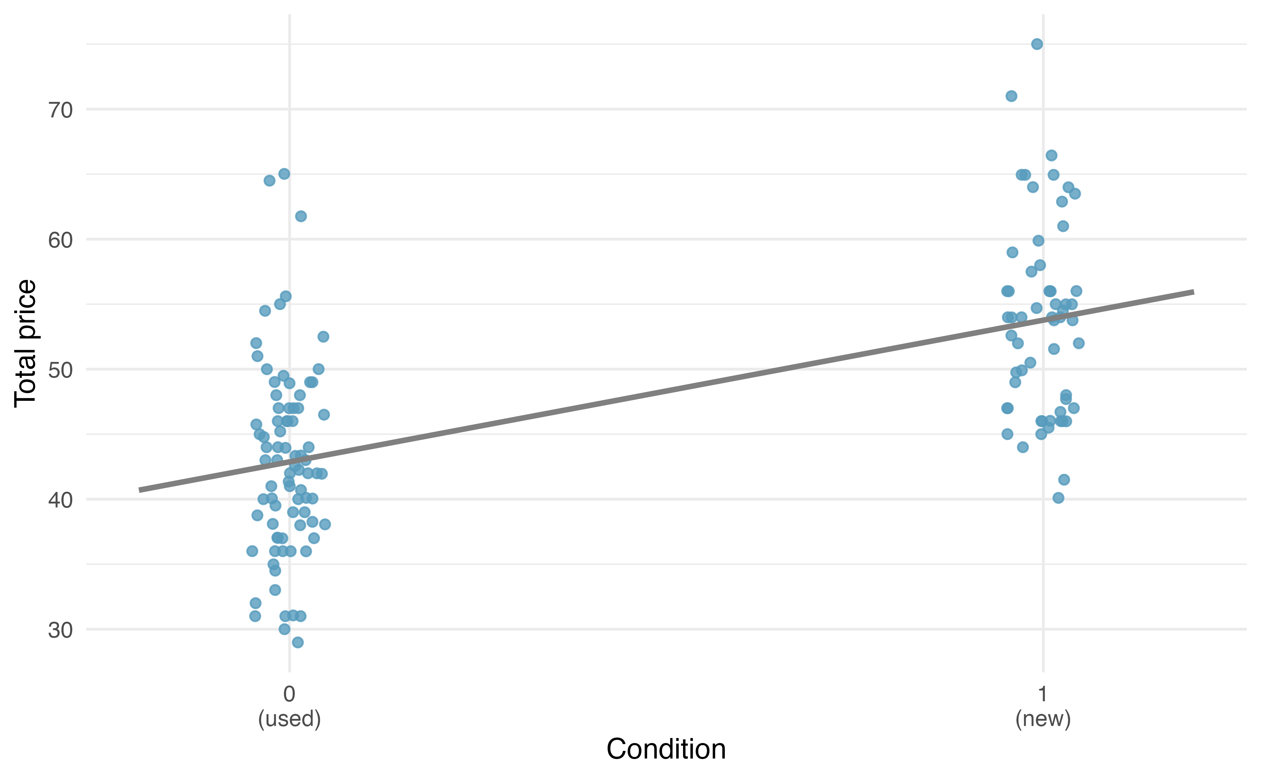
To incorporate the game condition variable into a regression equation, we must convert the categories into a numerical form. We will do so using an indicator variable called condnew, which takes value 1 when the game is new and 0 when the game is used. Using this indicator variable, the linear model may be written as
\[ \widehat{\texttt{price}} = b_0 + b_1 \times \texttt{condnew} \]
The parameter estimates are given in Table 7.4.
| term | estimate | std.error | statistic | p.value |
|---|---|---|---|---|
| (Intercept) | 42.9 | 0.81 | 52.67 | <0.0001 |
| condnew | 10.9 | 1.26 | 8.66 | <0.0001 |
Using values from Table 7.4, the model equation can be summarized as
\[ \widehat{\texttt{price}} = 42.87 + 10.9 \times \texttt{condnew} \]
Interpret the two parameters estimated in the model for the price of Mario Kart in eBay auctions.
The intercept is the estimated price when condnew has a value 0, i.e., when the game is in used condition. That is, the average selling price of a used version of the game is $42.9. The slope indicates that, on average, new games sell for about $10.9 more than used games.
Interpreting model estimates for categorical predictors.
The estimated intercept is the value of the outcome variable for the first category (i.e., the category corresponding to an indicator value of 0). The estimated slope is the average change in the outcome variable between the two categories.
Note that, fundamentally, the intercept and slope interpretations do not change when modeling categorical variables with two levels. However, when the predictor variable is binary, the coefficient estimates (\(b_0\) and \(b_1\)) are directly interpretable with respect to the dataset at hand.
We’ll elaborate further on modeling categorical predictors in Chapter 8, where we examine the influence of many predictor variables simultaneously using multiple regression.
7.3 Outliers in linear regression
In this section, we discuss when outliers are important and influential. Outliers in a regression model with one predictor and one outcome are observations that fall far from the cloud of points. These points are especially important because they can have a strong influence on the least squares line. Note that there are times when observations are outlying in the \(x\) direction, the \(y\) direction, or both. However, being outlying in a univariate sense (either \(x\) or \(y\) or both) is not outlying from the bivariate model. If the points are in-line with the bivariate model, they will not influence the least squares regression line (even if the observations are outlying in the \(x\) or \(y\) or both directions!).
There are three plots shown in Figure 7.16 (a) along with the corresponding least squares line and residual plots. For each scatterplot and residual plot pair, identify the outliers and note how they influence the least squares line. Recall that an outlier is any point that does not appear to belong with the vast majority of the other points.
A: There is one outlier far from the other points (in the \(y\) direction and it is an outlier of the bivariate model), though it only appears to slightly influence the line.
B: There is one outlier on the right (in the \(x\) and \(y\) direction although it is not an outlier of the bivariate model), though it is quite close to the least squares line, which suggests it wasn’t very influential.
C: There is one point far away from the cloud (in the \(x\) and \(y\) direction and an outlier of the bivariate model), and this outlier appears to pull the least squares line up on the right; examine how the line around the primary cloud does not appear to fit very well.
There are three plots shown in Figure 7.16 (b) along with the least squares line and residual plots. As you did in previous exercise, for each scatterplot and residual plot pair, identify the outliers and note how they influence the least squares line. Recall that an outlier is any point that does not appear to belong with the vast majority of the other points. A point can be outlying in the \(x\) direction, in the \(y\) direction, or in relation to the bivariate model.
D: There is a primary cloud and then a small secondary cloud of four outliers (with respect to both \(x\) and the bivariate model). The secondary cloud appears to be influencing the line somewhat strongly, making the least square line fit poorly almost everywhere. There might be an interesting explanation for the dual clouds, which is something that could be investigated.
E: There is no obvious trend in the main cloud of points and the outlier on the right (with respect to both \(x\) and \(y\)) appears to largely (and problematically) control the slope of the least squares line. The point creates a bivariate model when seemingly there is none.
F: There is one outlier far from the cloud (with respect to both \(x\) and \(y\)). However, it falls quite close to the least squares line and does not appear to be very influential (it is not outlying with respect to the bivariate model).
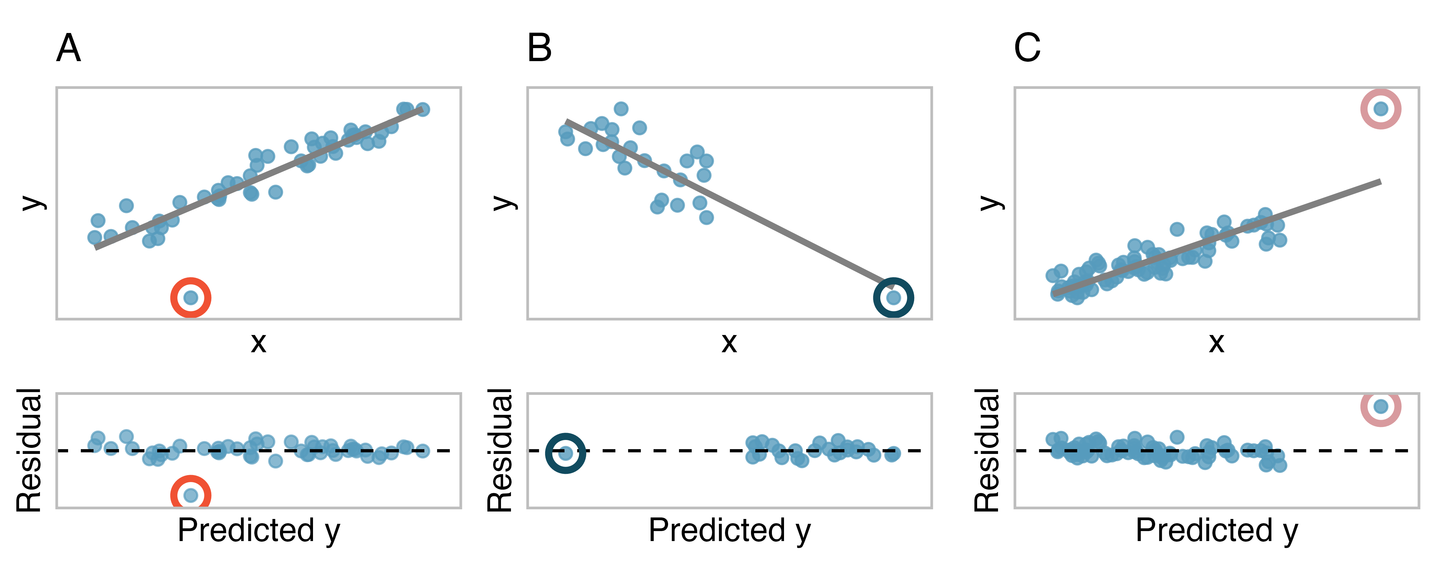
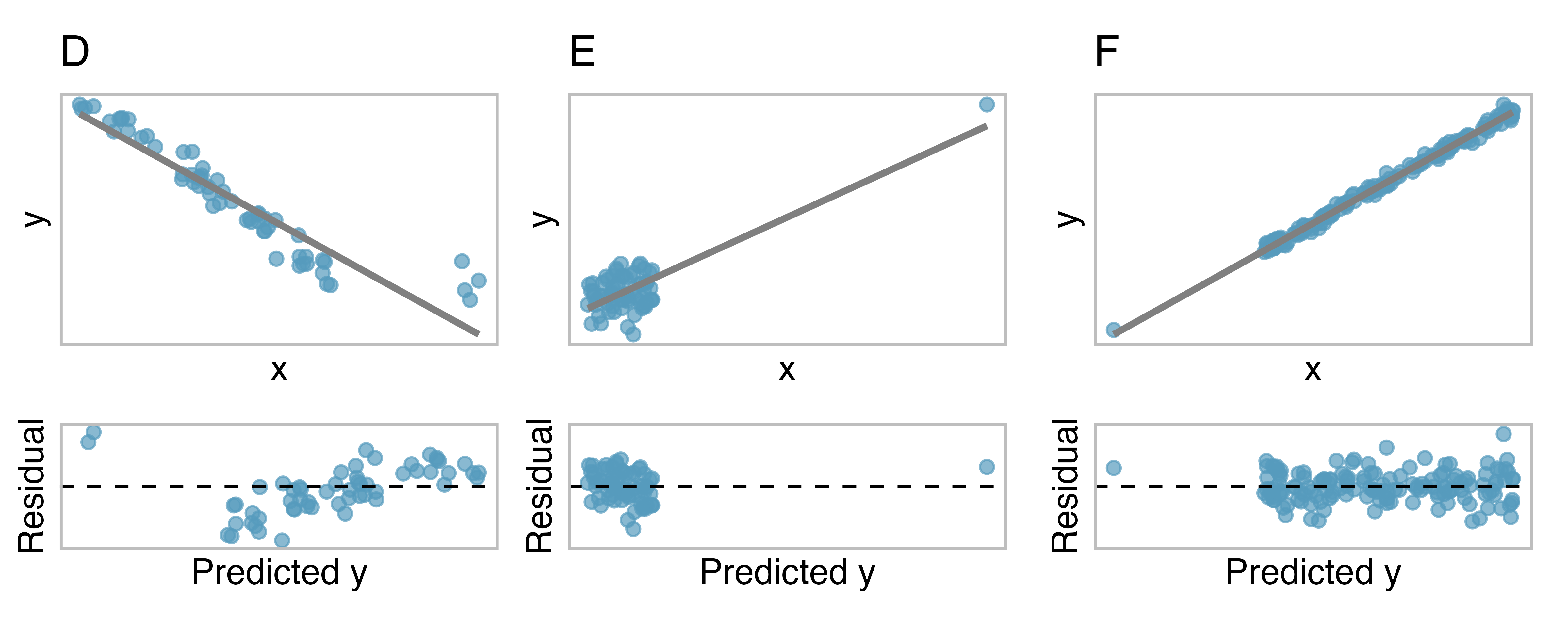
Examine the residual plots in Figure 7.16 (a) and Figure 7.16 (b). In Plots C, D, and E, you will probably find that there are a few observations which are both away from the remaining points along the x-axis and not in the trajectory of the trend in the rest of the data. In these cases, the outliers influenced the slope of the least squares lines. In Plot E, the bulk of the data show no clear trend, but if we fit a line to these data, we impose a trend where there isn’t really one.
A good practice for dealing with outlying observations is to produce two analyses: one with and one without the outlying observations. Presenting both analyses to a client and discussing the role of the outlying observations should lead you to a more holistic understanding of the appropriate model for the data.
Leverage.
Points that fall horizontally away from the center of the cloud tend to pull harder on the line, so we call them points with high leverage or leverage points.
Points that fall horizontally far from the line are points of high leverage; these points can strongly influence the slope of the least squares line. If one of these high leverage points does appear to actually invoke its influence on the slope of the line – as in Plots C, D, and E of Figure 7.16 (a) and Figure 7.16 (b) – then we call it an influential point. Usually we can say a point is influential if, had we fitted the line without it, the influential point would have been unusually far from the least squares line.
Types of outliers.
A point (or a group of points) that stands out from the rest of the data is called an outlier. Outliers that fall horizontally away from the center of the cloud of points are called leverage points. Outliers that influence on the slope of the line are called influential points.
It is tempting to remove outliers. Don’t do this without a very good reason. Models that ignore exceptional (and interesting) cases often perform poorly. For instance, if a financial firm ignored the largest market swings – the “outliers” – they would soon go bankrupt by making poorly thought-out investments.
7.4 Chapter review
7.4.1 Summary
Throughout this chapter, the nuances of the linear model have been described. You have learned how to create a linear model with explanatory variables that are numerical (e.g., total possum length) and those that are categorical (e.g., whether a video game was new). The residuals in a linear model are an important metric used to understand how well a model fits; high leverage points, influential points, and other types of outliers can impact the fit of a model. Correlation is a measure of the strength and direction of the linear relationship of two variables, without specifying which variable is the explanatory and which is the outcome. Future chapters will focus on generalizing the linear model from the sample of data to claims about the population of interest.
7.4.2 Terms
The terms introduced in this chapter are presented in Table 7.5. If you’re not sure what some of these terms mean, we recommend you go back in the text and review their definitions. You should be able to easily spot them as bolded text.
| coefficient of determination | least squares line | regression sum of squares |
| correlation | leverage point | residuals |
| extrapolation | outcome | sum of squared error |
| high leverage | outlier | total sum of squares |
| indicator variable | predictor | |
| influential point | R-squared |
7.5 Exercises
Answers to odd-numbered exercises can be found in Appendix A.7.
-
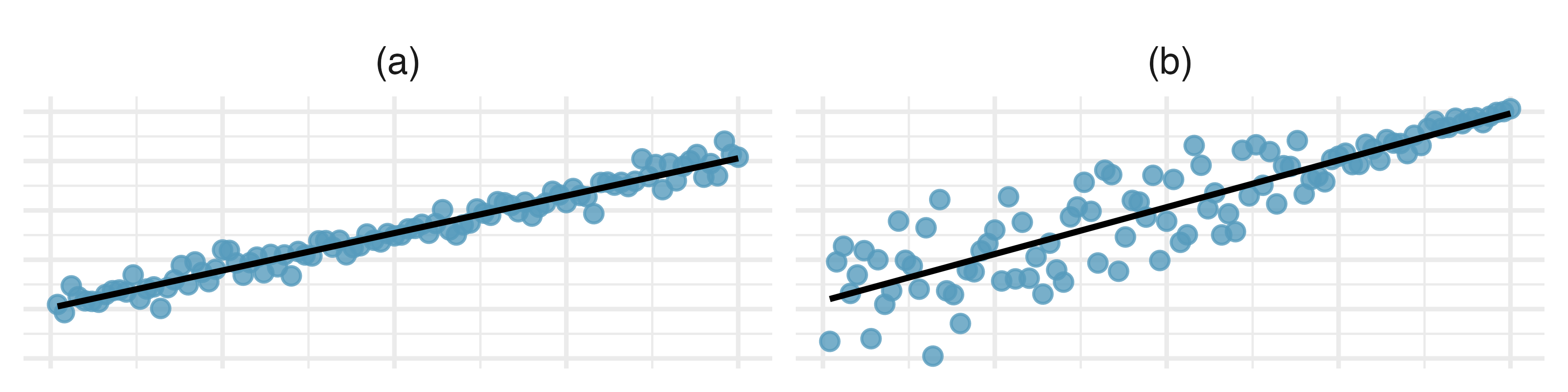
Visualizing residuals. The scatterplots shown below each have a superimposed regression line. If we were to construct a residual plot (residuals versus \(x\)) for each, describe in words what those plots would look like.
-
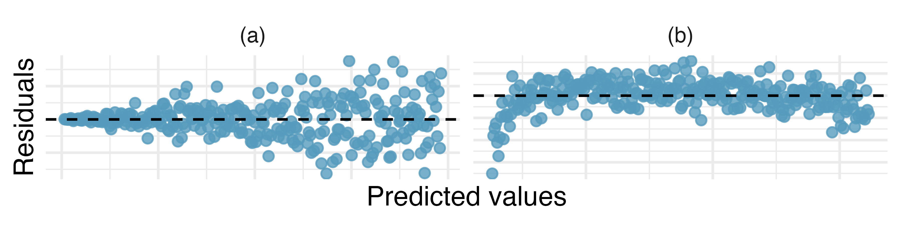
Trends in residuals. Shown below are two plots of residuals remaining after fitting a linear model to two different sets of data. For each plot, describe important features and determine if a linear model would be appropriate for these data. Explain your reasoning.
-
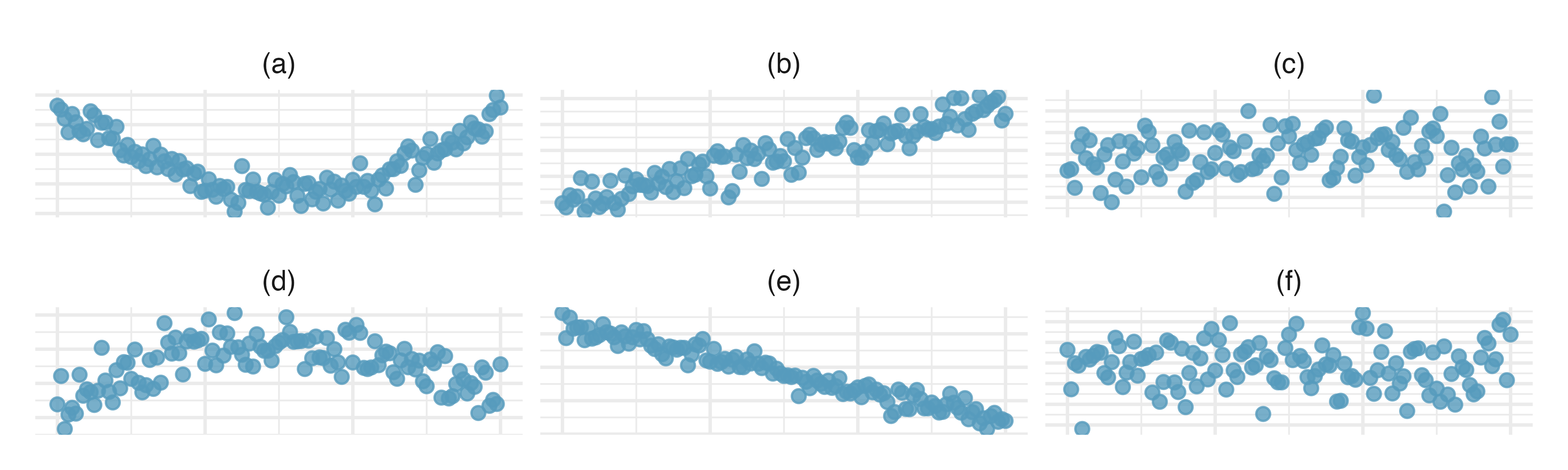
Identify relationships, I. For each of the six plots, identify the strength of the relationship (e.g., weak, moderate, or strong) in the data and whether fitting a linear model would be reasonable.
-
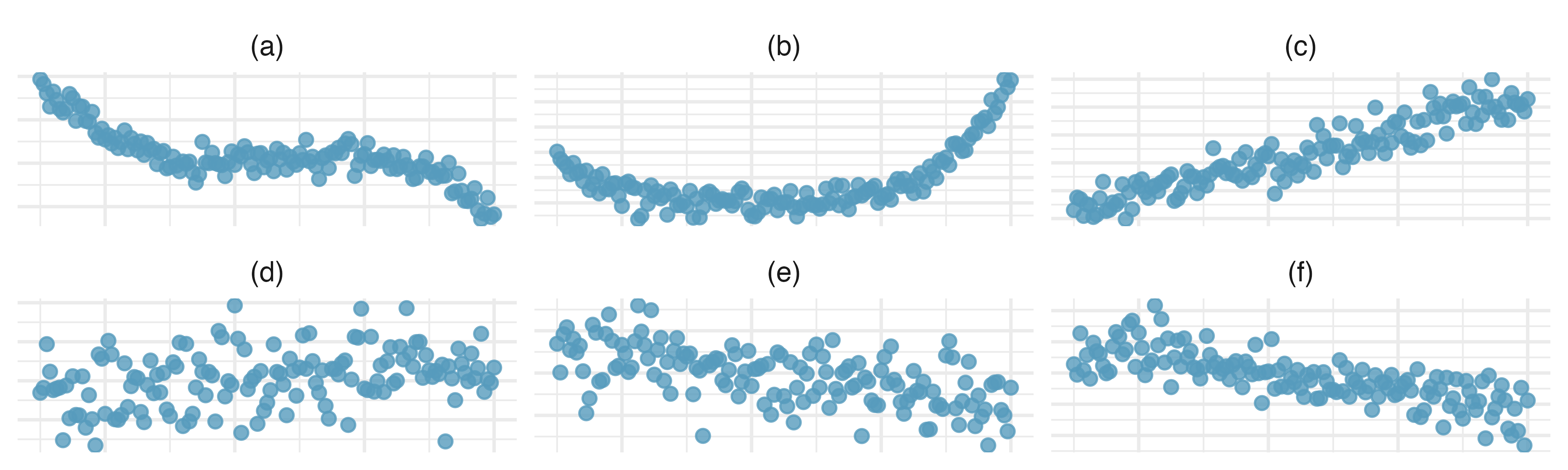
Identify relationships, II. For each of the six plots, identify the strength of the relationship (e.g., weak, moderate, or strong) in the data and whether fitting a linear model would be reasonable.
-
Midterms and final. The two scatterplots below show the relationship between the overall course average and two midterm exams (Exam 1 and Exam 2) recorded for 233 students during several years for a statistics course at a university.10
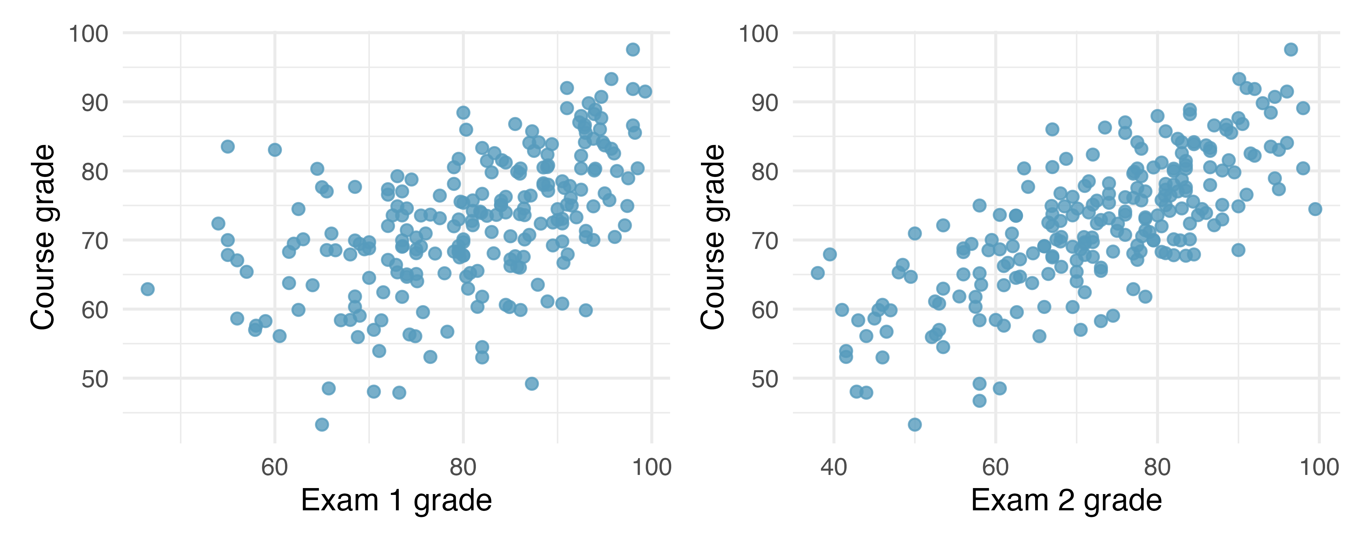
Based on these graphs, which of the two exams has the strongest correlation with the course grade? Explain.
Can you think of a reason why the correlation between the exam you chose in part (a) and the course grade is higher?
-
Meat consumption and life expectancy. In data collected for You et al. (2022), total meat intake is associated with life expectancy (at birth) in 175 countries. Meat intake is measured in kg per capita per year (averaged over 2011 to 2013). Additionally, the authors collected data on carbohydrate crops (e.g., cereals, root, sugar, etc.) in kg per capita per year (averaged over 2011 and 2013). The scatterplot on the left shows the life expectancy at birth plotted against the per capita meat consumption. The scatterplot on the right shows the amount of carbohydrate consumption plotted against the per capita meat consumption.
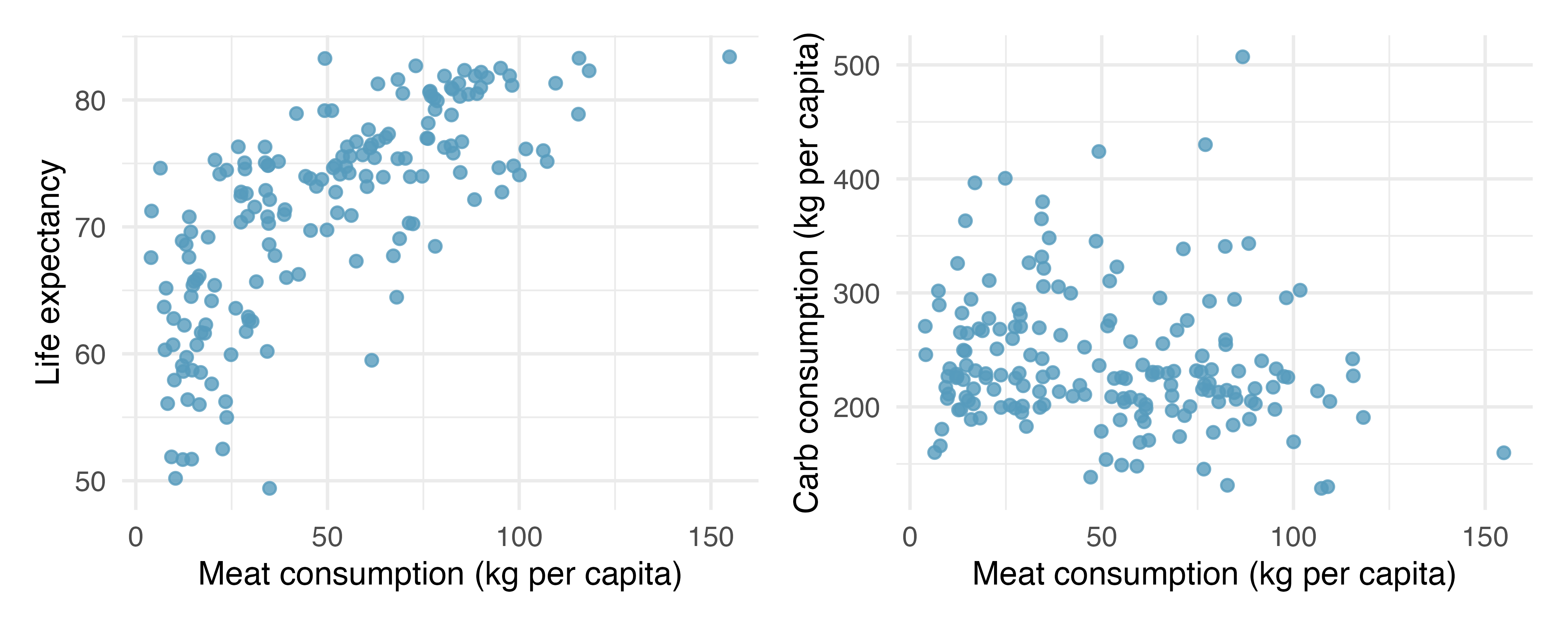
Describe the relationship between meat consumption and life expectancy.
Describe the relationship between meat consumption and carbohydrate consumption.
Which plot shows a stronger correlation? Explain your reasoning.
Data on consumption were originally collected in kilograms. How would the plots above and the correlation values change if the consumption variables were converted to pounds?
-
Match the correlation, I. Match each correlation to the corresponding scatterplot.11
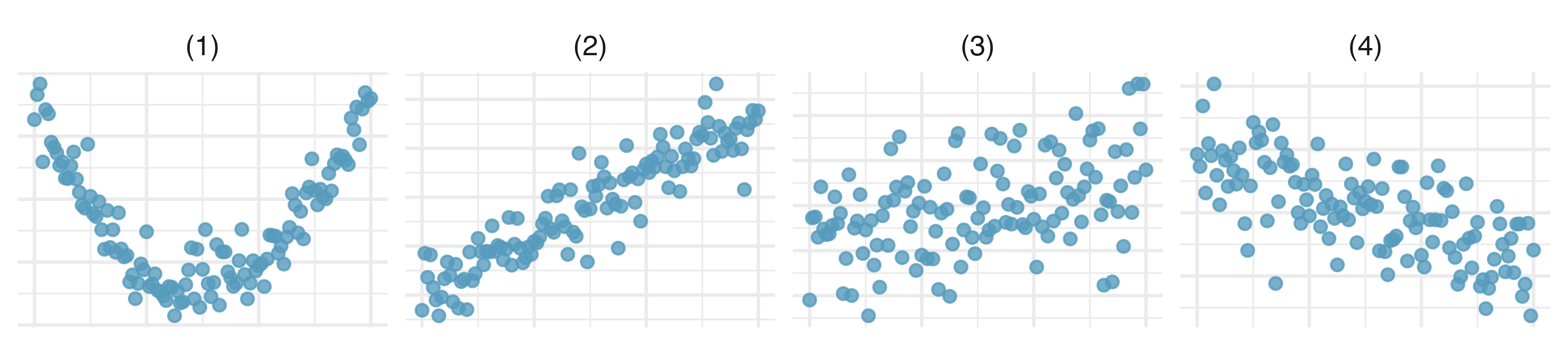
\(r = -0.7\)
\(r = 0.45\)
\(r = 0.06\)
\(r = 0.92\)
-
Match the correlation, II. Match each correlation to the corresponding scatterplot.12
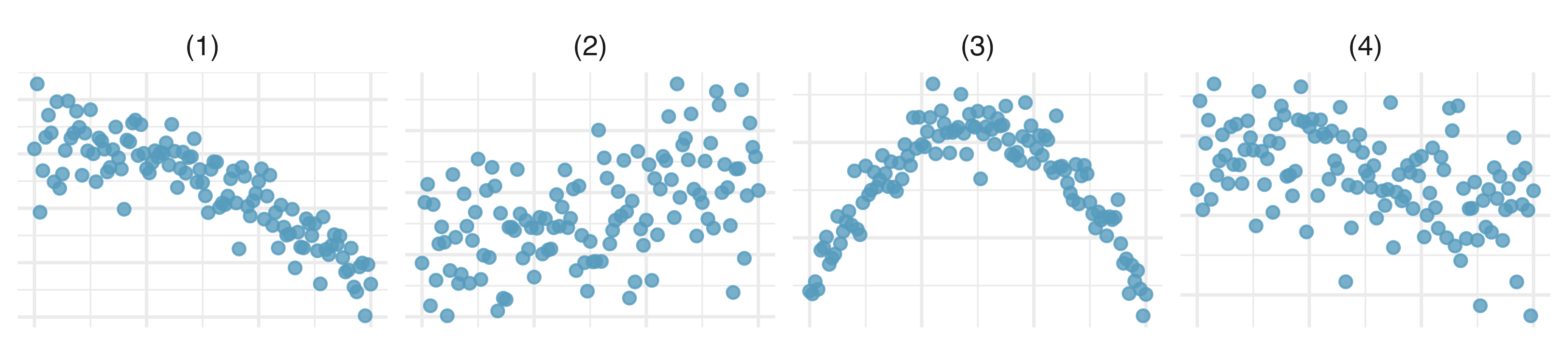
\(r = 0.49\)
\(r = -0.48\)
\(r = -0.03\)
\(r = -0.85\)
-
Body measurements, correlation. Researchers studying anthropometry collected body and skeletal diameter measurements, as well as age, weight, height and sex for 507 physically active individuals. The scatterplot below shows the relationship between height and shoulder girth (circumference of shoulders measured over deltoid muscles), both measured in centimeters.13 (Heinz et al. 2003)
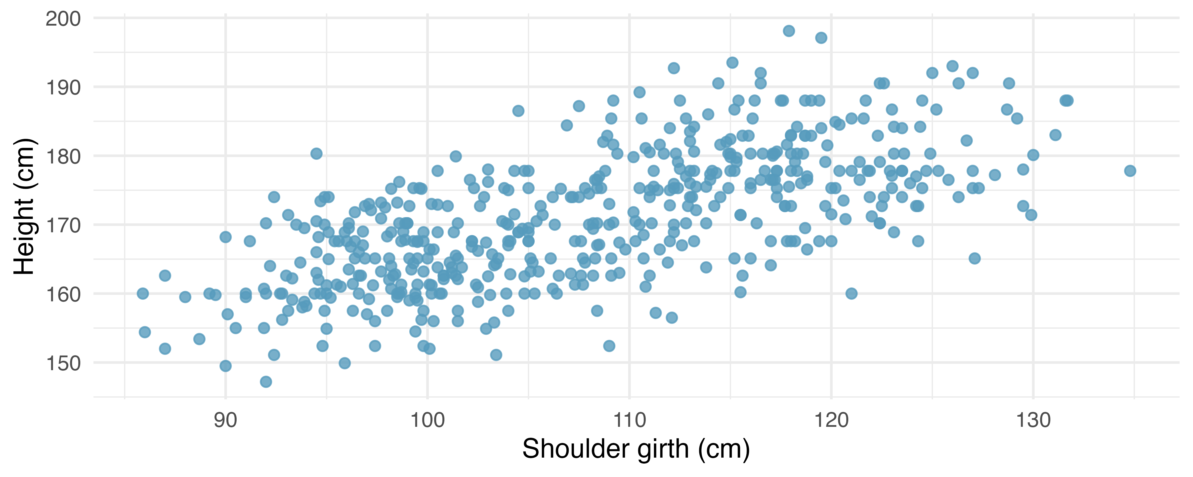
Describe the relationship between shoulder girth and height.
How would the relationship change if shoulder girth was measured in inches while the units of height remained in centimeters?
- Compare correlations. Eduardo and Rosie are both collecting data on number of rainy days in a year and the total rainfall for the year. Eduardo records rainfall in inches and Rosie in centimeters. How will their correlation coefficients compare?
-
The Coast Starlight, correlation. The Coast Starlight Amtrak train runs from Seattle to Los Angeles. The scatterplot below displays the distance between each stop (in miles) and the amount of time it takes to travel from one stop to another (in minutes).14
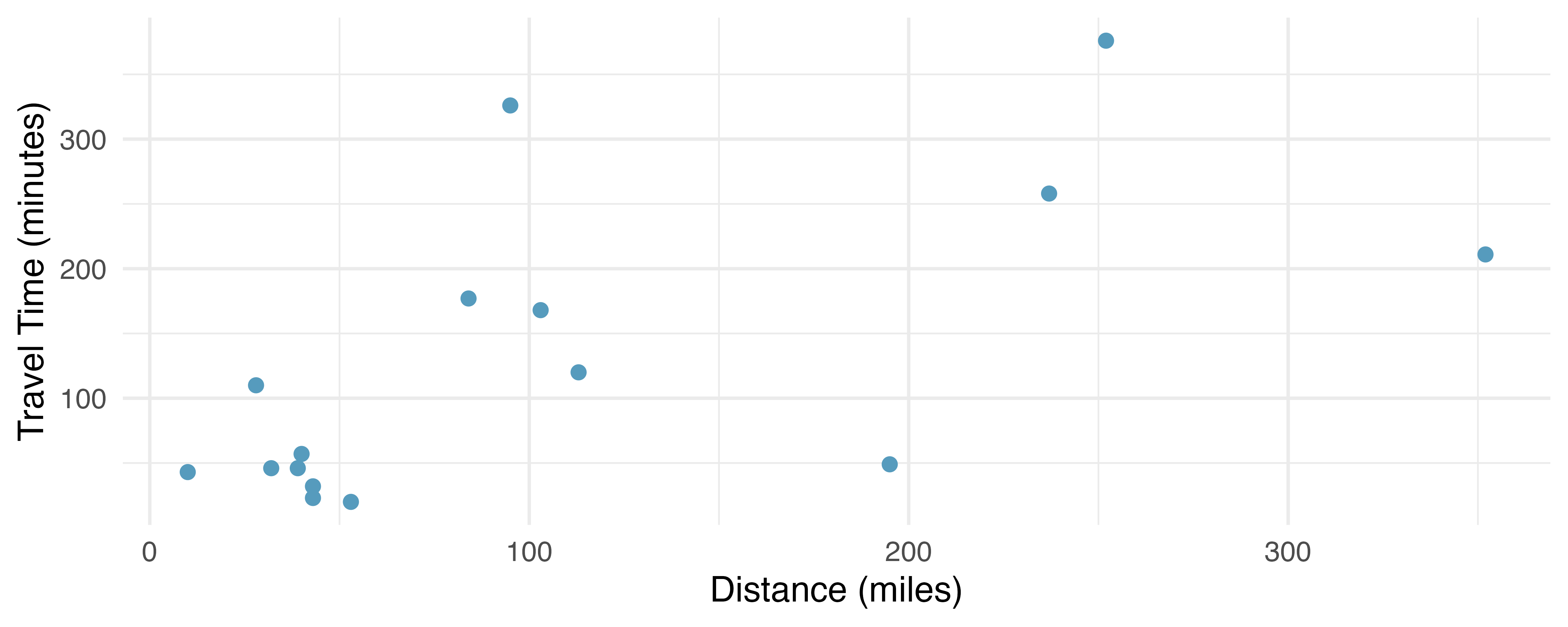
Describe the relationship between distance and travel time.
How would the relationship change if travel time was instead measured in hours, and distance was instead measured in kilometers?
Correlation between travel time (in miles) and distance (in minutes) is \(r = 0.636\). What is the correlation between travel time (in kilometers) and distance (in hours)?
-
Crawling babies, correlation. A study conducted at the University of Denver investigated whether babies take longer to learn to crawl in cold months, when they are often bundled in clothes that restrict their movement, than in warmer months. Infants born during the study year were split into twelve groups, one for each birth month. We consider the average crawling age of babies in each group against the average temperature when the babies are six months old (that’s when babies often begin trying to crawl). Temperature is measured in degrees Fahrenheit (F) and age is measured in weeks.15 (Benson 1993)
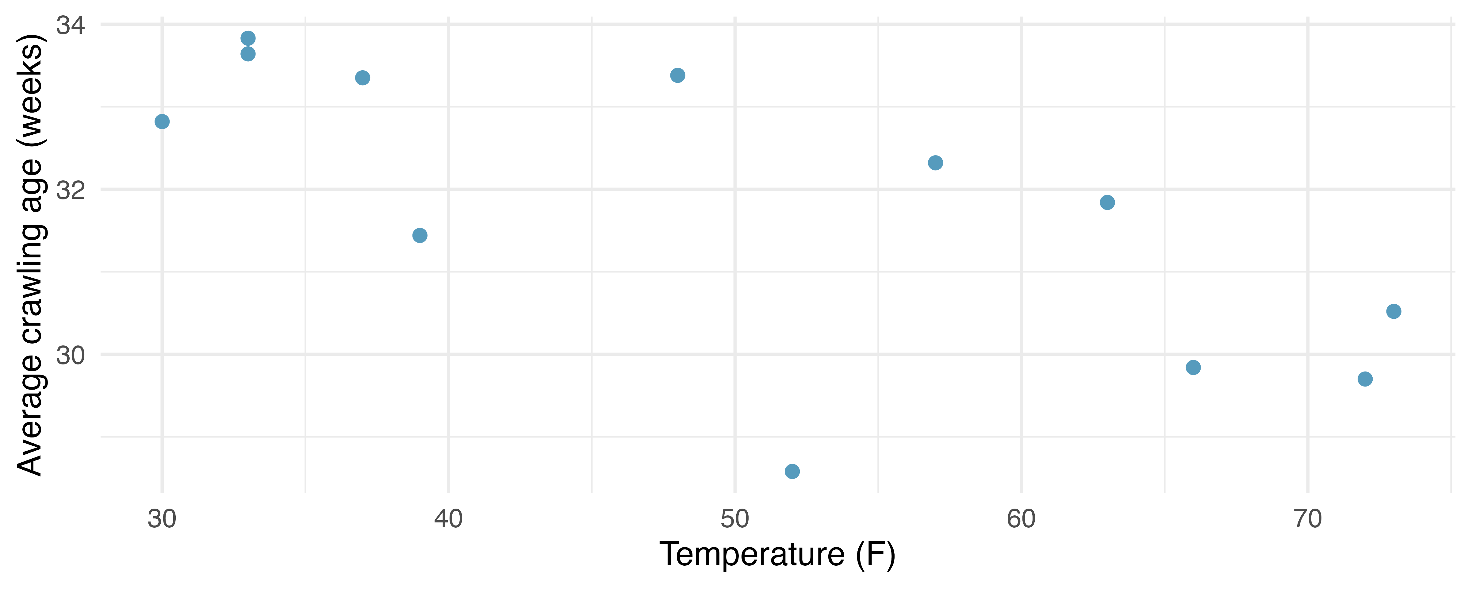
Describe the relationship between temperature and crawling age.
How would the relationship change if temperature was measured in degrees Celsius (C) and age was measured in months?
The correlation between temperature in F and age in weeks was \(r=-0.70\). If we converted the temperature to C and age to months, what would the correlation be?
-
Meat and carbohydrate consumption. What would be the correlation between the per capita meat consumption and per capita carbohydrate consumption if, for each country, people always consumed
3 kg more of meat than of carbohydrates each year?
2 kg less of meat than of carbohydrates each year?
half as much meat as carbohydrates each year?
-
Graduate degrees and salaries. What would be the correlation between the annual salaries of people with and without a graduate degree at a company if, for a certain type of position, someone with a graduate degree always made
$5,000 more than those without a graduate degree?
25% more than those without a graduate degree?
15% less than those without a graduate degree?
- Units of regression. Consider a regression predicting the number of calories (cal) from width (cm) for a sample of square shaped chocolate brownies. What are the units of the correlation coefficient, the intercept, and the slope?
- Which is higher? Determine if (I) or (II) is higher or if they are equal: “For a regression line, the uncertainty associated with the slope estimate, \(b_1\), is higher when (I) there is a lot of scatter around the regression line or (II) there is very little scatter around the regression line.” Explain your reasoning.
- Over-under, I. Suppose we fit a regression line to predict the shelf life of an apple based on its weight. For a particular apple, we predict the shelf life to be 4.6 days. The apple’s residual is -0.6 days. Did we over or under estimate the shelf-life of the apple? Explain your reasoning.
- Over-under, II. Suppose we fit a regression line to predict the number of incidents of skin cancer per 1,000 people from the number of sunny days in a year. For a particular year, we predict the incidence of skin cancer to be 1.5 per 1,000 people, and the residual for this year is 0.5. Did we over or under estimate the incidence of skin cancer? Explain your reasoning.
-
Starbucks, calories, and protein. The scatterplot below shows the relationship between the number of calories and amount of protein (in grams) Starbucks food menu items contain. Since Starbucks only lists the number of calories on the display items, we might be interested in predicting the amount of protein a menu item has based on its calorie content.16
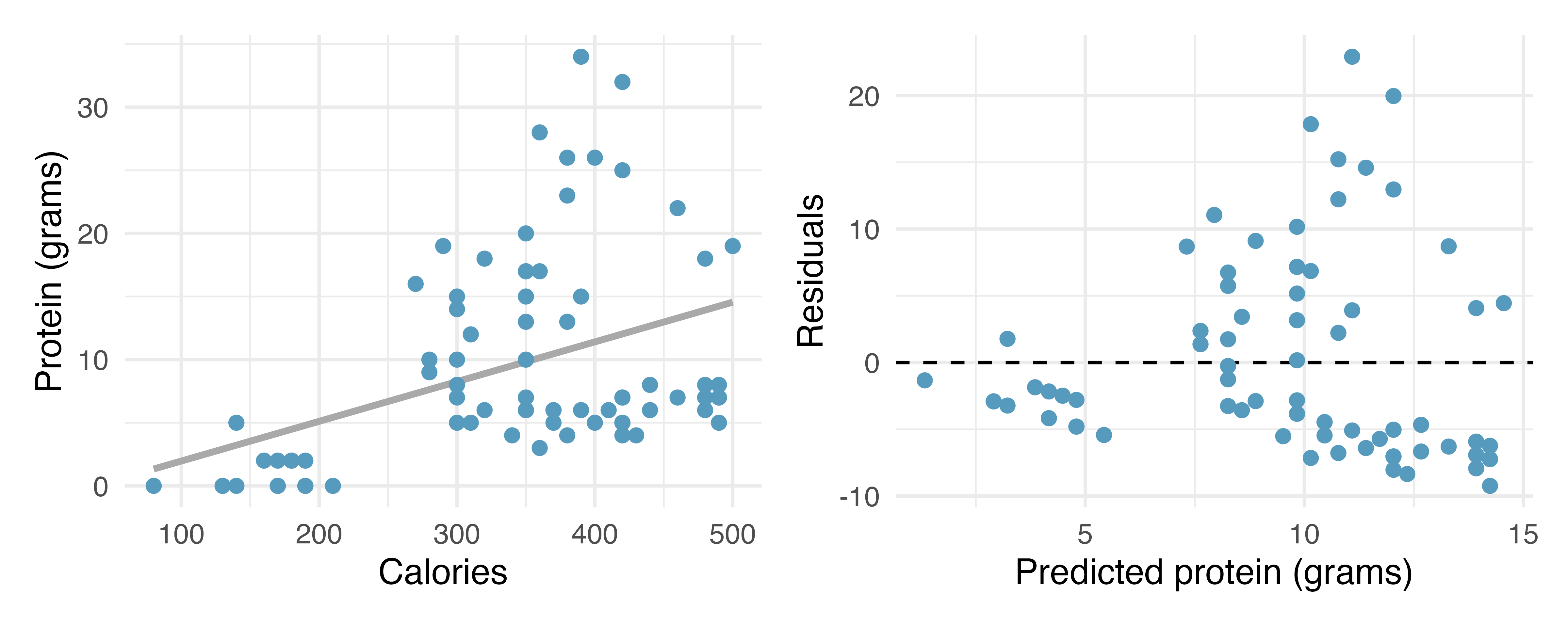
Describe the relationship between number of calories and amount of protein (in grams) that Starbucks food menu items contain.
In this scenario, what are the predictor and outcome variables?
Why might we want to fit a regression line to these data?
What does the residuals vs. predicted plot tell us about the variability in prediction errors based on this model for items with lower vs. higher predicted protein?
-
Starbucks, calories, and carbs. The scatterplot below shows the relationship between the number of calories and amount of carbohydrates (in grams) Starbucks food menu items contain. Since Starbucks only lists the number of calories on the display items, we might be interested in predicting the amount of carbs a menu item has based on its calorie content.17
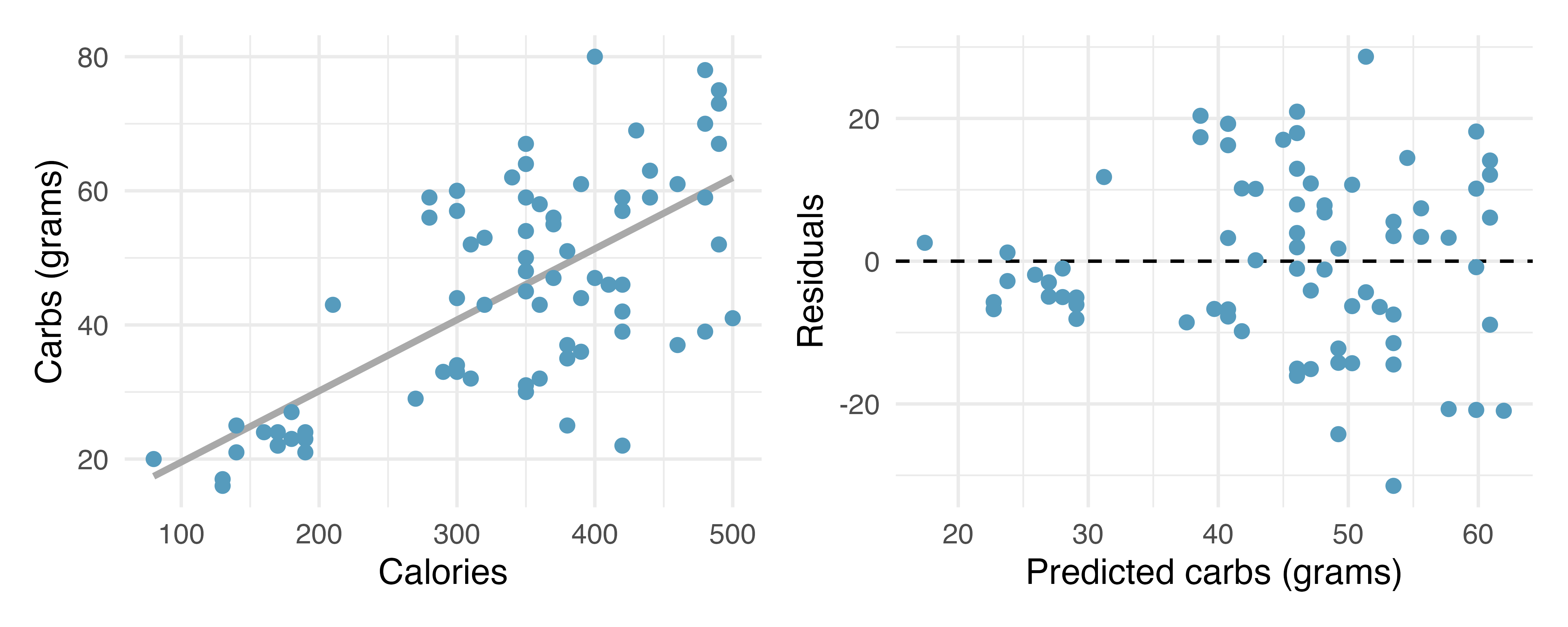
Describe the relationship between number of calories and amount of carbohydrates (in grams) that Starbucks food menu items contain.
In this scenario, what are the predictor and outcome variables?
Why might we want to fit a regression line to these data?
What does the residuals vs. predicted plot tell us about the variability in prediction errors based on this model for items with lower vs. higher predicted carbs?
-
The Coast Starlight, regression. The Coast Starlight Amtrak train runs from Seattle to Los Angeles. The scatterplot below displays the distance between each stop (in miles) and the amount of time it takes to travel from one stop to another (in minutes). The mean travel time from one stop to the next on the Coast Starlight is 129 mins, with a standard deviation of 113 minutes. The mean distance traveled from one stop to the next is 108 miles with a standard deviation of 99 miles. The correlation between travel time and distance is 0.636.18
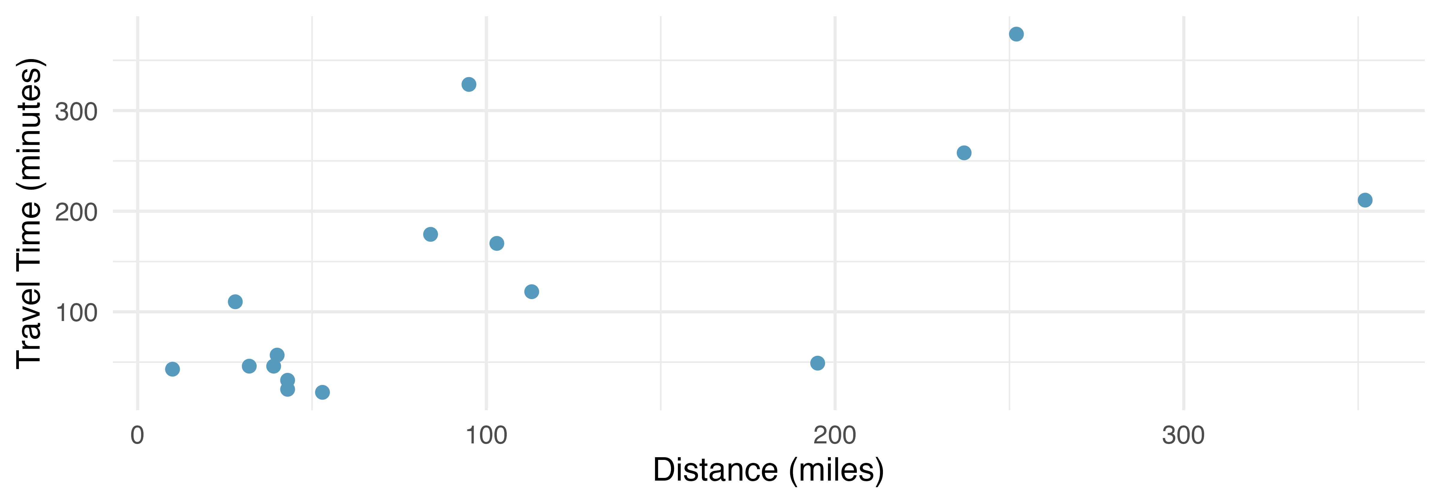
Write the equation of the regression line for predicting travel time.
Interpret the slope and the intercept in this context.
Calculate \(R^2\) of the regression line for predicting travel time from distance traveled for the Coast Starlight, and interpret \(R^2\) in the context of the application.
The distance between Santa Barbara and Los Angeles is 103 miles. Use the model to estimate the time it takes for the Starlight to travel between these two cities.
It takes the Coast Starlight about 168 mins to travel from Santa Barbara to Los Angeles. Calculate the residual and explain the meaning of this residual value.
Suppose Amtrak is considering adding a stop to the Coast Starlight 500 miles away from Los Angeles. Would it be appropriate to use this linear model to predict the travel time from Los Angeles to this point?
-
Body measurements, regression. Researchers studying anthropometry collected body and skeletal diameter measurements, as well as age, weight, height and sex for 507 physically active individuals. The scatterplot below shows the relationship between height and shoulder girth (circumference of shoulders measured over deltoid muscles), both measured in centimeters. The mean shoulder girth is 107.20 cm with a standard deviation of 10.37 cm. The mean height is 171.14 cm with a standard deviation of 9.41 cm. The correlation between height and shoulder girth is 0.67.19 (Heinz et al. 2003)
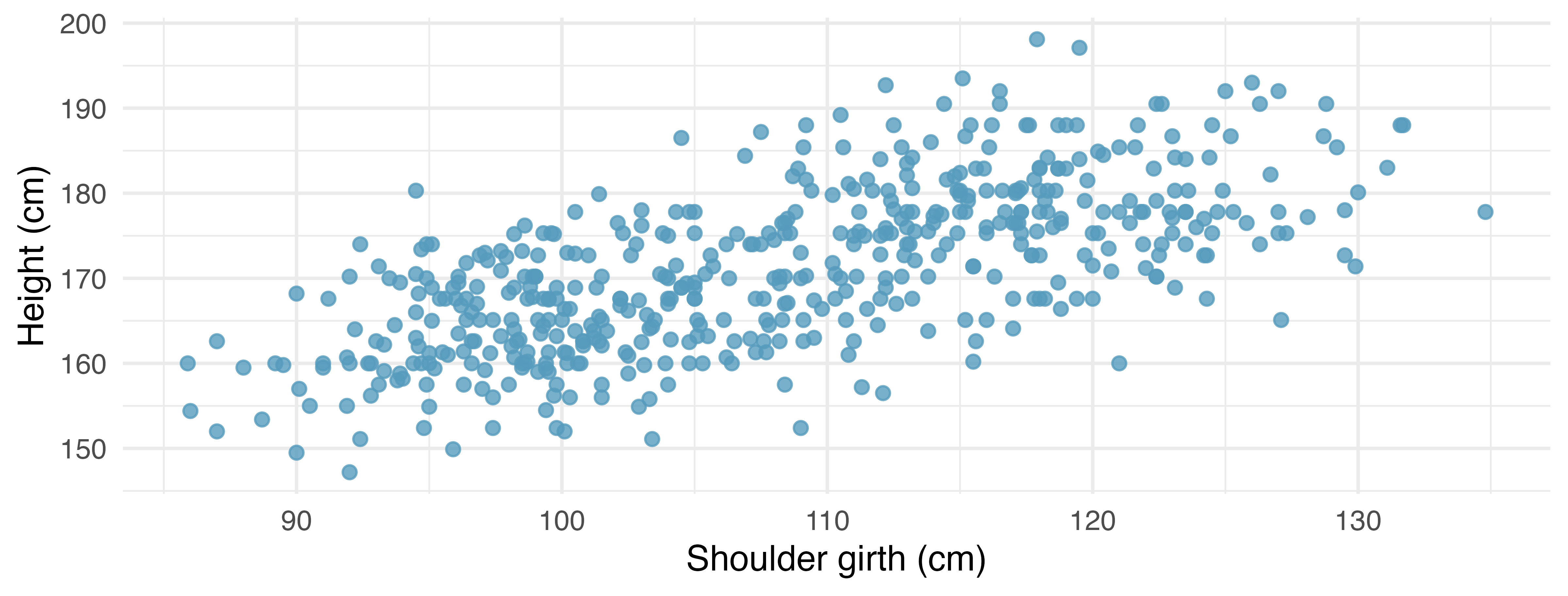
Write the equation of the regression line for predicting height.
Interpret the slope and the intercept in this context.
Calculate \(R^2\) of the regression line for predicting height from shoulder girth, and interpret it in the context of the application.
A randomly selected student from your class has a shoulder girth of 100 cm. Predict the height of this student using the model.
The student from part (d) is 160 cm tall. Calculate the residual, and explain what this residual means.
A one year old has a shoulder girth of 56 cm. Would it be appropriate to use this linear model to predict the height of this child?
-
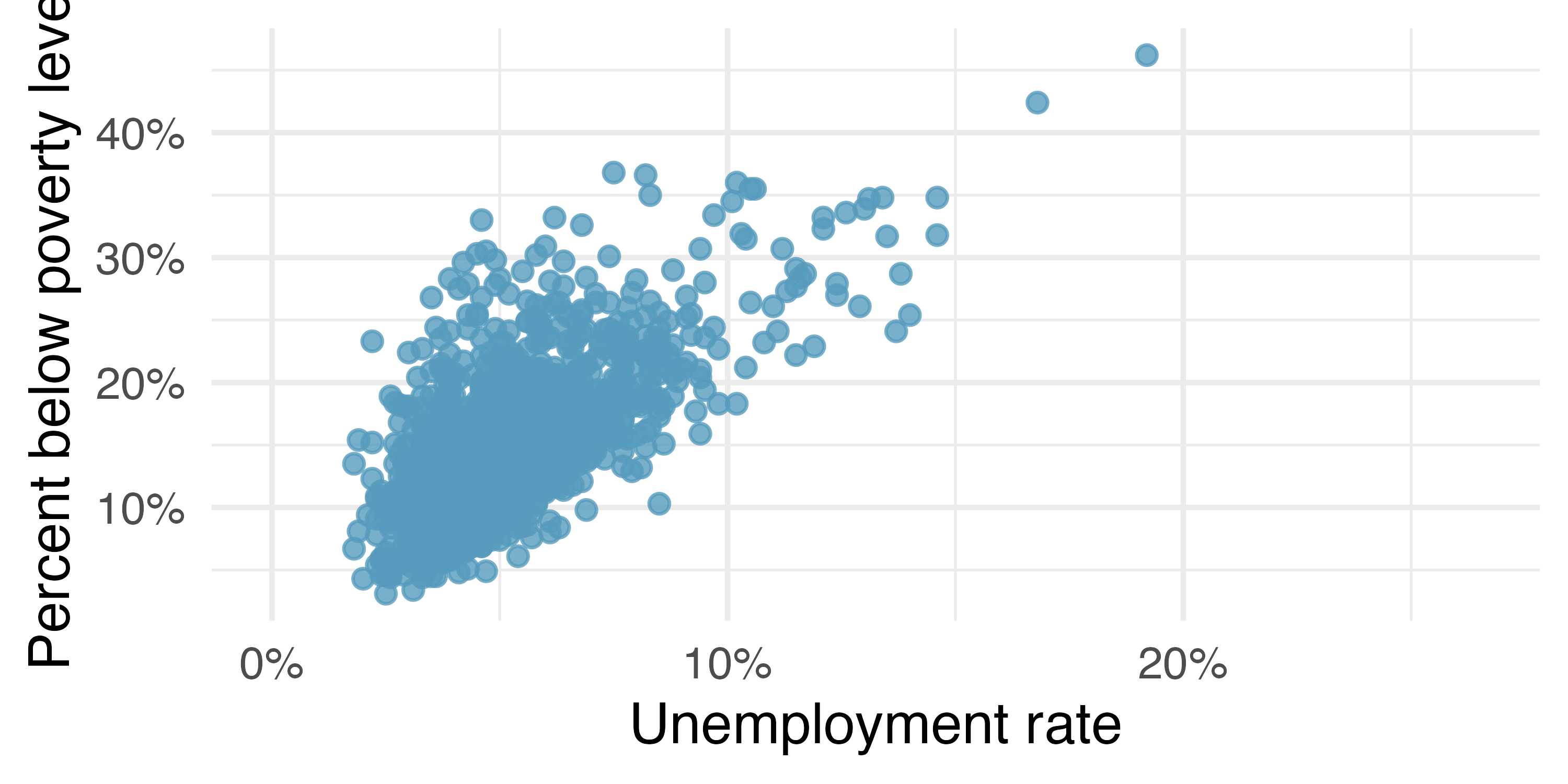
Poverty and unemployment. The following scatterplot shows the relationship between percent of population below the poverty level (
poverty) from unemployment rate among those ages 20-64 (unemployment_rate) in counties in the US, as provided by data from the 2019 American Community Survey. The regression output for the model for predictingpovertyfromunemployment_rateis also provided.20term estimate std.error statistic p.value (Intercept) 4.60 0.349 13.2 <0.0001 unemployment_rate 2.05 0.062 33.1 <0.0001 Write out the linear model.
Interpret the intercept.
Interpret the slope.
The \(R^2\) of this model is 46%.
Interpret this value.Calculate the correlation coefficient.
-
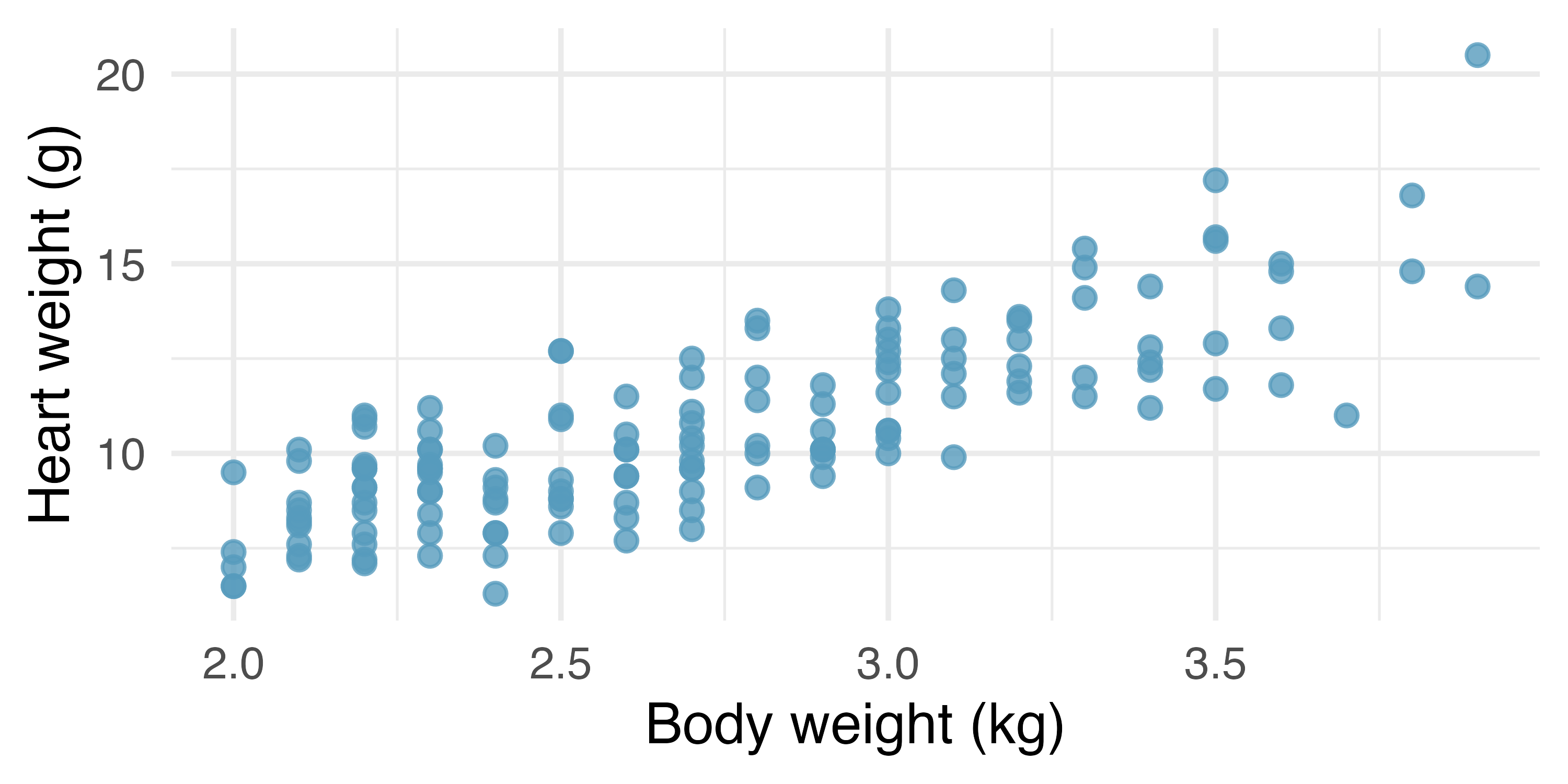
Cat weights. The following regression output is for predicting the heart weight (
Hwt, in g) of cats from their body weight (Bwt, in kg). The coefficients are estimated using a dataset of 144 domestic cats.21term estimate std.error statistic p.value (Intercept) -0.357 0.692 -0.515 0.6072 Bwt 4.034 0.250 16.119 <0.0001 Write out the linear model.
Interpret the intercept.
Interpret the slope.
The \(R^2\) of this model is 65%.
Interpret \(R^2\).Calculate the correlation coefficient.
-
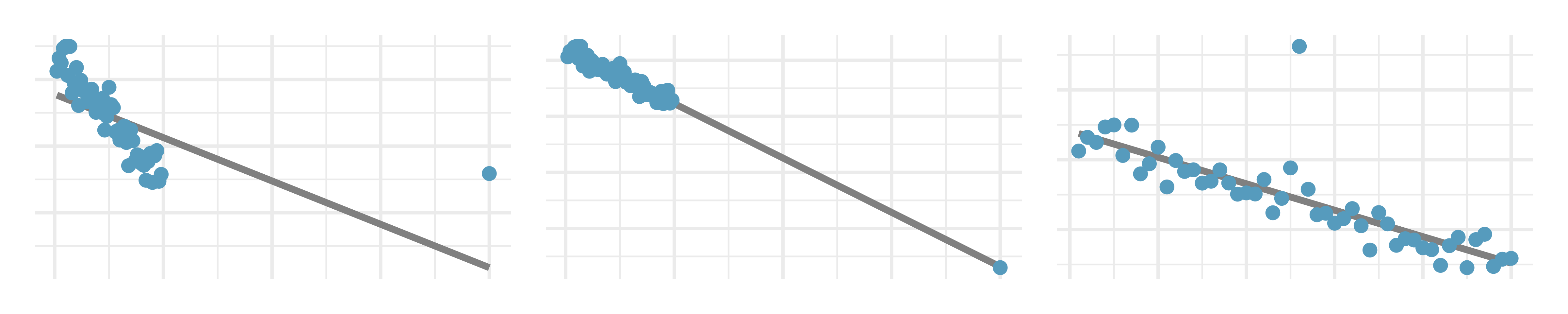
Outliers, I. Identify the outliers in the scatterplots shown below, and determine what type of outliers they are. Explain your reasoning.
-
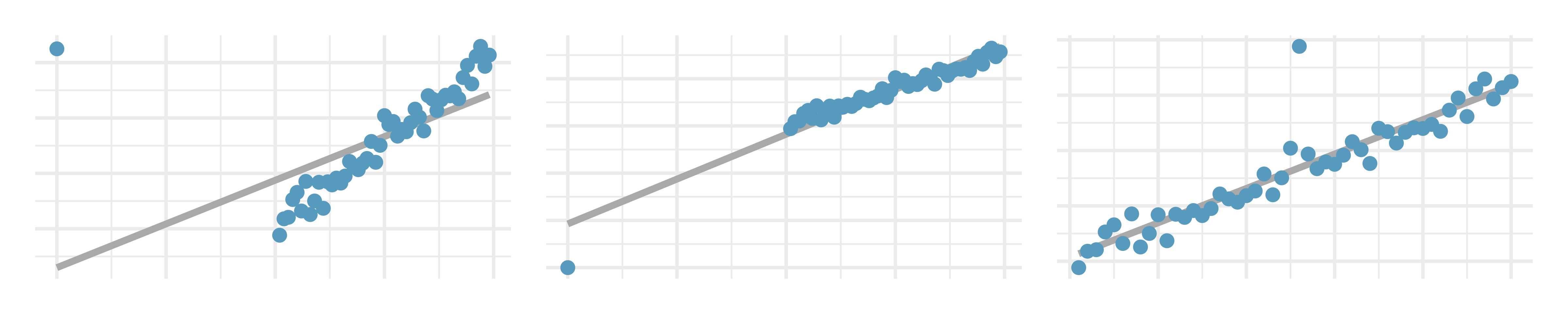
Outliers, II. Identify the outliers in the scatterplots shown below and determine what type of outliers they are. Explain your reasoning.
-
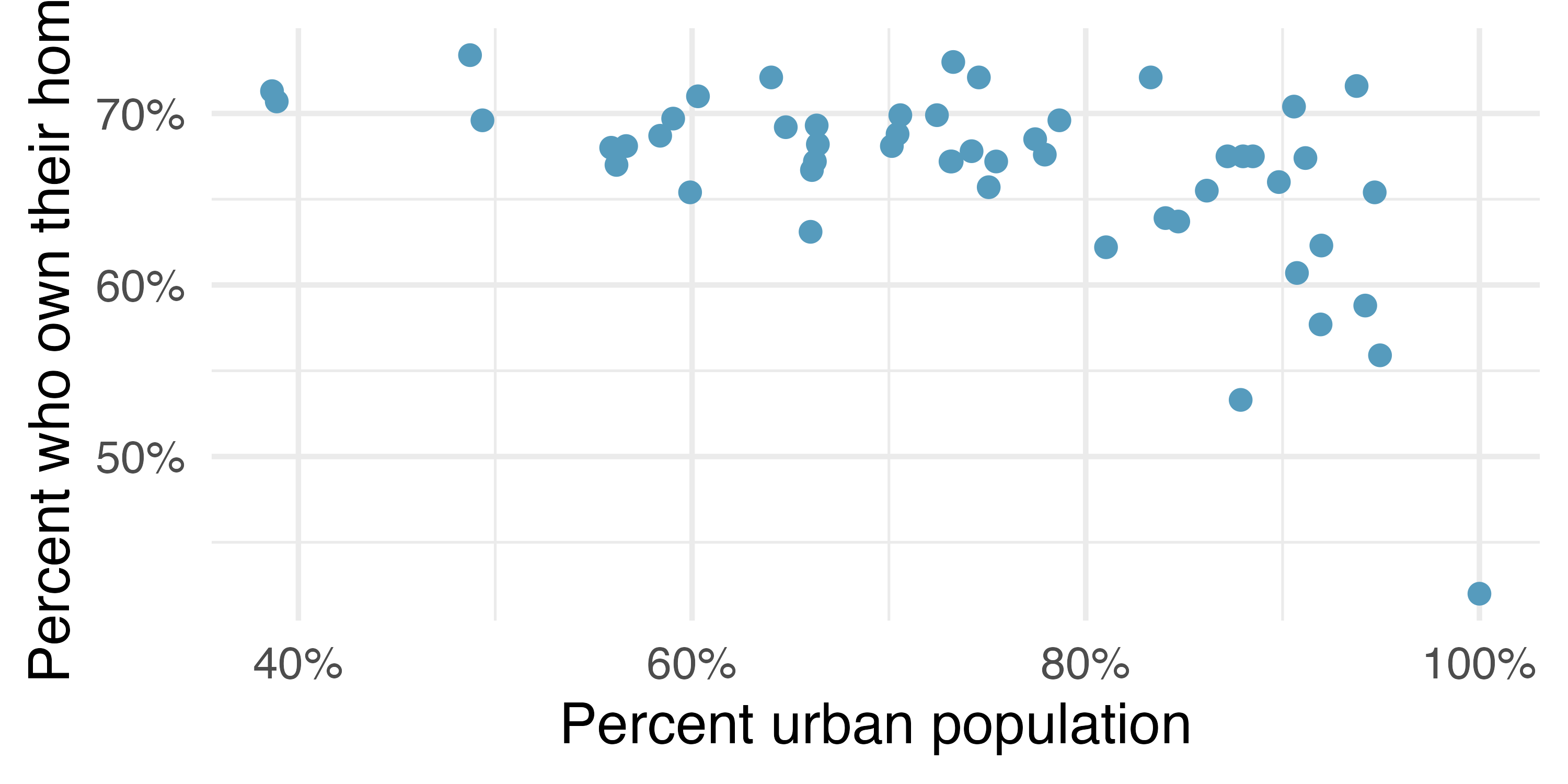
Urban homeowners, outliers. The scatterplot below shows the percent of families who own their home vs. the percent of the population living in urban areas. There are 52 observations, each corresponding to a state in the US. Puerto Rico and District of Columbia are also included.22
Describe the relationship between the percent of families who own their home and the percent of the population living in urban areas.
The outlier at the bottom right corner is District of Columbia, where 100% of the population is considered urban. What type of an outlier is this observation?
-
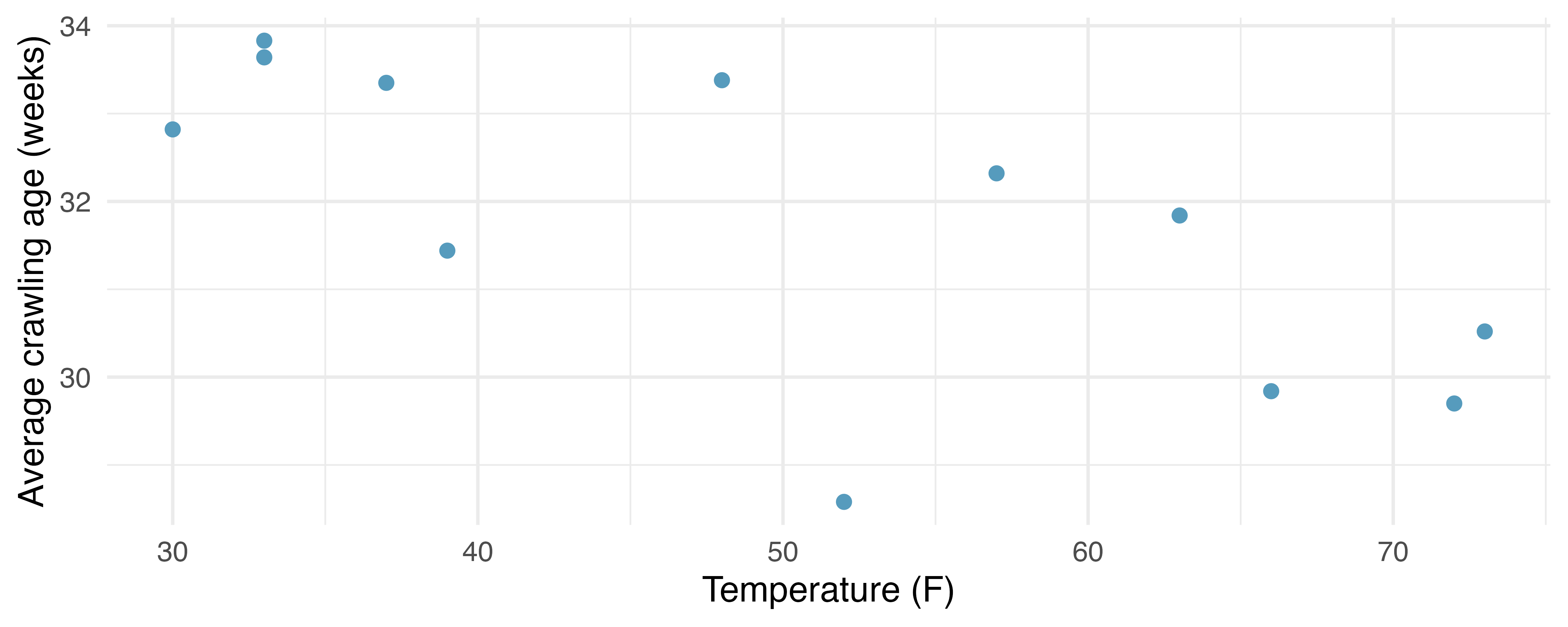
Crawling babies, outliers. A study conducted at the University of Denver investigated whether babies take longer to learn to crawl in cold months, when they are often bundled in clothes that restrict their movement, than in warmer months. The plot below shows the relationship between average crawling age of babies born in each month and the average temperature in the month when the babies are six months old. The plot reveals a potential outlying month when the average temperature is about 53F and average crawling age is about 28.5 weeks. Does this point have high leverage? Is it an influential point?23 (Benson 1993)
-
True / False. Determine if the following statements are true or false. If false, explain why.
A correlation coefficient of -0.90 indicates a stronger linear relationship than a correlation of 0.5.
Correlation is a measure of the association between any two variables.
-
Cherry trees. The scatterplots below show the relationship between height, diameter, and volume of timber in 31 felled black cherry trees. The diameter of the tree is measured 4.5 feet above the ground.24
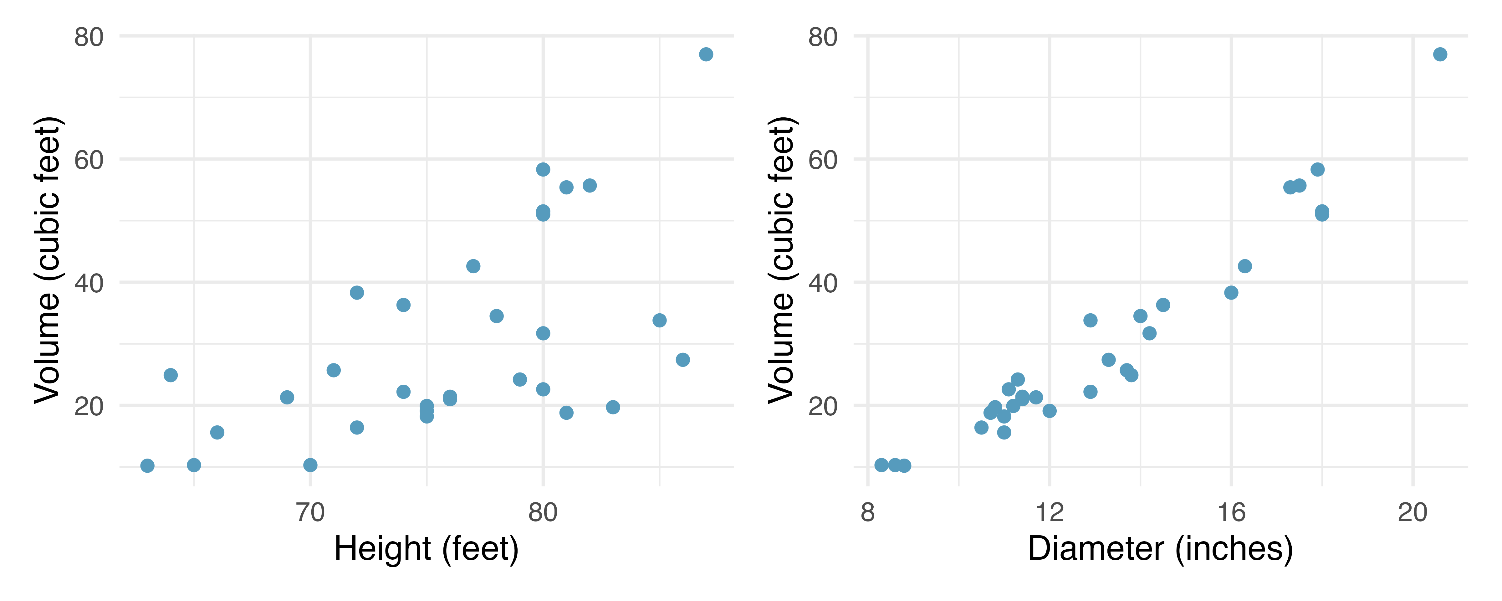
Describe the relationship between volume and height of these trees.
Describe the relationship between volume and diameter of these trees.
Suppose you have height and diameter measurements for another black cherry tree. Which of these variables would be preferable to use to predict the volume of timber in this tree using a simple linear regression model? Explain your reasoning.
-
Match the correlation, III. Match each correlation to the corresponding scatterplot.25
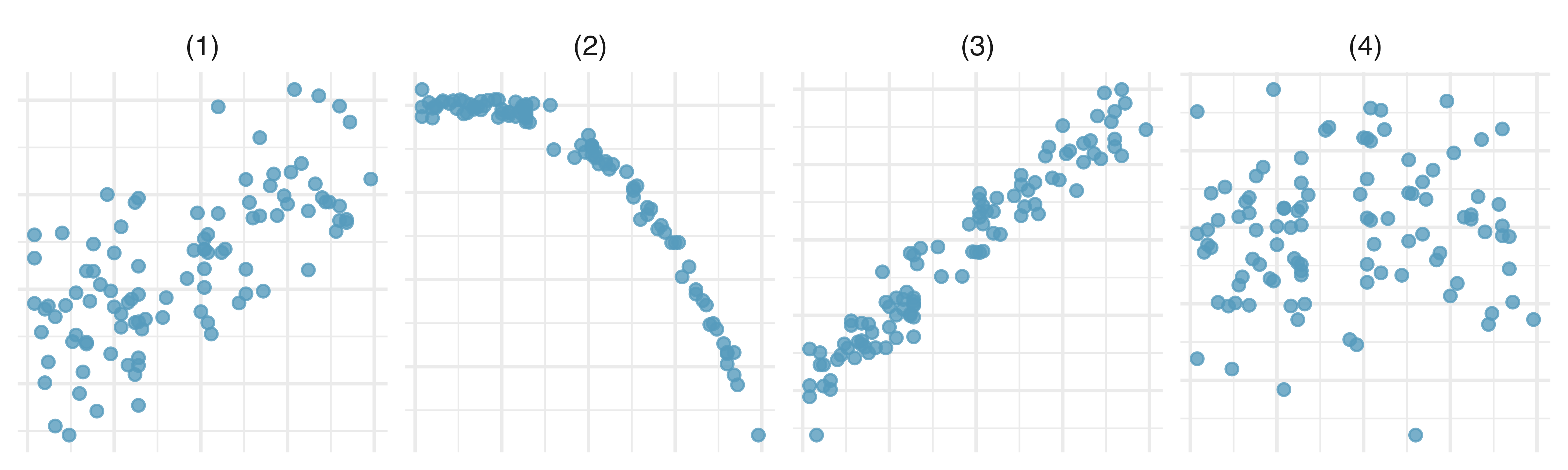
r = 0.69
r = 0.09
r = -0.91
r = 0.97
-
Helmets and lunches. The scatterplot shows the relationship between socioeconomic status measured as the percentage of children in a neighborhood receiving reduced-fee lunches at school (
lunch) and the percentage of bike riders in the neighborhood wearing helmets (helmet). The average percentage of children receiving reduced-fee lunches is 30.833% with a standard deviation of 26.724% and the average percentage of bike riders wearing helmets is 30.883% with a standard deviation of 16.948%.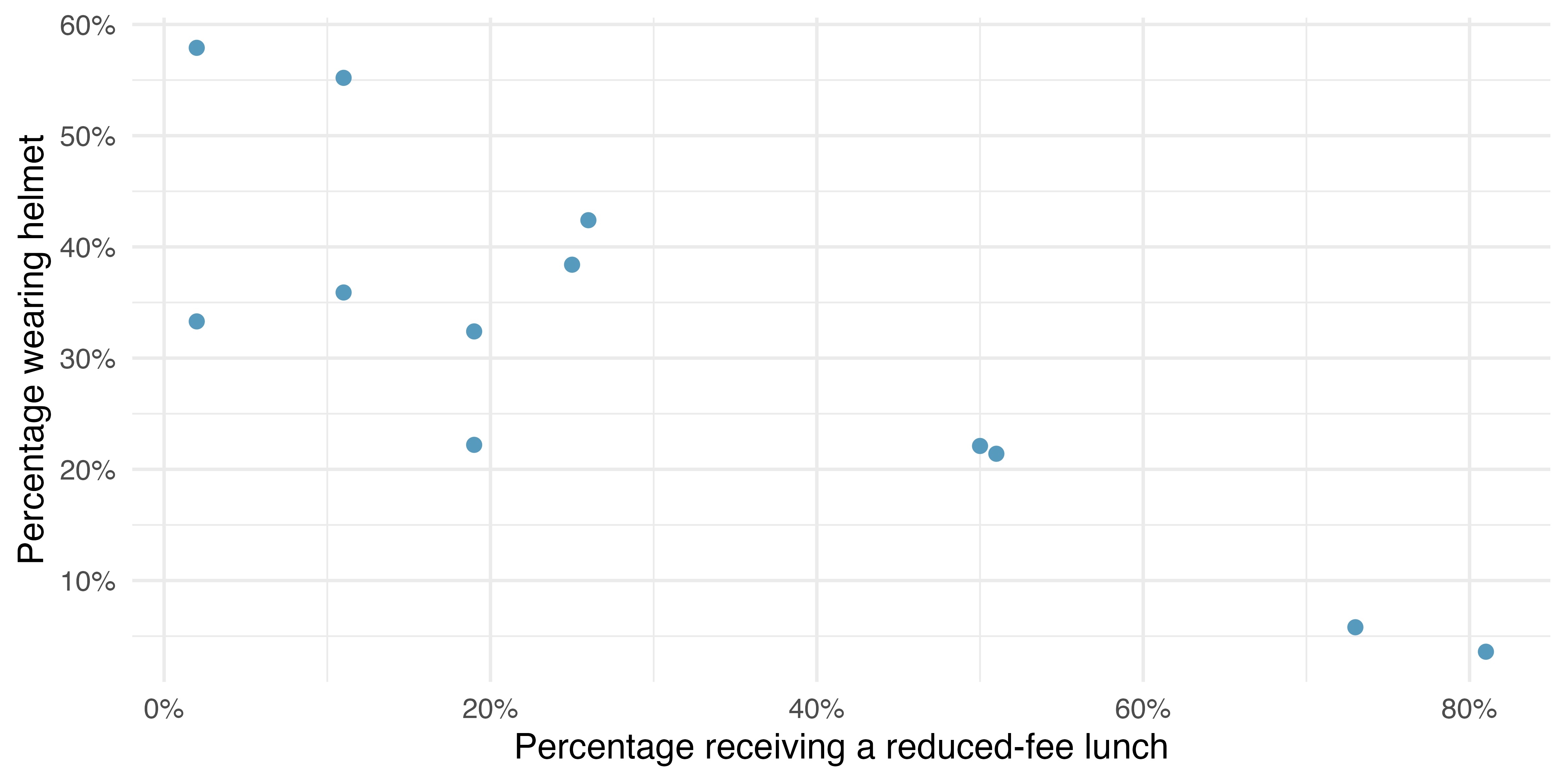
If the \(R^2\) for the least-squares regression line for these data is 72%, what is the correlation between
lunchandhelmet?Calculate the slope and intercept for the least-squares regression line for these data.
Interpret the intercept of the least-squares regression line in the context of the application.
Interpret the slope of the least-squares regression line in the context of the application.
What would the value of the residual be for a neighborhood where 40% of the children receive reduced-fee lunches and 40% of the bike riders wear helmets? Interpret the meaning of this residual in the context of the application.
If a model underestimates an observation, then the model estimate is below the actual. The residual, which is the actual observation value minus the model estimate, must then be positive. The opposite is true when the model overestimates the observation: the residual is negative.↩︎
Gray diamond: \(\hat{y} = 41+0.59x = 41+0.59\times 85.0 = 91.15 \rightarrow e = y - \hat{y} = 98.6-91.15=7.45.\) This is close to the earlier estimate of 7. pink triangle: \(\hat{y} = 41+0.59x = 97.3 \rightarrow e = -3.3.\) This is also close to the estimate of -4.↩︎
Formally, we can compute the correlation for observations \((x_1, y_1),\) \((x_2, y_2),\) …, \((x_n, y_n)\) using the formula↩︎
We’ll leave it to you to draw the lines. In general, the lines you draw should be close to most points and reflect overall trends in the data.↩︎
Larger family incomes are associated with lower amounts of aid, so the correlation will be negative. Using a computer, the correlation can be computed: -0.499.↩︎
There are applications where the sum of residual magnitudes may be more useful, and there are plenty of other criteria we might consider. However, this book only applies the least squares criterion.↩︎
About \(R^2 = (-0.97)^2 = 0.94\) or 94% of the variation in the outcome variable is explained by the linear model.↩︎
The difference \(SST - SSE\) is called the regression sum of squares, \(SSR,\) and can also be calculated as \(SSR = (\hat{y}_1 - \bar{y})^2 + (\hat{y}_2 - \bar{y})^2 + \cdots + (\hat{y}_n - \bar{y})^2.\) \(SSR\) represents the variation in \(y\) that was accounted for in our model.↩︎
\(SST\) can be calculated by finding the sample variance of the outcome variable, \(s^2\) and multiplying by \(n-1.\)↩︎
The
exam_gradesdata used in this exercise can be found in the openintro R package.↩︎The
corr_matchdata used in this exercise can be found in the openintro R package.↩︎The
corr_matchdata used in this exercise can be found in the openintro R package.↩︎The
bdimsdata used in this exercise can be found in the openintro R package.↩︎The
coast_starlightdata used in this exercise can be found in the openintro R package.↩︎The
babies_crawldata used in this exercise can be found in the openintro R package.↩︎The
starbucksdata used in this exercise can be found in the openintro R package.↩︎The
starbucksdata used in this exercise can be found in the openintro R package.↩︎The
coast_starlightdata used in this exercise can be found in the openintro R package.↩︎The
bdimsdata used in this exercise can be found in the openintro R package.↩︎The
county_2019data used in this exercise can be found in the usdata R package.↩︎The
catsdata used in this exercise can be found in the MASS R package.↩︎The
urban_ownerdata used in this exercise can be found in the usdata R package.↩︎The
babies_crawldata used in this exercise can be found in the openintro R package.↩︎The
treesdata used in this exercise can be found in the datasets R package.↩︎The
corr_matchdata used in this exercise can be found in the openintro R package.↩︎