24 Inference for linear regression with a single predictor
We now bring together ideas of inferential analyses with the descriptive models seen in Chapter 7. In particular, we will use the least squares regression line to test whether there is a relationship between two continuous variables. Additionally, we will build confidence intervals which quantify the slope of the linear regression line. The setting is now focused on predicting a numeric response variable (for linear models) or a binary response variable (for logistic models), we continue to ask questions about the variability of the model from sample to sample. The sampling variability will inform the conclusions about the population that can be drawn.
Many of the inferential ideas are remarkably similar to those covered in previous chapters. The technical conditions for linear models are typically assessed graphically, although independence of observations continues to be of utmost importance.
We encourage the reader to think broadly about the models at hand without putting too much dependence on the exact p-values that are reported from the statistical software. Inference on models with multiple explanatory variables can suffer from data snooping which results in false positive claims. We provide some guidance and hope the reader will further their statistical learning after working through the material in this text.
24.1 Case study: Sandwich store
24.1.1 Observed data
We start the chapter with a hypothetical example describing the linear relationship between dollars spent advertising for a chain sandwich restaurant and monthly revenue. The hypothetical example serves the purpose of illustrating how a linear model varies from sample to sample. Because we have made up the example and the data (and the entire population), we can take many many samples from the population to visualize the variability. Note that in real life, we always have exactly one sample (that is, one dataset), and through the inference process, we imagine what might have happened had we taken a different sample. The change from sample to sample leads to an understanding of how the single observed dataset is different from the population of values, which is typically the fundamental goal of inference.
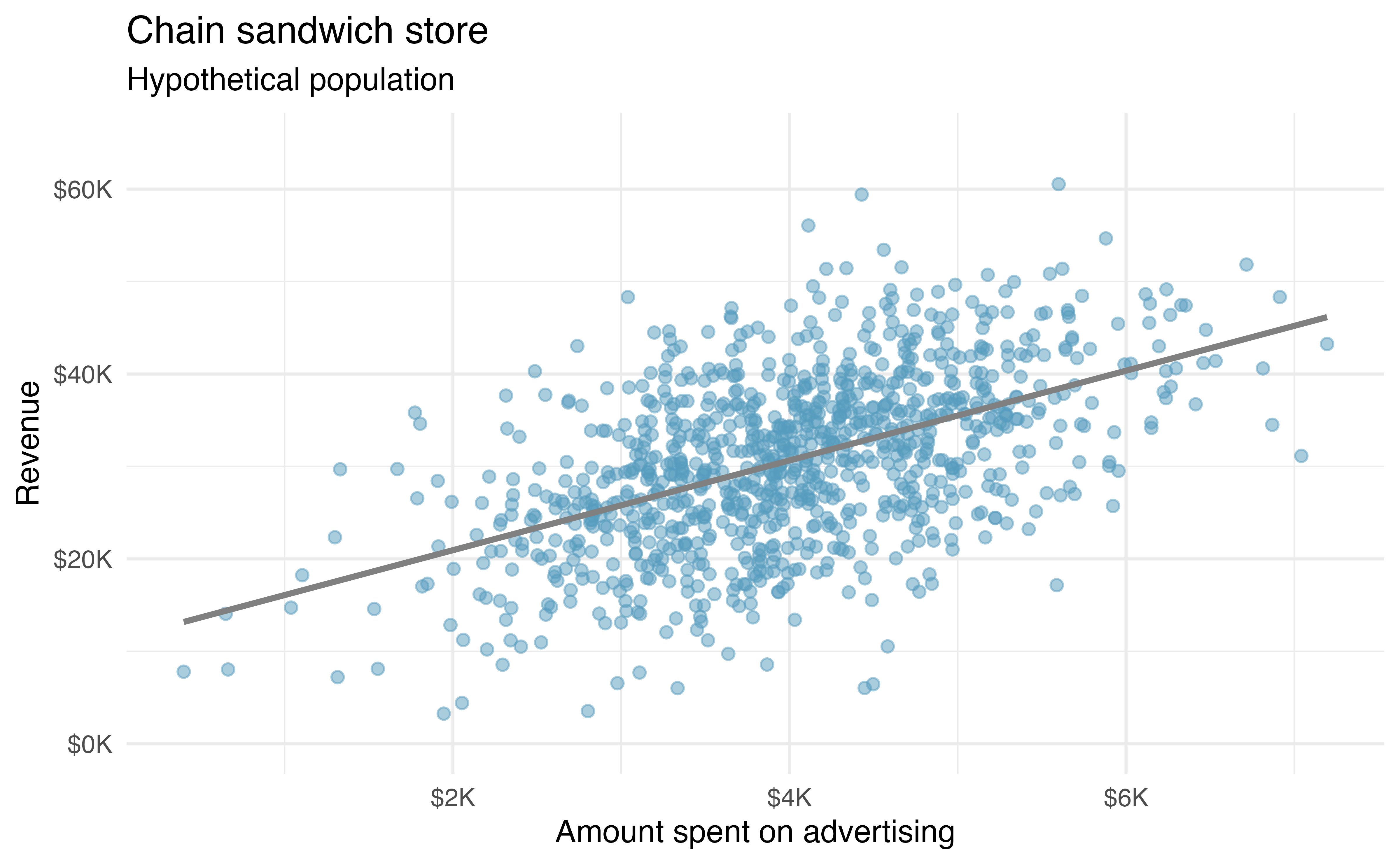
Consider the following hypothetical population of all of the sandwich stores of a particular chain seen in Figure 24.1. In this made-up world, the CEO actually has all the relevant data, which is why they can plot it here. The CEO is omniscient and can write down the population model which describes the true population relationship between the advertising dollars and revenue. There appears to be a linear relationship between advertising dollars and revenue (both in $1,000).
You may remember from Chapter 7 that the population model is: \[y = \beta_0 + \beta_1 x + \varepsilon.\]
Again, the omniscient CEO (with the full population information) can write down the true population model as: \[\texttt{expected revenue} = 11.23 + 4.8 \times \texttt{advertising}.\]
24.1.2 Variability of the statistic
Unfortunately, in our scenario, the CEO is not willing to part with the full set of data, but they will allow potential franchise buyers to see a small sample of the data in order to help the potential buyer decide whether set up a new franchise. The CEO is willing to give each potential franchise buyer a random sample of data from 20 stores.
As with any numerical characteristic which describes a subset of the population, the estimated slope of a sample will vary from sample to sample. Consider the linear model which describes revenue (in $1,000) based on advertising dollars (in $1,000).
The least squares regression model uses the data to find a sample linear fit: \[\hat{y} = b_0 + b_1 x.\]
Two random samples of 20 stores shows different least squares regression lines in Figure 24.2 (a) and Figure 24.2 (b), depending on which observations are selected. Both trends are similar to those seen in Figure 24.1, which describes the population.
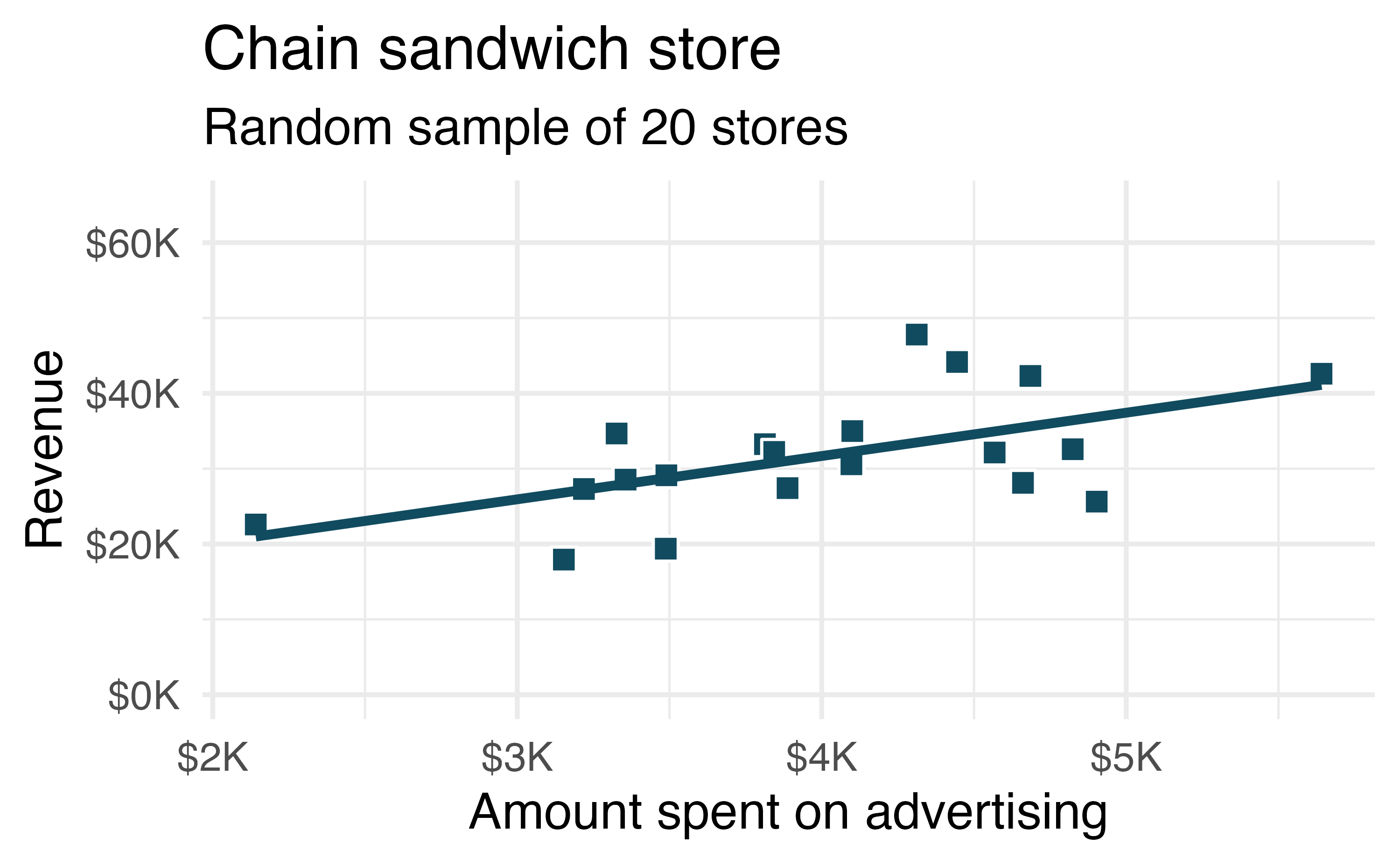
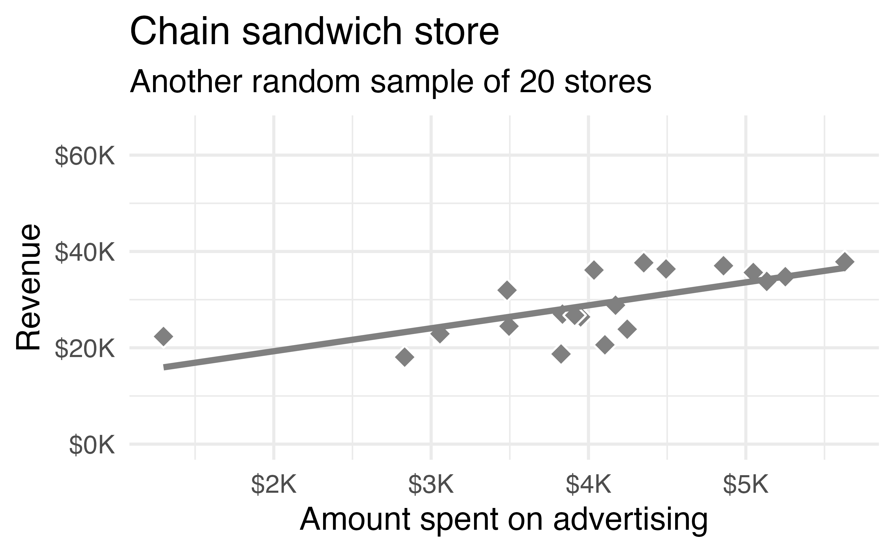
Figure 24.3 shows the two samples and the least squares regressions from Figure 24.2 on the same plot. We can see that the two lines are different. That is, there is variability in the regression line from sample to sample. The concept of the sampling variability is something you’ve seen before, but in this lesson, you will focus on the variability of the line often measured through the variability of a single statistic: the slope of the line.
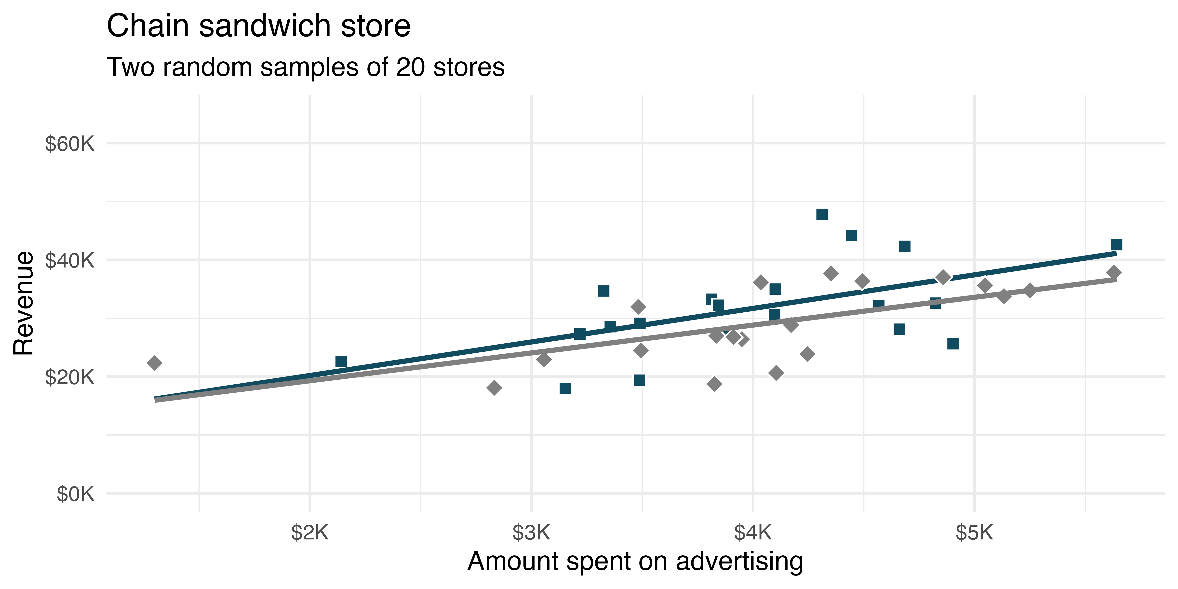
Figure 24.4 shows least squares lines fit to many more random samples of 20 from the population.
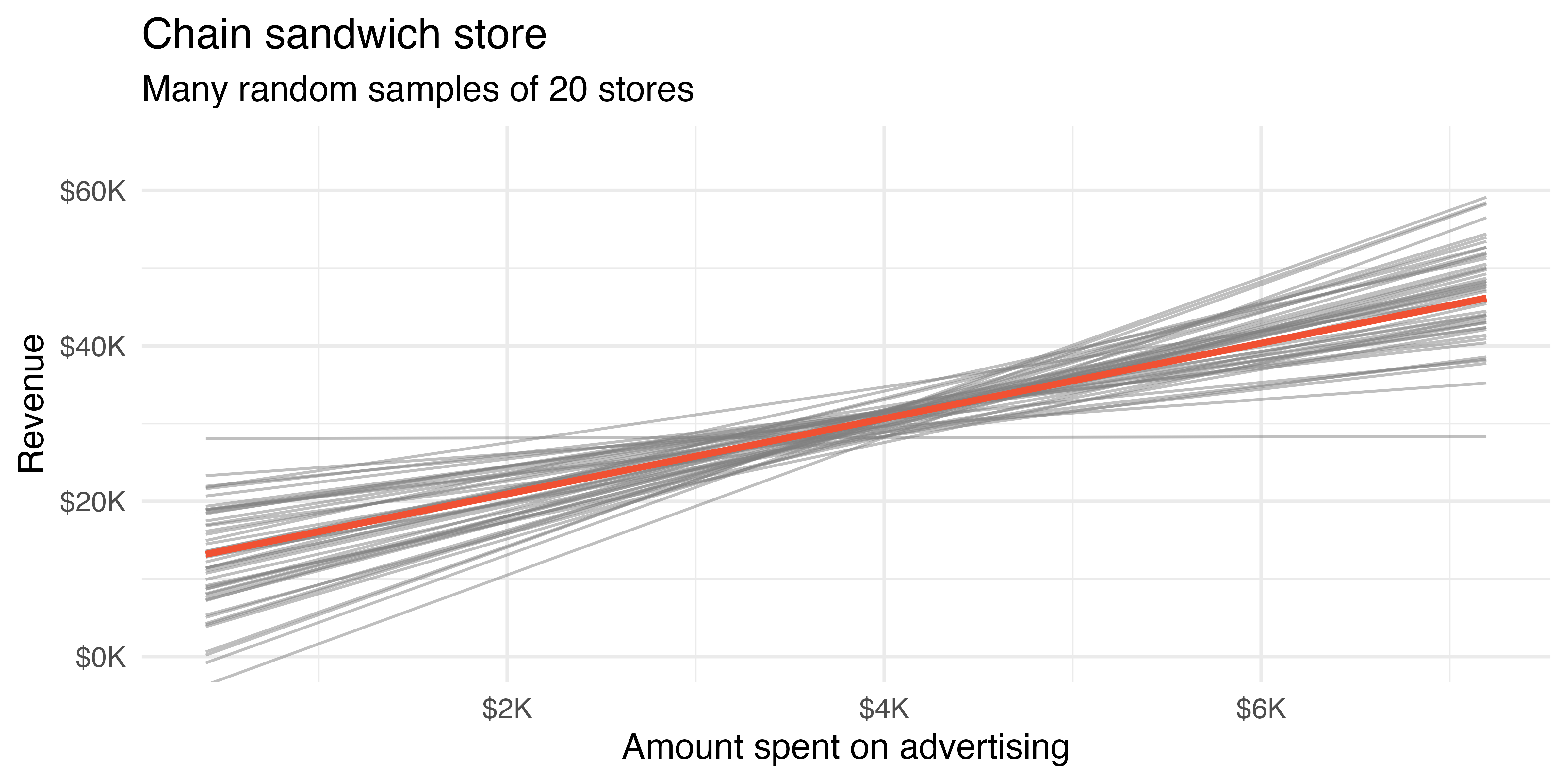
You might notice in Figure 24.4 that the \(\hat{y}\) values given by the lines are much more consistent in the middle of the dataset than at the ends. The reason is that the data itself anchors the lines in such a way that the line must pass through the center of the data cloud. The effect of the fan-shaped lines is that predicted revenue for advertising close to $4,000 will be much more precise than the revenue predictions made for $1,000 or $7,000 of advertising.
The distribution of slopes (for samples of size \(n=20\)) can be seen in Figure 24.5.
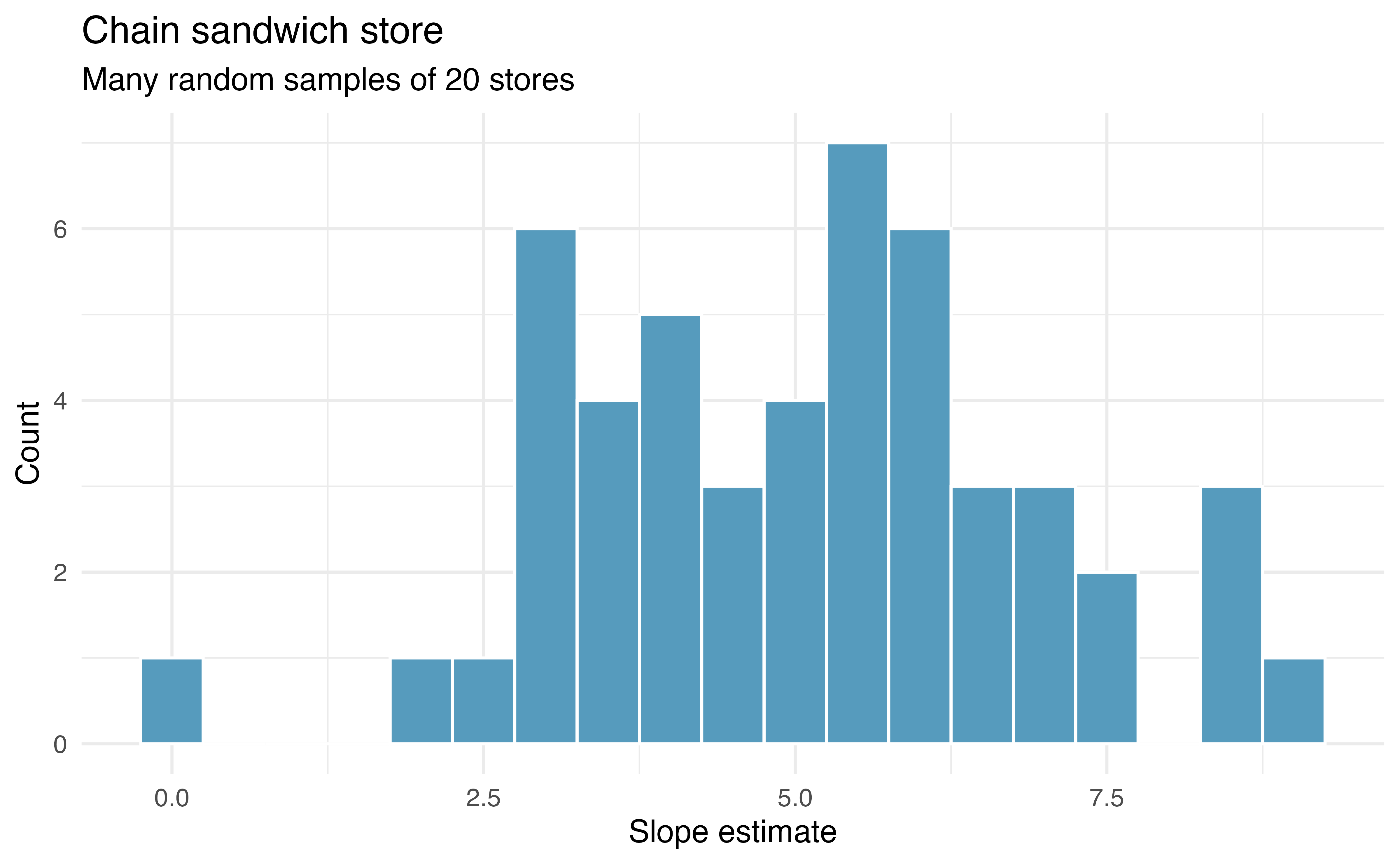
Recall, the example described in this introduction is hypothetical. That is, we created an entire population in order to demonstrate how the slope of a line would vary from sample to sample. The tools in this textbook are designed to evaluate only one single sample of data. With actual studies, we do not have repeated samples, so we are not able to use repeated samples to visualize the variability in slopes. We have seen variability in samples throughout this text, so it should not come as a surprise that different samples will produce different linear models. However, it is nice to visually consider the linear models produced by different slopes. Additionally, as with measuring the variability of previous statistics (e.g., \(\overline{X}_1 - \overline{X}_2\) or \(\hat{p}_1 - \hat{p}_2\)), the histogram of the sample statistics can provide information related to inferential considerations.
In the following sections, the distribution (i.e., histogram) of \(b_1\) (the estimated slope coefficient) will be constructed in the same three ways that, by now, may be familiar to you. First (in Section 24.2), the distribution of \(b_1\) when \(\beta_1 = 0\) is constructed by randomizing (permuting) the response variable. Next (in Section 24.3), we can bootstrap the data by taking random samples of size \(n\) from the original dataset. And last (in Section 24.4), we use mathematical tools to describe the variability using the \(t\)-distribution that was first encountered in Section 19.2.
24.2 Randomization test for the slope
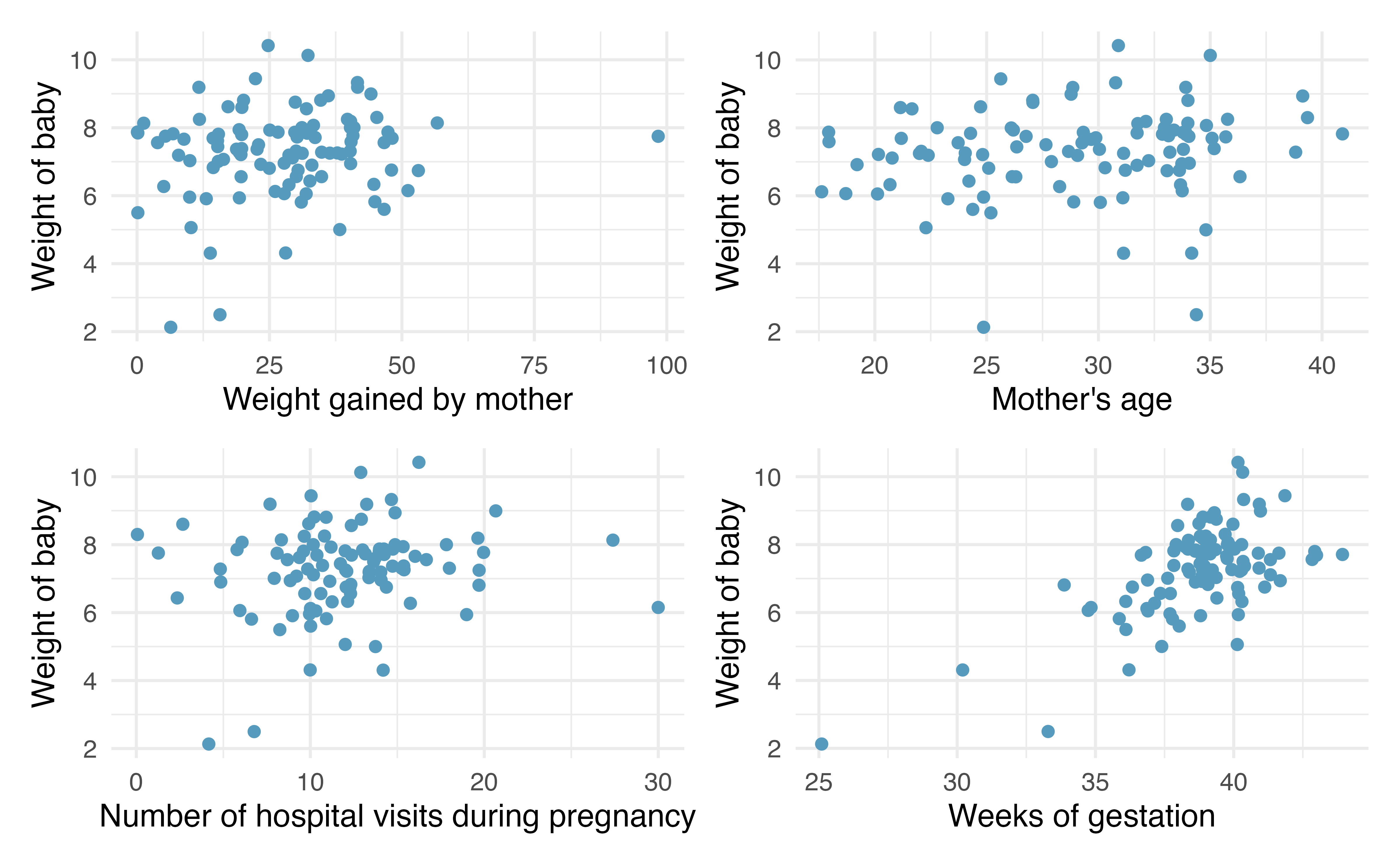
Consider data on 100 randomly selected births gathered originally from the US Department of Health and Human Services. Some of the variables are plotted in Figure 24.6.
The scientific research interest at hand will be in determining the linear relationship between weight of baby at birth (in lbs) and number of weeks of gestation. The dataset is quite rich and deserves exploring, but for this example, we will focus only on the weight of the baby.
The births14 data can be found in the openintro R package. We will work with a random sample of 100 observations from these data.
As you have seen previously, statistical inference typically relies on setting a null hypothesis which is hoped to be subsequently rejected. In the linear model setting, we might hope to have a linear relationship between weeks and weight in settings where weeks gestation is known and weight of baby needs to be predicted.
The relevant hypotheses for the linear model setting can be written in terms of the population slope parameter. Here the population refers to a larger population of births in the US.
-
\(H_0: \beta_1= 0\), there is no linear relationship between
weightandweeks. -
\(H_A: \beta_1 \ne 0\), there is some linear relationship between
weightandweeks.
Recall that for the randomization test, we permute one variable to eliminate any existing relationship between the variables. That is, we set the null hypothesis to be true, and we measure the natural variability in the data due to sampling but not due to variables being correlated. Figure 24.7 (a) shows the observed data and Figure 24.7 (b) shows one permutation of the weight variable. The careful observer can see that each of the observed values for weight (and for weeks) exist in both the original data plot as well as the permuted weight plot, but the weight and weeks gestation are no longer matched for a given birth. That is, each weight value is randomly assigned to a new weeks gestation.
By repeatedly permuting the response variable, any pattern in the linear model that is observed is due only to random chance (and not an underlying relationship). The randomization test compares the slopes calculated from the permuted response variable with the observed slope. If the observed slope is inconsistent with the slopes from permuting, we can conclude that there is some underlying relationship (and that the slope is not merely due to random chance).
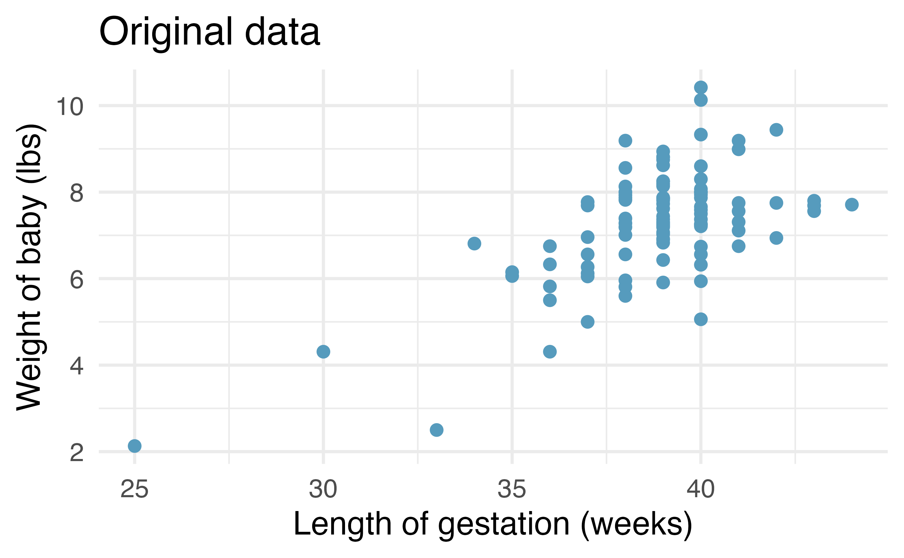
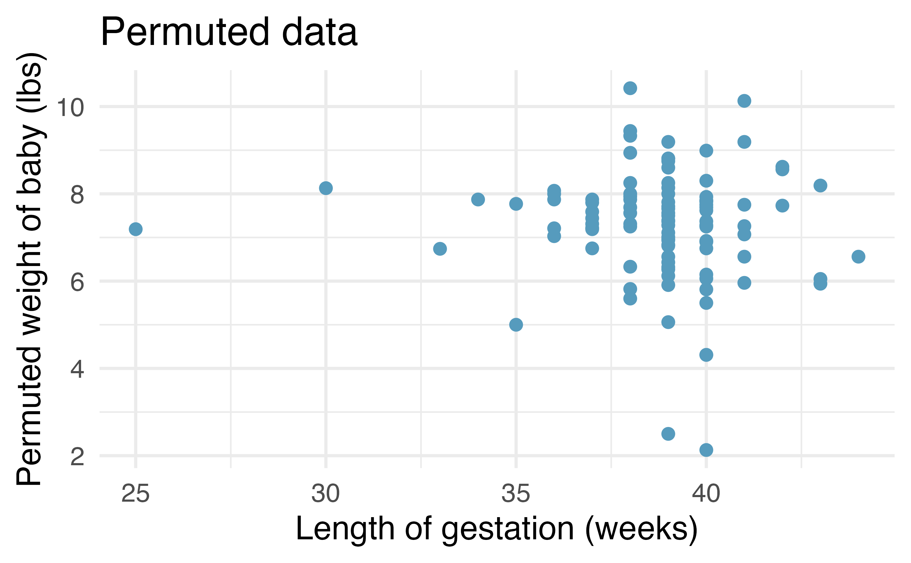
weight and weeks. Repeated permutations allow for quantifying the variability in the slope under the condition that there is no linear relationship (i.e., that the null hypothesis is true).
24.2.1 Observed data
We will continue to use the births data to investigate the linear relationship between weight and weeks gestation. Note that the least squares model (see Chapter 7) describing the relationship is given in Table 24.1. The columns in Table 24.1 are further described in Section 24.4.
| term | estimate | std.error | statistic | p.value |
|---|---|---|---|---|
| (Intercept) | -5.72 | 1.61 | -3.54 | 6e-04 |
| weeks | 0.34 | 0.04 | 8.07 | <0.0001 |
24.2.2 Variability of the statistic
After permuting the data, the least squares estimate of the line can be computed. Repeated permutations and slope calculations describe the variability in the line (i.e., in the slope) due only to the natural variability and not due to a relationship between weight and weeks gestation. Figure 24.8 shows two different permutations of weight and the resulting linear models.
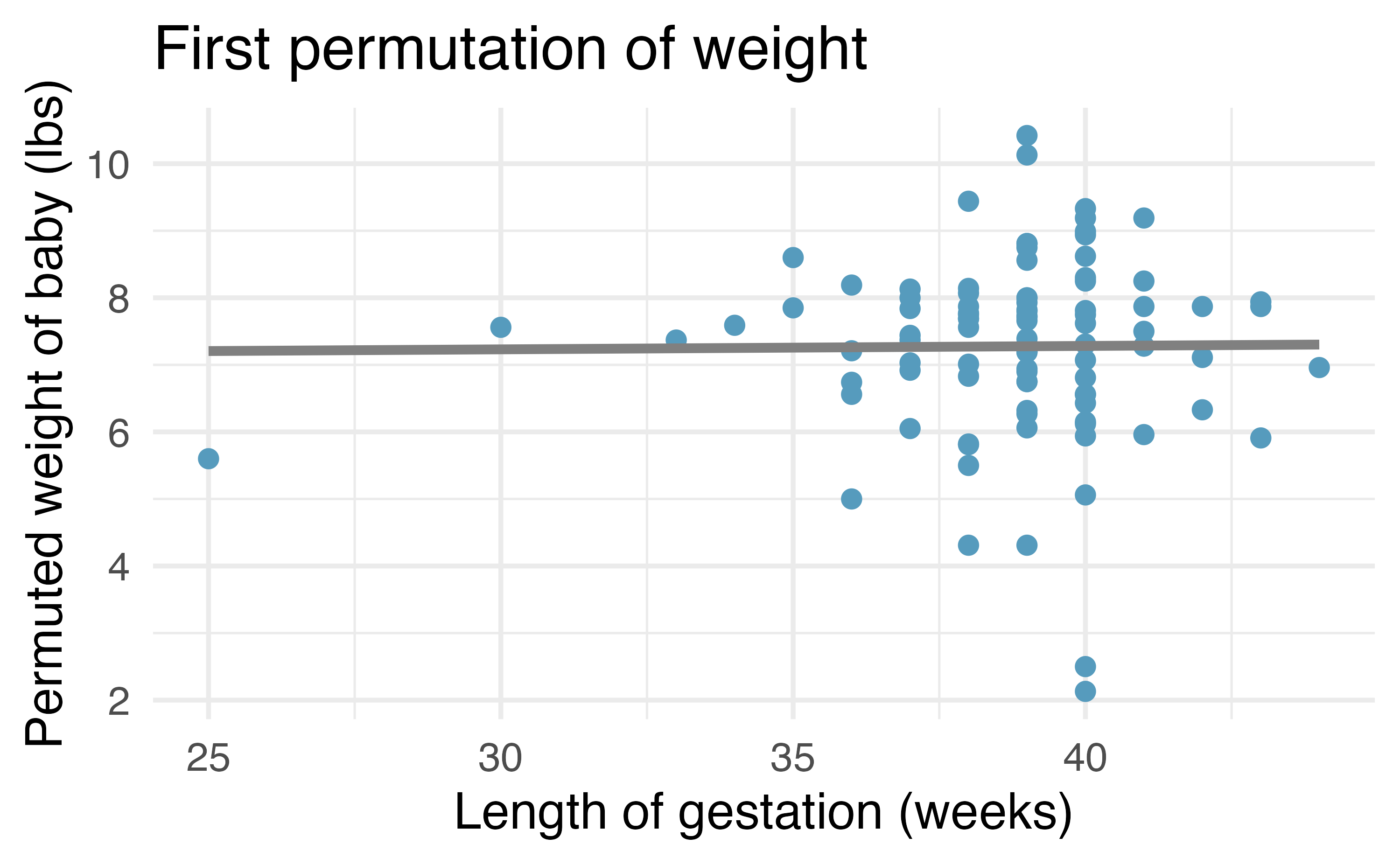
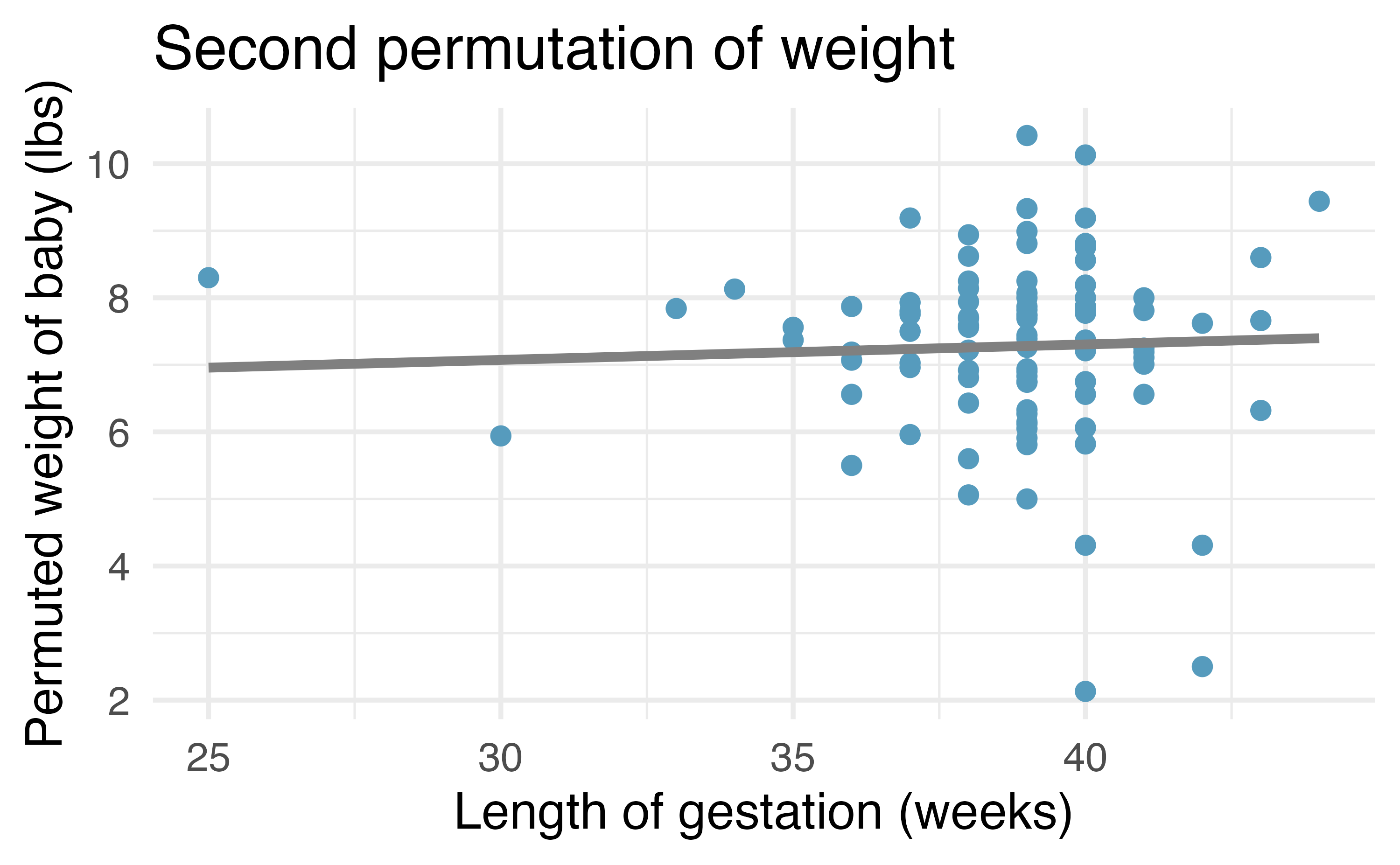
weight with slightly different least squares regression lines.
As you can see, sometimes the slope of the permuted data is positive, sometimes it is negative. Because the randomization happens under the condition of no underlying relationship (because the response variable is completely mixed with the explanatory variable), we expect to see the center of the randomized slope distribution to be zero.
24.2.3 Observed statistic vs. null statistics
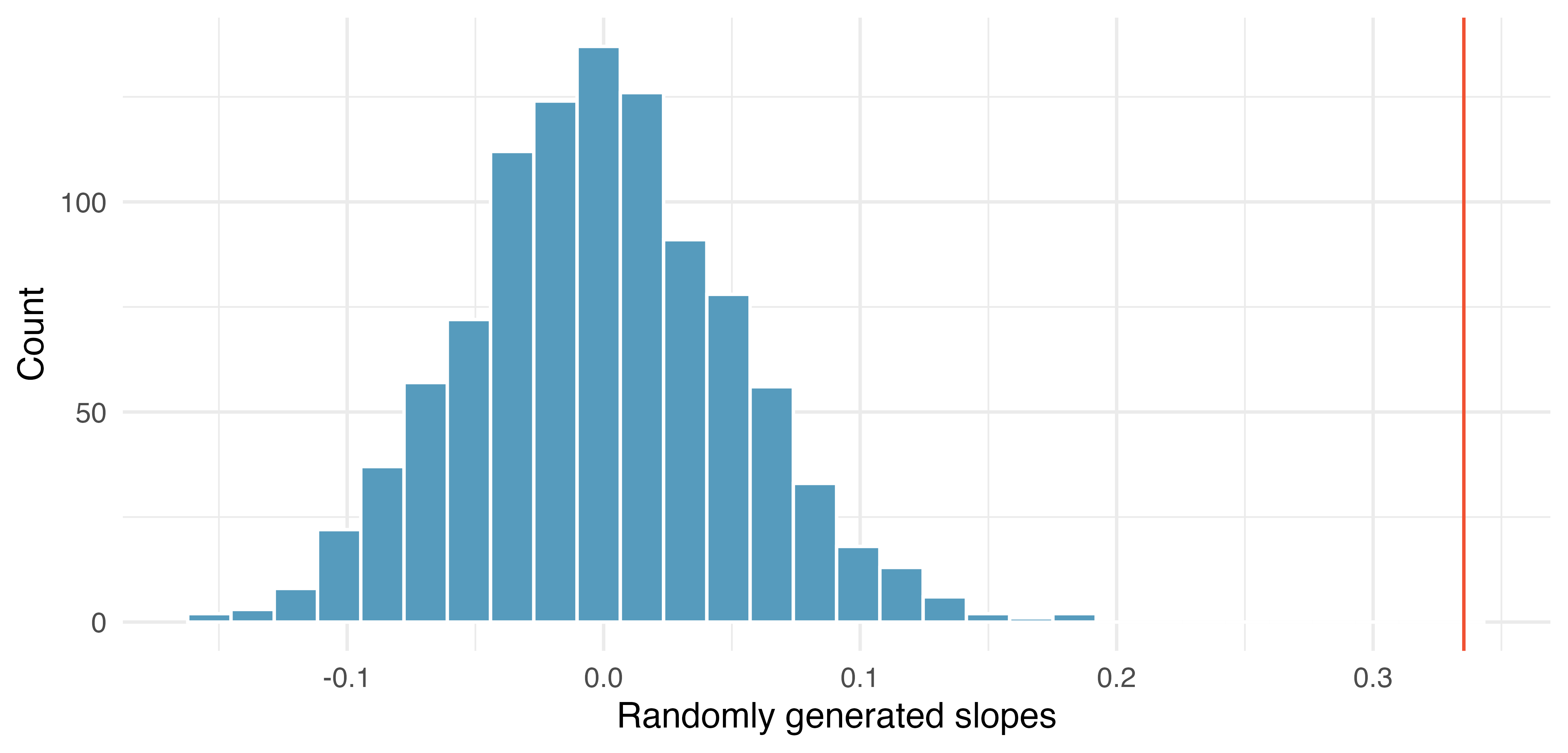
weight variable. The vertical red line is at the observed value of the slope, 0.335.
As we can see from Figure 24.9, a slope estimate as extreme as the observed slope estimate (the red line) never happened in many repeated permutations of the weight variable. That is, if indeed there were no linear relationship between weight and weeks, the natural variability of the slopes would produce estimates between approximately -0.15 and +0.15. We reject the null hypothesis. Therefore, we believe that the slope observed on the original data is not just due to natural variability and indeed, there is a linear relationship between weight of baby and weeks gestation for births in the US.
24.3 Bootstrap confidence interval for the slope
As we have seen in previous chapters, we can use bootstrapping to estimate the sampling distribution of the statistic of interest (here, the slope) without the null assumption of no relationship (which was the condition in the randomization test). Because interest is now in creating a CI, there is no null hypothesis, so there won’t be any reason to permute either of the variables.
24.3.1 Observed data
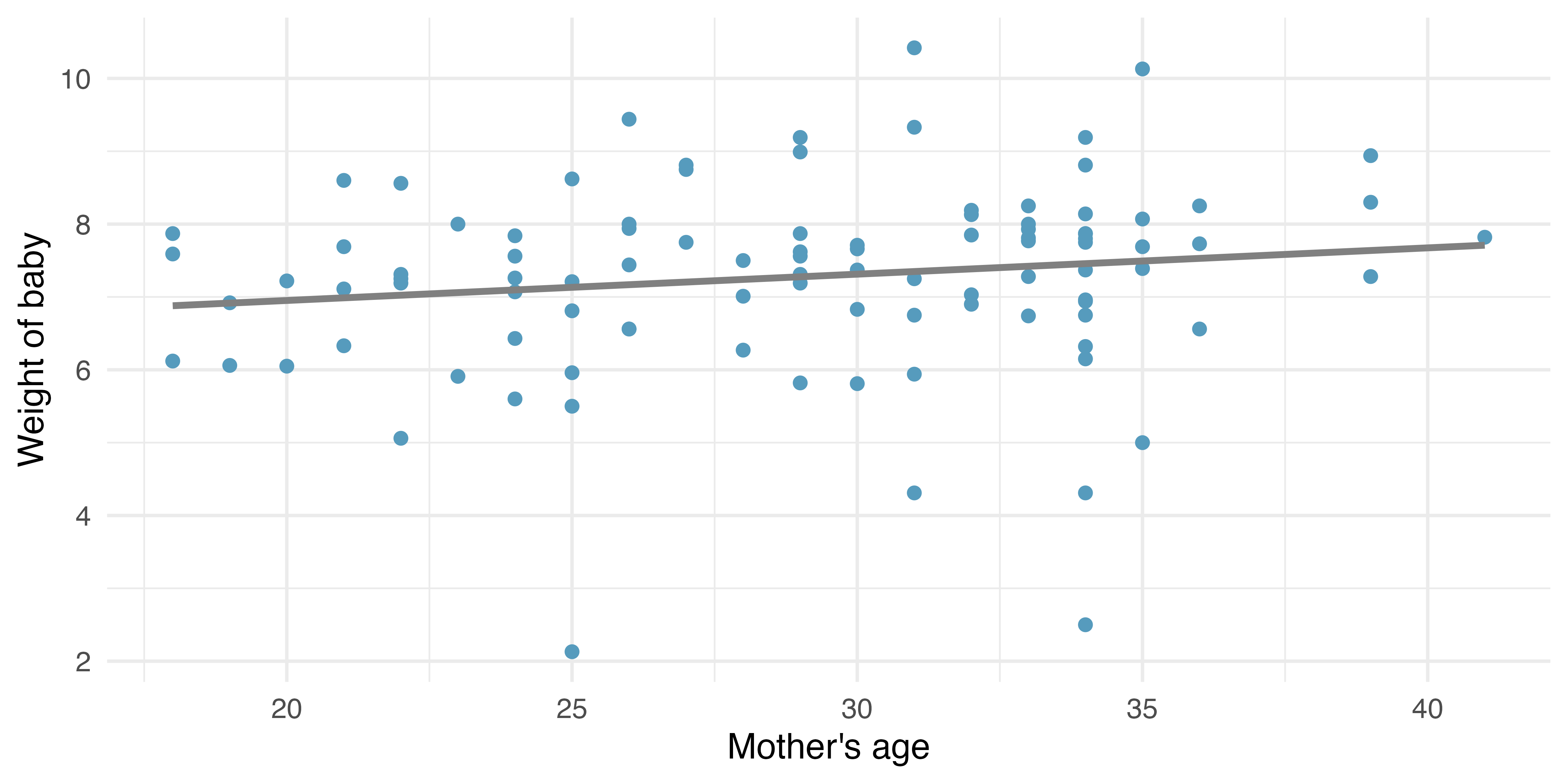
Returning to the births data, we may want to consider the relationship between mage (mother’s age) and weight. Is mage a good predictor of weight? And if so, what is the relationship? That is, what is the slope that models average weight of baby as a function of mage (mother’s age)? The linear model regressing weight on mage is provided in Table 24.2.
| term | estimate | std.error | statistic | p.value |
|---|---|---|---|---|
| (Intercept) | 6.23 | 0.71 | 8.79 | <0.0001 |
| mage | 0.04 | 0.02 | 1.50 | 0.1362 |
24.3.2 Variability of the statistic
Because the focus here is not on a null distribution, we sample with replacement \(n = 100\) observations from the original dataset. Recall that with bootstrapping the resample always has the same number of observations as the original dataset in order to mimic the process of taking a sample from the population. When sampling in the linear model case, consider each observation to be a single dot. If the dot is resampled, both the weight and the mage measurement are observed. The measurements are linked to the dot (i.e., to the birth in the sample).
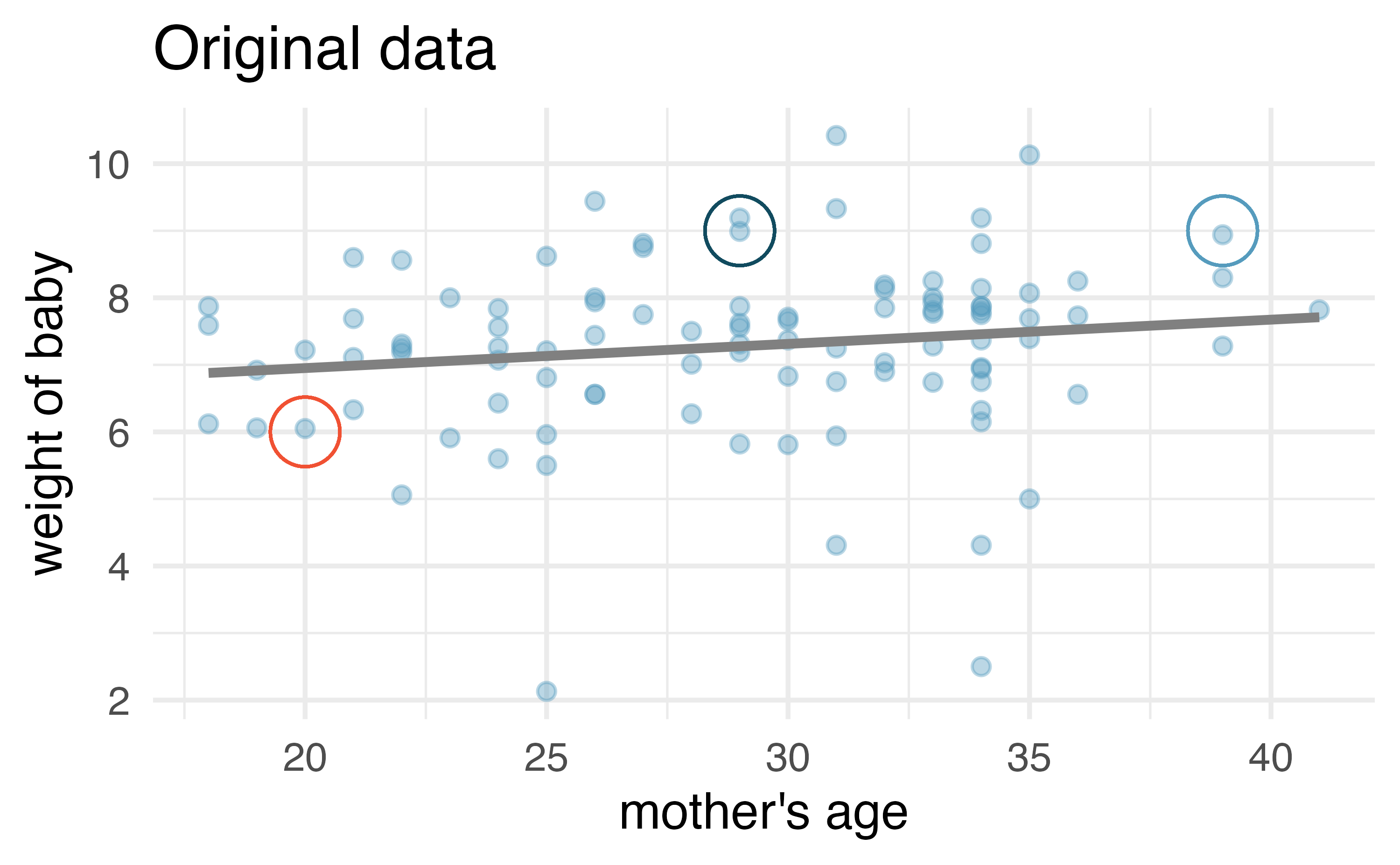
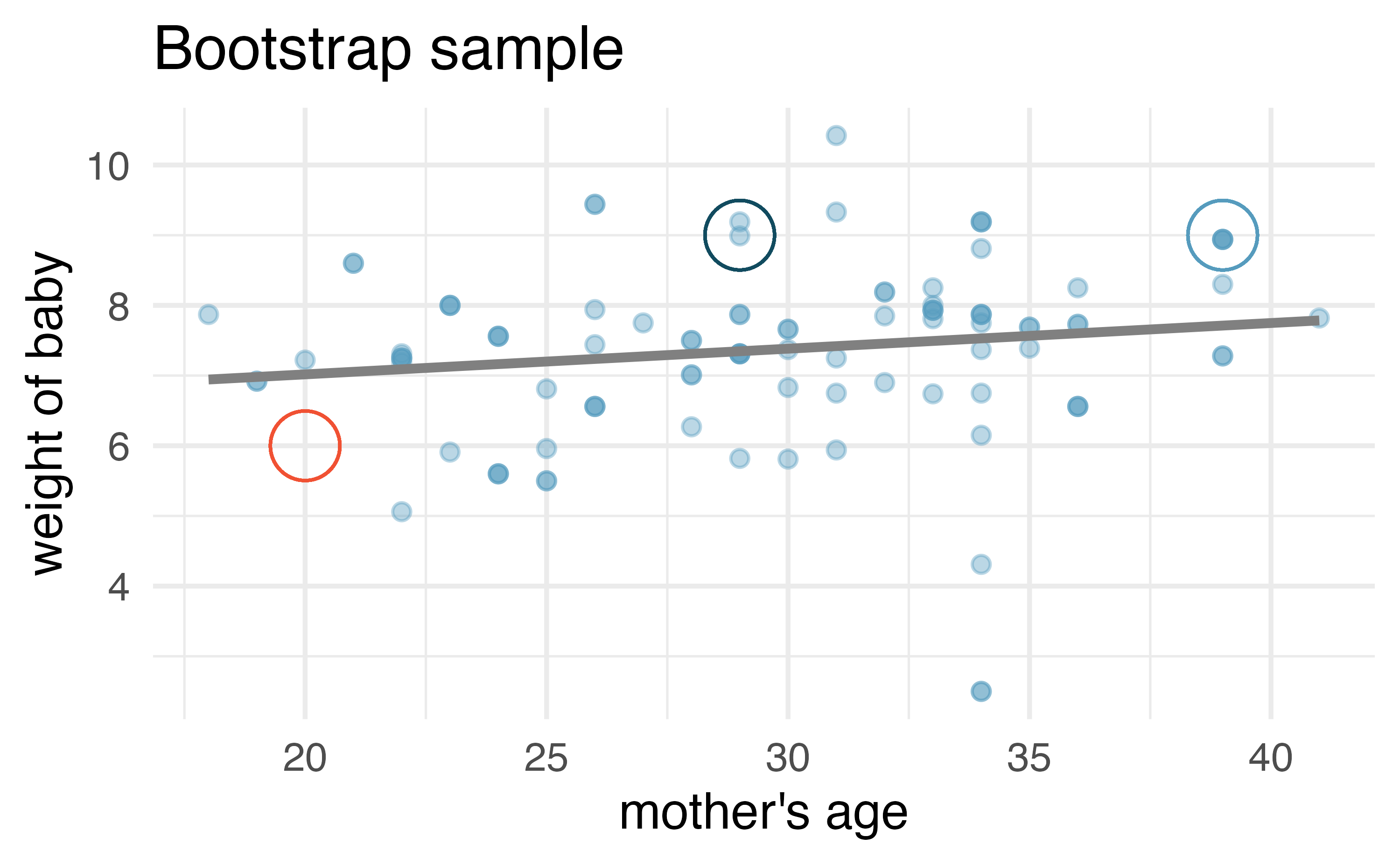
Figure 24.11 (a) shows the original data as compared with a single bootstrap sample in Figure 24.11 (b), resulting in (slightly) different linear models. The red circles represent points in the original data which were not included in the bootstrap sample. The blue circles represent a point that was repeatedly resampled (and is therefore darker) in the bootstrap sample. The green circles represent a particular structure to the data which is observed in both the original and bootstrap samples. By repeatedly resampling, we can see dozens of bootstrapped slopes on the same plot in Figure 24.12.
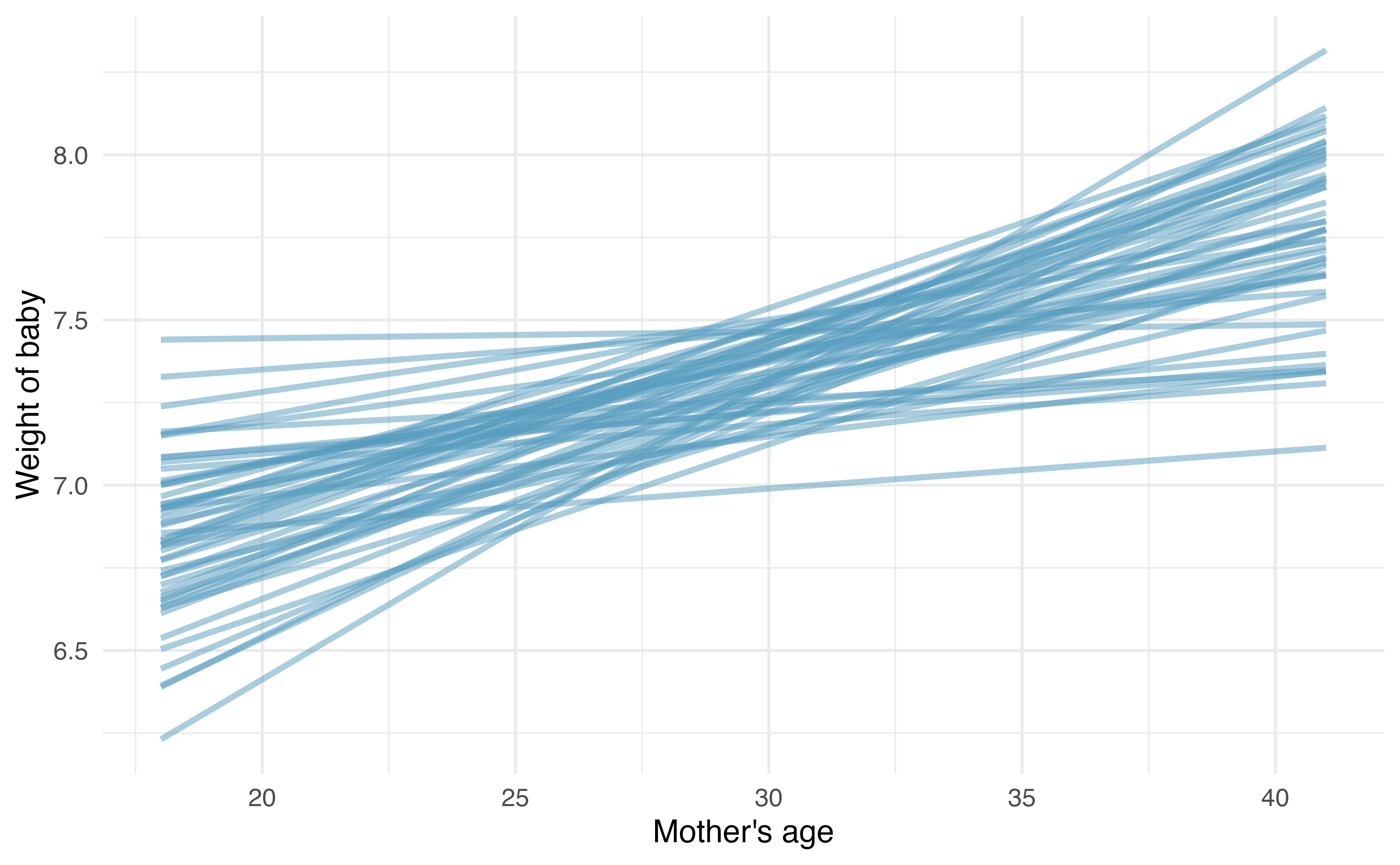
Recall that in order to create a confidence interval for the slope, we need to find the range of values that the statistic (here the slope) takes on from different bootstrap samples. Figure 24.13 is a histogram of the relevant bootstrapped slopes. We can see that a 95% bootstrap percentile interval for the true population slope is given by (-0.01, 0.081). We are 95% confident that for the model describing the population of births, predicting weight of baby from mother’s age, a one unit increase in mage (in years) is associated with an increase in predicted average baby weight of between -0.01 and 0.081 pounds. Notice that the CI contains zero, so the true relationship might be null!
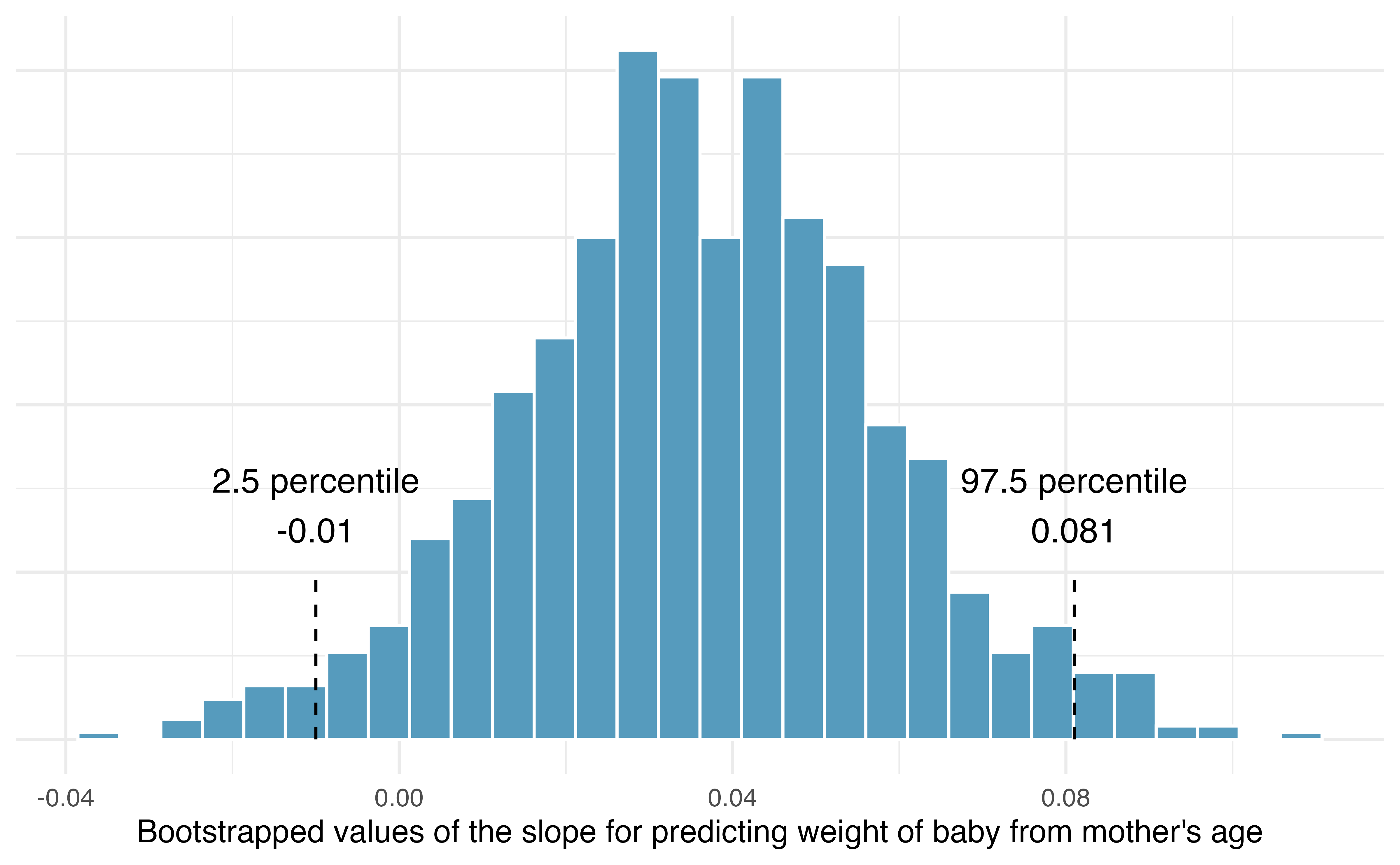
Using Figure 24.13, calculate the bootstrap estimate for the standard error of the slope. Using the bootstrap standard error, find a 95% bootstrap SE confidence interval for the true population slope, and interpret the interval in context.
Notice that most of the bootstrapped slopes fall between -0.01 and +0.08 (a range of 0.09). Using the empirical rule (that with bell-shaped distributions, most observations are within two standard errors of the center), the standard error of the slopes is approximately 0.0225. The critical value for a 95% confidence interval is \(z^\star = 1.96\) which leads to a confidence interval of \(b_1 \pm 1.96 \cdot SE \rightarrow 0.036 \pm 1.96 \cdot 0.0225 \rightarrow (-0.0081, 0.0801).\) The bootstrap SE confidence interval is almost identical to the bootstrap percentile interval. In context, we are 95% confident that for the model describing the population of births, predicting weight of baby from mother’s age, a one unit increase in mage (in years) is associated with an increase in predicted average baby weight of between -0.0081 and 0.0801 pounds.
24.4 Mathematical model for testing the slope
When certain technical conditions apply, it is convenient to use mathematical approximations to test and estimate the slope parameter. The approximations will build on the t-distribution which was described in Chapter 19. The mathematical model is often correct and is usually easy to implement computationally. The validity of the technical conditions will be considered in detail in Section 24.6.
In this section, we discuss uncertainty in the estimates of the slope and y-intercept for a regression line. Just as we identified standard errors for point estimates in previous chapters, we start by discussing standard errors for the slope and y-intercept estimates.
24.4.1 Observed data
Midterm elections and unemployment
Elections for members of the United States House of Representatives occur every two years, coinciding every four years with the U.S. Presidential election. The set of House elections occurring during the middle of a Presidential term are called midterm elections. In America’s two-party system (the vast majority of House members through history have been either Republicans or Democrats), one political theory suggests the higher the unemployment rate, the worse the President’s party will do in the midterm elections. In 2020 there were 232 Democrats, 198 Republicans, and 1 Libertarian in the House.
To assess the validity of the claim related to unemployment and voting patterns, we can compile historical data and look for a connection. We consider every midterm election from 1898 to 2018, with the exception of the elections during the Great Depression. The House of Representatives is made up of 435 voting members.
The midterms_house data can be found in the openintro R package.
Figure 24.14 shows these data and the least-squares regression line:
\[ \begin{aligned} &\texttt{percent change in House seats for President's party} \\ &\qquad\qquad= -7.36 - 0.89 \times \texttt{(unemployment rate)} \end{aligned} \]
We consider the percent change in the number of seats of the President’s party (e.g., percent change in the number of seats for Republicans in 2018) against the unemployment rate.
Examining the data, there are no clear deviations from linearity or substantial outliers (see Section 7.1.3 for a discussion on using residuals to visualize how well a linear model fits the data). While the data are collected sequentially, a separate analysis was used to check for any apparent correlation between successive observations; no such correlation was found.
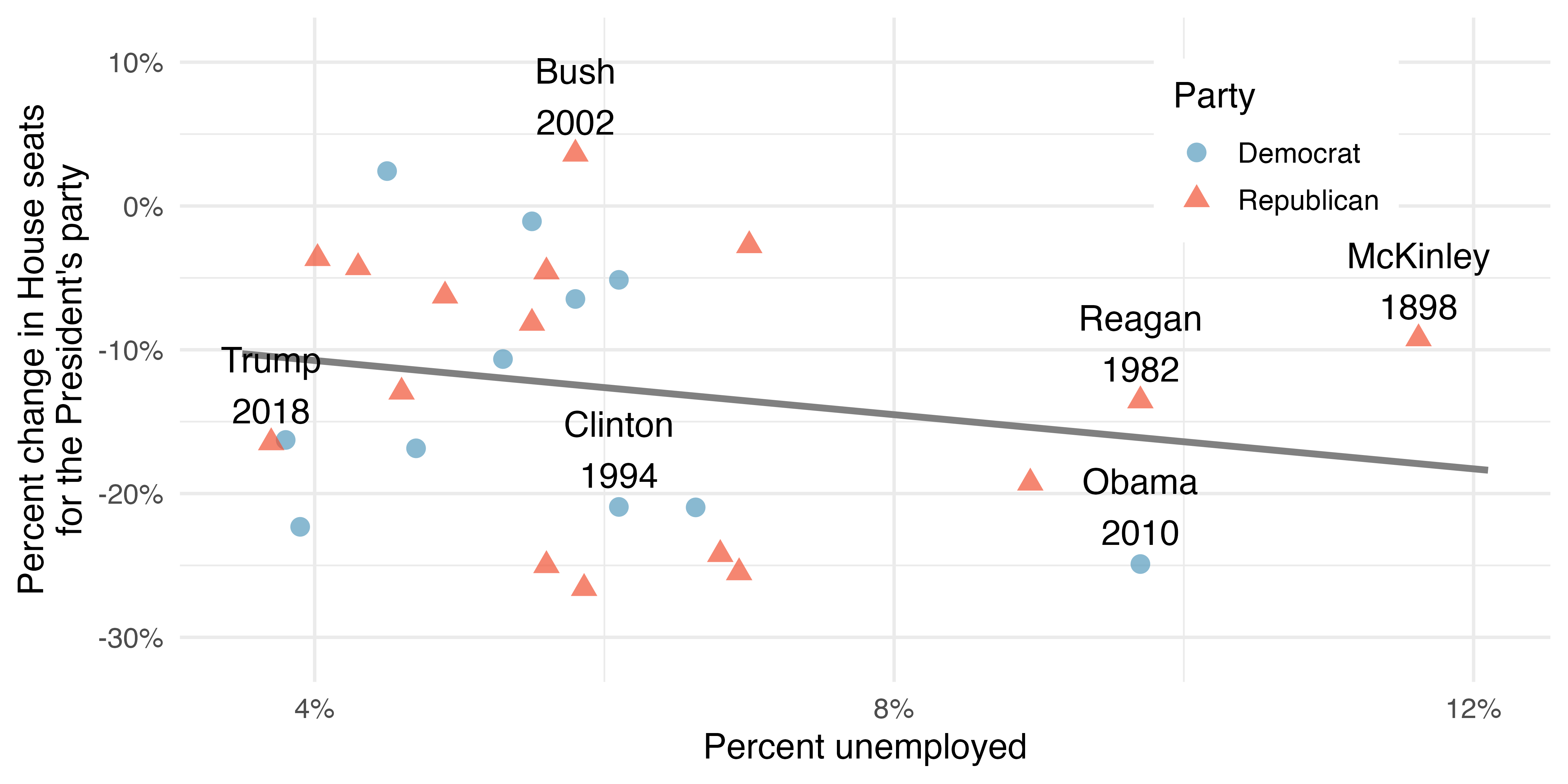
The data for the Great Depression (1934 and 1938) were removed because the unemployment rate was 21% and 18%, respectively. Do you agree that they should be removed for this investigation? Why or why not?1
There is a negative slope in the line shown in Figure 24.14. However, this slope (and the y-intercept) are only estimates of the parameter values. We might wonder, is this convincing evidence that the “true” linear model has a negative slope? That is, do the data provide strong evidence that the political theory is accurate, where the unemployment rate is a useful predictor of the midterm election? We can frame this investigation into a statistical hypothesis test:
- \(H_0\): \(\beta_1 = 0\). The true linear model has slope zero.
- \(H_A\): \(\beta_1 \neq 0\). The true linear model has a slope different than zero. The unemployment is predictive of whether the President’s party wins or loses seats in the House of Representatives.
We would reject \(H_0\) in favor of \(H_A\) if the data provide strong evidence that the true slope parameter is different than zero. To assess the hypotheses, we identify a standard error for the estimate, compute an appropriate test statistic, and identify the p-value.
24.4.2 Variability of the statistic
Just like other point estimates we have seen before, we can compute a standard error and test statistic for \(b_1\). We will generally label the test statistic using a \(T\), since it follows the \(t\)-distribution.
We will rely on statistical software to compute the standard error and leave the explanation of how this standard error is determined to a second or third statistics course. Table 24.3 shows software output for the least squares regression line in Figure 24.14. The row labeled unemp includes all relevant information about the slope estimate (i.e., the coefficient of the unemployment variable, the related SE, the T statistic, and the corresponding p-value).
| term | estimate | std.error | statistic | p.value |
|---|---|---|---|---|
| (Intercept) | -7.36 | 5.16 | -1.43 | 0.16 |
| unemp | -0.89 | 0.83 | -1.07 | 0.30 |
What do the first and second columns of Table 24.3 represent?
The entries in the first column represent the least squares estimates, \(b_0\) and \(b_1\), and the values in the second column correspond to the standard errors of each estimate. Using the estimates, we could write the equation for the least square regression line as
\[ \hat{y} = -7.36 - 0.89 x \]
where \(\hat{y}\) in this case represents the predicted change in the number of seats for the president’s party, and \(x\) represents the unemployment rate.
We previously used a \(t\)-test statistic for hypothesis testing in the context of numerical data. Regression is very similar. In the hypotheses we consider, the null value for the slope is 0, so we can compute the test statistic using the T score formula:
\[ T \ = \ \frac{\text{estimate} - \text{null value}}{\text{SE}} = \ \frac{-0.89 - 0}{0.835} = \ -1.07 \]
The T score we calculated corresponds to the third column of Table 24.3.
Use Table 24.3 to determine the p-value for the hypothesis test.
The last column of the table gives the p-value for the two-sided hypothesis test for the coefficient of the unemployment rate 0.2961. That is, the data do not provide convincing evidence that a higher unemployment rate has any correspondence with smaller or larger losses for the President’s party in the House of Representatives in midterm elections. If there was no linear relationship between the two variables (i.e., if \(\beta_1 = 0)\), then we would expect to see linear models as or more extreme that the observed model roughly 30% of the time.
24.4.3 Observed statistic vs. null statistics
As the final step in a mathematical hypothesis test for the slope, we use the information provided to make a conclusion about whether the data could have come from a population where the true slope was zero (i.e., \(\beta_1 = 0\)). Before evaluating the formal hypothesis claim, sometimes it is important to check your intuition. Based on everything we have seen in the examples above describing the variability of a line from sample to sample, ask yourself if the linear relationship given by the data could have come from a population in which the slope was truly zero.
Examine Figure 7.13, which relates the Elmhurst College aid and student family income. Are you convinced that the slope is discernibly different from zero? That is, do you think a formal hypothesis test would reject the claim that the true slope of the line should be zero?
While the relationship between the variables is not perfect, there is an evident decreasing trend in the data. Such a distinct trend suggests that the hypothesis test will reject the null claim that the slope is zero.
The tools in this section help you go beyond a visual interpretation of the linear relationship toward a formal mathematical claim about whether the slope estimate is meaningfully different from 0 to suggest that the true population slope is different from 0.
| term | estimate | std.error | statistic | p.value |
|---|---|---|---|---|
| (Intercept) | 24319.33 | 1291.45 | 18.83 | <0.0001 |
| family_income | -0.04 | 0.01 | -3.98 | 2e-04 |
Table 24.4 shows statistical software output from fitting the least squares regression line shown in Figure 7.13. Use the output to formally evaluate the following hypotheses.2
- \(H_0\): The true coefficient for family income is zero.
- \(H_A\): The true coefficient for family income is not zero.
Inference for regression.
We usually rely on statistical software to identify point estimates, standard errors, test statistics, and p-values in practice. However, be aware that software will not generally check whether the method is appropriate, meaning we must still verify conditions are met. See Section 24.6.
24.5 Mathematical model, interval for the slope
Similar to how we can conduct a hypothesis test for a model coefficient using regression output, we can also construct confidence intervals for the slope and intercept coefficients.
Confidence intervals for coefficients.
Confidence intervals for model coefficients (e.g., the intercept or the slope) can be computed using the \(t\)-distribution:
\[ b_i \ \pm\ t_{df}^{\star} \times SE_{b_{i}} \]
where \(t_{df}^{\star}\) is the appropriate \(t^{\star}\) cutoff corresponding to the confidence level with the model’s degrees of freedom, \(df = n - 2\).
Compute the 95% confidence interval for the coefficient using the regression output from Table 24.4.
The point estimate is -0.0431 and the standard error is \(SE = 0.0108\). When constructing a confidence interval for a model coefficient, we generally use a \(t\)-distribution. The degrees of freedom for the distribution are noted in the regression output, \(df = 48\), allowing us to identify \(t_{48}^{\star} = 2.01\) for use in the confidence interval.
We can now construct the confidence interval in the usual way:
\[ \begin{aligned} \text{point estimate} &\pm t_{48}^{\star} \times SE \\ -0.0431 &\pm 2.01 \times 0.0108 \\ (-0.0648 &, -0.0214) \end{aligned} \]
We are 95% confident that for an additional one unit (i.e., $1000 increase) in family income, the university’s gift aid is predicted to decrease on average by $21.40 to $64.80.
On the topic of intervals in this book, we have focused exclusively on confidence intervals for model parameters. However, there are other types of intervals that may be of interest (and are outside the scope of this book), including prediction intervals for a response value and confidence intervals for a mean response value in the context of regression.
24.6 Checking model conditions
In the previous sections, we used randomization and bootstrapping to perform inference when the mathematical model was not valid due to violations of the technical conditions. In this section, we’ll provide details for when the mathematical model is appropriate and a discussion of technical conditions needed for the randomization and bootstrapping procedures. Recall from Section 7.1.3 that residual plots can be used to visualize how well a linear model fits the data.
24.6.1 What are the technical conditions for the mathematical model?
When fitting a least squares line, we generally require the following:
Linearity. The data should show a linear trend. If there is a nonlinear trend (e.g., first panel of Figure 24.15) an advanced regression method from another book or later course should be applied.
Independent observations. Be cautious about applying regression to data that are sequential observations in time such as a stock price each day. Such data may have an underlying structure that should be considered in a different type of model and analysis. An example of a dataset where successive observations are not independent is shown in the fourth panel of Figure 24.15. There are also other instances where correlations within the data are important, which is further discussed in Chapter 25.
Nearly normal residuals. Generally, the residuals should be nearly normal. When this condition is found to be unreasonable, it is often because of outliers or concerns about influential points, which we’ll talk about more in Section 7.3. An example of a residual that would be potentially concerning is shown in the second panel of Figure 24.15, where one observation is clearly much further from the regression line than the others. Outliers should be treated extremely carefully. Do not automatically remove an outlier if it truly belongs in the dataset. However, be honest about its impact on the analysis. A strategy for dealing with outliers is to present two analyses: one with the outlier and one without the outlier. Additionally, a type of violation of normality happens when the positive residuals are smaller in magnitude than the negative residuals (or vice versa). That is, when the residuals are not symmetrically distributed around the line \(y=0.\)
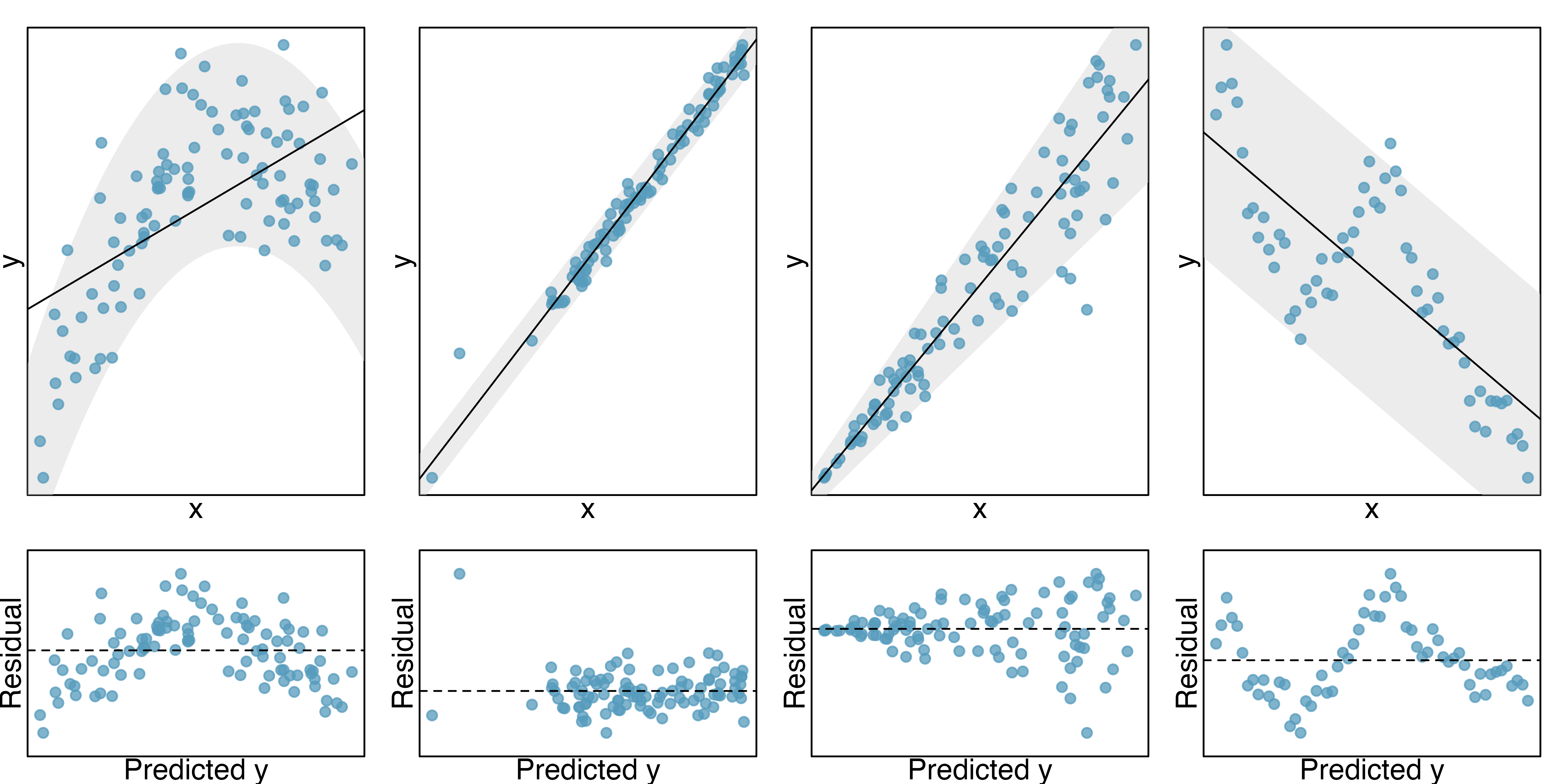
- Constant or equal variability. The variability of points around the least squares line remains roughly constant. An example of non-constant variability is shown in the third panel of Figure 24.15, which represents the most common pattern observed when this condition fails: the variability of \(y\) is larger when \(x\) is larger.
Should we have concerns about applying least squares regression to the Elmhurst data in Figure 7.14?3
The technical conditions are often remembered using the LINE mnemonic. The linearity, normality, and equality of variance conditions usually can be assessed through residual plots, as seen in Figure 24.15. A careful consideration of the experimental design should be undertaken to confirm that the observed values are indeed independent.
- L: linear model
- I: independent observations
- N: points are normally distributed around the line
- E: equal variability around the line for all values of the explanatory variable
24.6.2 Why do we need technical conditions?
As with other inferential techniques we have covered in this text, if the technical conditions above do not hold, then it is not possible to make concluding claims about the population. That is, without the technical conditions, the T score will not have the assumed t-distribution. That said, it is almost always impossible to check the conditions precisely, so we look for large deviations from the conditions. If there are large deviations, we will be unable to trust the calculated p-value or the endpoints of the resulting confidence interval.
The model based on linearity
The linearity condition is among the most important if your goal is to understand a linear model between \(x\) and \(y\). For example, the value of the slope will not be at all meaningful if the true relationship between \(x\) and \(y\) is quadratic, as in Figure 7.3. Not only should we be cautious about the inference, but the model itself is also not an accurate portrayal of the relationship between the variables. However, an extended discussion on the different methods for modeling functional forms other than linear is outside the scope of this text.
The importance of independence
The technical condition describing the independence of the observations is often the most crucial but also the most difficult to diagnose. It is also extremely difficult to gather a dataset which is a true random sample from the population of interest. A true randomized experiment from a fixed set of individuals is much easier to implement, and indeed, randomized experiments are done in most medical studies these days.
Dependent observations can bias results in ways that produce fundamentally flawed analyses. That is, if you hang out at the gym measuring height and weight, your linear model is surely not a representation of all students at your university. At best it is a model describing students who use the gym, but also who are willing to talk to you, that use the gym at the times you were there measuring, etc.
In lieu of trying to answer whether your observations are a true random sample, you might instead focus on whether you believe your observations are representative of a population of interest. Humans are notoriously bad at implementing random procedures, so you should be wary of any process that used human intuition to balance the data with respect to, for example, the demographics of the individuals in the sample.
Some thoughts on normality
The normality condition requires that points vary symmetrically around the line, spreading out in a bell-shaped fashion. You should consider the “bell” of the normal distribution as sitting on top of the line (coming off the paper in a 3-D sense) so as to indicate that the points are dense close to the line and disperse gradually as they get farther from the line.
The normality condition is less important than linearity or independence for a few reasons. First, the linear model fit with least squares will still be an unbiased estimate of the true population model. However, the distribution of the estimate will be unknown. Fortunately the Central Limit Theorem (described in Section 19.2) tells us that most of the analyses (e.g., SEs, p-values, confidence intervals) done using the mathematical model (with the \(t\)-distribution) will still hold (even if the data are not normally distributed around the line) as long as the sample size is large enough. One analysis method that does require normality, regardless of sample size, is creating intervals which predict the response of individual outcomes at a given \(x\) value, using the linear model. One additional reason to worry slightly less about normality is that neither the randomization test nor the bootstrapping procedures require the data to be normal around the line.
Equal variability for prediction in particular
As with normality, the equal variability condition (that points are spread out in similar ways around the line for all values of \(x\)) will not cause problems for the estimate of the linear model. That said, the inference on the model (e.g., computing p-values) will be incorrect if the variability around the line is extremely heterogeneous. Data that exhibit non-equal variance across the range of x-values will have the potential to seriously mis-estimate the variability of the slope which will have consequences for the inference results (i.e., hypothesis tests and confidence intervals).
In many cases, the inference results for both a randomization test or a bootstrap confidence interval are also robust to the equal variability condition, so they provide the analyst a set of methods to use when the data are heteroskedastic (that is, exhibit unequal variability around the regression line). Although randomization tests and bootstrapping allow us to analyze data using fewer conditions, some technical conditions are required for all methods described in this text (e.g., independent observation). When the equal variability condition is violated and a mathematical analysis (e.g., p-value from T score) is needed, there are other existing methods (outside the scope of this text) which can handle the unequal variance (e.g., weighted least squares analysis).
24.6.3 What if all the technical conditions are met?
When the technical conditions are met, the least squares regression model and inference is provided by virtually all statistical software. In addition to being ubiquitous, however, an additional advantage to the least squares regression model (and related inference) is that the linear model has important extensions (which are not trivial to implement with bootstrapping and randomization tests). In particular, random effects models, repeated measures, and interaction are all linear model extensions which require the above technical conditions. When the technical conditions hold, the extensions to the linear model can provide important insight into the data and research question at hand. We will discuss some of the extended modeling and associated inference in Chapter 25 and Chapter 26. Many of the techniques used to deal with technical condition violations are outside the scope of this text, but they are taught in universities in the very next class after this one. If you are working with linear models or are curious to learn more, we recommend that you continue learning about statistical methods applicable to a larger class of datasets.
24.7 Chapter review
24.7.1 Summary
Recall that early in the text we presented graphical techniques which communicated relationships across multiple variables. We also used modeling to formalize the relationships. Many chapters were dedicated to inferential methods which allowed claims about the population to be made based on samples of data. Not only did we present the mathematical model for each of the inferential techniques, but when appropriate, we also presented bootstrapping and permutation methods.
In Chapter 24 we brought all of those ideas together by considering inferential claims on linear models through randomization tests, bootstrapping, and mathematical modeling. We continue to emphasize the importance of experimental design in making conclusions about research claims. In particular, recall that variability can come from different sources (e.g., random sampling vs. random allocation, see Figure 2.8).
24.7.2 Terms
The terms introduced in this chapter are presented in Table 24.5. If you’re not sure what some of these terms mean, we recommend you go back in the text and review their definitions. You should be able to easily spot them as bolded text.
| bootstrap CI for the slope | randomization test for the slope | technical conditions linear regression |
| inference with single predictor regression | t-distribution for slope | variability of the slope |
24.8 Exercises
Answers to odd-numbered exercises can be found in Appendix A.24.
-
Body measurements, randomization test. Researchers studying anthropometry collected body and skeletal diameter measurements, as well as age, weight, height and sex for 507 physically active individuals. A linear model is built to predict height based on shoulder girth (circumference of shoulders measured over deltoid muscles), both measured in centimeters.4 (Heinz et al. 2003) Shown below are the linear model output for predicting height from shoulder girth and the histogram of slopes from 1,000 randomized datasets (1,000 times,
hgtwas permuted and regressed againstsho_gi). The red vertical line is drawn at the observed slope value which was produced in the linear model output.term estimate std.error statistic p.value (Intercept) 105.832 3.27 32.3 <0.0001 sho_gi 0.604 0.03 20.0 <0.0001 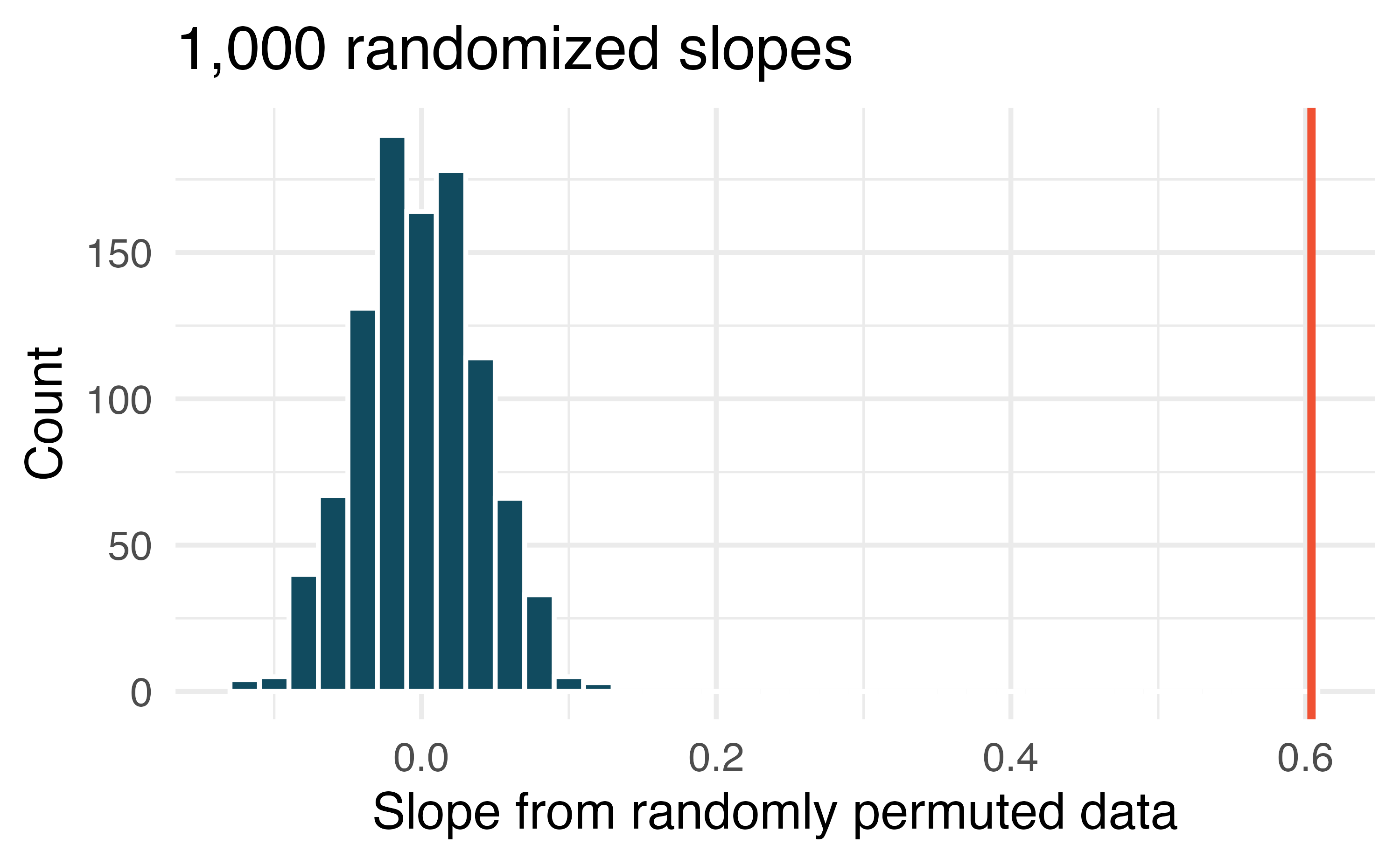
What are the null and alternative hypotheses for evaluating whether the slope of the model predicting height from shoulder girth is differen than 0.
Using the histogram which describes the distribution of slopes when the null hypothesis is true, find the p-value and conclude the hypothesis test in the context of the problem (use words like shoulder girth and height).
Is the conclusion based on the histogram of randomized slopes consistent with the conclusion from the mathematical model? Explain your reasoning.
-
Baby’s weight and father’s age, randomization test. US Department of Health and Human Services, Centers for Disease Control and Prevention collect information on births recorded in the country. The data used here are a random sample of 1000 births from 2014. Here, we study the relationship between the father’s age and the weight of the baby.5 (ICPSR 2014) Shown below are the linear model output for predicting baby’s weight (in pounds) from father’s age (in years) and the histogram of slopes from 1000 randomized datasets (1000 times,
weightwas permuted and regressed againstfage). The red vertical line is drawn at the observed slope value which was produced in the linear model output.term estimate std.error statistic p.value (Intercept) 7.101 0.199 35.674 <0.0001 fage 0.005 0.006 0.757 0.4495 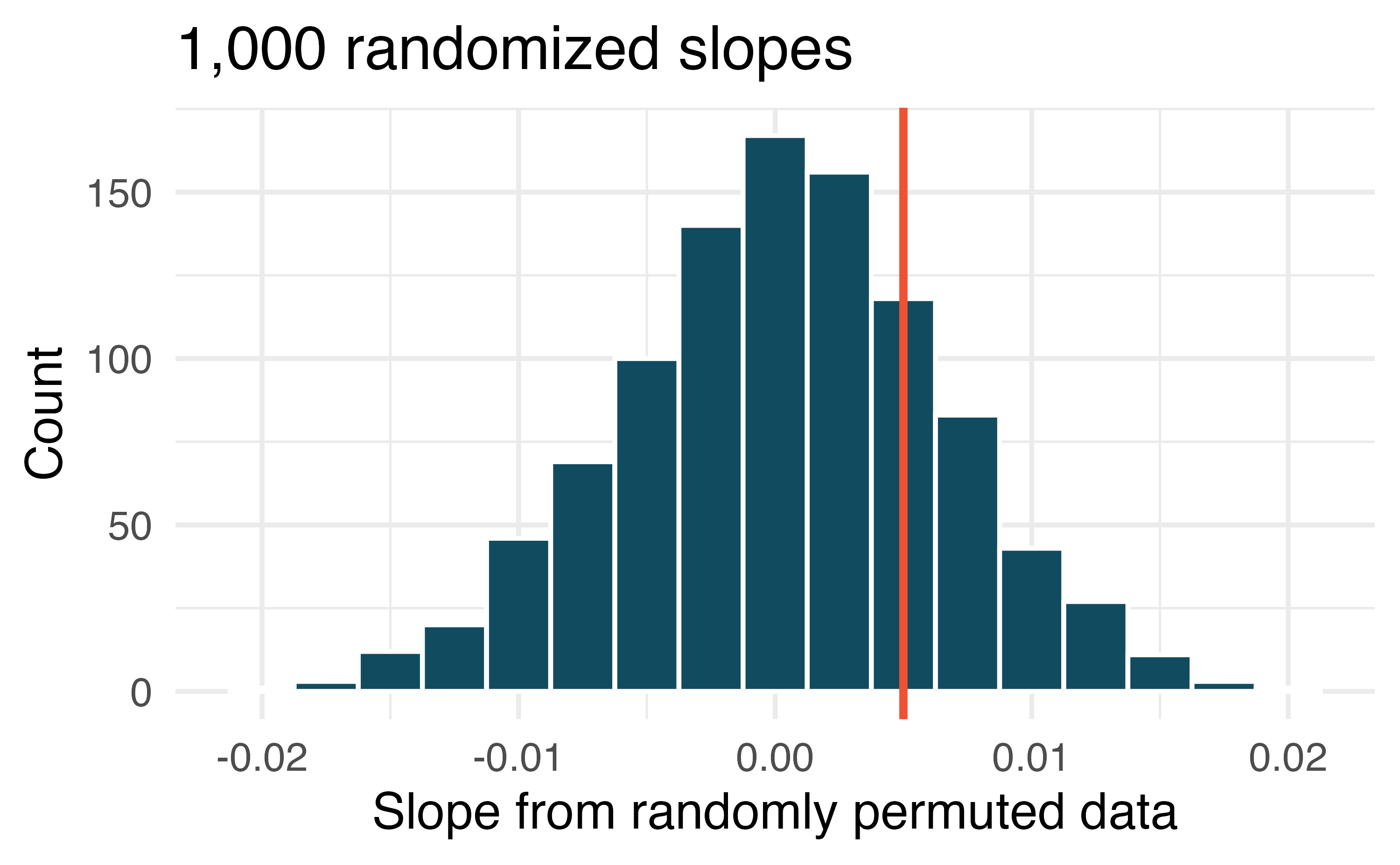
What are the null and alternative hypotheses for evaluating whether the slope of the model for predicting baby’s weight from father’s age is different than 0?
Using the histogram which describes the distribution of slopes when the null hypothesis is true, find the p-value and conclude the hypothesis test in the context of the problem (use words like father’s age and weight of baby). What does the conclusion of your test say about whether the father’s age is a useful predictor of baby’s weight?
Is the conclusion based on the histogram of randomized slopes consistent with the conclusion from the mathematical model? Explain your reasoning.
-
Body measurements, mathematical test. The scatterplot and least squares summary below show the relationship between weight measured in kilograms and height measured in centimeters of 507 physically active individuals. (Heinz et al. 2003)
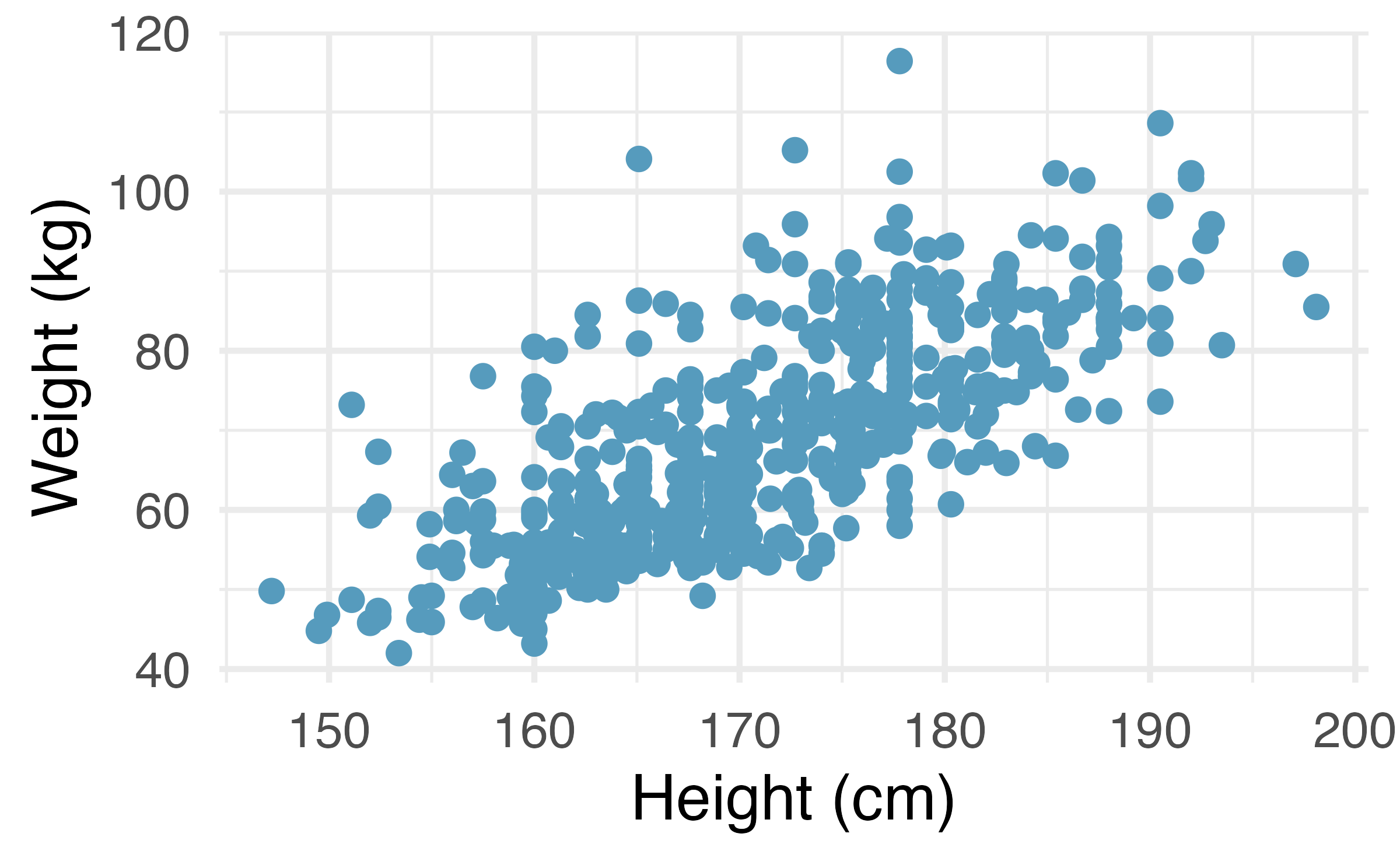
term estimate std.error statistic p.value (Intercept) -105.01 7.54 -13.9 <0.0001 hgt 1.02 0.04 23.1 <0.0001 Describe the relationship between height and weight.
Write the equation of the regression line. Interpret the slope and intercept in context.
Do the data provide convincing evidence that the true slope parameter is different than 0? State the null and alternative hypotheses, report the p-value (using a mathematical model), and state your conclusion.
The correlation coefficient for height and weight is 0.72. Calculate \(R^2\) and interpret it in context.
-
Baby’s weight and father’s age, mathematical test. Is the father’s age useful in predicting the baby’s weight? The scatterplot and least squares summary below show the relationship between baby’s weight (measured in pounds) and father’s age for a random sample of babies. (ICPSR 2014)
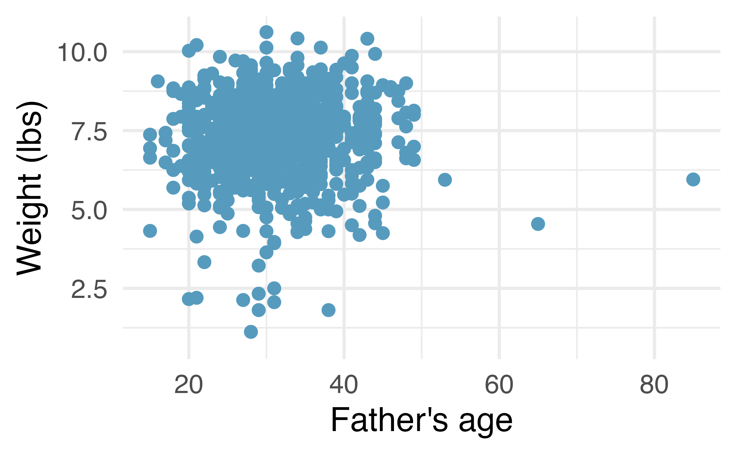
term estimate std.error statistic p.value (Intercept) 7.1042 0.1936 36.698 <0.0001 fage 0.0047 0.0061 0.779 0.4359 What is the predicted weight of a baby whose father is 30 years old?
Do the data provide convincing evidence that the model for predicting baby weights from father’s age has a slope different than 0? State the null and alternative hypotheses, report the p-value (using a mathematical model), and state your conclusion.
Based on your conclusion, is father’s age a useful predictor of baby’s weight?
-
Body measurements, bootstrap percentile interval. In order to estimate the slope of the model predicting height based on shoulder girth (circumference of shoulders measured over deltoid muscles), 1,000 bootstrap samples are taken from a dataset of body measurements from 507 people. A linear model predicting height based on shoulder girth is fit to each bootstrap sample, and the slope is estimated. A histogram of these slopes is shown below. (Heinz et al. 2003)
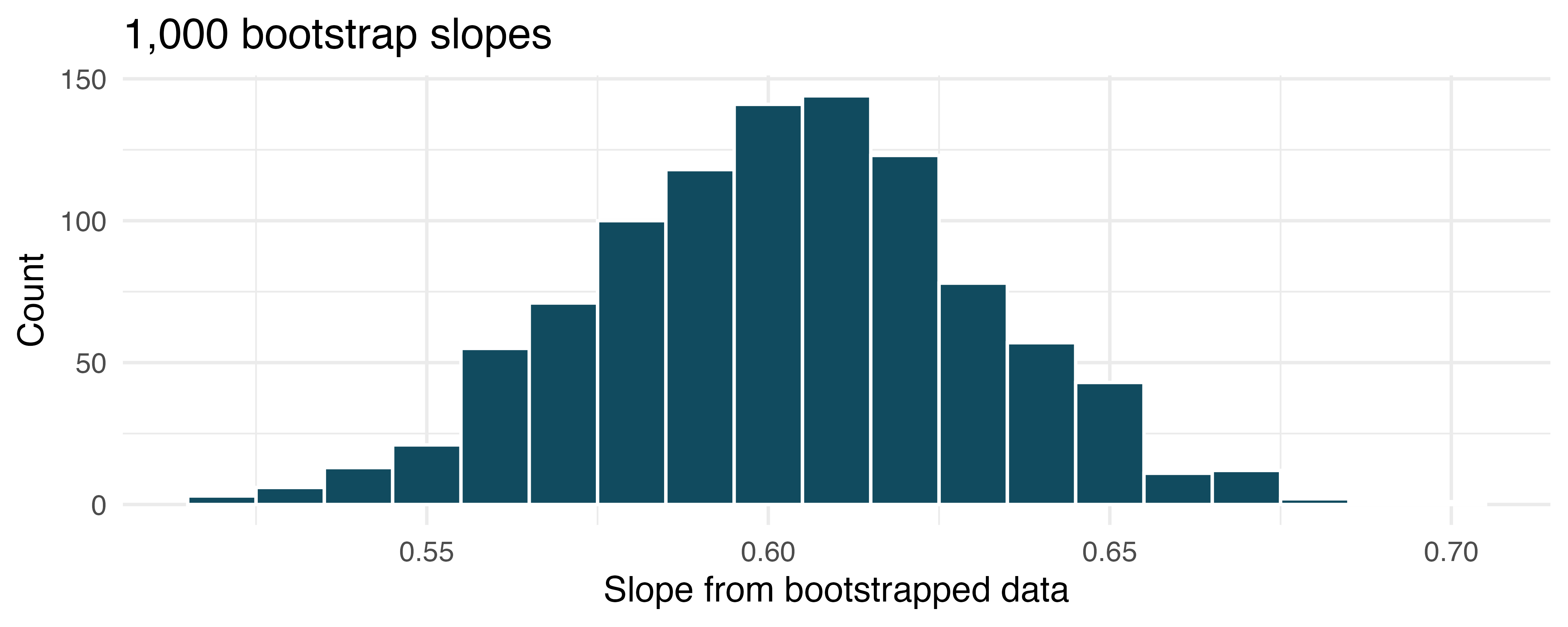
Using the bootstrap percentile method and the histogram above, find a 98% confidence interval for the slope parameter.
Interpret the confidence interval in the context of the problem.
-
Baby’s weight and father’s age, bootstrap percentile interval. US Department of Health and Human Services, Centers for Disease Control and Prevention collect information on births recorded in the country. The data used here are a random sample of 1000 births from 2014. Here, we study the relationship between the father’s age and the weight of the baby. Below is the bootstrap distribution of the slope statistic from 1,000 different bootstrap samples of the data. (ICPSR 2014)
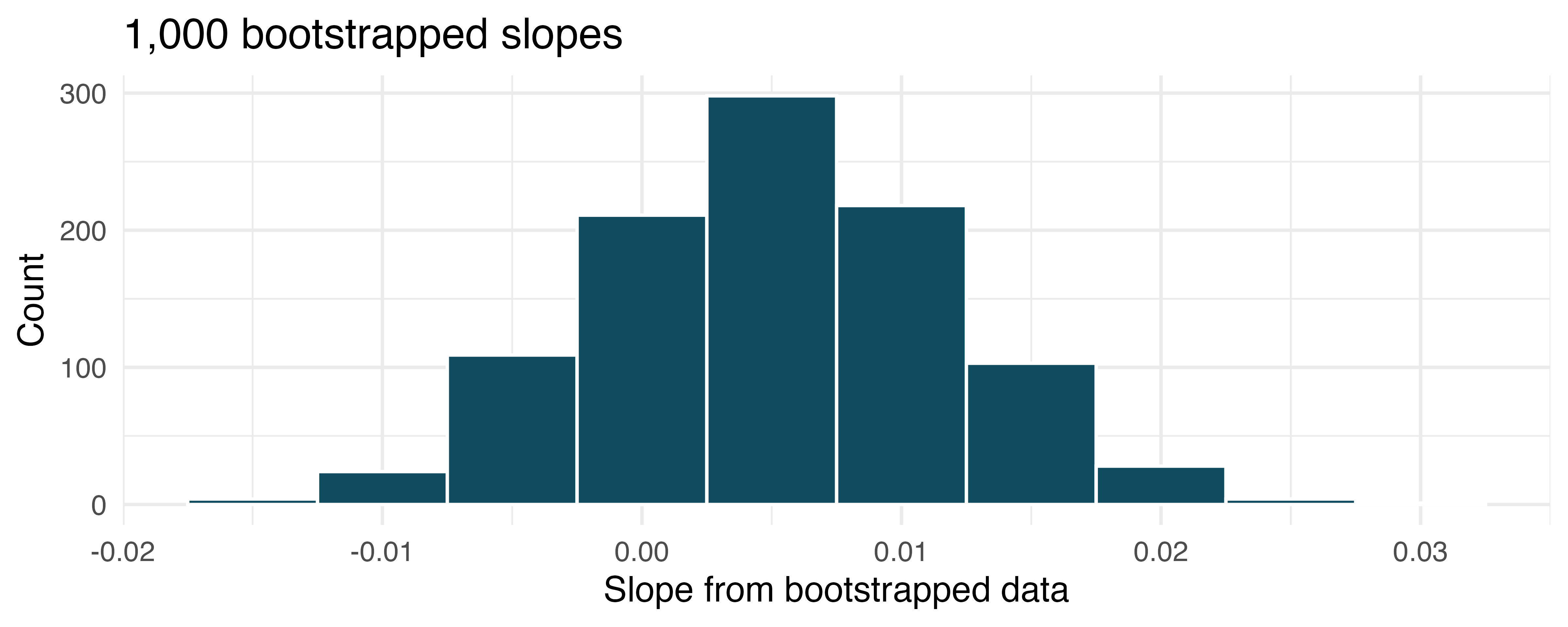
Using the bootstrap percentile method and the histogram above, find a 95% confidence interval for the slope parameter.
Interpret the confidence interval in the context of the problem.
-
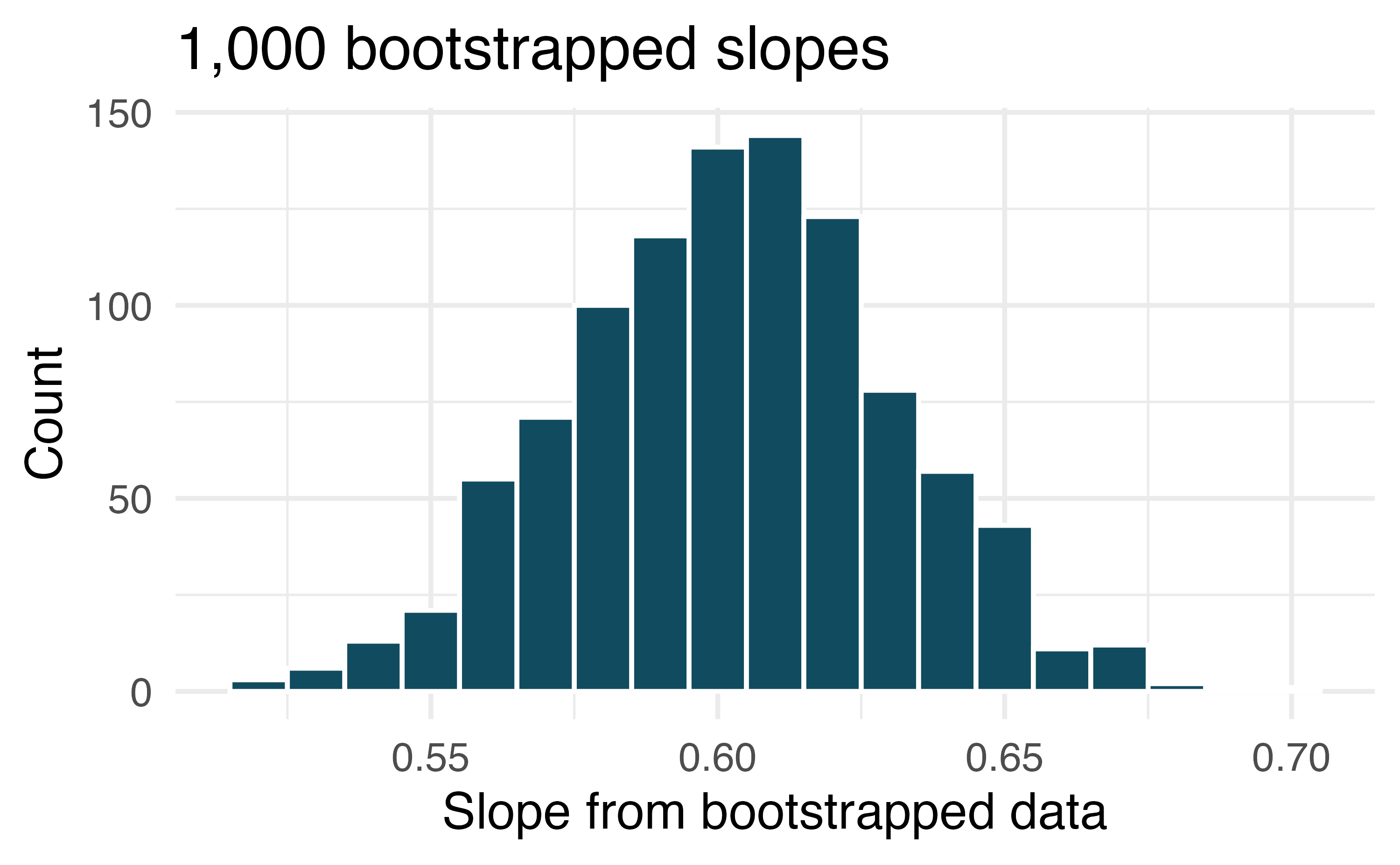
Body measurements, standard error bootstrap interval. A linear model is built to predict height based on shoulder girth (circumference of shoulders measured over deltoid muscles), both measured in centimeters. (Heinz et al. 2003) Shown below are the linear model output for predicting height from shoulder girth and the bootstrap distribution of the slope statistic from 1,000 different bootstrap samples of the data.
term estimate std.error statistic p.value (Intercept) 105.832 3.27 32.3 <0.0001 sho_gi 0.604 0.03 20.0 <0.0001 Using the histogram, approximate the standard error of the slope statistic (that is, quantify the variability of the slope statistic from sample to sample).
Find a 98% bootstrap SE confidence interval for the slope parameter.
Interpret the confidence interval in the context of the problem.
-
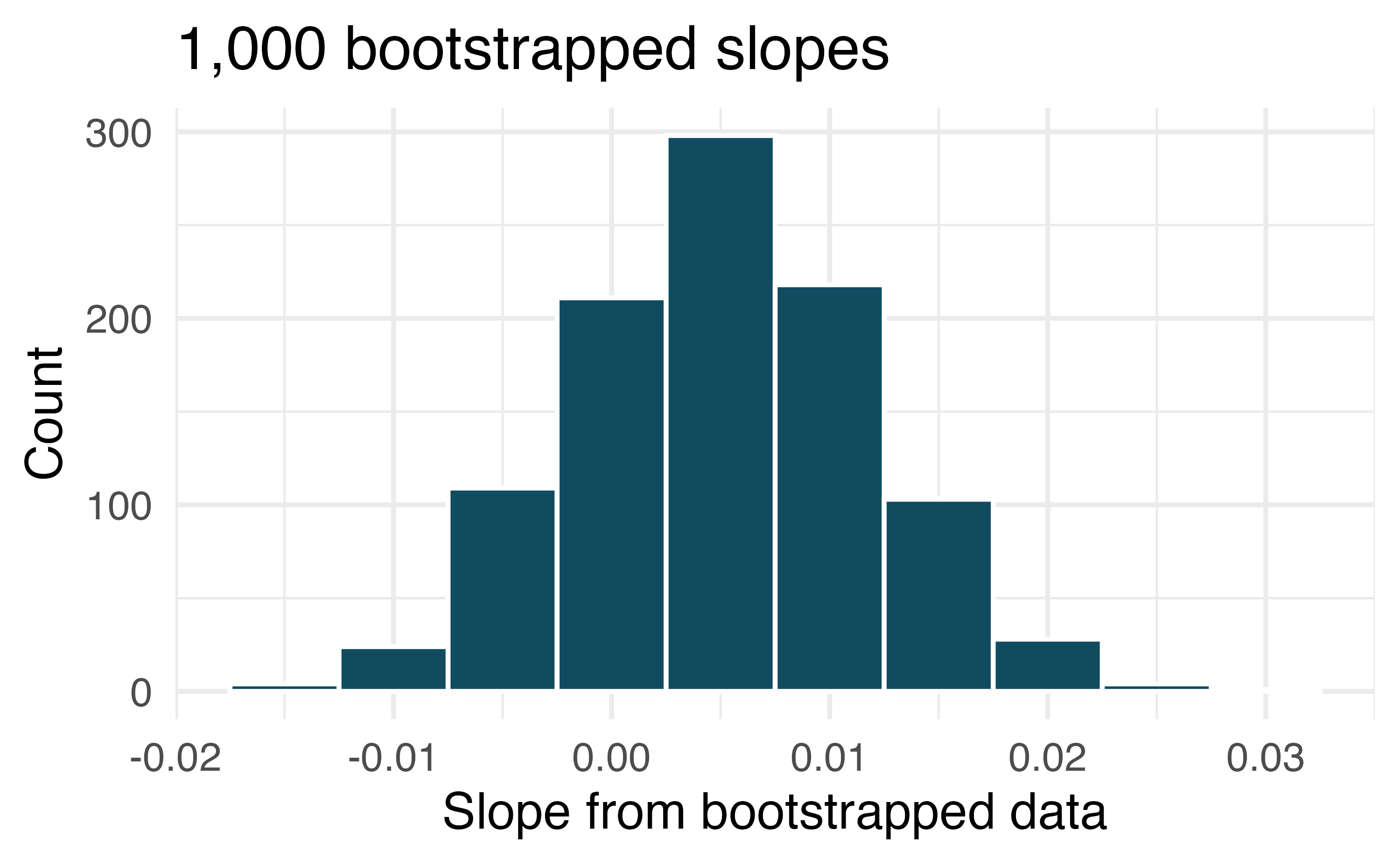
Baby’s weight and father’s age, standard error bootstrap interval. US Department of Health and Human Services, Centers for Disease Control and Prevention collect information on births recorded in the country. The data used here are a random sample of 1000 births from 2014. Here, we study the relationship between the father’s age and the weight of the baby. (ICPSR 2014) Shown below are the linear model output for predicting baby’s weight (in pounds) from father’s age (in years) and the the bootstrap distribution of the slope statistic from 1000 different bootstrap samples of the data.
term estimate std.error statistic p.value (Intercept) 7.101 0.199 35.674 <0.0001 fage 0.005 0.006 0.757 0.4495 Using the histogram, approximate the standard error of the slope statistic (that is, quantify the variability of the slope statistic from sample to sample).
Find a 95% bootstrap SE confidence interval for the slope parameter.
Interpret the confidence interval in the context of the problem.
-
Body measurements, conditions. The scatterplot below shows the residuals (on the y-axis) from the linear model of weight vs. height from a dataset of body measurements from 507 physically active individuals. The x-axis is the height of the individuals, in cm. (Heinz et al. 2003)
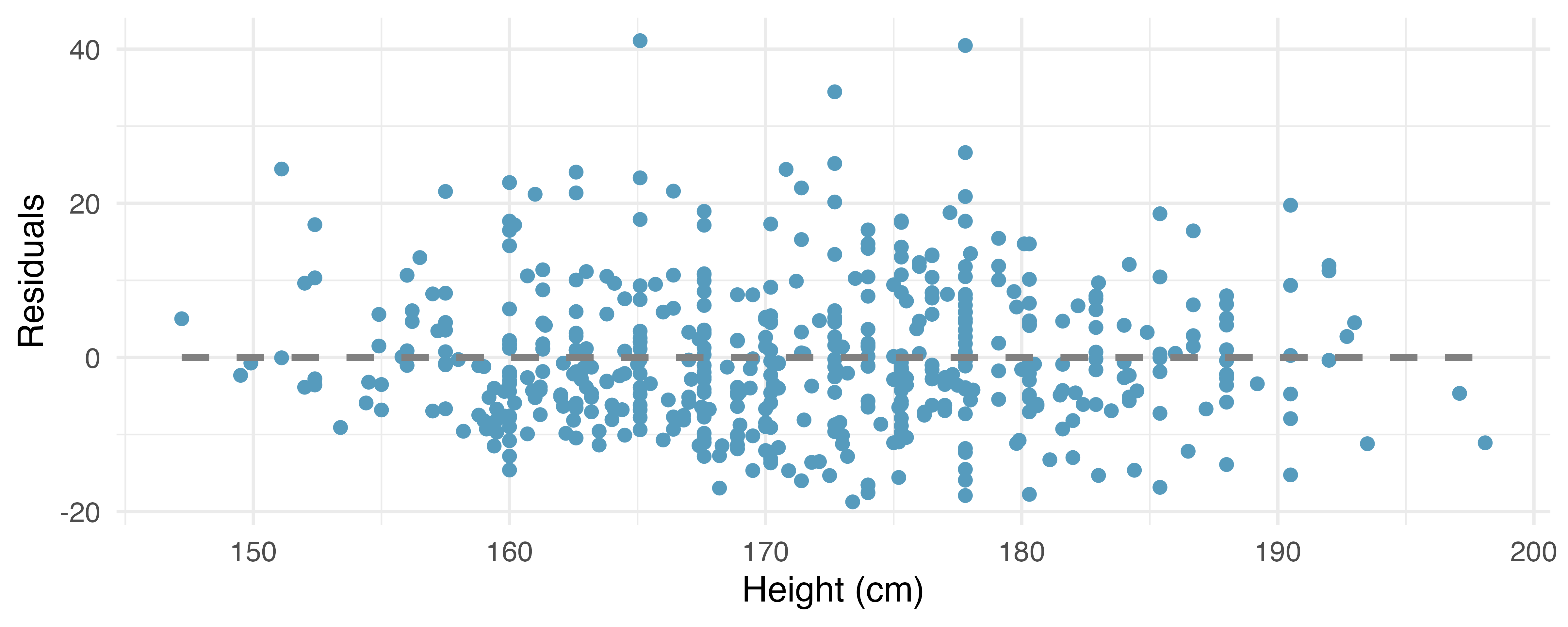
For these data, \(R^2\) is 51.84%. What is the value of the correlation coefficient? How can you tell if it is positive or negative? (Hint: you may need to look at a previous exercise.)
Examine the residual plot. What do you observe? Is a simple least squares fit appropriate for these data? Which of the LINE conditions are met or not met?
-
Baby’s weight and father’s age, conditions. The scatterplot below shows the residuals (on the y-axis) from the linear model of baby’s weight (measured in pounds) vs. father’s age for a random sample of babies. Father’s age is on the x-axis. (ICPSR 2014)
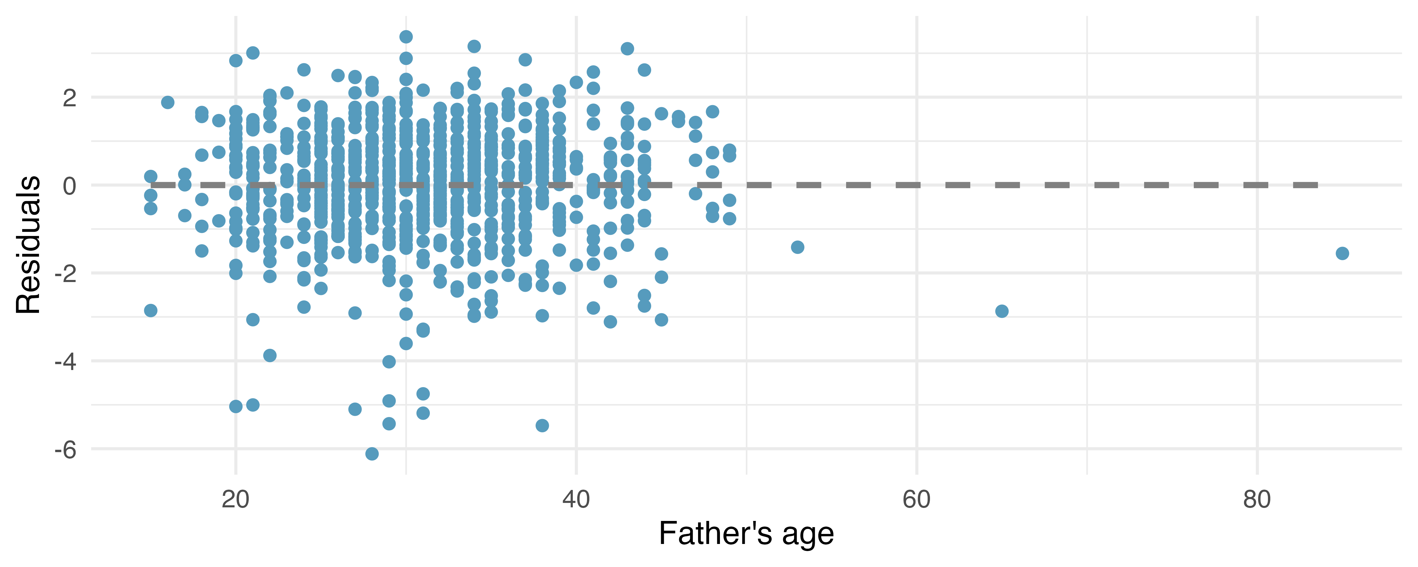
For these data, \(R^2\) is 0.09%. What is the value of the correlation coefficient? How can you tell if it is positive or negative? (Hint: you may need to look at a previous exercise.)
Examine the residual plot. What do you observe? Is a simple least squares fit appropriate for these data? Which of the LINE conditions are met or not met?
-
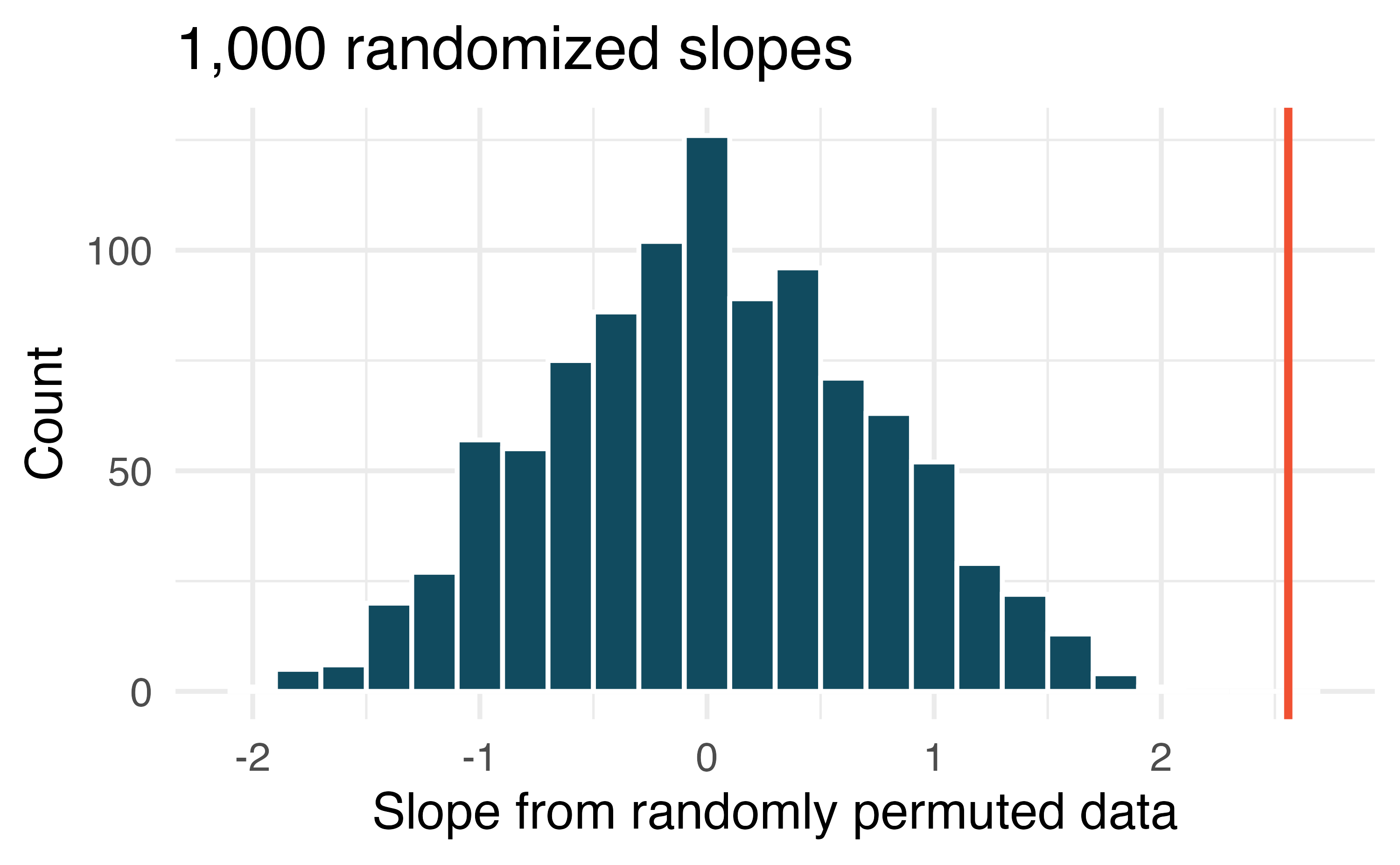
Murders and poverty, randomization test. The following regression output is for predicting annual murders per million (
annual_murders_per_mil) from percentage living in poverty (perc_pov) in a random sample of 20 metropolitan areas. Shown below are the linear model output for predicting annual murders per million from percentage living in poverty for metropolitan areas and the histogram of slopes from 1000 randomized datasets (1000 times,annual_murders_per_milwas permuted and regressed againstperc_pov). The red vertical line is drawn at the observed slope value which was produced in the linear model output.term estimate std.error statistic p.value (Intercept) -29.90 7.79 -3.84 0.0012 perc_pov 2.56 0.39 6.56 <0.0001 What are the null and alternative hypotheses for evaluating whether the slope of the model for predicting annual murder rate from poverty percentage is different than 0?
Using the histogram which describes the distribution of slopes when the null hypothesis is true, find the p-value and conclude the hypothesis test in the context of the problem (use words like murder rate and poverty).
Is the conclusion based on the histogram of randomized slopes consistent with the conclusion which would have been obtained using the mathematical model? Explain your reasoning.
-
Murders and poverty, mathematical test. The table below shows the output of a linear model annual murders per million (
annual_murders_per_mil) from percentage living in poverty (perc_pov) in a random sample of 20 metropolitan areas.term estimate std.error statistic p.value (Intercept) -29.90 7.79 -3.84 0.0012 perc_pov 2.56 0.39 6.56 <0.0001 What are the hypotheses for evaluating whether the slope of the model predicting annual murder rate from poverty percentage is different than 0?
State the conclusion of the hypothesis test from part (a) in context. What does this say about whether poverty percentage is a useful predictor of annual murder rate?
Calculate a 95% confidence interval for the slope of poverty percentage, and interpret it in context.
Do your results from the hypothesis test and the confidence interval agree? Explain your reasoning.
-
Murders and poverty, bootstrap percentile interval. Data on annual murders per million (
annual_murders_per_mil) and percentage living in poverty (perc_pov) is collected from a random sample of 20 metropolitan areas. Using these data we want to estimate the slope of the model predictingannual_murders_per_milfromperc_pov. We take 1,000 bootstrap samples of the data and fit a linear model predictingannual_murders_per_milfromperc_povto each bootstrap sample. A histogram of these slopes is shown below.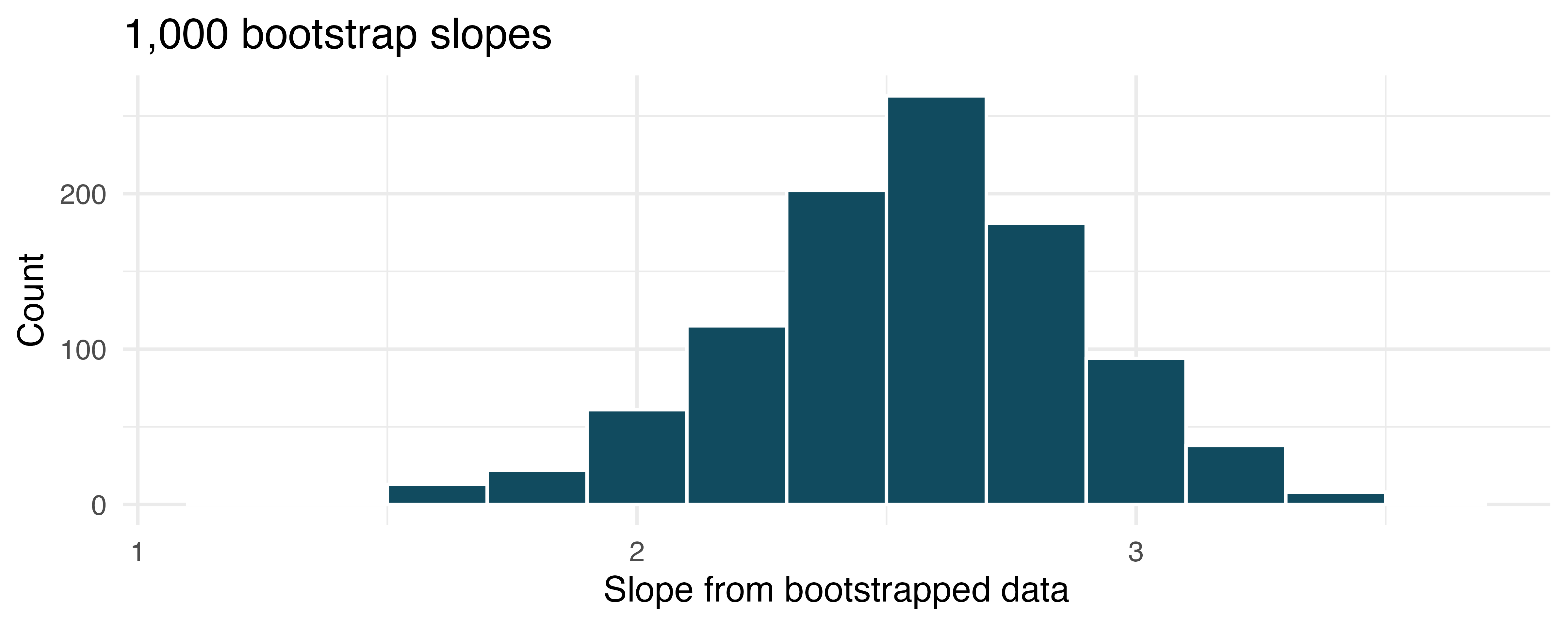
Using the percentile bootstrap method and the histogram above, find a 90% confidence interval for the slope parameter.
Interpret the confidence interval in the context of the problem.
-
Murders and poverty, standard error bootstrap interval. A linear model is built to predict annual murders per million (
annual_murders_per_mil) from percentage living in poverty (perc_pov) in a random sample of 20 metropolitan areas. Shown below are the standard linear model output for predicting annual murders per million from percentage living in poverty for metropolitan areas and the bootstrap distribution of the slope statistic from 1000 different bootstrap samples of the data.term estimate std.error statistic p.value (Intercept) -29.90 7.79 -3.84 0.0012 perc_pov 2.56 0.39 6.56 <0.0001 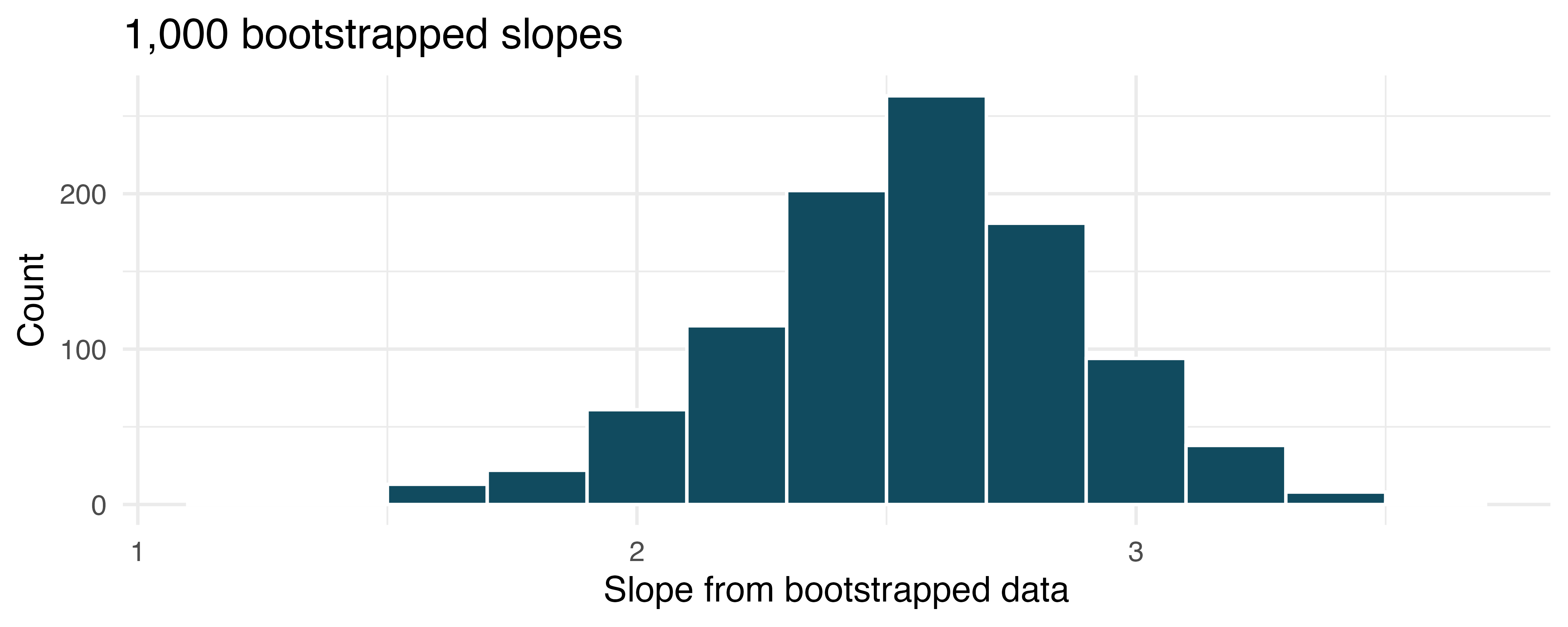
Using the histogram, approximate the standard error of the slope statistic (that is, quantify the variability of the slope statistic from sample to sample).
Find a 90% bootstrap SE confidence interval for the slope parameter.
Interpret the confidence interval in the context of the problem.
-
Murders and poverty, conditions. The scatterplot below shows the annual murders per million vs. percentage living in poverty in a random sample of 20 metropolitan areas. The second figure plots residuals on the y-axis and percent living in poverty on the x-axis.
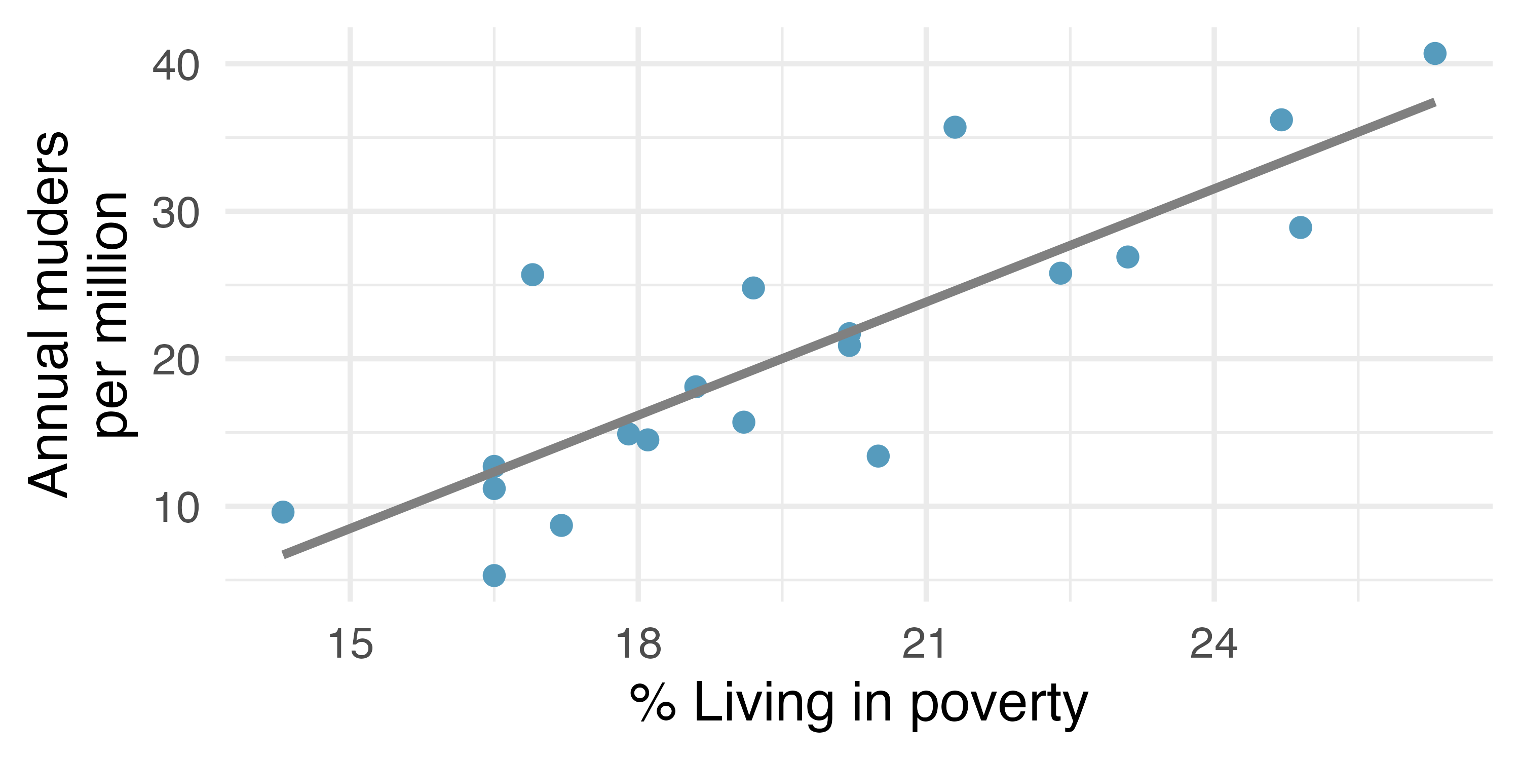
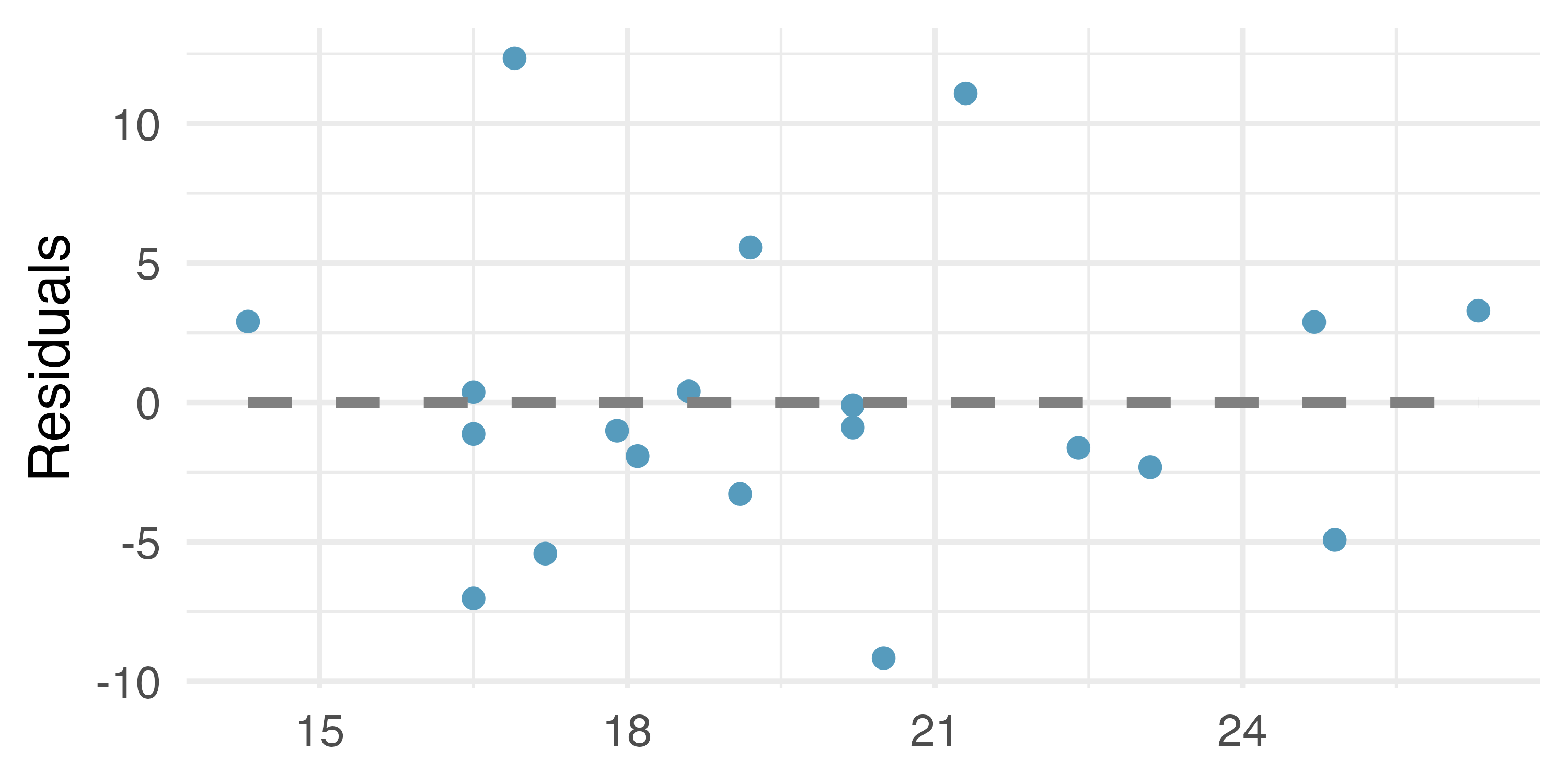
For these data, \(R^2\) is 70.56%. What is the value of the correlation coefficient? How can you tell if it is positive or negative?
Examine the residual plot. What do you observe? Is a simple least squares fit appropriate for the data? Which of the LINE conditions are met or not met?
-
I heart cats. Researchers collected data on heart and body weights of 144 domestic adult cats. The table below shows the output of a linear model predicting heart weight (measured in grams) from body weight (measured in kilograms) of these cats.6
term estimate std.error statistic p.value (Intercept) -0.357 0.692 -0.515 0.6072 Bwt 4.034 0.250 16.119 <0.0001 What are the hypotheses for evaluating whether body weight is positively associated with heart weight in cats?
State the conclusion of the hypothesis test from part (a) in context.
Calculate a 95% confidence interval for the slope of body weight, and interpret it in context.
Do your results from the hypothesis test and the confidence interval agree? Explain your reasoning.
-
Beer and blood alcohol content. Many people believe that weight, drinking habits, and many other factors are much more important in predicting blood alcohol content (BAC) than simply considering the number of drinks a person consumed. Here we examine data from sixteen student volunteers at Ohio State University who each drank a randomly assigned number of cans of beer. These students were evenly divided between men and women, and they differed in weight and drinking habits. Thirty minutes later, a police officer measured their blood alcohol content (BAC) in grams of alcohol per deciliter of blood. The scatterplot and regression table summarize the findings. 7 (Malkevitch and Lesser 2008)
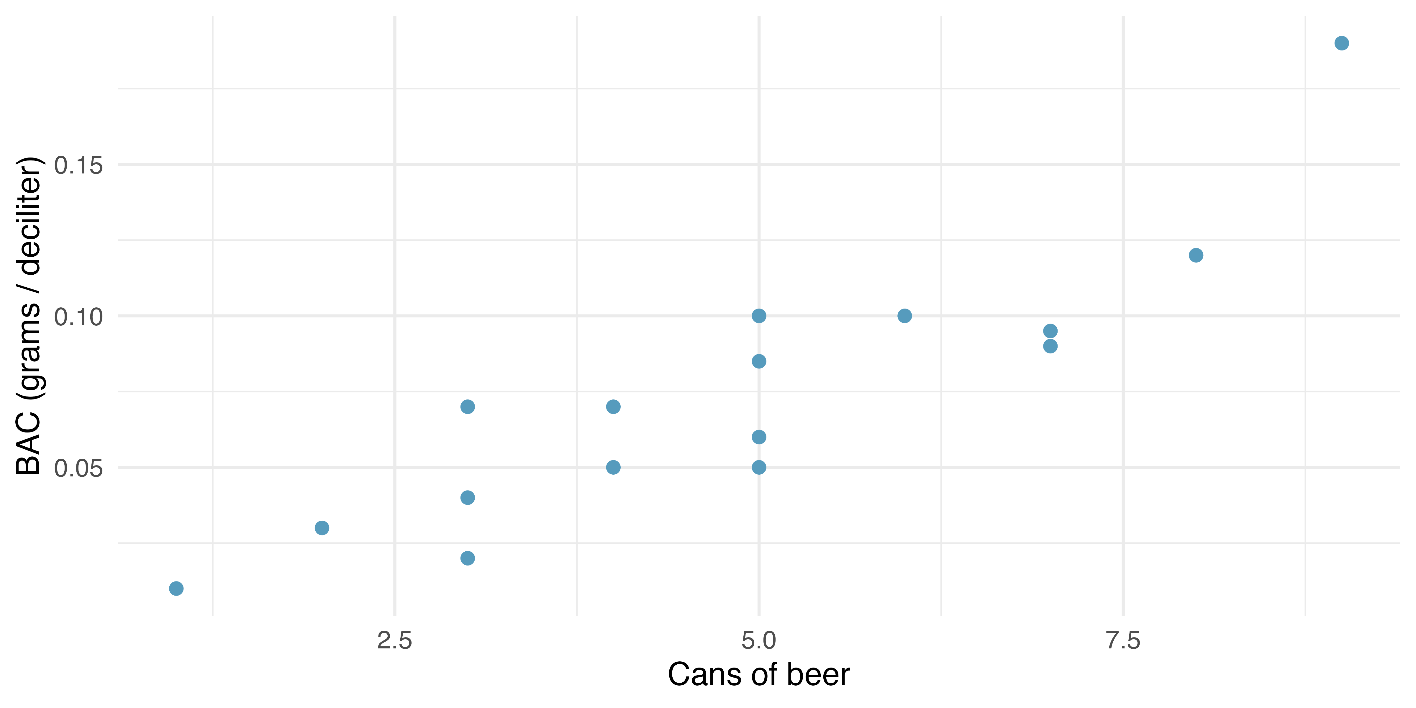
term estimate std.error statistic p.value (Intercept) -0.0127 0.0126 -1.00 0.332 beers 0.0180 0.0024 7.48 <0.0001 Describe the relationship between the number of cans of beer and BAC.
Write the equation of the regression line. Interpret the slope and intercept in context.
Do the data provide convincing evidence that drinking more cans of beer is associated with an increase in blood alcohol? State the null and alternative hypotheses, report the p-value, and state your conclusion.
The correlation coefficient for number of cans of beer and BAC is 0.89. Calculate \(R^2\) and interpret it in context.
Suppose we visit a bar in our own town, ask people how many drinks they have had, and also measure their BAC. Would the relationship between number of drinks and BAC would be as strong as the relationship found in the Ohio State study? Why?
-
Urban homeowners, conditions. The scatterplot below shows the percent of families who own their home vs. the percent of the population living in urban areas. (US Census Bureau 2010) There are 52 observations, each corresponding to a state in the US. Puerto Rico and District of Columbia are also included. The second figure plots residuals on the y-axis and percent of the population living in urban areas on the x-axis.
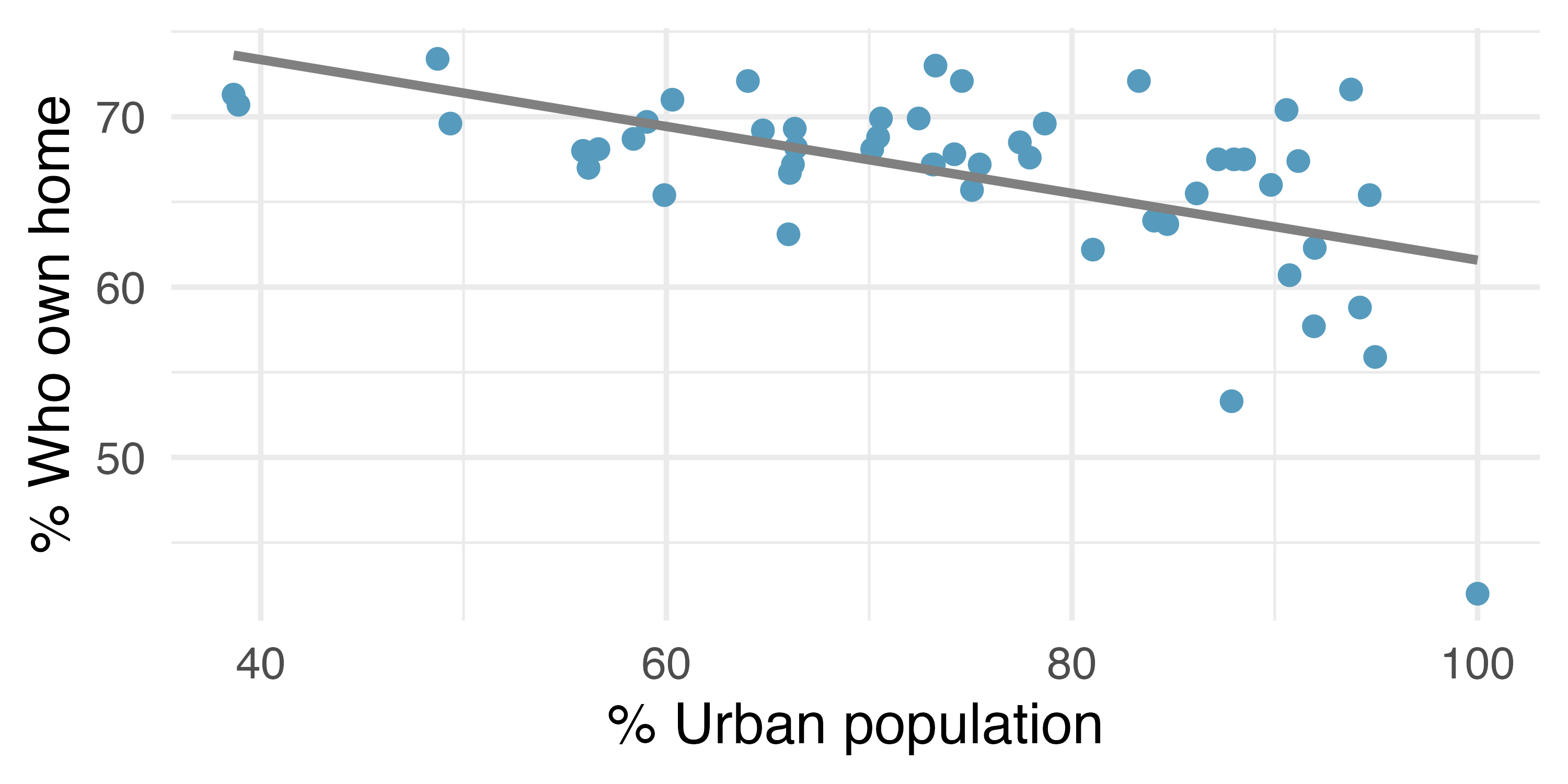
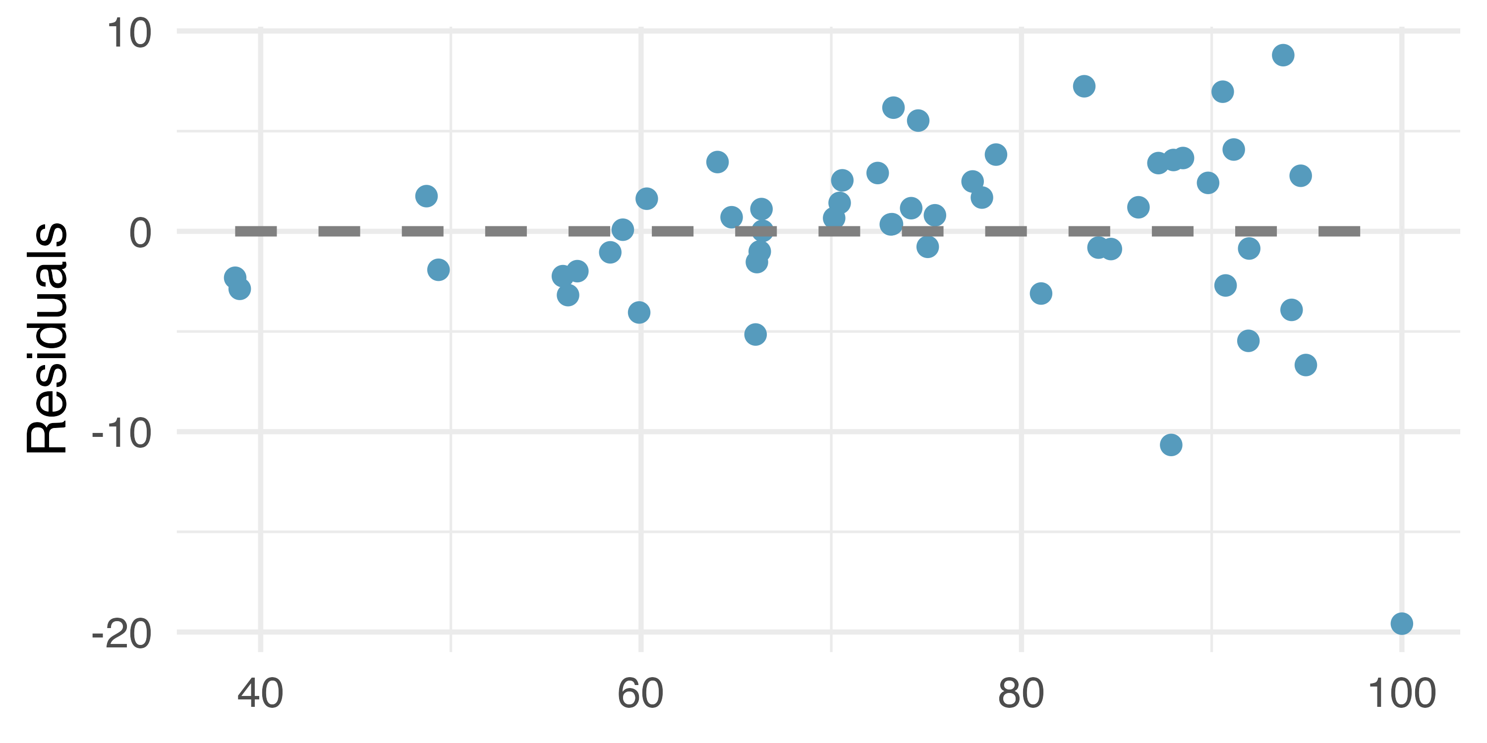
For these data, \(R^2\) is 29.16%. What is the value of the correlation coefficient? How can you tell if it is positive or negative?
Examine the residual plot. What do you observe? Is a simple least squares fit appropriate for the data? Which of the LINE conditions are met or not met?
-
I heart cats, LINE conditions. Researchers collected data on heart and body weights of 144 domestic adult cats. The figure below shows the output of the predicted values and residuals generated from a linear model predicting heart weight (measured in grams) from body weight (measured in kilograms) of these cats.
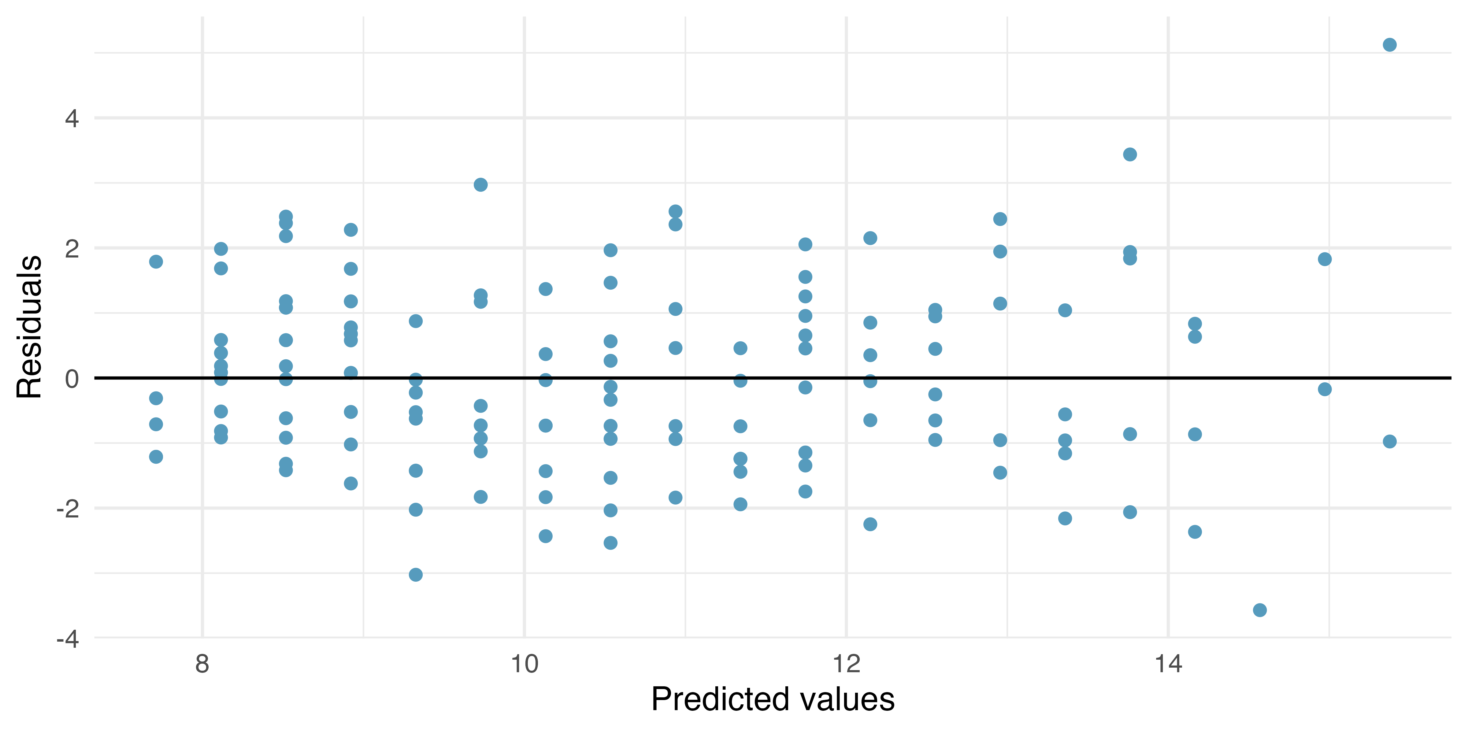
Examine the residual plot. Notice that for the small predicted values the residuals have a smaller magnitude than the larger residuals seen with the larger predicted values. The change in magnitude of the residuals across the predicted values is an indication of violation of which LINE technical condition?
If the LINE condtion described in part (a) is violated, might it lead to an incorrect conclusion about the model (i.e., the least squares regression line itself), the inference of the model (i.e., the p-value associated with the least squares regression line), neither, or both? Explain your reasoning.
-
Beer and blood alcohol content, LINE conditions. The figure below shows the output of the predicted values and residuals generated from a linear model predicting the blood alcohol content (BAC) from number of cans of beer drunk by sixteen student volunteers at Ohio State University.8 (Malkevitch and Lesser 2008)
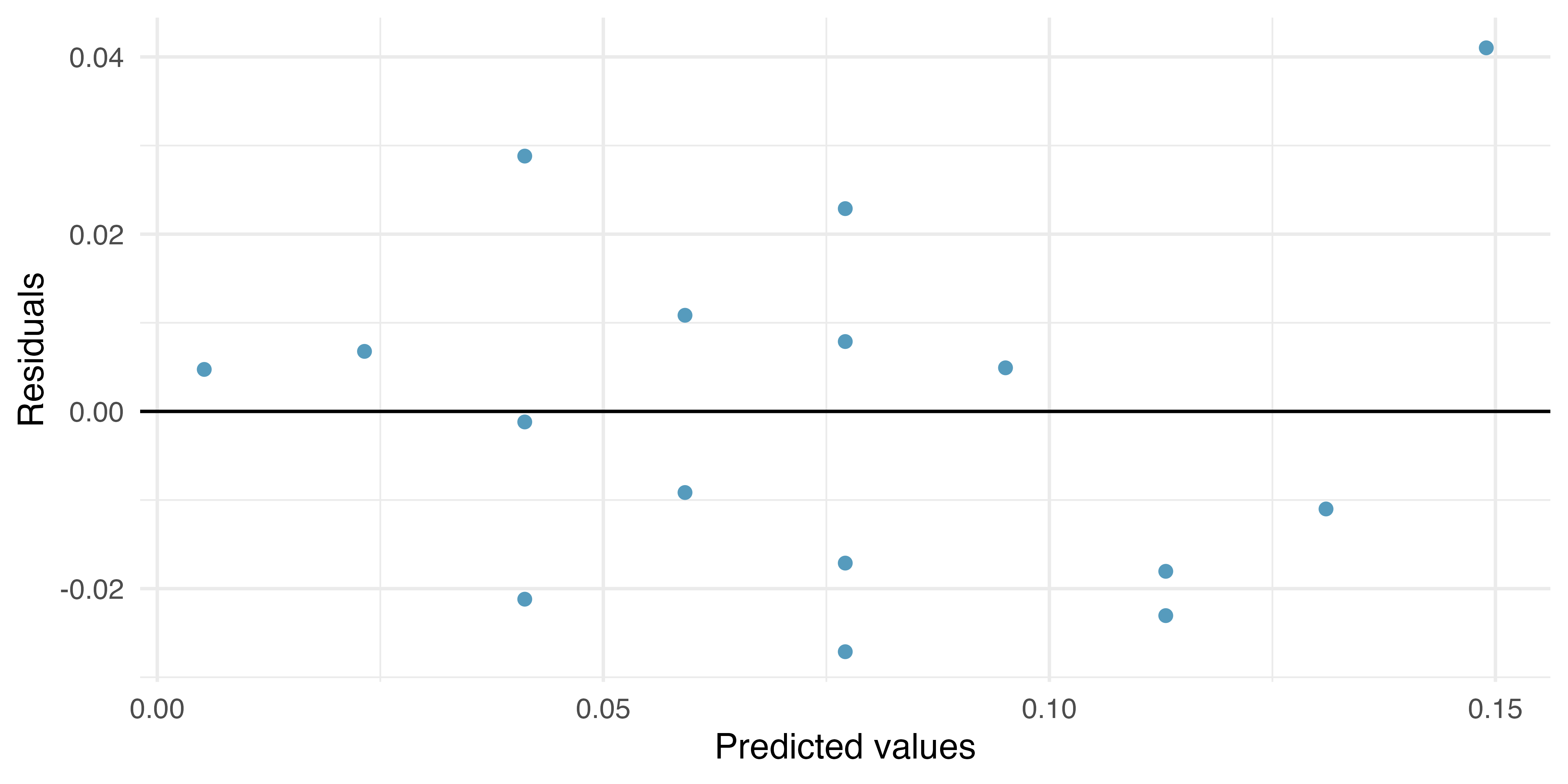
Examine the residual plot. Notice that it is difficult to identify any convincing patterns for or against violation of the LINE technical conditions. What is it about the residual plot that makes it difficult to assess the LINE technical conditions?
Is there anything about the residual plot which would make you hesitate about using the linear model for inference about all students? Is there anything about the experimental design of the study which would make you hesitate about using the linear model for inference about all students?
The answer to this question relies on the idea that statistical data analysis is somewhat of an art. That is, in many situations, there is no “right” answer. As you do more and more analyses on your own, you will come to recognize the nuanced understanding which is needed for a particular dataset. In terms of the Great Depression, we will provide two contrasting considerations. Each of these points would have very high leverage on any least-squares regression line, and years with such high unemployment may not help us understand what would happen in other years where the unemployment is only modestly high. On the other hand, the Depression years are exceptional cases, and we would be discarding important information if we exclude them from a final analysis.↩︎
We look in the second row corresponding to the family income variable. We see the point estimate of the slope of the line is -0.0431, the standard error of this estimate is 0.0108, and the \(t\)-test statistic is \(T = -3.98\). The p-value corresponds exactly to the two-sided test we are interested in: 0.0002. The p-value is so small that we reject the null hypothesis and conclude that family income and financial aid at Elmhurst College for freshman entering in the year 2011 are negatively correlated and the true slope parameter is indeed less than 0, just as we believed in our analysis of Figure 7.13.↩︎
The trend appears to be linear, the data fall around the line with no obvious outliers, the variance is roughly constant. The data do not come from a time series or other obvious violation to independence. Least squares regression can be applied to these data.↩︎
The
bdimsdata used in this exercise can be found in the openintro R package.↩︎The
births14data used in this exercise can be found in the openintro R package.↩︎The
catsdata used in this exercise can be found in the MASS R package.↩︎The
bacdata used in this exercise can be found in the openintro R package.↩︎The
bacdata used in this exercise can be found in the openintro R package.↩︎