Chapter page 11 / 386 Applications: Explore
English

6  Applications: Explore

6.1 Case study: Effective communication of exploratory results

Graphs can powerfully communicate ideas directly and quickly. We all know, after all, that “a picture is worth 1000 words.” Unfortunately, however, there are times when an image conveys a message which is inaccurate or misleading.

This chapter focuses on how graphs can best be utilized to present data accurately and effectively. Along with data modeling, creative visualization is somewhat of an art. However, even with an art, there are recommended guiding principles. We provide a few best practices for creating data visualizations.

6.1.1 Keep it simple

When creating a graphic, keep in mind what it is that you’d like your reader to see. Colors should be used to group items or differentiate levels in meaningful ways. Colors can be distracting when they are only used to brighten up the plot.

Consider a manufacturing company that has summarized its costs into five different categories. In the two graphics provided in Figure 6.1, notice that the magnitudes in the pie chart in Figure 6.1 (a) are difficult for the eye to compare. That is, can your eye tell how different “Buildings and administration” is from “Workplace materials” when looking at the slices of pie? Additionally, the colors in the pie chart do not mean anything and are therefore distracting. Lastly, the three-dimensional aspect of the image does not improve the reader’s ability to understand the data presented.

As an alternative, a bar plot is been provided in Figure 6.1 (b). Notice how much easier it is to identify the magnitude of the differences across categories while not being distracted by other aspects of the image. Typically, a bar plot will be easier for the reader to digest than a pie chart, especially if the categorical data being plotted has more than just a few levels.
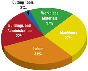
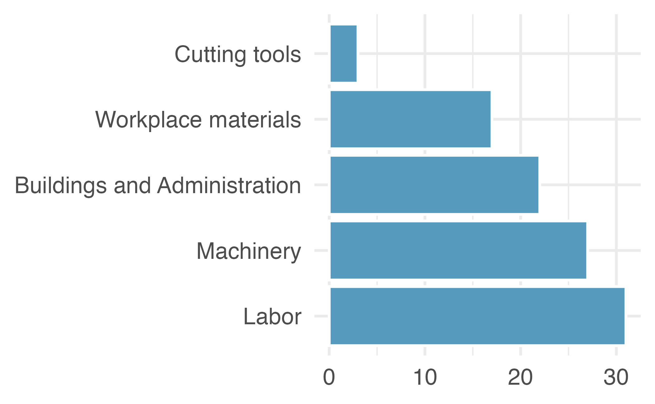
A three dimensional pie chart and a bar plot. Both plots show that the biggest sources of cost are labor, machinery, and buildings & administration, in that order. Very little of the costs are due to cutting tools.
(a) A three-dimensional pie chart.
A three dimensional pie chart and a bar plot. Both plots show that the biggest sources of cost are labor, machinery, and buildings & administration, in that order. Very little of the costs are due to cutting tools.
(b) A bar plot.
Figure 6.1: Same information displayed with two very different visualizations.

6.1.2 Use color to draw attention

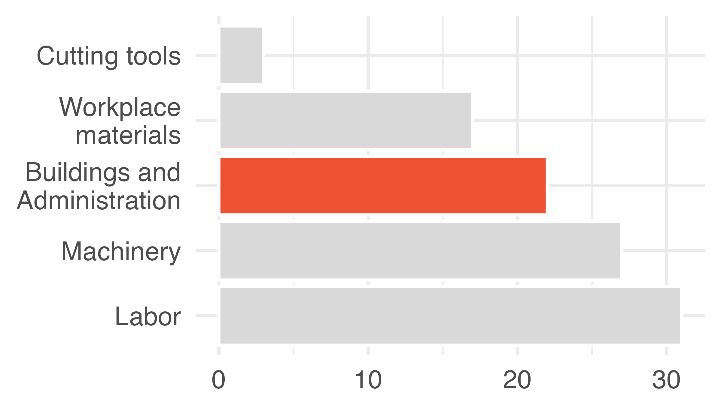
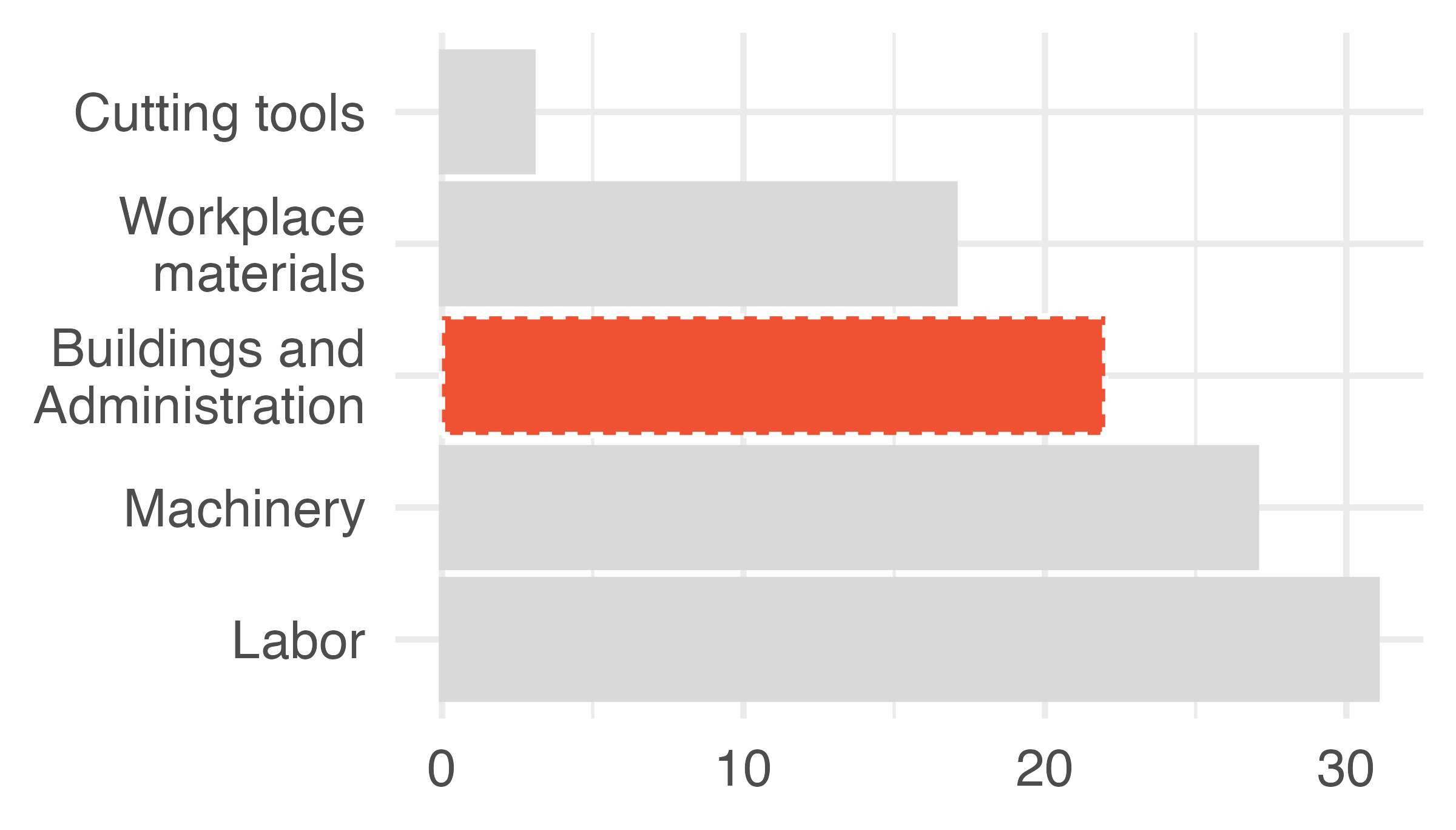
There are many reasons why you might choose to add color to your plots. An important principle to keep in mind is to use color to draw attention. Of course, you should still think about how visually pleasing your visualization is, and if you’re adding color for making it visually pleasing without drawing attention to a particular feature, that might be fine. However, you should be critical of default coloring and explicitly decide whether to include color and how. Notice that in Figure 6.2 (b) the coloring is done in such a way to draw the reader’s attention to one particular piece of information. The default coloring in Figure 6.2 (a) can be distracting and makes the reader question, for example, is there something similar about the red and purple bars? Also note that not everyone sees color the same way, often it’s useful to add color and one more feature (e.g., pattern) so that you can refer to the features you’re drawing attention to in multiple ways, as shown in Figure 6.2 (c).
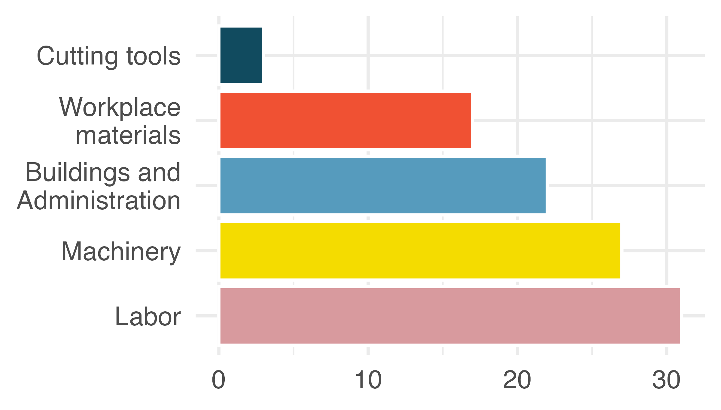
Three bar charts visualizing the same information with different coloring to highlight different aspects. First plot colors each bar (Cutting tools, Workspace materials, Buildings and Administration, Machinery, and Labor) differently, while in the second and third plots Buildings and Administration is highlighted in red and the rest of the bars are grey.
(a) Default coloring does nothing for the understanding of the data.


Three bar charts visualizing the same information with different coloring to highlight different aspects. First plot colors each bar (Cutting tools, Workspace materials, Buildings and Administration, Machinery, and Labor) differently, while in the second and third plots Buildings and Administration is highlighted in red and the rest of the bars are grey.
(b) Color draws attention directly to the bar on Buildings and Administration.
Three bar charts visualizing the same information with different coloring to highlight different aspects. First plot colors each bar (Cutting tools, Workspace materials, Buildings and Administration, Machinery, and Labor) differently, while in the second and third plots Buildings and Administration is highlighted in red and the rest of the bars are grey.
(c) Color and linetype draw attention directly to the bar on Buildings and Administration.


Figure 6.2: Three bar charts visualizing the same information with different coloring to highlight different aspects.

6.1.3 Tell a story

For many graphs, an important aspect is the inclusion of information which is not provided in the dataset that is being plotted. The external information serves to contextualize the data and helps communicate the narrative of the research.

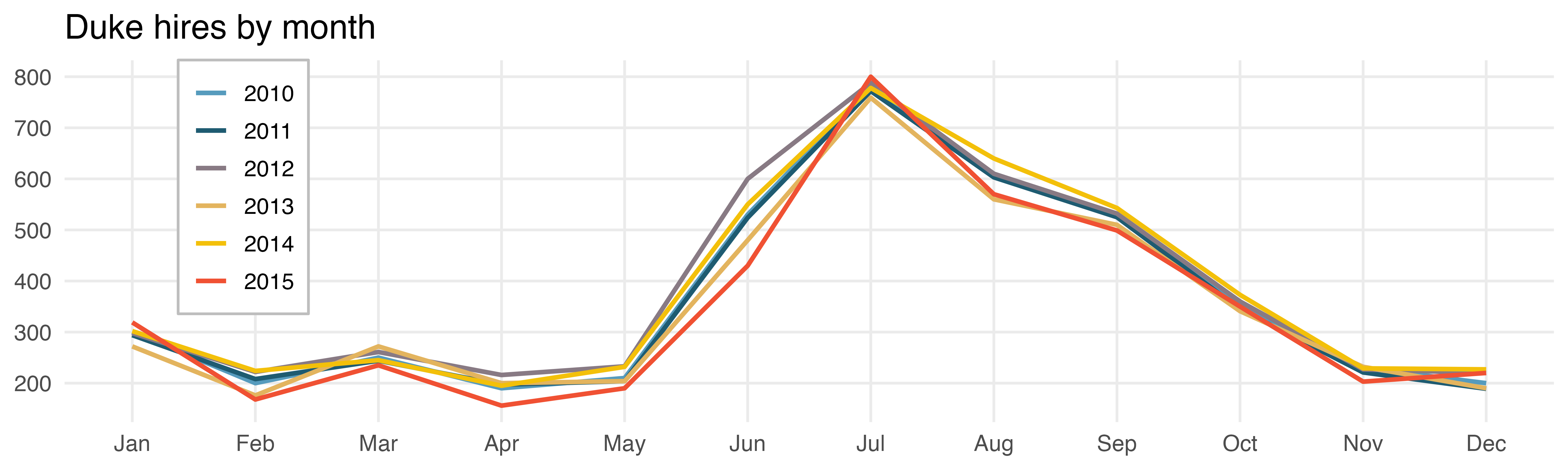
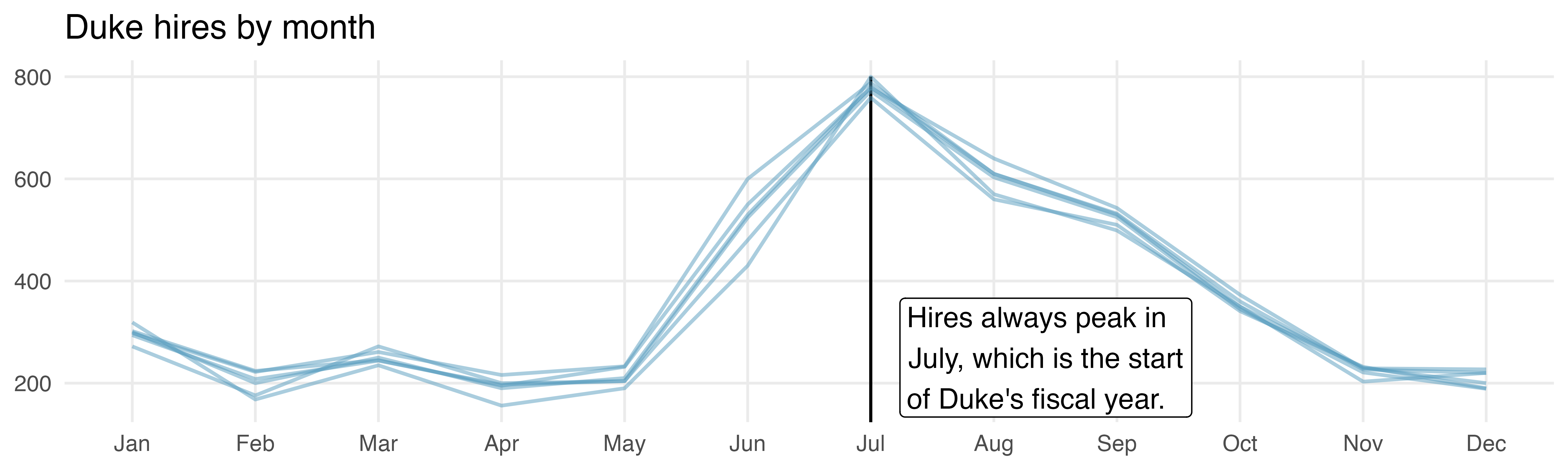
In Figure 6.3, the graph on the right is annotated with information about the start of the university’s fiscal year which contextualizes the information provided by the data. Sometimes the additional information may be a diagonal line given by \(y = x\), points above the line quickly show the reader which values have a \(y\) coordinate larger than the \(x\) coordinate; points below the line show the opposite.
(a) Colored by year
(b) Same color for all years, annotation summarizing trend
Figure 6.3: Time series plot showing monthly Duke University hiring trends over five calendar years.

6.1.4 Order matters

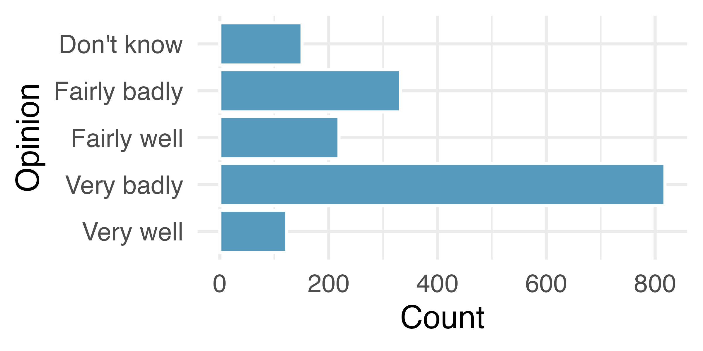
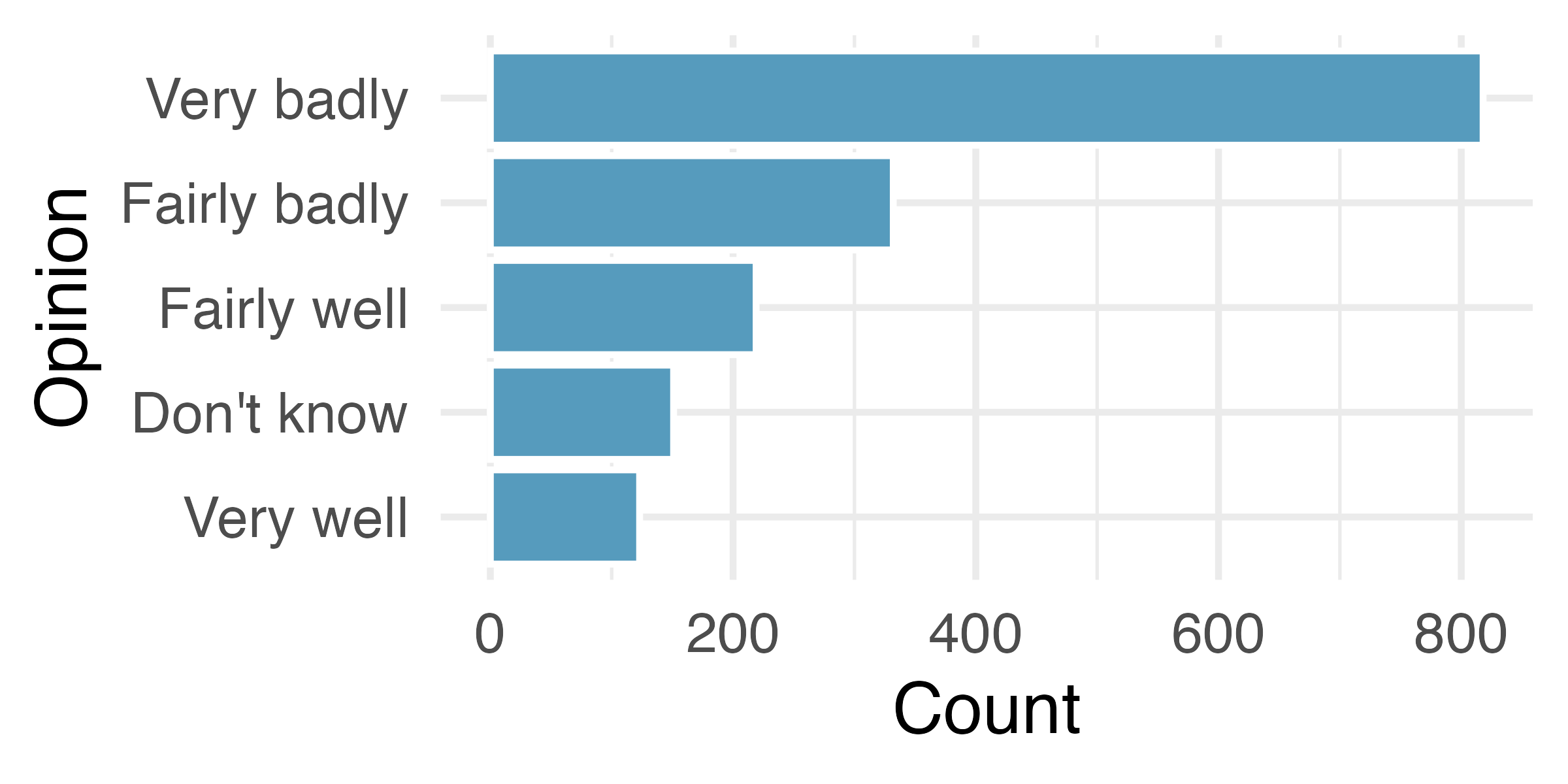
Most software programs have built in methods for some of the plot details – some order levels alphabetically, some provide functionality for arranging them in a custom order. As seen in Figure 6.4 (a), the alphabetical ordering isn’t particularly meaningful for describing the data. Sometimes it makes sense to order the bars from tallest to shortest (or vice versa), as shown in Figure 6.4 (b). But in this case, the best ordering is probably the one in which the questions were asked, as shown in Figure 6.4 (c). An ordering which does not make sense in the context of the problem (e.g., alphabetically here), can mislead the reader who might take a quick glance at the axes and not read the bar labels carefully.

In September 2019, YouGov survey asked 1,639 Great Britain adults the following question1:

How well or badly do you think the government are doing at handling Britain’s exit from the European Union?

  • Very well
  • Fairly well
  • Fairly badly
  • Very badly
  • Don’t know
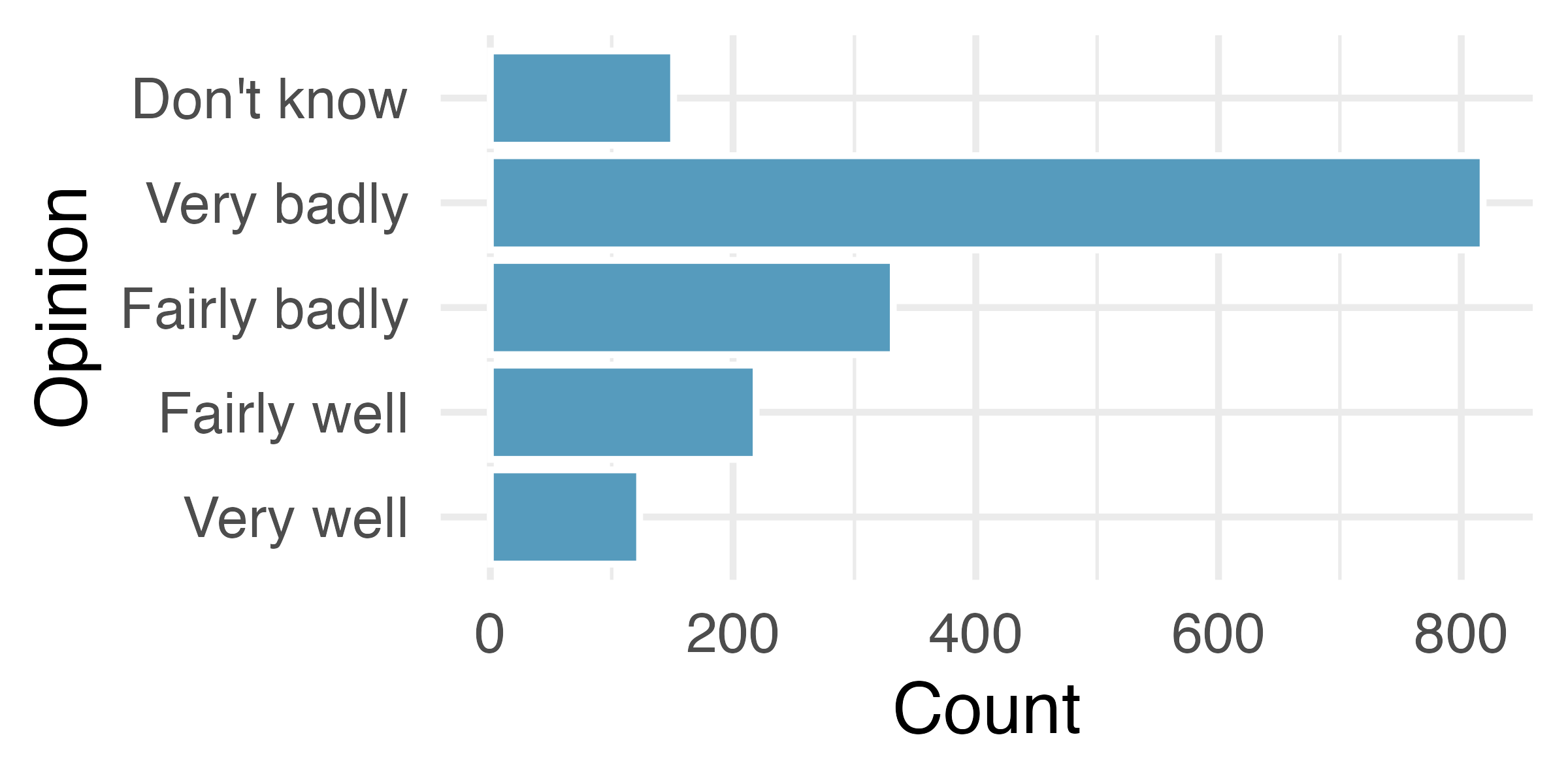
Three bar plots with the bars (Very well, Fairly well, Fairly badly, Very badly, Don't know) arranged differently in each plot. In the first plot they're in alphabetical order, in the second in frequency order (highest Very badly to lowest Very well), and in the third plot in the same order as presented in the survey question.
(a) Alphabetic order
Three bar plots with the bars (Very well, Fairly well, Fairly badly, Very badly, Don't know) arranged differently in each plot. In the first plot they're in alphabetical order, in the second in frequency order (highest Very badly to lowest Very well), and in the third plot in the same order as presented in the survey question.
(b) Frequecy order
Three bar plots with the bars (Very well, Fairly well, Fairly badly, Very badly, Don't know) arranged differently in each plot. In the first plot they're in alphabetical order, in the second in frequency order (highest Very badly to lowest Very well), and in the third plot in the same order as presented in the survey question.
(c) Same order as presented in the survey question
Figure 6.4: Three bar charts visualizing the same information with arrangement of levels.

6.1.5 Make the labels as easy to read as possible

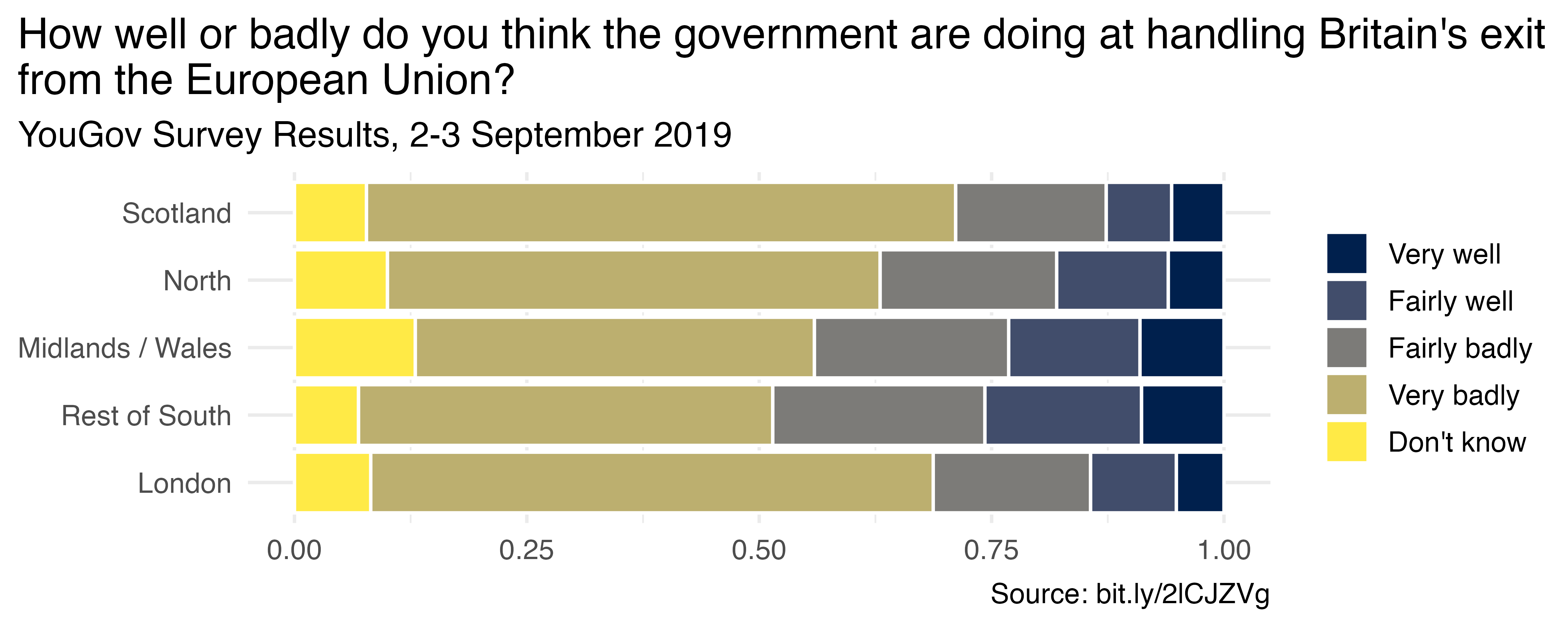
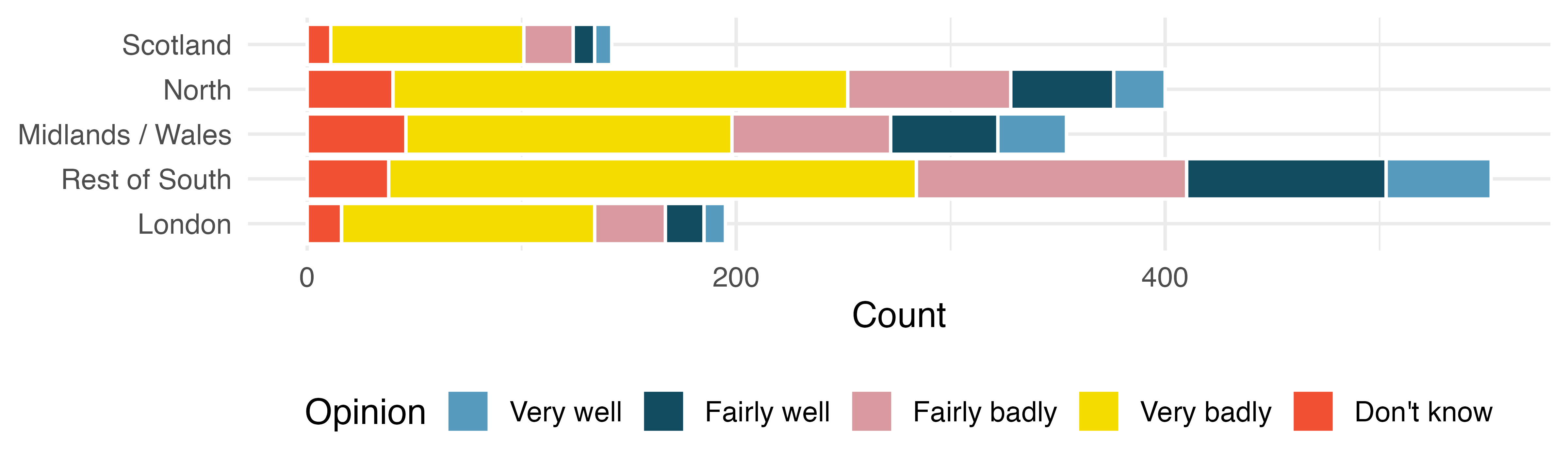
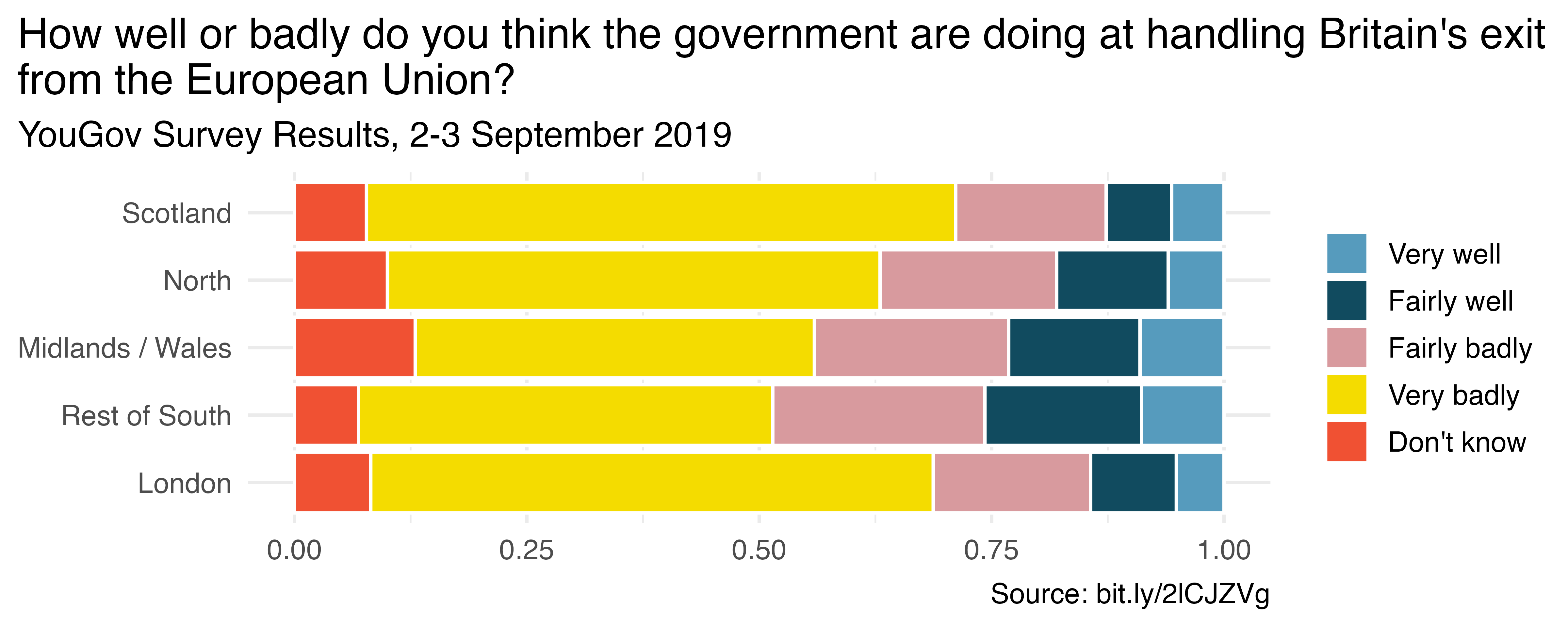
The Brexit survey results were additionally broken down by region in Great Britain. The stacked bar plot allows for comparison of Brexit opinion across the five regions. In Figure 6.5 (a) the bars are vertical and in Figure 6.5 (b) they are horizontal. While the quantitative information in the two graphics is identical, flipping the graph and creating horizontal bars provides more space for the axis labels. The easier the categories are to read, the more the reader will learn from the visualization. Remember, the goal is to convey as much information as possible in a succinct and clear manner.
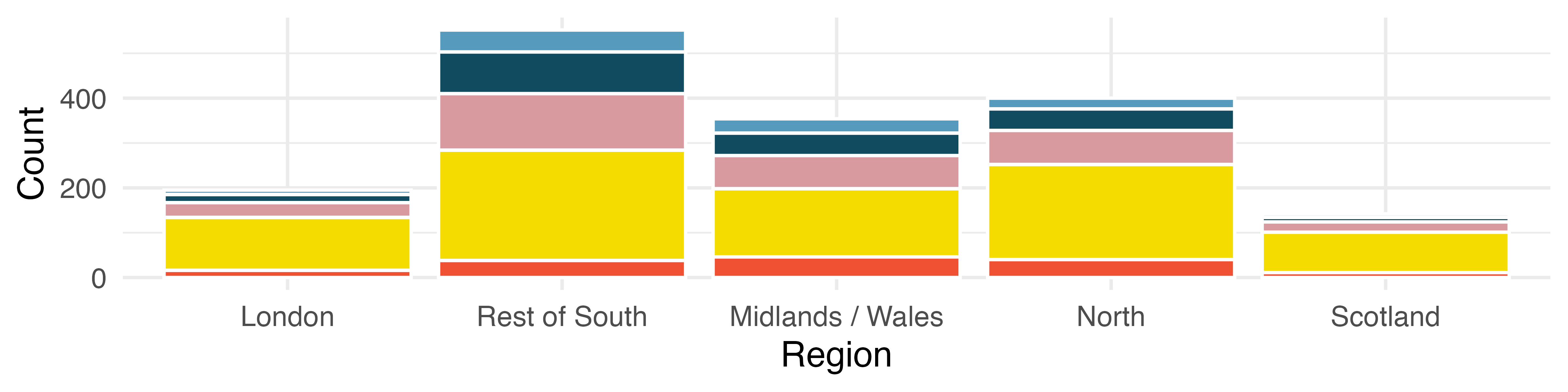
Stacked bar plot of region and opinion, where vertical bars are on the x-axis.
(a) Vertical bars across the x-axis.
Stacked bar plot of region and opinion, where horizontal bars are on the y-axis.
(b) Horizontal bars across the y-axis.
Figure 6.5: Stacked bar plots. Horizontal orientation makes the region labels easier to read.

6.1.6 Pick a purpose

Every graphical decision should be made with a purpose. As previously mentioned, sticking with default options is not always best for conveying the narrative of your data story. Stacked bar plots tell one part of a story. Depending on your research question, they may not tell the part of the story most important to the research.

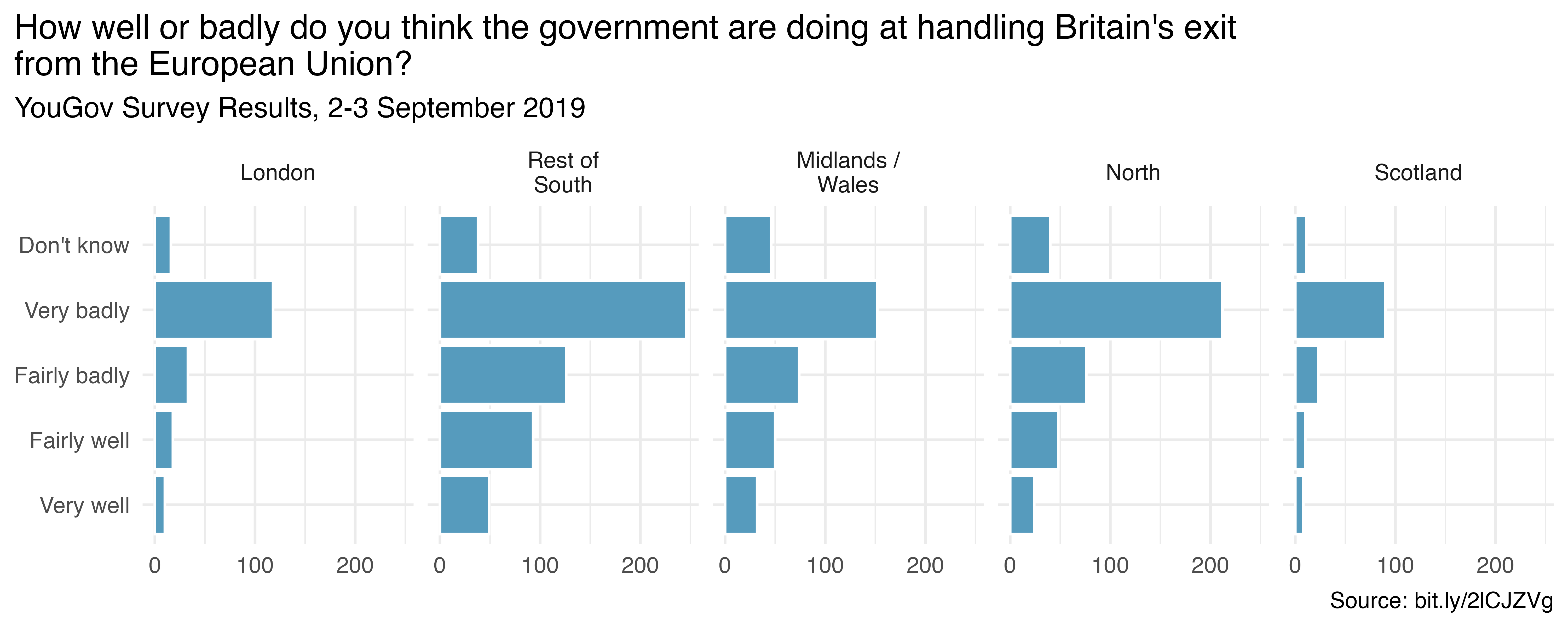
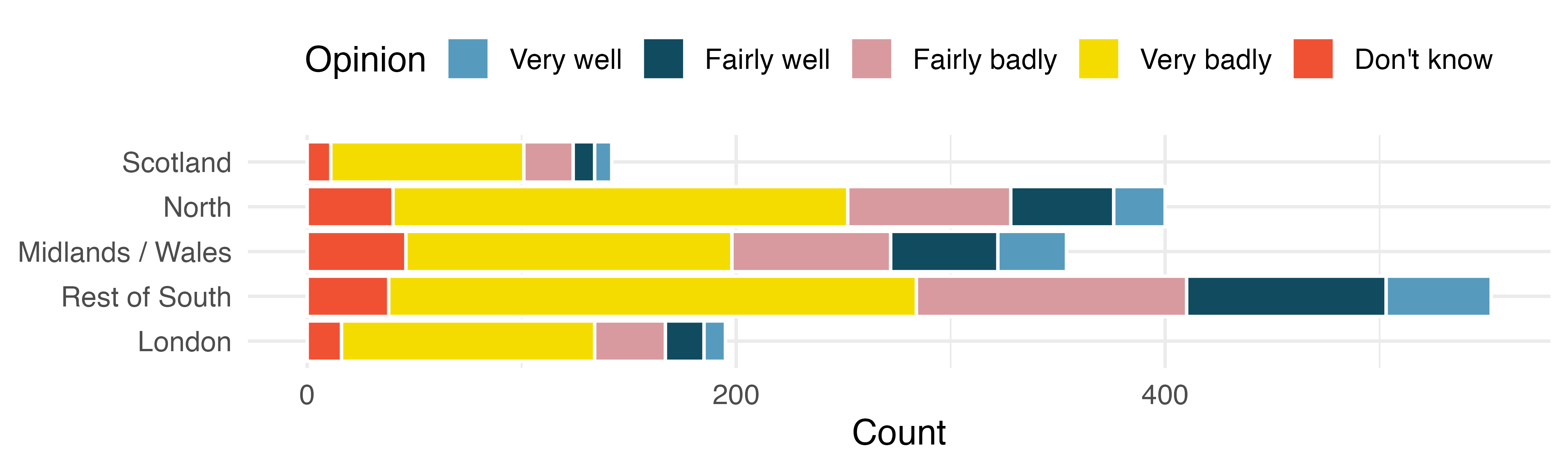
Figure 6.6 provides three different ways of representing the same information. If the most important comparison across regions is proportion, you might prefer Figure 6.6 (a). If the most important comparison across regions also considers the total number of individuals in the region, you might prefer Figure 6.6 (b). If a separate bar plot for each region makes the point you’d like, use Figure 6.6 (c), which has been faceted by region. Figure 6.6 (c) also provides full titles and a succinct URL with the data source. Other deliberate decisions to consider include using informative labels and avoiding redundancy.
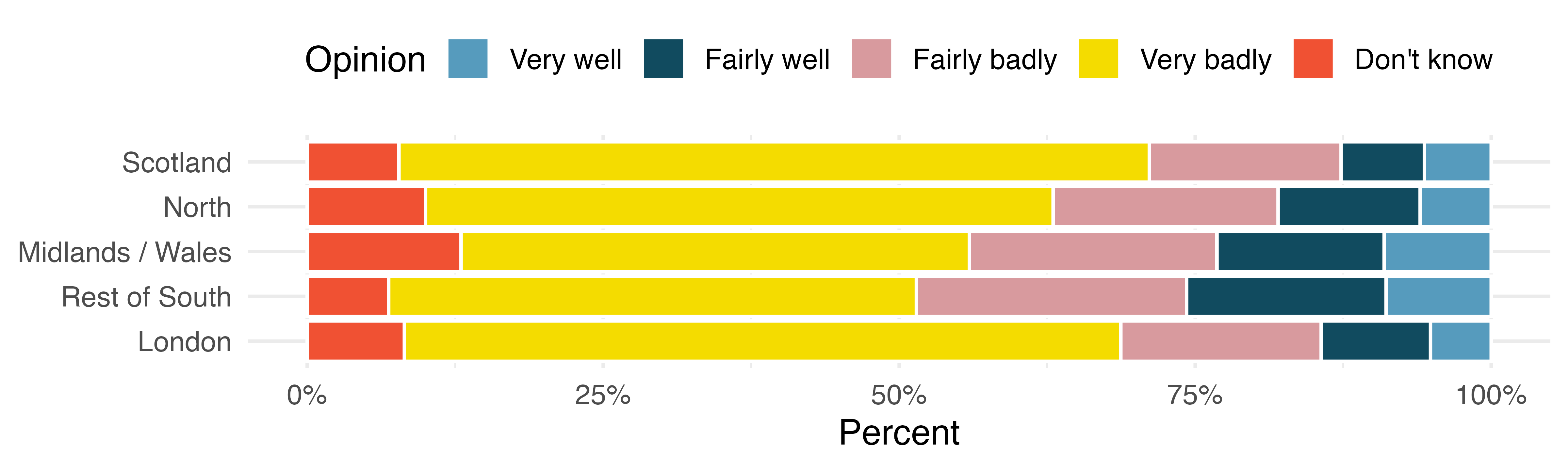
Stacked bar plot of region and opinion, showing percentages.
(a) Stacked bar plot of region and opinion, showing percentages.
Stacked bar plot of region and opinion, showing counts.
(b) Stacked bar plot of region and opinion, showing counts.
Dodged bar plot of region and opinion, showing counts.
(c) Dodged bar plot of region and opinion, showing counts.
Figure 6.6: Three different representations of two variables from the survey, region and opinion.

6.1.7 Select meaningful colors

One last consideration for building graphs is to consider color choices. Default or rainbow colors are not always the choice which will best distinguish the level of your variables. Much research has been done to find color combinations which are distinct and which are clear for differently sighted individuals. The cividis scale works well with ordinal data. (Nuñez et al. 2018) Figure 6.7 shows the same plot with two different color themes.
Identical bar plots with two different coloring options.
(a) Default color scale
Identical bar plots with two different coloring options.
(b) Cividis scale
Figure 6.7: Identical bar plots with two different coloring options.

In this chapter different representations are contrasted to demonstrate best practices in creating graphs. The fundamental principle is that your graph should provide maximal information succinctly and clearly. Labels should be clear and oriented horizontally for the reader. Don’t forget titles and, if possible, include the source of the data.

6.2 Interactive R tutorials

Navigate the concepts you’ve learned in this part in R using the following self-paced tutorials. All you need is your browser to get started!

You can also access the full list of tutorials supporting this book here.

6.3 R labs

Further apply the concepts you’ve learned in this part in R with computational labs that walk you through a data analysis case study.

You can also access the full list of labs supporting this book here.


  1. Source: YouGov Survey Results, retrieved Oct 7, 2019.↩︎

中文

6  应用:探索

6.1 案例研究:探索性结果的有效沟通

图形能够直接而迅速地有力传达观点。毕竟,我们都知道“一图胜千言”。然而遗憾的是,有时图像所传达的信息可能不准确或具有误导性。

本章重点讨论如何最好地利用图形来准确而有效地呈现数据。与数据建模一样,创造性可视化在某种程度上是一门艺术。然而,即便是艺术,也存在一些值得遵循的指导原则。我们提供几条创建数据可视化的最佳实践。

6.1.1 保持简洁

在创建图形时,请牢记您希望读者看到的内容。应使用颜色以有意义的方式对各项进行分组或区分不同层级。如果使用颜色仅仅是为了让图表更亮丽,颜色反而会分散注意力。

设想一家已将其成本归纳为五个不同类别的制造企业。在 图 6.1中提供的两幅图中,请注意饼图中的数值大小,见 图 6.1 (a) 很难用肉眼进行比较。也就是说,在观察扇形切片时,你的眼睛能看出“Buildings and administration”与“Workplace materials”之间有多大差异吗?此外,饼图中的颜色没有任何含义,因此反而会分散注意力。最后,图像的三维效果也无助于读者理解所呈现的数据。

作为替代方案,条形图见 图 6.1 (b)。请注意,这样识别各类别之间差异的大小要容易得多,而且不会受到图像其他方面的干扰。通常,条形图比饼图更容易让读者理解,尤其是当所绘制的分类数据不只有寥寥几个水平时。

A three dimensional pie chart and a bar plot. Both plots show that the biggest sources of cost are labor, machinery, and buildings & administration, in that order. Very little of the costs are due to cutting tools.
(a) 三维饼图。
A three dimensional pie chart and a bar plot. Both plots show that the biggest sources of cost are labor, machinery, and buildings & administration, in that order. Very little of the costs are due to cutting tools.
(b) 条形图。
图 6.1:用两种截然不同的可视化方式展示相同的信息。

6.1.2 使用颜色吸引注意力

你可能出于多种原因选择为图形添加 颜色 。需要牢记的一个重要原则是:使用颜色来吸引注意力。当然,你仍应考虑可视化在视觉上是否美观;如果你添加颜色只是为了让图形美观,而不是为了将注意力引向某个特定特征,那也许没有问题。然而,你应该以批判的态度看待默认配色,并明确决定是否使用颜色以及如何使用。请注意,在 图 6.2 (b) 中,配色的方式能够将读者的注意力吸引到某一条特定的信息上。而在 图 6.2 (a) 中,默认配色可能会分散注意力,并让读者产生疑问,例如:红色条形和紫色条形之间是否有什么相似之处?另外请注意,并非每个人感知颜色的方式都相同,通常有用的做法是同时添加颜色和另一种特征(例如图案),这样你就可以通过多种方式指代想要突出的特征,如图 图 6.2 (c).

Three bar charts visualizing the same information with different coloring to highlight different aspects. First plot colors each bar (Cutting tools, Workspace materials, Buildings and Administration, Machinery, and Labor) differently, while in the second and third plots Buildings and Administration is highlighted in red and the rest of the bars are grey.
(a) 默认配色对理解数据毫无帮助。


Three bar charts visualizing the same information with different coloring to highlight different aspects. First plot colors each bar (Cutting tools, Workspace materials, Buildings and Administration, Machinery, and Labor) differently, while in the second and third plots Buildings and Administration is highlighted in red and the rest of the bars are grey.
(b) 颜色直接将注意力引向“建筑与行政管理”对应的柱形。
Three bar charts visualizing the same information with different coloring to highlight different aspects. First plot colors each bar (Cutting tools, Workspace materials, Buildings and Administration, Machinery, and Labor) differently, while in the second and third plots Buildings and Administration is highlighted in red and the rest of the bars are grey.
(c) 颜色和线型直接将注意力引向“建筑与行政管理”对应的柱形。


图 6.2:三幅条形图以不同的配色呈现相同的信息,从而突出不同的方面。

6.1.3 讲述故事

对于许多图形而言,一个重要的方面是纳入所绘制的数据集本身未包含的信息。这些外部信息为数据提供了背景,有助于传达研究的叙事。

图 6.3中,右侧的图被 标注 了有关该大学财政年度开始的信息,这些信息为数据所呈现的内容提供了背景。有时,附加信息可能是一条由 \(y = x\)给出的对角线,线上方的点能让读者快速看出哪些值的 \(y\) 坐标大于 \(x\) 坐标;线下方的点则相反。

(a) 按年份着色
(b) 所有年份使用相同颜色,并附有总结趋势的注释
图 6.3:显示杜克大学五个日历年中月度招聘趋势的时间序列图。

6.1.4 顺序很重要

大多数软件程序都为部分图表细节提供了内置方法——有些会按字母顺序对水平进行排序,有些则提供了按自定义顺序排列的功能。如 图 6.4 (a)所示,按字母顺序排列对于描述数据而言并没有特别的意义。有时,对条形进行 排序 (从最高到最矮,或反之)是有意义的,如 图 6.4 (b)所示。但在本例中,最佳的排序可能是按照问题被提出的先后顺序,如 图 6.4 (c)所示。在问题背景下说不通的排序方式(例如本例中的按字母顺序)可能会误导读者——他们可能只是匆匆扫一眼坐标轴,而没有仔细阅读条形标签。

2019年9月,YouGov 调查询问了 1,639 名大不列颠成年人以下问题1:

你认为政府在处理英国退出欧盟问题上做得有多好还是有多差?

  • 非常好
  • 比较好
  • 比较差
  • 非常差
  • 不知道
Three bar plots with the bars (Very well, Fairly well, Fairly badly, Very badly, Don't know) arranged differently in each plot. In the first plot they're in alphabetical order, in the second in frequency order (highest Very badly to lowest Very well), and in the third plot in the same order as presented in the survey question.
(a) 字母顺序
Three bar plots with the bars (Very well, Fairly well, Fairly badly, Very badly, Don't know) arranged differently in each plot. In the first plot they're in alphabetical order, in the second in frequency order (highest Very badly to lowest Very well), and in the third plot in the same order as presented in the survey question.
(b) 频率顺序
Three bar plots with the bars (Very well, Fairly well, Fairly badly, Very badly, Don't know) arranged differently in each plot. In the first plot they're in alphabetical order, in the second in frequency order (highest Very badly to lowest Very well), and in the third plot in the same order as presented in the survey question.
(c) 与调查问题中呈现的顺序相同
图 6.4:以不同的水平排列方式展示相同信息的三个条形图。

6.1.5 使标签尽可能易于阅读

英国脱欧调查结果还按大不列颠的地区进行了细分。堆叠条形图可用于比较五个地区对脱欧的看法。在 图 6.5 (a) 中条形是垂直的,而在 图 6.5 (b) 中它们是水平的。虽然两幅图中的定量信息完全相同,但将图形翻转并制作水平条形可为 轴标签提供更多空间。类别越易于阅读,读者从可视化中就能学到越多。请记住,目标是以简洁清晰的方式传达尽可能多的信息。

Stacked bar plot of region and opinion, where vertical bars are on the x-axis.
(a) 沿 x 轴的垂直条形。
Stacked bar plot of region and opinion, where horizontal bars are on the y-axis.
(b) 沿 y 轴的水平条形。
图 6.5:堆叠条形图。水平方向使地区标签更易于阅读。

6.1.6 选择一个目的

做出每一个图形决策时都应当带有 目的。如前所述,坚持使用默认选项并不总是传达数据故事叙事的最佳方式。堆叠条形图讲述的是故事的一部分。根据你的研究问题,它们可能无法讲述故事中对研究最重要的那部分。

图 6.6 提供了呈现相同信息的三种不同方式。如果各地区之间最重要的比较是占比,你可能会更喜欢图 图 6.6 (a)。如果各地区之间最重要的比较还要考虑该地区的个体总数,你可能会更喜欢图 图 6.6 (b)。如果为每个地区单独绘制一张条形图更能说明你想表达的观点,请使用图 图 6.6 (c),其中 分面 是按地区进行的。 图 6.6 (c) 还提供了完整的标题和注明数据来源的简洁 URL。其他值得慎重考虑的决策包括使用有信息量的标签以及避免冗余。

Stacked bar plot of region and opinion, showing percentages.
(a) 地区与观点的堆叠条形图,显示百分比。
Stacked bar plot of region and opinion, showing counts.
(b) region 与 opinion 的堆叠条形图,显示计数。
Dodged bar plot of region and opinion, showing counts.
(c) region 与 opinion 的并列条形图,显示计数。
图 6.6:调查中两个变量 region 和 opinion 的三种不同表示方式。

6.1.7 选择有意义的颜色

构建图形时最后一个需要考虑的因素是颜色选择。默认颜色或彩虹色并不总是最能区分变量各个水平的最佳选择。为了找到既彼此可区分、又对不同视觉能力的人清晰明了的颜色组合,人们已经开展了大量研究。cividis 色标对有序数据效果很好。 (Nuñez 等,2018) 图 6.7 展示了使用两种不同颜色主题的同一图形。

Identical bar plots with two different coloring options.
(a) 默认颜色标度
Identical bar plots with two different coloring options.
(b) Cividis 标度
图 6.7:采用两种不同着色选项的相同条形图。

本章对比了不同的表示方式,以展示创建图形的最佳实践。基本原则是:图形应当以简洁清晰的方式提供最大程度的信息。标签应当清晰,并水平排列以便于读者阅读。不要忘记标题,并且如果可能,请注明数据来源。

6.2 交互式 R 教程

使用以下自学教程在 R 中探索你在本部分所学的概念。你只需要一个浏览器即可开始!

您还可以访问支持本书的完整教程列表 这里.

6.3 R 实验课

通过引导您逐步完成数据分析案例研究的计算实验,在 R 中进一步应用您在本部分学到的概念。

您还可以访问支持本书的完整实验列表 这里.


  1. 来源: YouGov 调查结果,检索于 2019 年 10 月 7 日。↩︎