4 Exploring categorical data
This chapter focuses on exploring categorical data using summary statistics and visualizations. The summaries and graphs presented in this chapter are created using statistical software; however, since this might be your first exposure to the concepts, we take our time in this chapter to detail how to create them. Where possible, we present multivariate plots; plots that visualize the relationship between multiple variables. Mastery of the content presented in this chapter will be crucial for understanding the methods and techniques introduced in the rest of the book.
In this chapter we will work with data on loans from Lending Club that you’ve previously seen in Chapter 1. The loan50 dataset from Chapter 1 represents a sample from a larger loan dataset called loans. This larger dataset contains information on 10,000 loans made through Lending Club. We will examine the relationship between homeownership, which for the loans data can take a value of rent, mortgage (owns but has a mortgage), or own, and application_type, which indicates whether the loan application was made with a partner or whether it was an individual application.
The loans_full_schema data can be found in the openintro R package. Based on the data in this dataset we have modified the homeownership and application_type variables. We will refer to this modified dataset as loans.
4.1 Contingency tables and bar plots
Table 4.1 summarizes two variables: application_type and homeownership. Note that loans from Lending Club are typically for small items or for cash, not for homes. The individuals in the dataset are taking out loans for their personal use, and we categorize them based on their homeownership status (which is unrelated to the purpose of the loan). A table that summarizes data for two categorical variables in this way is called a contingency table. Each value in the table represents the number of times a particular combination of variable outcomes occurred.
For example, the value 3496 corresponds to the number of loans in the dataset where the borrower rents their home and the application type was by an individual. Row and column totals are also included. The row totals provide the total counts across each row and the column totals down each column. We can also create a table that shows only the overall percentages or proportions for each combination of categories, or we can create a table for a single variable, such as the one shown in Table 4.2 for the homeownership variable.
| application_type | rent | mortgage | own | Total |
|---|---|---|---|---|
| joint | 362 | 950 | 183 | 1495 |
| individual | 3496 | 3839 | 1170 | 8505 |
| Total | 3858 | 4789 | 1353 | 10000 |
| homeownership | Count |
|---|---|
| rent | 3858 |
| mortgage | 4789 |
| own | 1353 |
| Total | 10000 |
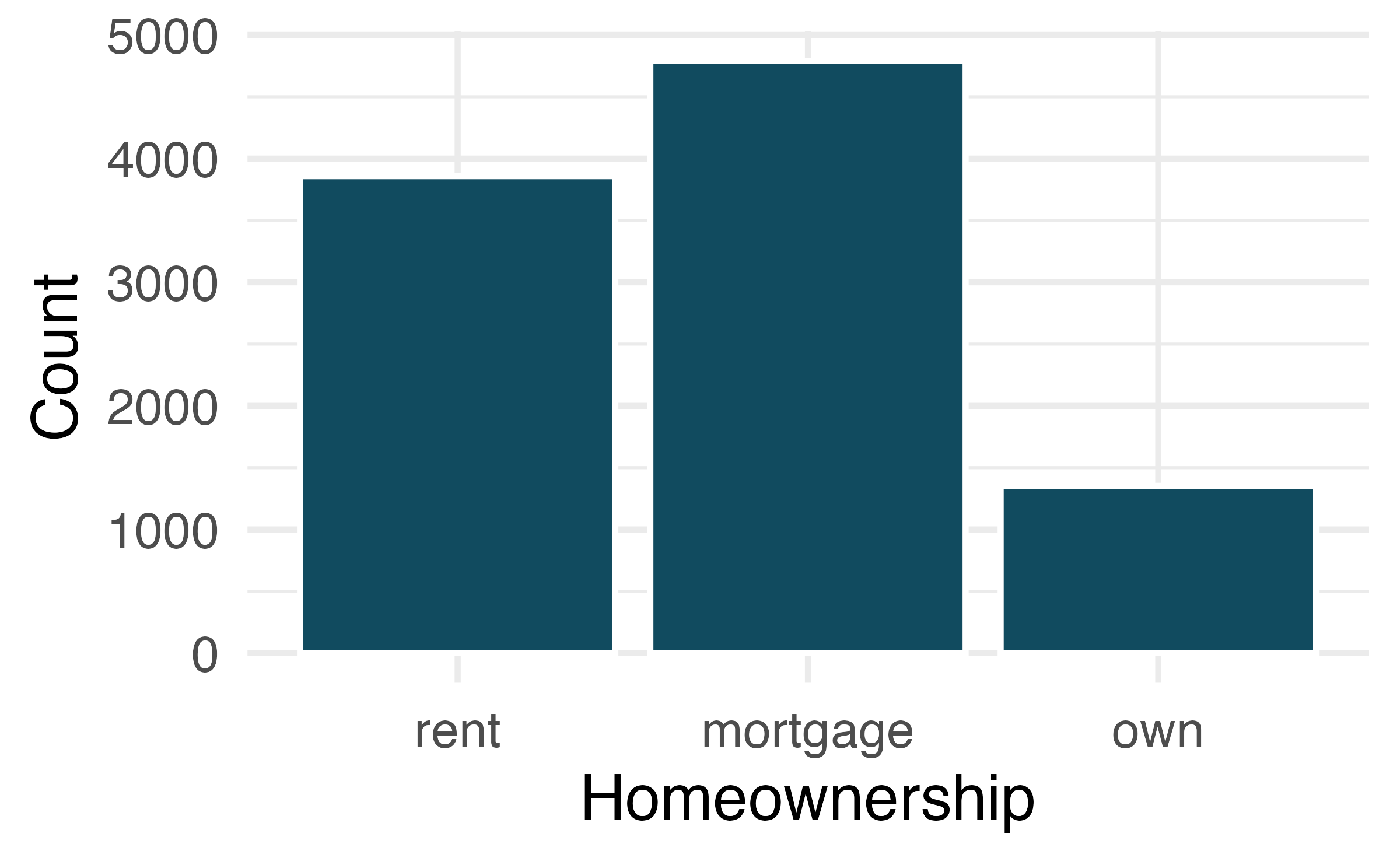
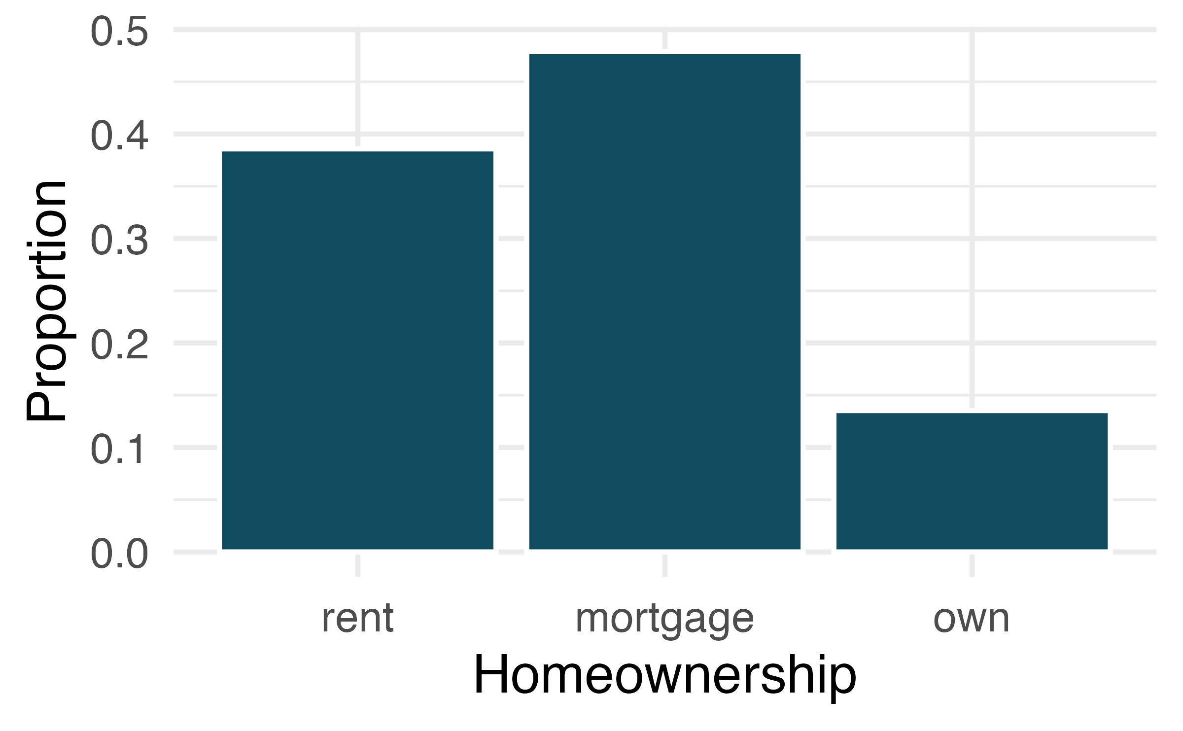
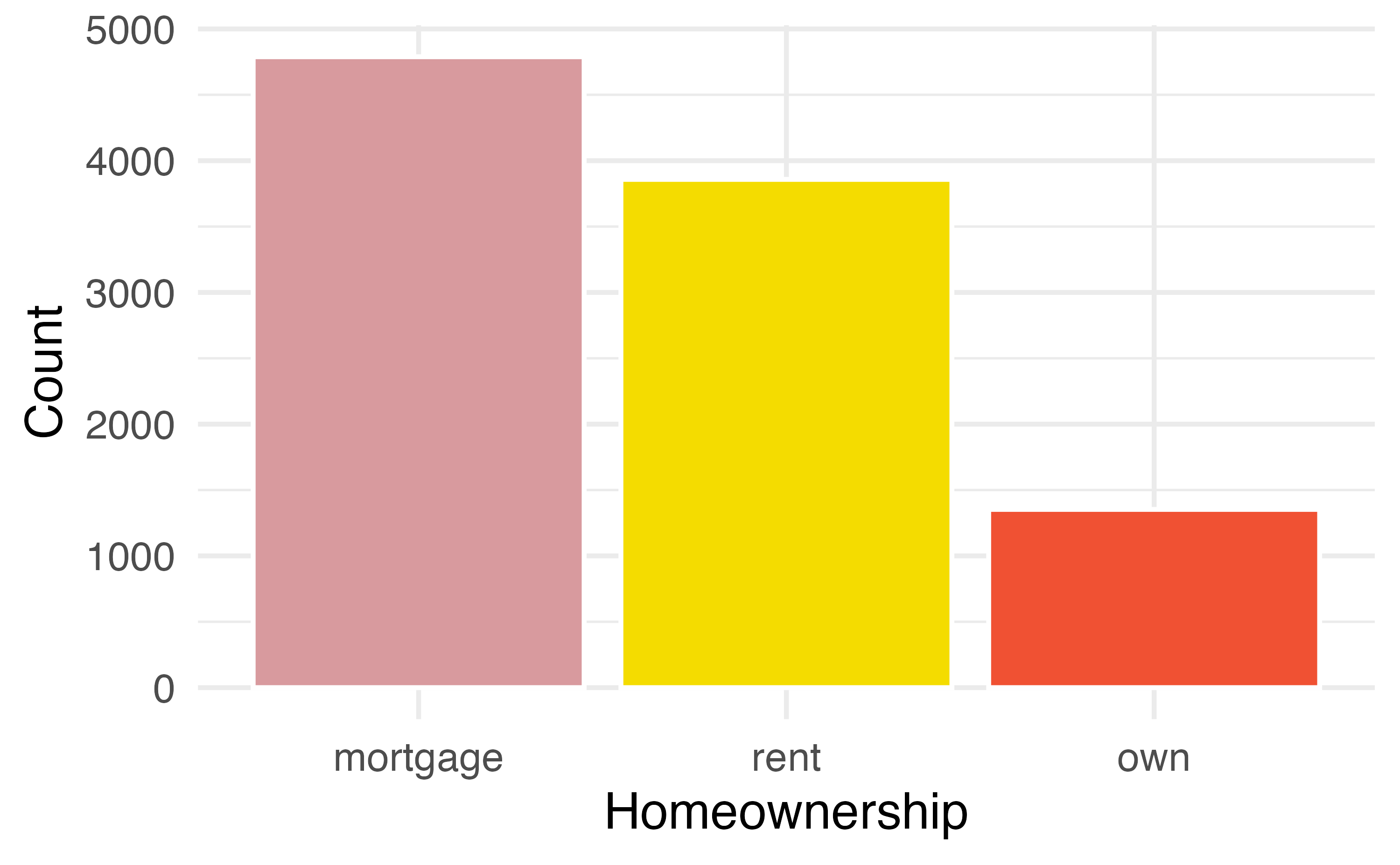
A bar plot is a common way to display a single categorical variable. Figure 4.1 (a) displays a bar plot of the homeownership variable. In Figure 4.1 (b) the counts are converted into proportions, showing the proportion of observations that are in each level.
4.2 Visualizing two categorical variables
4.2.1 Bar plots with two variables
We can display the distributions of two categorical variables on a bar plot concurrently. Such plots are generally useful for visualizing the relationship between two categorical variables. Figure 4.2 shows three such plots that visualize Figure 4.2 (a) is a stacked bar plot. This plot most clearly displays that loan applicants most commonly live in mortgaged homes. It is difficult to say, based on this plot alone, how different application types vary across the levels of homeownership. Figure 4.2 (b) is a standardized bar plot (also known as filled bar plot). This type of visualization is helpful in understanding the fraction of individual or joint loan applications for borrowers in each level of homeownership. Additionally, since the proportions of joint and individual loans vary across the groups, we can conclude that the two variables are associated for this sample. Finally, Figure 4.2 (c) is a dodged bar plot. This plot most clearly displays that within each level of homeownership, individual applications are more common than joint applications. This plot most clearly displays that joint applications are most common among loans for applicants who live in mortgaged homes, compared to renters and owners.
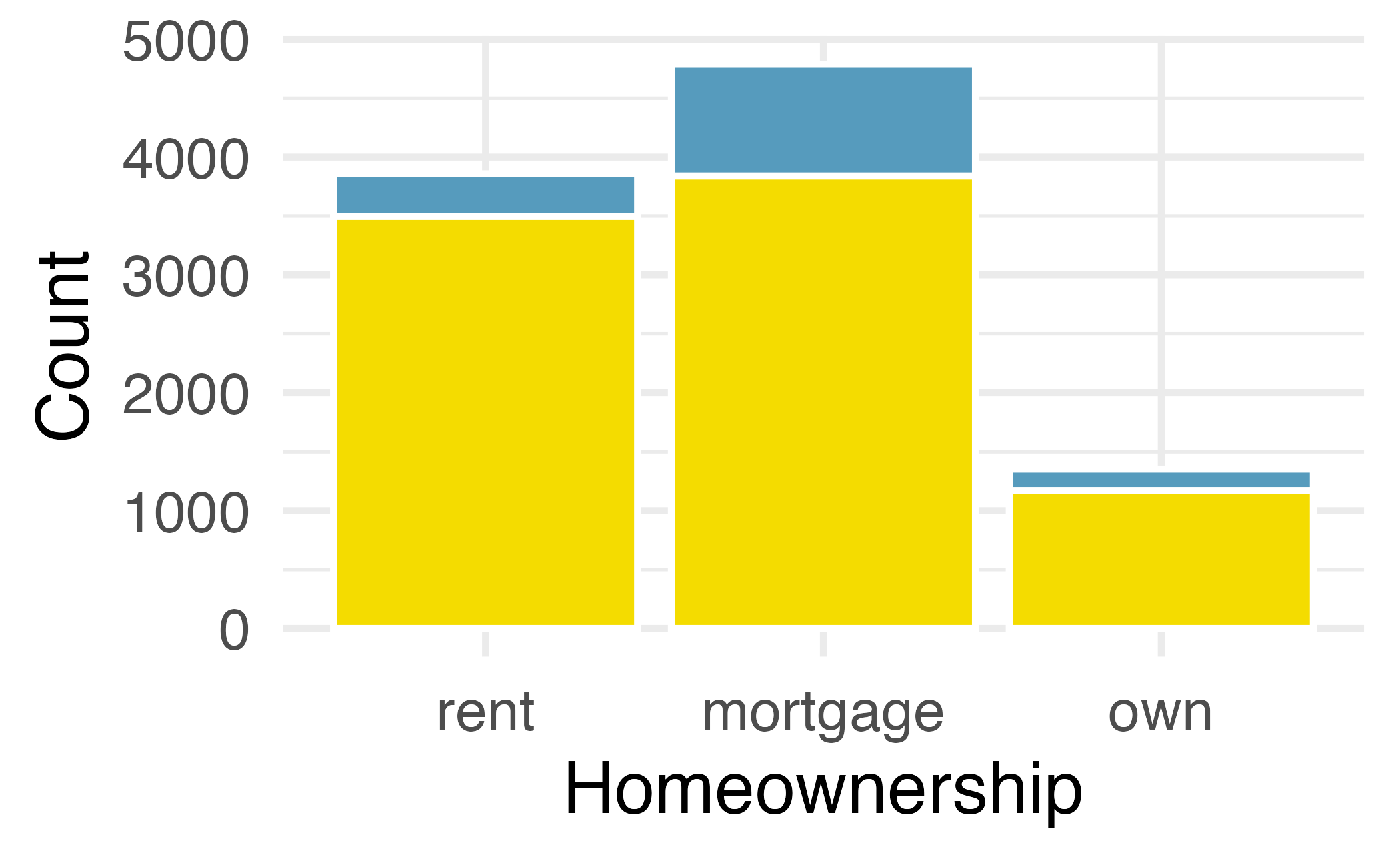
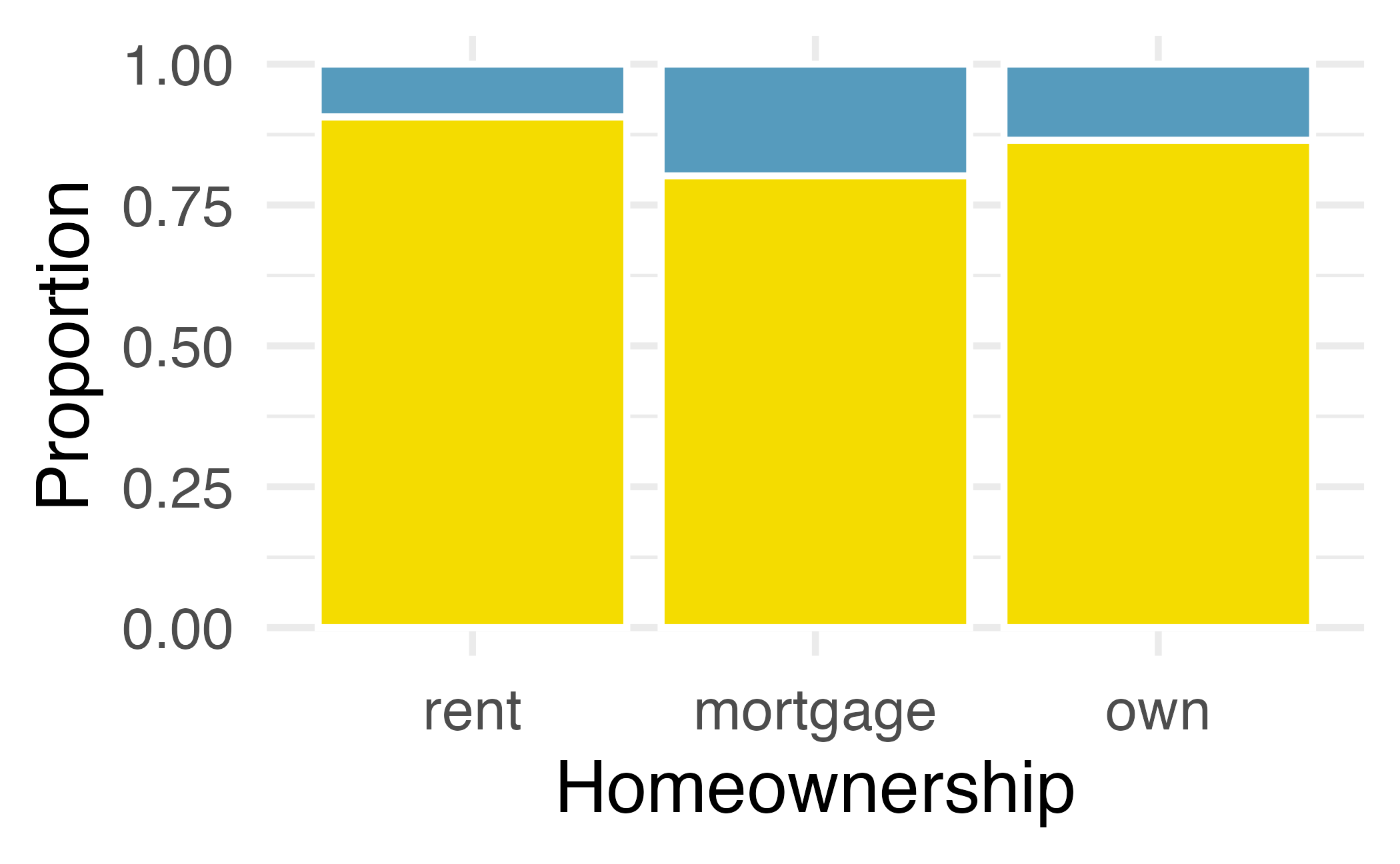
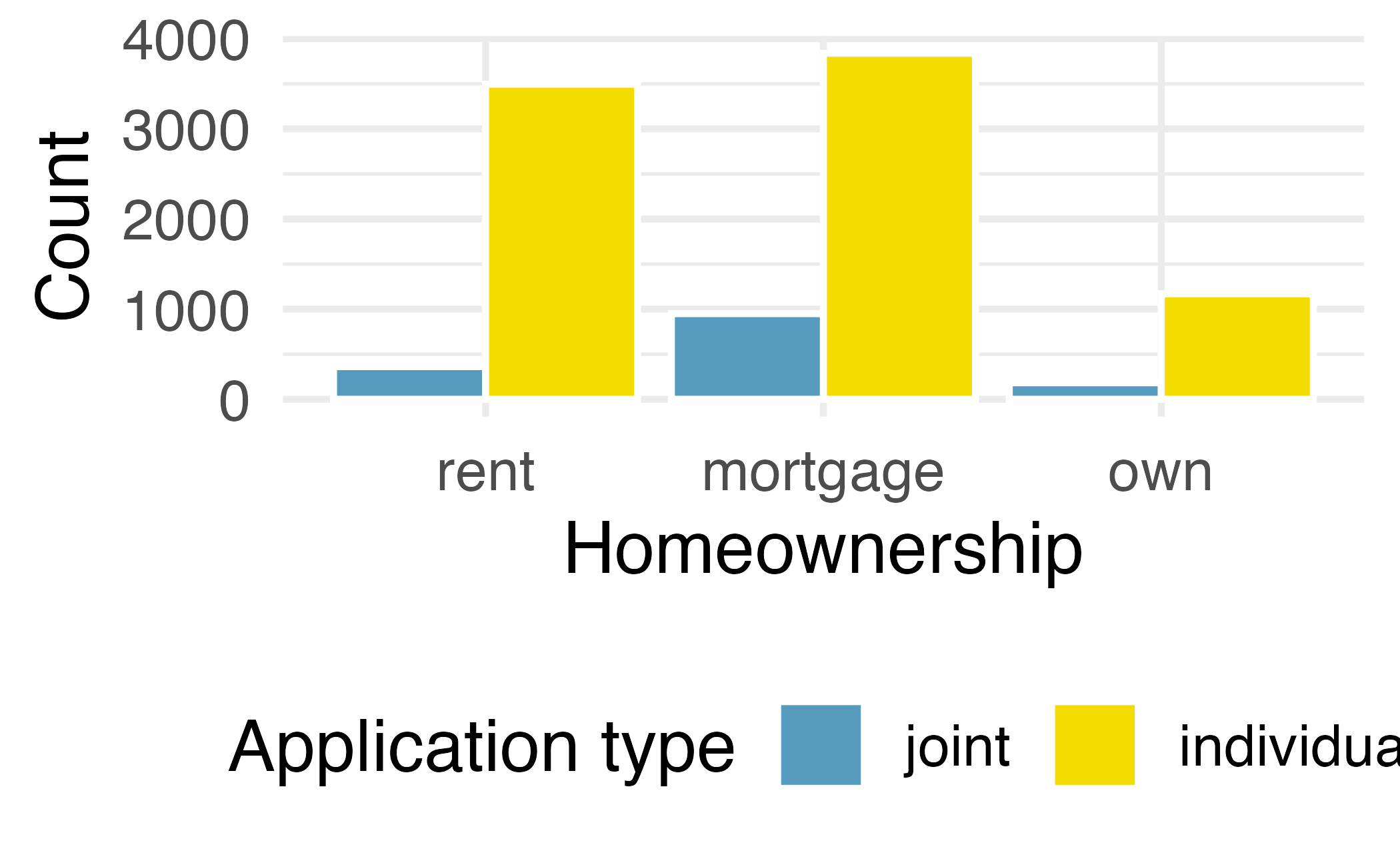
Examine the three bar plots in Figure 4.2. When is the stacked, dodged, or standardized bar plot the most useful?
The stacked bar plot is most useful when it’s reasonable to assign one variable as the explanatory variable (here homeownership) and the other variable as the response (here application_type) since we are effectively grouping by one variable first and then breaking it down by the others.
Dodged bar plots are more agnostic in their display about which variable, if any, represents the explanatory and which the response variable. It is also easy to discern the number of cases in each of the six different group combinations. However, one downside is that it tends to require more horizontal space; the narrowness of Plot B compared to the other two in Figure 4.2 makes the plot feel a bit cramped. Additionally, when two groups are of very different sizes, as we see in the group own relative to either of the other two groups, it is difficult to discern if there is an association between the variables.
The standardized stacked bar plot is helpful if the primary variable in the stacked bar plot is relatively imbalanced, e.g., the category has only a third of the observations in the category, making the simple stacked bar plot less useful for checking for an association. The major downside of the standardized version is that we lose all sense of how many cases each of the bars represents.
4.2.2 Mosaic plots
A mosaic plot is a visualization technique suitable for contingency tables that resembles a standardized stacked bar plot with the benefit that we still see the relative group sizes of the primary variable as well.
To get started in creating our first mosaic plot, we’ll break a square into columns for each category of the variable, with the result shown in Figure 4.3 (a). Each column represents a level of homeownership, and the column widths correspond to the proportion of loans in each of those categories. For instance, there are fewer loans where the borrower is an owner than where the borrower has a mortgage. In general, mosaic plots use box areas to represent the number of cases in each category.
Figure 4.3 (b) displays the relationship between homeownership and application type. Each column is split proportionally to the number of loans from individual and joint borrowers. For example, the second column represents loans where the borrower has a mortgage, and it was divided into individual loans (upper) and joint loans (lower). As another example, the bottom segment of the third column represents loans where the borrower owns their home and applied jointly, while the upper segment of this column represents borrowers who are homeowners and filed individually. We can again use this plot to see that the homeownership and application_type variables are associated, since some columns are divided in different vertical locations than others, which was the same technique used for checking an association in the standardized stacked bar plot.
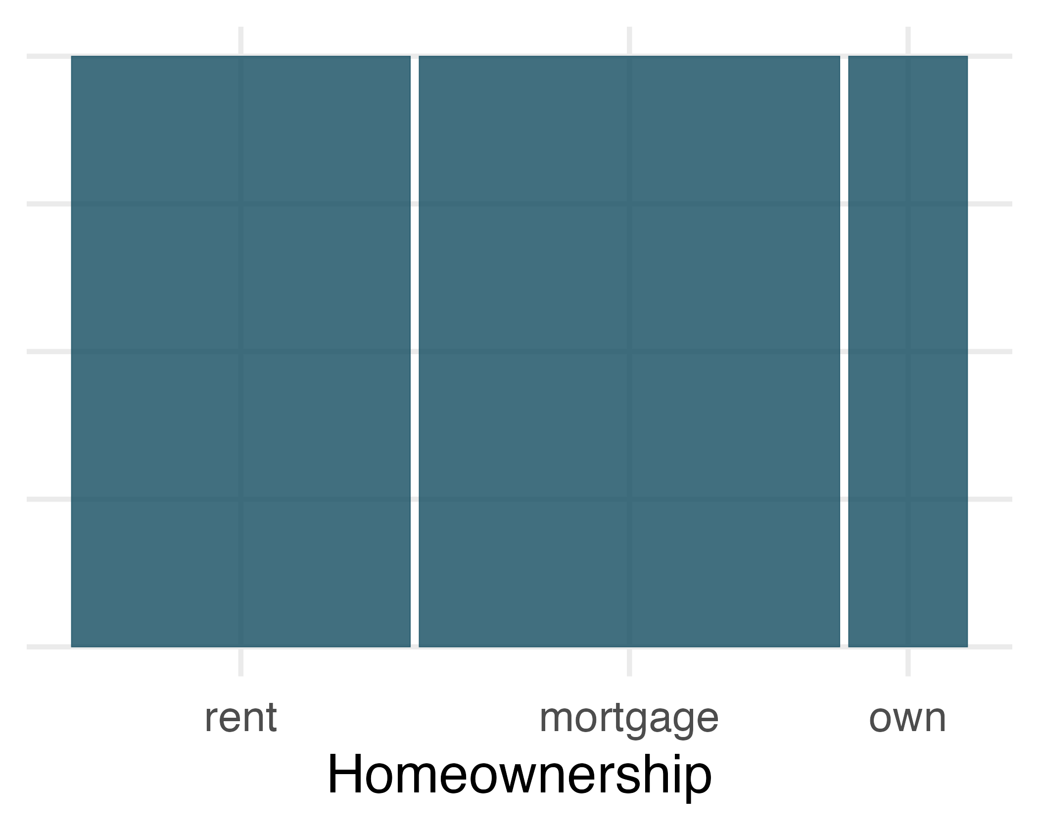
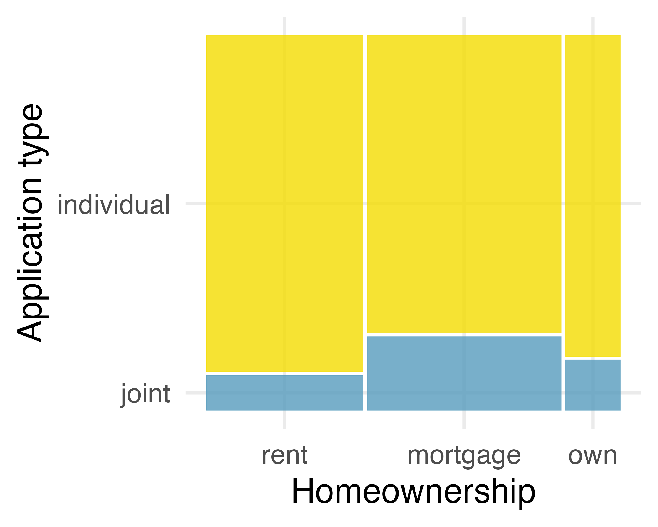
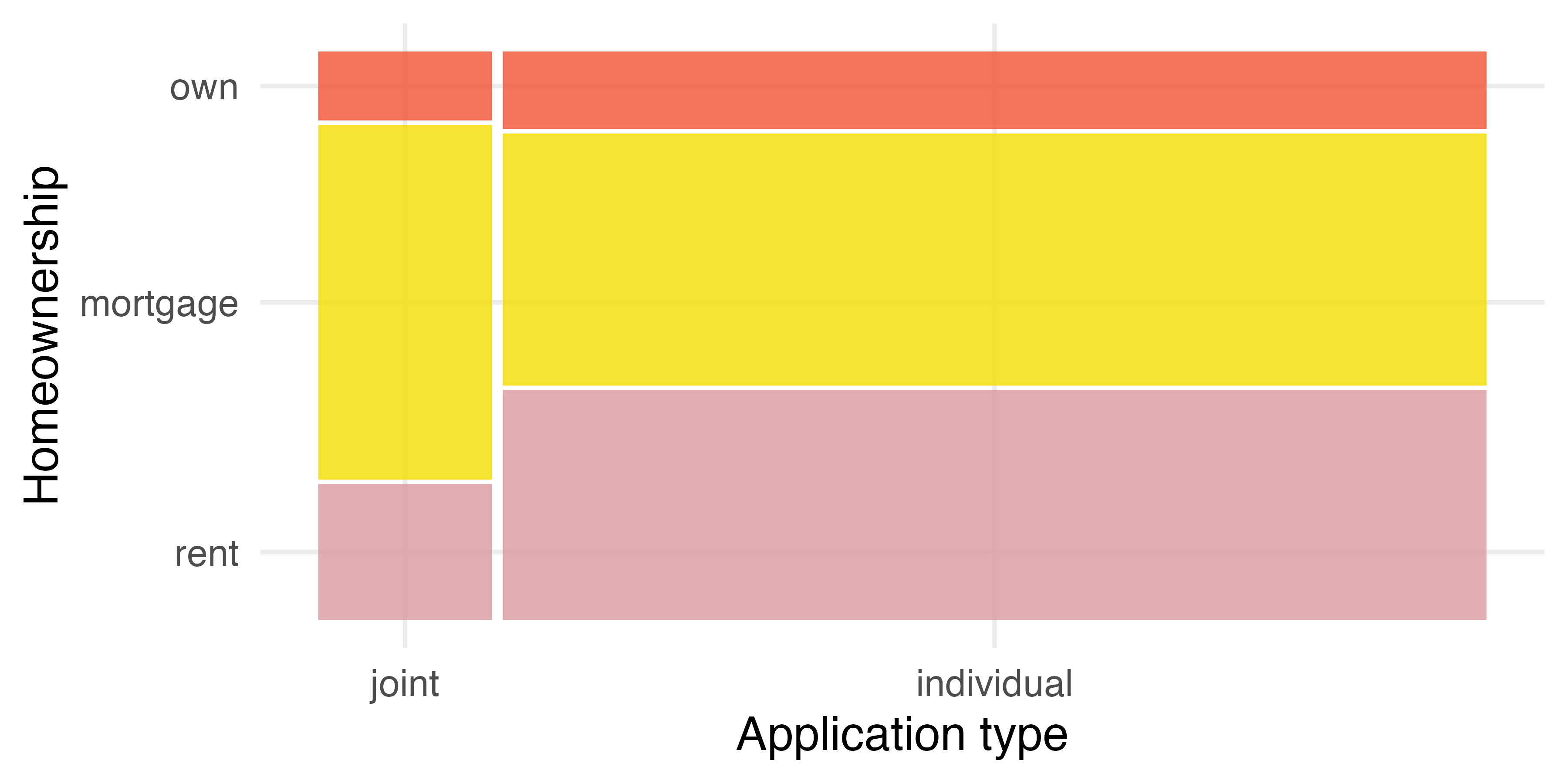
In Figure 4.3, we chose to first split by the homeowner status of the borrower. However, we could have instead first split by the application type, as in Figure 4.4. Like with the bar plots, it’s common to use the explanatory variable to represent the first split in a mosaic plot, and then for the response to break up each level of the explanatory variable if these labels are reasonable to attach to the variables under consideration.
4.3 Row and column proportions
In the previous sections we inspected visualizations of two categorical variables in bar plots and mosaic plots. However, we have not discussed how the values in the bar and mosaic plots that show proportions are calculated. In this section we will investigate fractional breakdown of one variable in another and we can modify our contingency table to provide such a view. Table 4.3 shows row proportions for Table 4.1, which are computed as the counts divided by their row totals. The value 3496 at the intersection of individual and rent is replaced by \(3496 / 8505 = 0.411,\) i.e., 3496 divided by its row total, 8505. So, what does 0.411 represent? It corresponds to the proportion of individual applicants who rent.
| application_type | rent | mortgage | own | Total |
|---|---|---|---|---|
| joint | 0.242 | 0.635 | 0.122 | 1 |
| individual | 0.411 | 0.451 | 0.138 | 1 |
A contingency table of the column proportions is computed in a similar way, where each is computed as the count divided by the corresponding column total. Table 4.4 shows such a table, and here the value 0.906 indicates that 90.6% of renters applied as individuals for the loan. This rate is higher compared to loans from people with mortgages (80.2%) or who own their home (86.5%). Because these rates vary between the three levels of homeownership (rent, mortgage, own), this provides evidence that application_type and homeownership variables may be associated.
| application_type | rent | mortgage | own |
|---|---|---|---|
| joint | 0.094 | 0.198 | 0.135 |
| individual | 0.906 | 0.802 | 0.865 |
| Total | 1.000 | 1.000 | 1.000 |
Row and column proportions can also be thought of as conditional proportions as they tell us about the proportion of observations in a given level of a categorical variable conditional on the level of another categorical variable.
We could also have checked for an association between application_type and homeownership in Table 4.3 using row proportions. When comparing these row proportions, we would look down columns to see if the fraction of loans where the borrower rents, has a mortgage, or owns varied across the application types.
Data scientists use statistics to build email spam filters. By noting specific characteristics of an email, a data scientist may be able to classify some emails as spam or not spam with high accuracy. One such characteristic is the email format, which indicates whether an email has any HTML content, such as bolded text. We’ll focus on email format and spam status using the dataset; these variables are summarized in a contingency table in Table 4.5. Which would be more helpful to someone hoping to classify email as spam or regular email for this table: row or column proportions?
A data scientist would be interested in how the proportion of spam changes within each email format. This corresponds to column proportions: the proportion of spam in plain text emails and the proportion of spam in HTML emails. If we generate the column proportions, we can see that a higher fraction of plain text emails are spam (\(209/1195 = 17.5\%\)) than compared to HTML emails (\(158/2726 = 5.8\%\)). This information on its own is insufficient to classify an email as spam or not spam, as over 80% of plain text emails are not spam. Yet, when we carefully combine this information with many other characteristics, we stand a reasonable chance of being able to classify some emails as spam or not spam with confidence. This example points out that row and column proportions are not equivalent. Before settling on one form for a table, it is important to consider each to ensure that the most useful table is constructed. However, sometimes it simply isn’t clear which, if either, is more useful.
| spam | HTML | text | Total |
|---|---|---|---|
| not spam | 2568 | 986 | 3554 |
| spam | 158 | 209 | 367 |
| Total | 2726 | 1195 | 3921 |
Look back to Table 4.3 and Table 4.4. Are there any obvious scenarios where one might be more useful than the other?
None that we think are obvious! What is distinct about the email example is that the two loan variables do not have a clear explanatory-response variable relationship that we might hypothesize. Usually it is most useful to “condition” on the explanatory variable. For instance, in the email example, the email format was seen as a possible explanatory variable of whether the message was spam, so we would find it more interesting to compute the relative frequencies (proportions) for each email format.
4.4 Pie charts
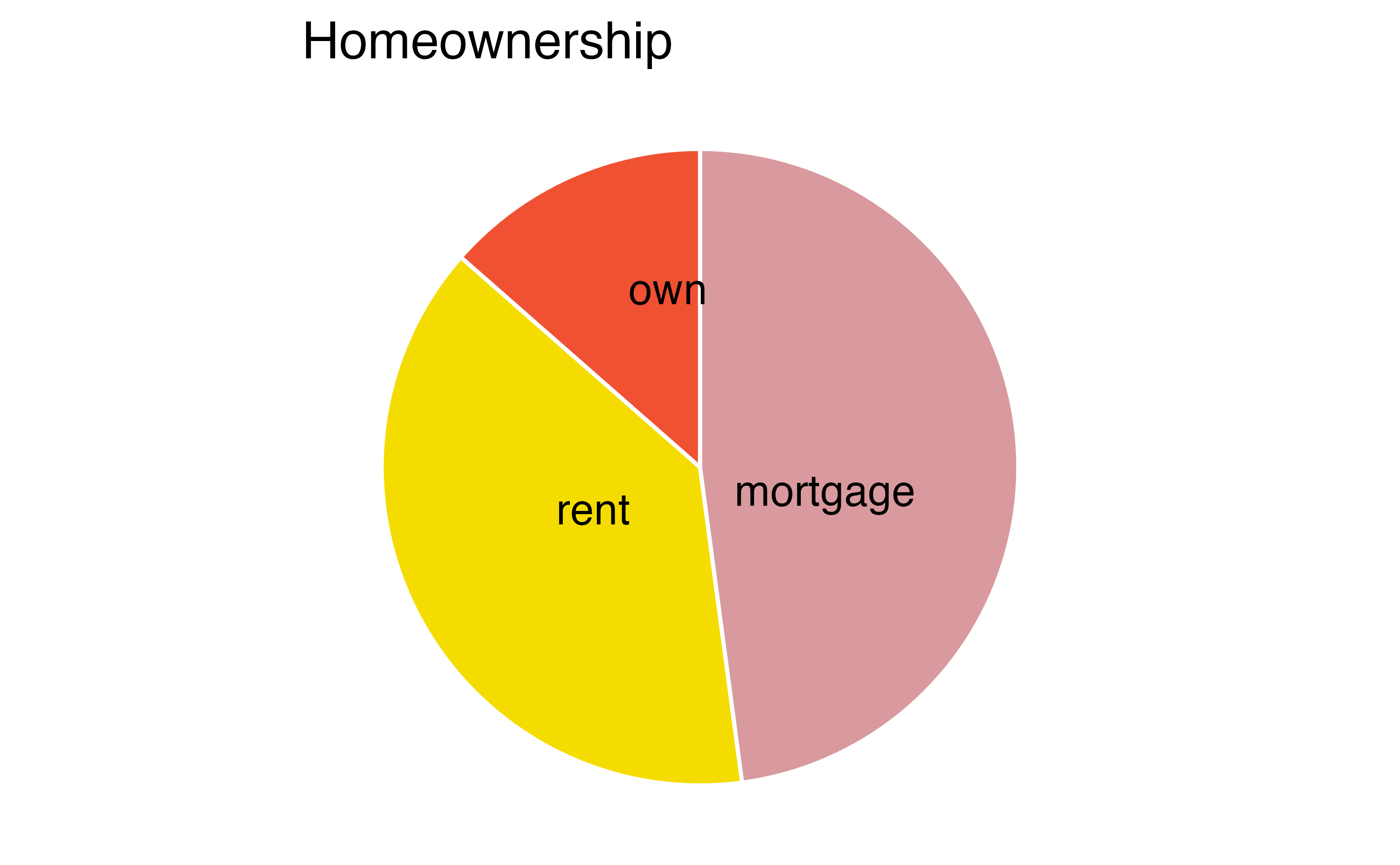
A pie chart is shown in Figure 4.5 (a) alongside a bar plot representing the same information in Figure 4.5 (b). Pie charts can be useful for giving a high-level overview to show how a set of cases break down. However, it is also difficult to decipher certain details in a pie chart. For example, it’s not immediately obvious that there are more loans where the borrower has a mortgage than rent when looking at the pie chart, while this detail is very obvious in the bar plot.
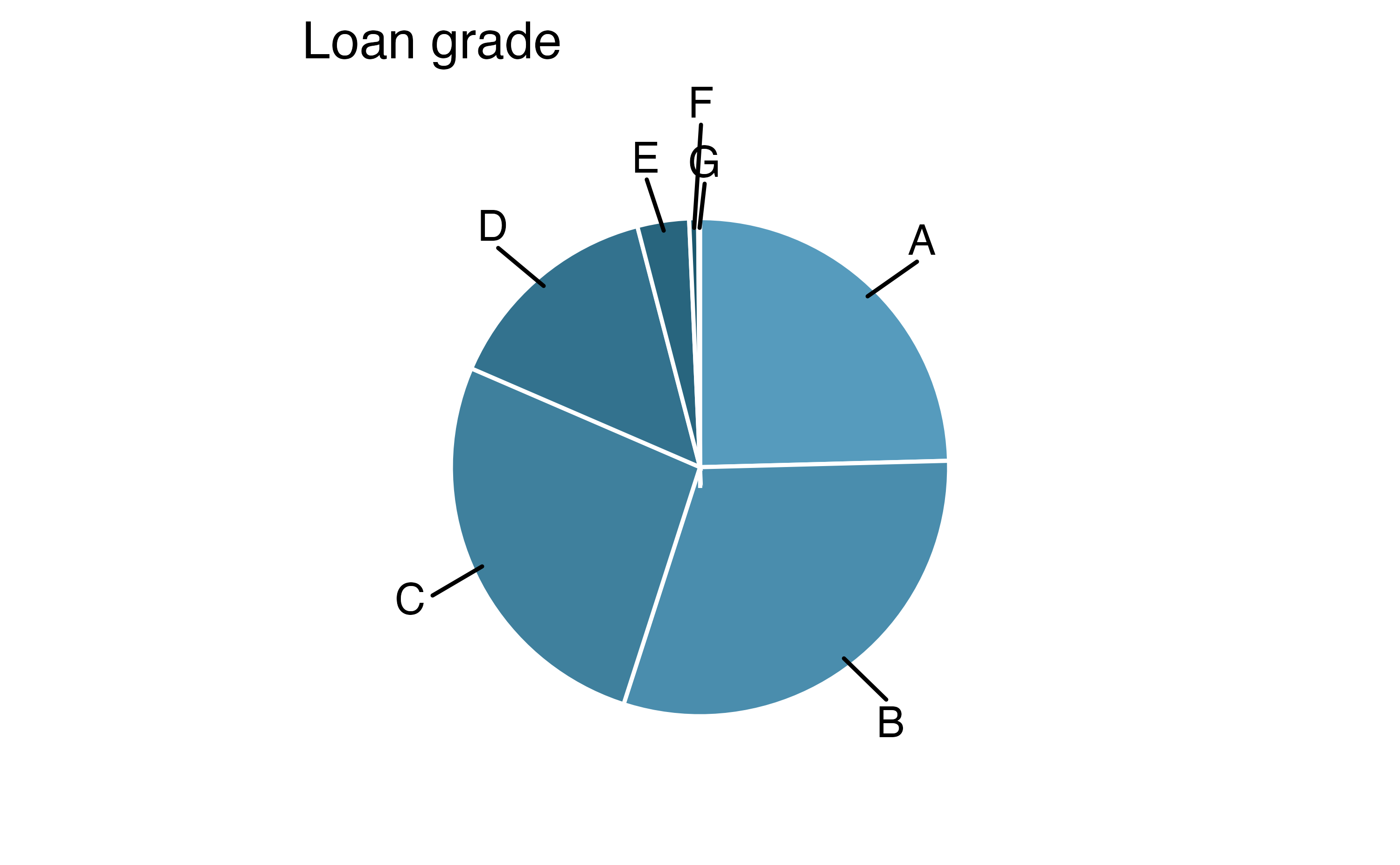
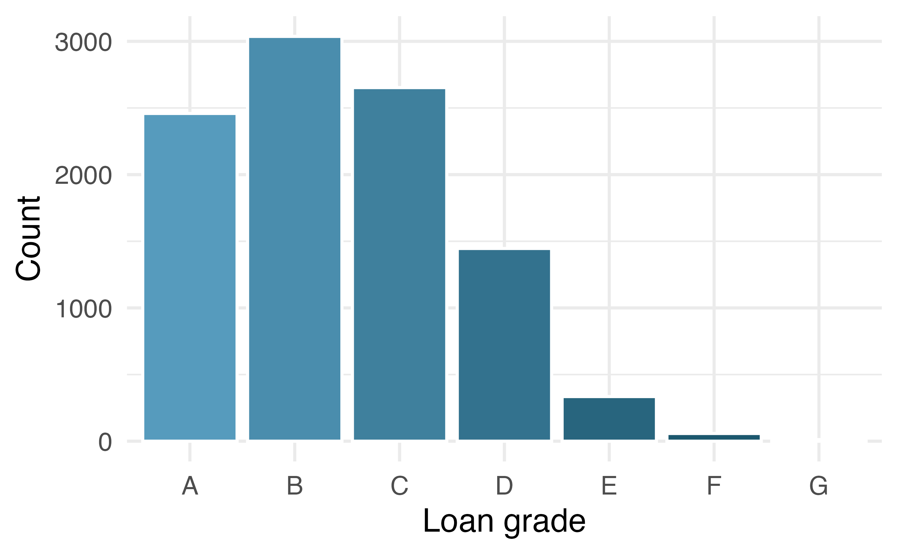
Pie charts can work well when the goal is to visualize a categorical variable with very few levels, and especially if each level represents a simple fraction (e.g., one-half, one-quarter, etc.). However, they can be quite difficult to read when they are used to visualize a categorical variable with many levels. For example, the pie chart Figure 4.6 (a) and the Figure 4.6 (b) both represent the distribution of loan grades (A through G). In this case, it is far easier to compare the counts of each loan grade using the bar plot than the pie chart.
4.5 Waffle charts
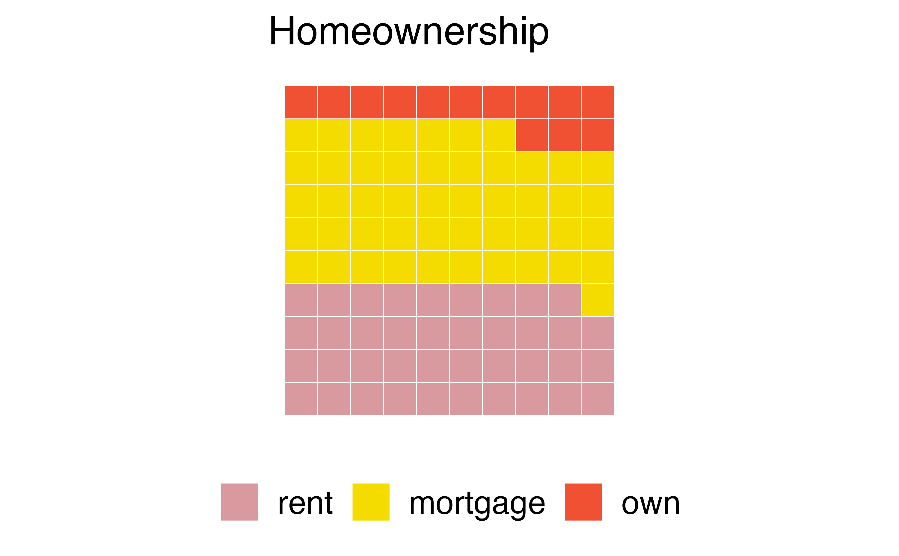
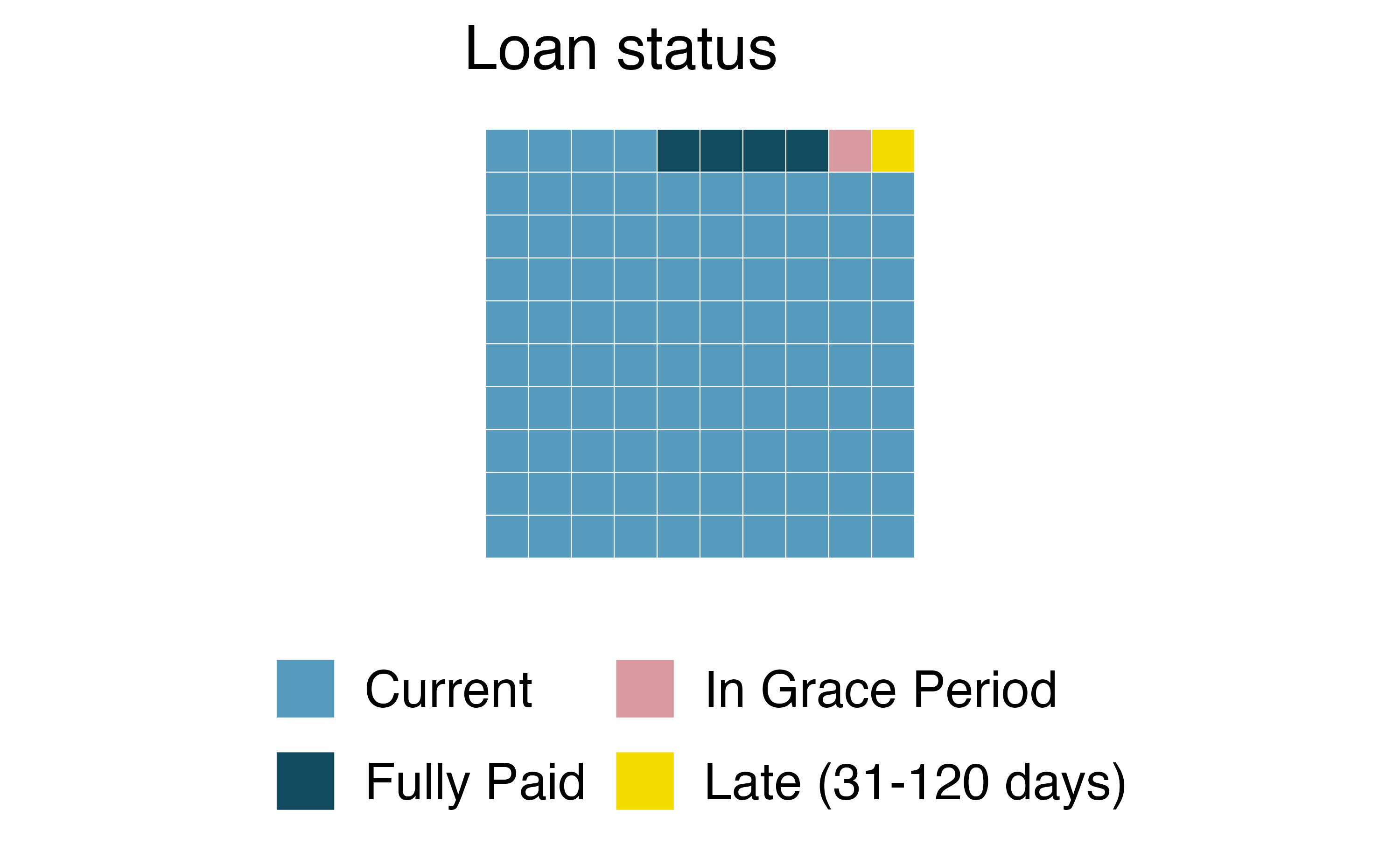
Another useful technique of visualizing categorical data is a waffle chart. Waffle charts can be used to communicate the proportion of the data that falls into each level of a categorical variable. Just like with pie charts, they work best when the number of levels represented is low. However, unlike pie charts, they can make it easier to compare proportions that represent non-simple fractions. Figure 4.7 (a) is a waffle chart of homeownership and Figure 4.7 (b) is a waffle chart of loan status.
4.6 Comparing numerical data across groups
Some of the more interesting investigations can be considered by examining numerical data across groups. In this section we will expand on a few methods we have already seen to make plots for numerical data from multiple groups on the same graph as well as introduce a few new methods for comparing numerical data across groups.
We will revisit the county dataset and compare the median household income for counties that gained population from 2010 to 2017 versus counties that had no gain. While we might like to make a causal connection between income and population growth, remember that these are observational data and so such an interpretation would be, at best, half-baked.
We have data on 3142 counties in the United States. We are missing 2017 population data from 3 of them, and of the remaining 3139 counties, in 1541 the population increased from 2010 to 2017 and in the remaining 1598 the population decreased. Table 4.6 shows a sample of four observations from each group.
| State | County | Population change (%) | Gain / No gain | Median household income |
|---|---|---|---|---|
| Arkansas | Izard County | 2.13 | gain | 39135 |
| Georgia | Jackson County | 10.17 | gain | 57999 |
| Oregon | Hood River County | 3.41 | gain | 57269 |
| Texas | Montague County | 0.75 | gain | 46592 |
| Kentucky | Ballard County | -2.62 | no gain | 42988 |
| Kentucky | Letcher County | -5.13 | no gain | 30293 |
| Texas | Jim Hogg County | -1.12 | no gain | 31403 |
| Virginia | Richmond County | -0.19 | no gain | 47341 |
Color can be used to split histograms (see Section 5.3 for an introduction to histograms) for numerical variables by levels of a categorical variable. An example of this is shown in Figure 4.8 (a). The side-by-side box plot is another traditional tool for comparing across groups. An example is shown in Figure 4.8 (b), where there are two box plots (see Section 5.5 for an introduction to box plots), one for each group, placed into one plotting window and drawn on the same scale.
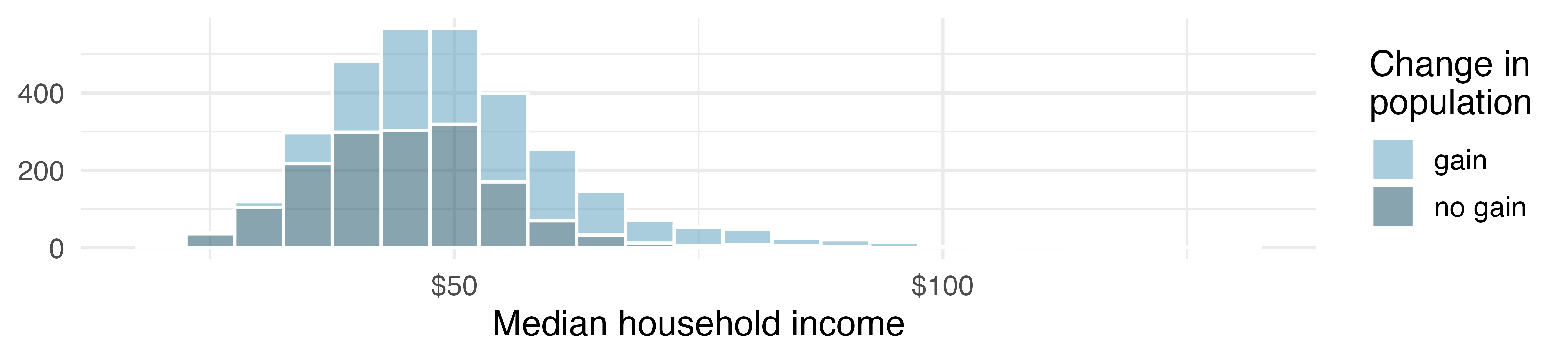
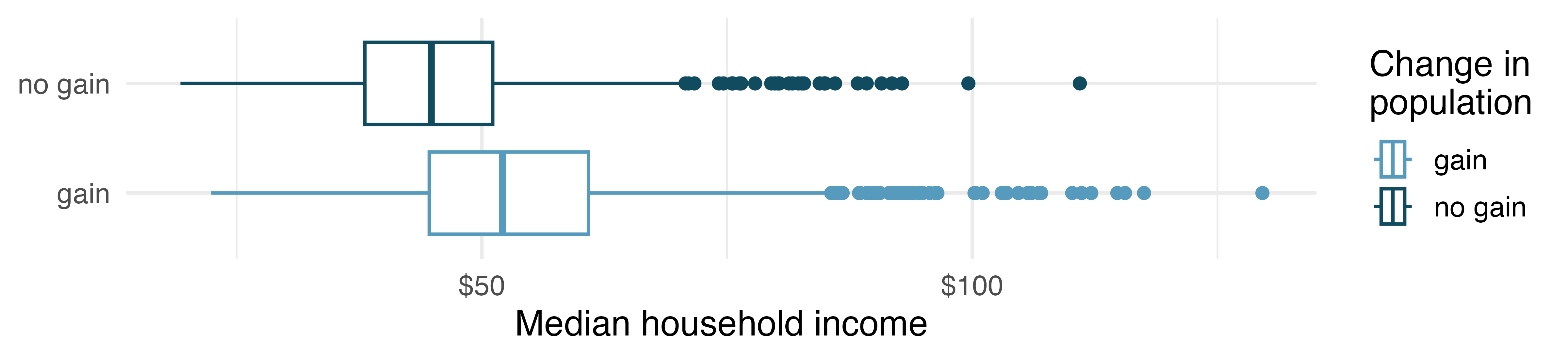
Use the plots in Figure 4.8 to compare the incomes for counties across the two groups. What do you notice about the approximate center of each group? What do you notice about the variability between groups? Is the shape relatively consistent between groups? How many prominent modes are there for each group?3
What components of each plot in Figure 4.8 do you find most useful?4
Another useful visualization for comparing numerical data across groups is a ridge plot, which combines density plots (see Section 5.5 for an introduction to density plots) for various groups drawn on the same scale in a single plotting window. Figure 4.9 displays a ridge plot for the distribution of median household income in counties, split by whether there was a population gain or not.
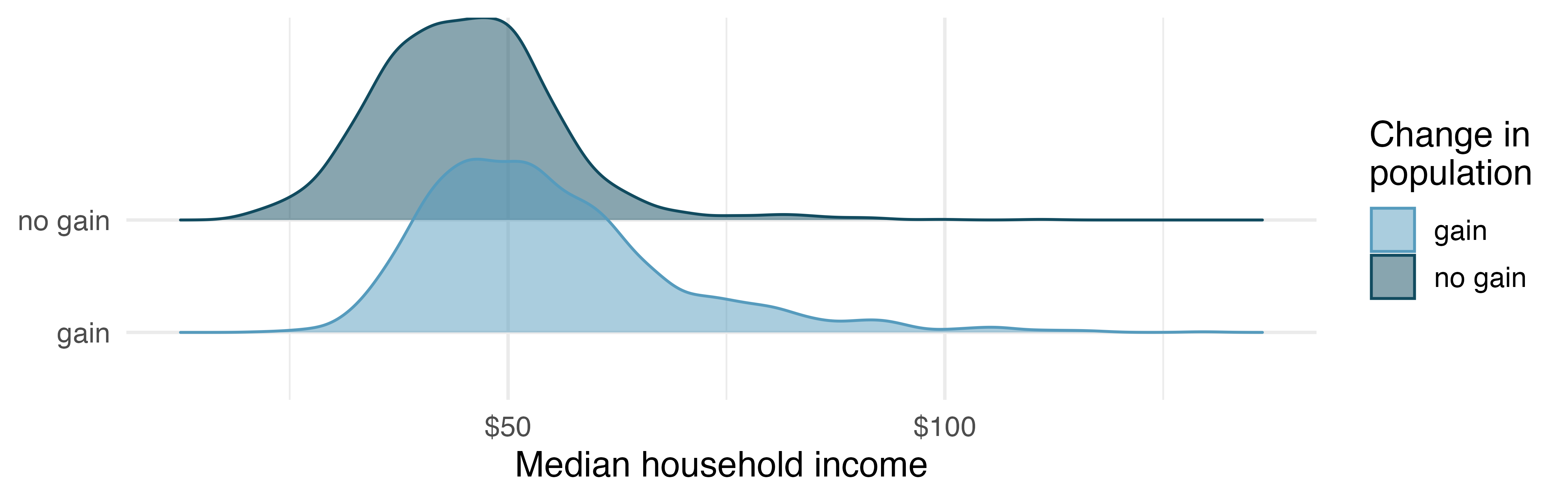
What components of the ridge plot in Figure 4.9 do you find most useful compared to those in Figure 4.8?5
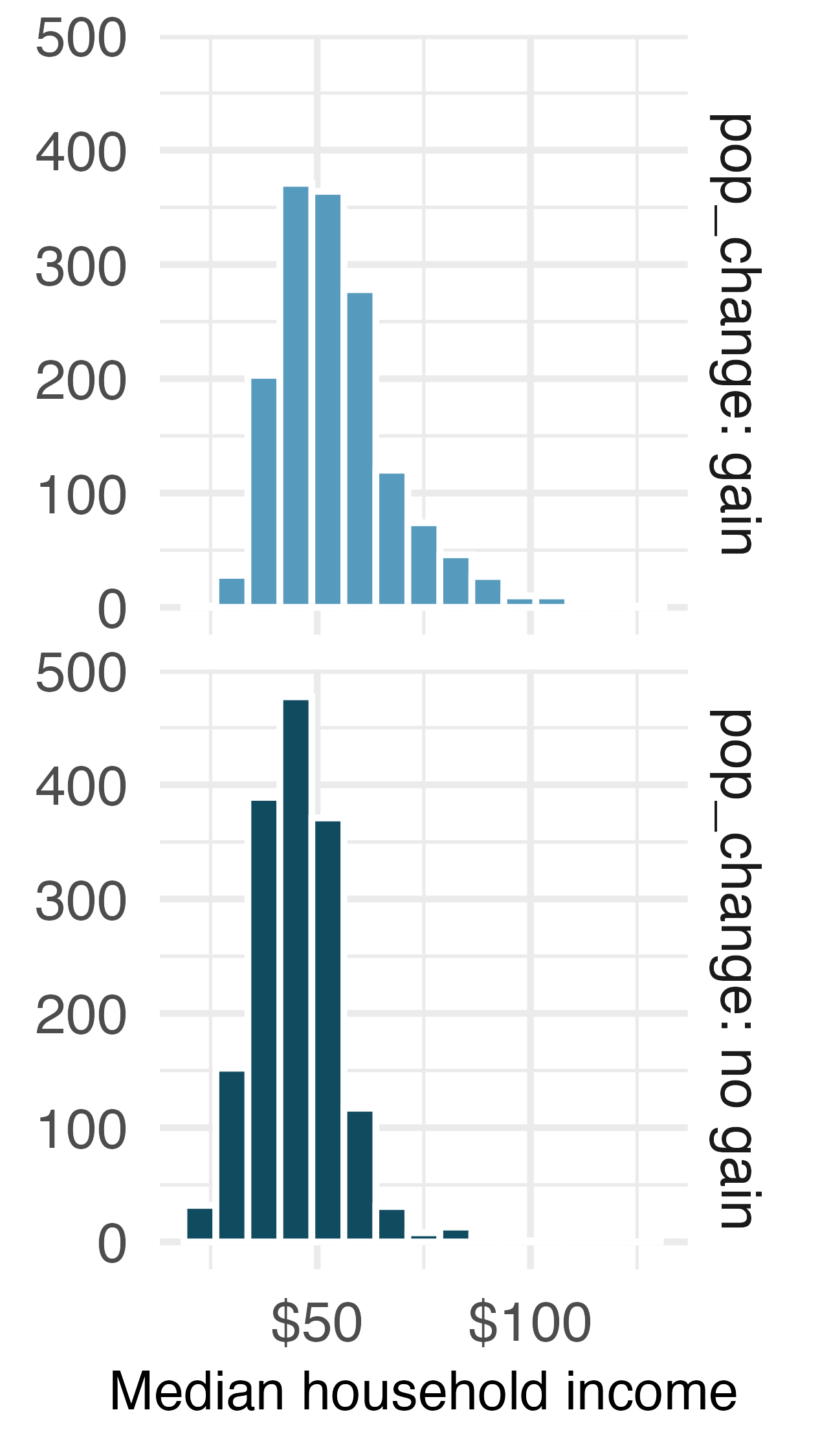
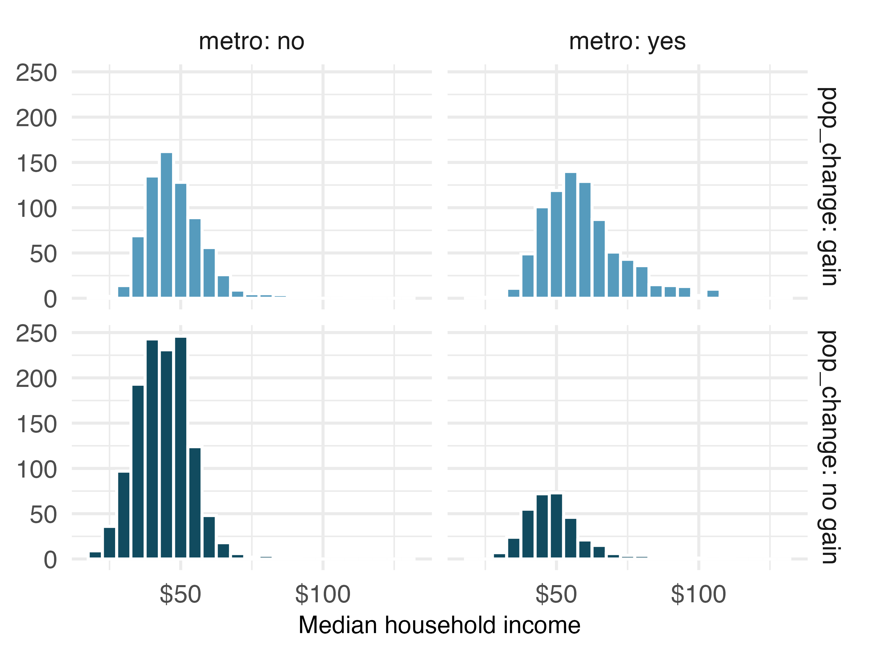
One last visualization technique we’ll highlight for comparing numerical data across groups is faceting. In this technique we split (facet) the graphical display of the data across plotting windows based on groups. In Figure 4.10 (a) displays the same information as Figure 4.8 (a), however here the distributions of median household income for counties with and without population gain are faceted across two plotting windows. We preserve the same scale on the x and y axes for easier comparison. An advantage of this approach is that it extends to splitting the data across levels of two categorical variables, which allows for displaying relationships between three variables. In Figure 4.10 (b) we have now split the data into four groups using the pop_change and metro variables:
- top left represents counties that are not in a
metropolitan area with population gain, - top right represents counties that are in a metropolitan area with population gain,
- bottom left represents counties that are not in a metropolitan area without population gain, and finally
- bottom right represents counties that are in a metropolitan area without population gain.
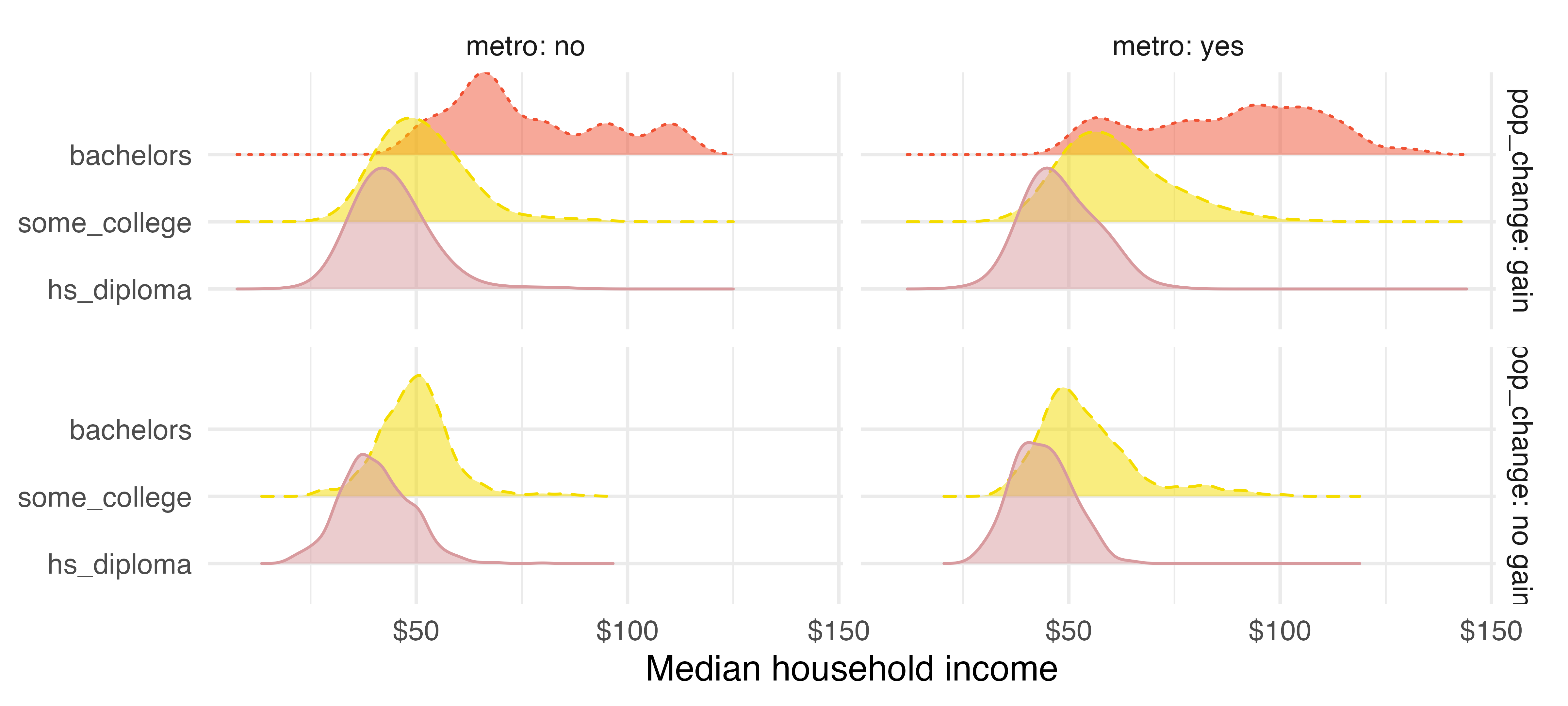
We can continue building upon this visualization to add one more variable, median_edu, which is the median education level in the county. In Figure 4.11, we represent median education level using color, where pink (solid line) represents counties where the median education level is high school diploma, yellow (dashed line) is some college degree, and red (dotted line) is Bachelor’s.
Based on Figure 4.11, what can you say about how median household income in counties vary depending on population gain/no gain, metropolitan area/not, and median degree?6
4.7 Chapter review
4.7.1 Summary
Fluently working with categorical variables is an important skill for data analysts. In this chapter we have introduced different visualizations and numerical summaries applied to categorical variables. The graphical visualizations are even more descriptive when two variables are presented simultaneously. We presented bar plots, mosaic plots, pie charts, and estimations of conditional proportions.
4.7.2 Terms
The terms introduced in this chapter are presented in Table 4.7. If you’re not sure what some of these terms mean, we recommend you go back in the text and review their definitions. You should be able to easily spot them as bolded text.
| column proportions | faceted plot | row totals |
| column totals | filled bar plot | side-by-side box plot |
| conditional proportions | mosaic plot | stacked bar plot |
| contingency table | ridge plot | standardized bar plot |
| dodged bar plot | row proportions |
4.8 Exercises
Answers to odd-numbered exercises can be found in Appendix A.4.
-
Antibiotic use in children. The bar plot and the pie chart below show the distribution of pre-existing medical conditions of children involved in a study on the optimal duration of antibiotic use in treatment of tracheitis, which is an upper respiratory infection.7
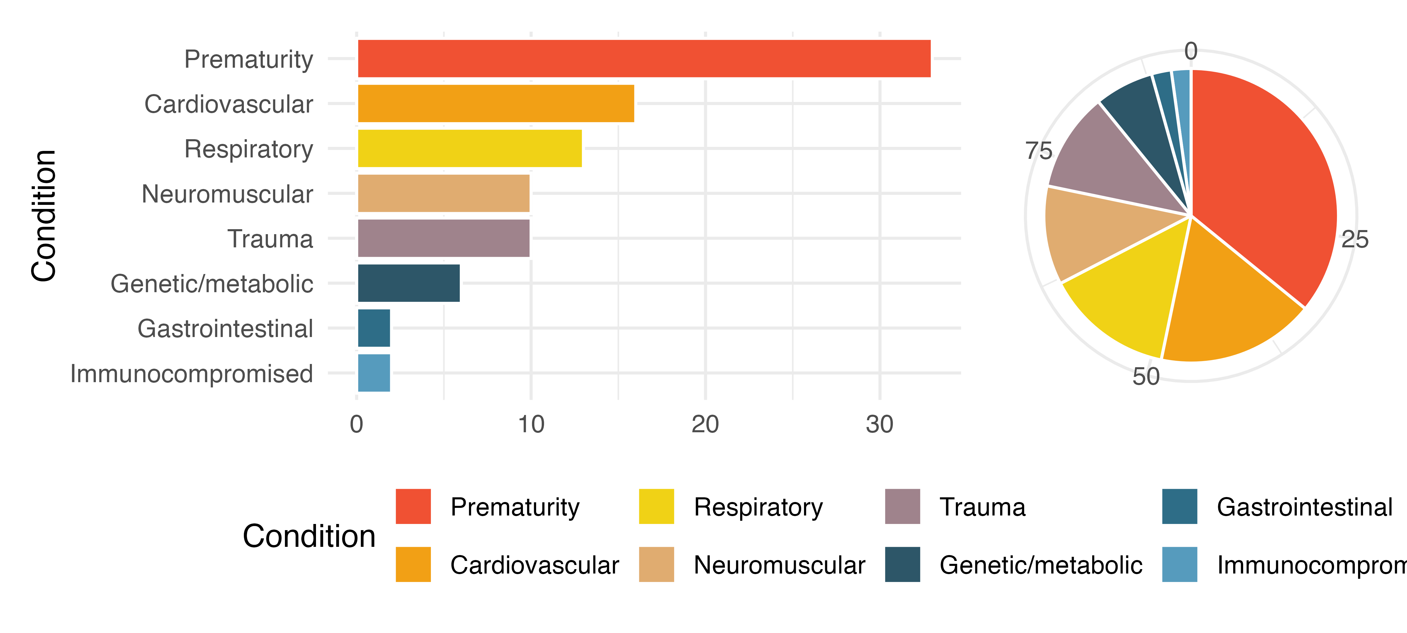
What features are apparent in the bar plot but not in the pie chart?
What features are apparent in the pie chart but not in the bar plot?
Which graph would you prefer to use for displaying these categorical data?
-
Views on immigration. Nine-hundred and ten (910) randomly sampled registered voters from Tampa, FL were asked if they thought workers who have illegally entered the US should be (i) allowed to keep their jobs and apply for US citizenship, (ii) allowed to keep their jobs as temporary guest workers but not allowed to apply for US citizenship, or (iii) lose their jobs and have to leave the country. The results of the survey by political ideology are shown below.8
Response Conservative Liberal Moderate Total Apply for citizenship 57 101 120 278 Guest worker 121 28 113 262 Leave the country 179 45 126 350 Not sure 15 1 4 20 Total 372 175 363 910 What percent of these Tampa, FL voters identify themselves as conservatives?
What percent of these Tampa, FL voters are in favor of the citizenship option?
What percent of these Tampa, FL voters identify themselves as conservatives and are in favor of the citizenship option?
What percent of these Tampa, FL voters who identify themselves as conservatives are also in favor of the citizenship option? What percent of moderates share this view? What percent of liberals share this view?
Do political ideology and views on immigration appear to be associated? Explain your reasoning.
Conjecture other variables that might explain the potential relationship between these two variables.
-
Black Lives Matter. A Washington Post-Schar School poll conducted in the United States in June 2020, among a random national sample of 1,006 adults, asked respondents whether they support or oppose protests following George Floyd’s killing that have taken place in cities across the US. The survey also collected information on the age of the respondents. (Washington Post 2020) The results are summarized in the stacked bar plot below.
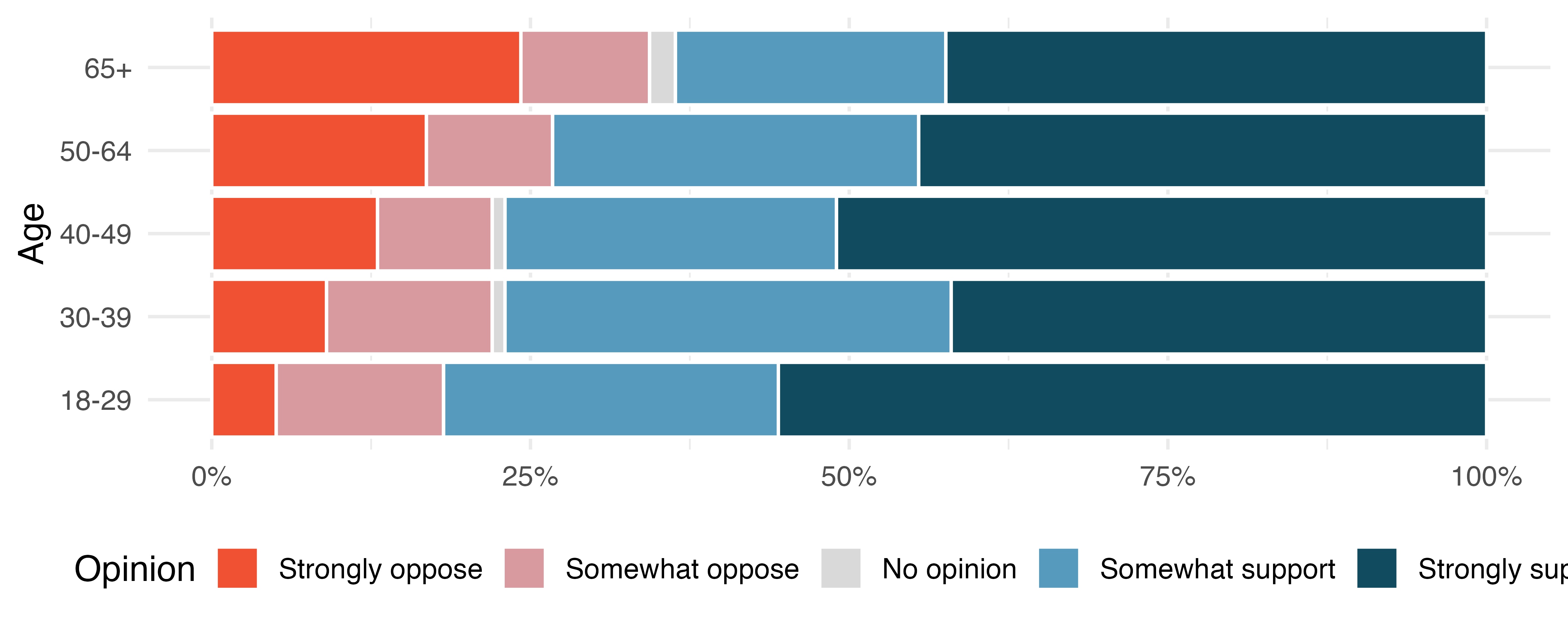
Based on the stacked bar plot, do views on the protests and age appear to be associated? Explain your reasoning.
Conjecture other possible variables that might explain the potential association between these two variables.
-
Raise taxes. A random sample of registered voters nationally were asked whether they think it’s better to raise taxes on the rich or raise taxes on the poor. The survey also collected information on the political party affiliation of the respondents. (Polling 2015)
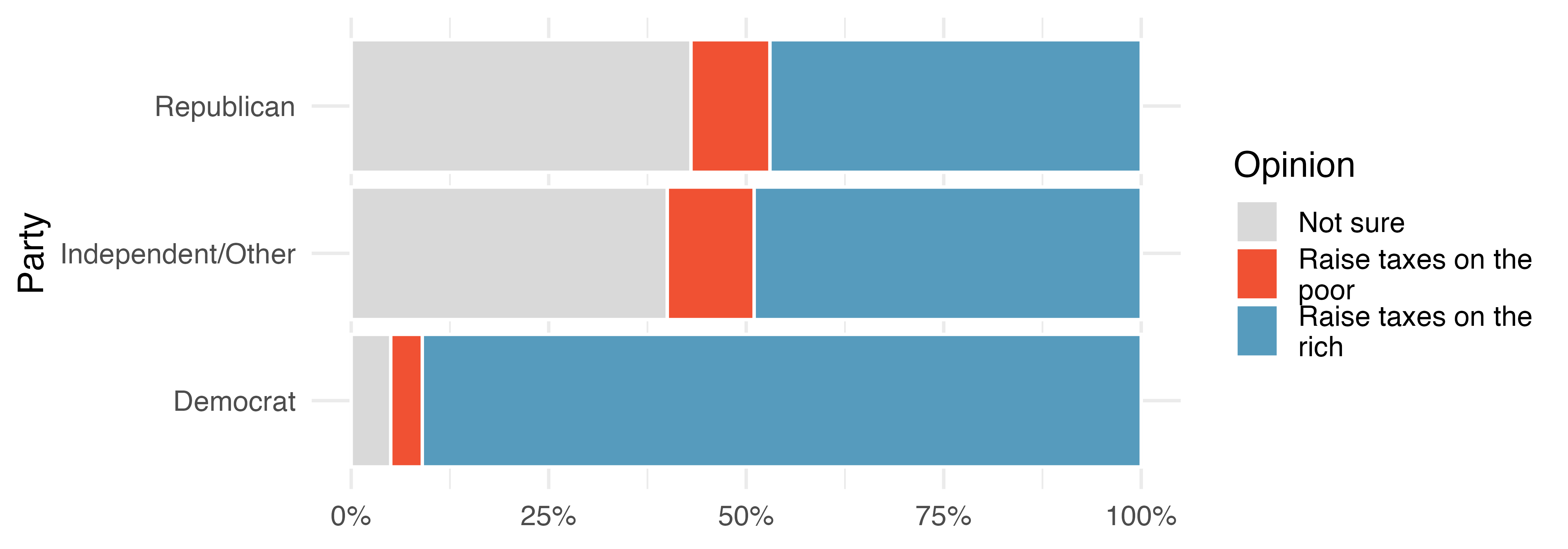
Based on the stacked bar plot shown above, do views on raising taxes and political affiliation appear to be associated? Explain your reasoning.
Conjecture other possible variables that might explain the potential association between these two variables.
-
Heart transplant data display. The Stanford University Heart Transplant Study was conducted to determine whether an experimental heart transplant program increased lifespan. Each patient entering the program was officially designated a heart transplant candidate, meaning that they were gravely ill and might benefit from a new heart. Patients were randomly assigned into treatment and control groups. Patients in the treatment group received a transplant, and those in the control group did not. The visualizations below display two different versions of the study results.9 (Turnbull et al. 1974)
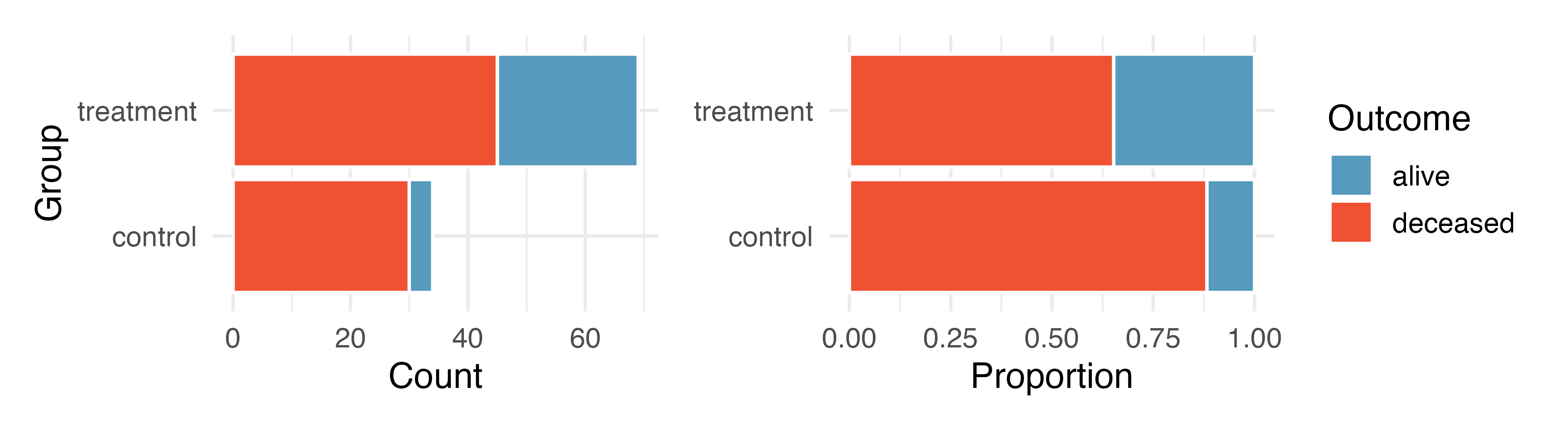
Provide one aspect of the two group comparison that is easier to see from the stacked bar plot (left)?
Provide one aspect of the two group comparison that is easeir to see from the standardized bar plot (right)?
For the Heart Transplant Study which of those aspects would be more important to display? That is, which bar plot would be better as a data visualization?
-
Shipping holiday gifts data display. A local news survey asked 500 randomly sampled Los Angeles residents which shipping carrier they prefer to use for shipping holiday gifts. The bar plots below show the distribution of responses by age group as well as distribution of responses by shipping method.
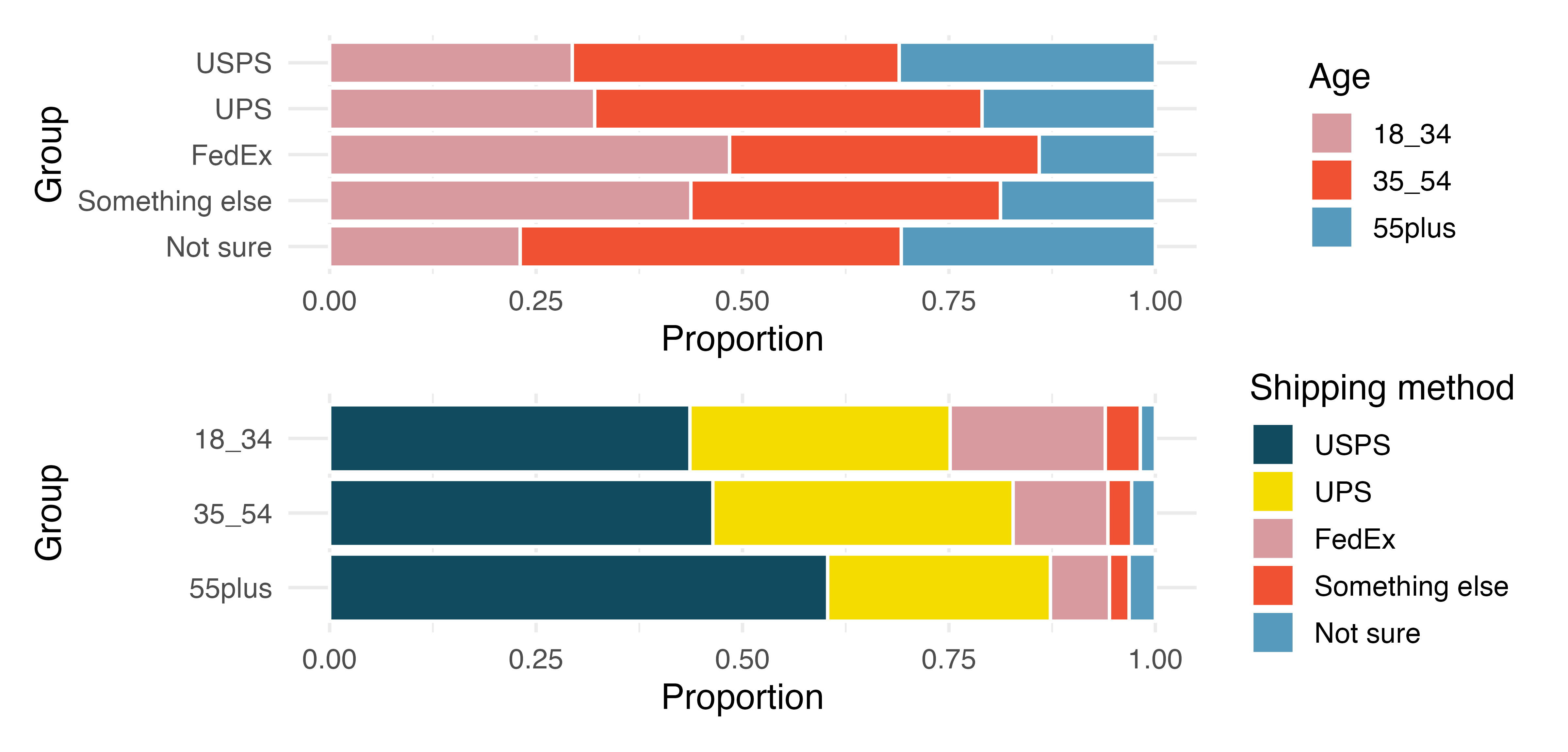
Which graph (top or bottom) would you use to understand the shipping choices of people of different ages? Explain.
Which graph (top or bottom) would you use to understand the age distribution across different types of shipping choices? Explain.
A new shipping company would like to market to people over the age of 55. Who will be their biggest competitor? Explain.
FedEx would like to reach out to grow their market share so as to balance the age demographics of FedEx users. To what age group should FedEx market?
-
Meat consumption and life expectancy. In data collected for You et al. (2022), total meat intake is associated with life expectancy (at birth) in 175 countries. Meat intake is measured in kg per capita per year (averaged over 2011 to 2013). The two ridge plots show an association between income and meat consumption (higher income countries tend to eat more meat) and an association between income and life expectancy (higher income countries have higher life expectancy).
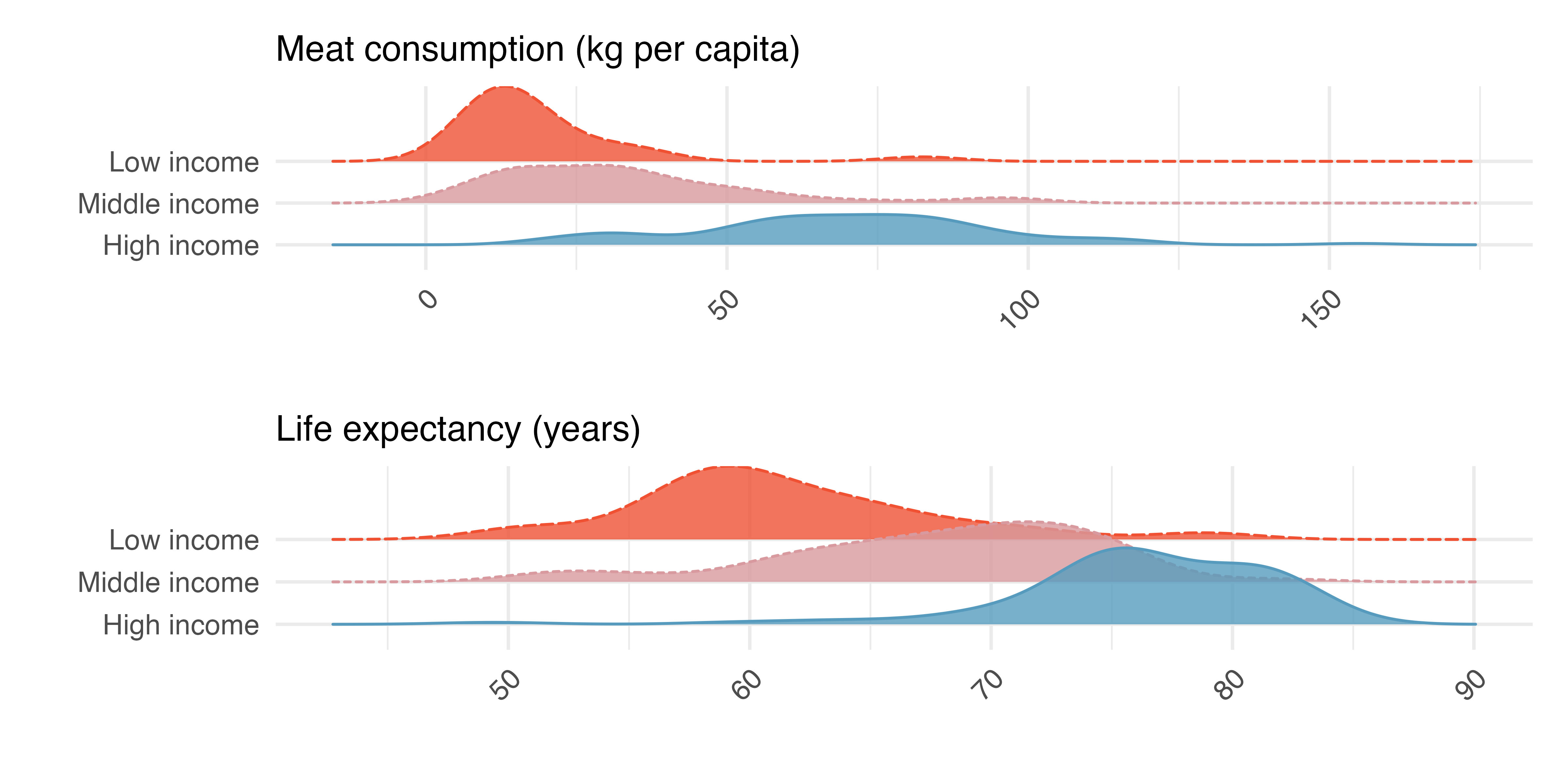
Do the graphs above demonstrate that meat consumption and life expectancy are associated? That is, can you tell if countries with low meat consumption have low life expectancy? Explain.
Let’s assume that you had a plot comparing meat consumption and life expectancy, and they do seem associated. Your friend says that the plot shows that high meat consumption leads to a longer life. You correctly say, no, we can’t tell if there is a causal realtionship because the relationship is confounded by income level. Explain what you mean.
How can you investigate the relationship between meat consumption and life expectancy in the presence of confounding variables (like income)?
-
Florence Nightingale. Florence Nightingale was a nurse in the Crimean War and an early statistician. In her notes, she opined, “In comparing the deaths of one hospital with those of another, any statistics are justly considered absolutely valueless which do not give the ages, the sexes, and the diseases of all the cases.” (Nightingale 1859)
Nightingale describes three confounding variables to consider when comparing death rates across hospitals. What are they? Describe what makes each variable potentially confounding.
Provide two additional potential confounding variables for this situation. Check to make sure that the variables are associated with both the explanatory variable (hospital) and the response variable (death).
Why does Nightingale say that the statistics are “valueless” if given without being broken down by age, sex, and disease? Explain.
-
On-time arrivals. Consider all of the flights out of New York City in 2013 that flew into Puerto Rico (BQN), Los Angeles (LAX), or San Francisco (SFO) on the following two airlines: JetBlue (B6) or United Airlines (UA). Below are the tabulated counts for the number of flights
delayedandon timefor each airline into each city.10dest carrier status count BQN B6 delayed 271 BQN B6 on time 322 BQN UA delayed 144 BQN UA on time 151 LAX B6 delayed 670 LAX B6 on time 999 LAX UA delayed 2368 LAX UA on time 3402 SFO B6 delayed 405 SFO B6 on time 615 SFO UA delayed 2694 SFO UA on time 4034 What percent of all JetBlue flights were delayed? What percent of all United Airlines flights were delayed? (Note, the overall delay proportions are typically what would be reported and associated with an airline.)
For each of the three airports, find the percent of delayed flights for each of JetBlue and United (you should have 6 numbers).
United has a higher proportion of delayed flights for each of the three cities, yet JetBlue has a higher proportion of delayed flights overall. Explain, using the data counts provided, how the seeming paradox could happen.11
-
US House of Representatives. The US House of Representatives is dominated by two political parties: Democrats and Republicans. Democrats are thought to be the more liberal party and Republicans are considered to be the more conservative party. However, within each party there is an internal spectrum of liberal to conservative. For example, conservative Democrats and liberal Republicans would be labeled moderate. Consider an election where the only change in membership is that the most conservative Democrats are replaced by a set of liberal Republicans who are more liberal than the incumbent Republicans but more conservative than the Democrats they replaced.
After the election, is the Democratic wing of the House more conservative or more liberal? Explain.
After the election, is the Republican wing of the House more conservative or more liberal? Explain.
After the election, is the overall House membership more conservative or more liberal? Explain.
In what settings would you report the outcome of the change in House membership to be more conservative? And in what settings would you report the outcome of the change in House membership to be more liberal?12
0.451 represents the proportion of individual applicants who have a mortgage. 0.802 represents the fraction of applicants with mortgages who applied as individuals.↩︎
0.122 represents the fraction of joint borrowers who own their home. 0.135 represents the home-owning borrowers who had a joint application for the loan.↩︎
Answers may vary a little. The counties with population gains tend to have higher income (median of about $45,000) versus counties without a gain (median of about $40,000). The variability is also slightly larger for the population gain group. This is evident in the IQR, which is about 50% bigger in the gain group. Both distributions show slight to moderate right skew and are unimodal. The box plots indicate there are many observations far above the median in each group, though we should anticipate that many observations will fall beyond the whiskers when examining any dataset that contain more than a few hundred data points.↩︎
Answers will vary. The side-by-side box plots are especially useful for comparing centers and spreads, while the hollow histograms are more useful for seeing distribution shape, skew, modes, and potential anomalies.↩︎
The ridge plot give us a better sense of the shape, and especially modality, of the data.↩︎
Regardless of the location (metropolitan or not) or change in population, it seems like there is an increase in median household income from individuals with only a HS diploma, to individuals with some college, to individuals with a Bachelor’s degree.↩︎
The
antibioticsdata used in this exercise can be found in the openintro R package.↩︎The
immigrationdata used in this exercise can be found in the openintro R package.↩︎The
heart_transplantdata used in this exercise can be found in the openintro R package.↩︎The
flightsdata used in this exercise can be found in the nycflights13 R package.↩︎The conundrum is known as Simpson’s Paradox and is explored in Chapter 3.↩︎
The conundrum is known as Simpson’s Paradox and is explored in Chapter 3.↩︎