3 Applications: Data
3.1 Case study: Olympic 1500m
While many of you may be glued to the Olympic Games every four years (or every two years if you fancy both summer and winter sports), the Paralympic Games are less popular than the Olympic Games, even if they hold the same competitive thrills.
The Paralympic Games began as a way to support soldiers who had been wounded in World War II as a way to help them rehabilitate. The first Paralympic Games were held in Rome, Italy in 1960. Since 1988 (Seoul, South Korea), the Paralympic Games have been held a few weeks later than the Olympic Games in the same city, in both the summer and winter.
In this case study we introduce a dataset comparing Olympic and Paralympic gold medal finishers in the 1500m running competition (the Olympic “mile”, if a bit shorter than a full mile). The goal of the case study is to walk you through what a data scientist does when they first get a hold of a dataset. We also provide some “foreshadowing” of concepts and techniques we’ll introduce in the next few chapters on exploratory data analysis. Last, we introduce Simpson’s paradox and discuss the importance of understanding the impact of multiple variables in an analysis.
The paralympic_1500 data can be found in the openintro R package.
Table 3.1 shows the last five rows from the dataset, which are the five most recent 1500m races. Notice that there are racers from both the Men’s and Women’s divisions as well as those of varying visual impairment (T11, T12, T13, and Olympic). The T11 athletes have almost complete visual impairment, run with a black-out blindfold, and are allowed to run with a guide-runner. T12 and T13 athletes have some visual impairment, and the visual acuity of Olympic runners is not determined.
When you encounter a new dataset, taking a peek at the last few rows as we did in Table 3.1 should be instinctual. It can be helpful to look at the first few rows of the data as well to get a sense of other aspects of the data which may not be apparent in the last few rows. Table 3.2 shows the top five rows of the paralympic_1500 dataset, which reveals that for at least the first five Olympiads, there were no runners in the Women’s division or in the Paralympics.
paralympic_1500 dataset.
| year | city | country_of_games | division | type | name | country_of_athlete | time | time_min | |
|---|---|---|---|---|---|---|---|---|---|
| 78 | 2020 | Tokyo | Japan | Men | T11 | Yeltsin Jacques | Brazil | 3:57.6 | 3.96 |
| 79 | 2020 | Tokyo | Japan | Men | T13 | Anton Kuliatin | Russian Paralympic Committee | 3:54.04 | 3.90 |
| 80 | 2020 | Tokyo | Japan | Women | Olympic | Faith Chepngetich Kipyegon | Kenya | 3:53.11 | 3.88 |
| 81 | 2020 | Tokyo | Japan | Women | T11 | Monica Olivia Rodriguez Saavedra | Mexico | 4:37.4 | 4.62 |
| 82 | 2020 | Tokyo | Japan | Women | T13 | Tigist Gezahagn Menigstu | Ethiopia | 4:23.24 | 4.39 |
paralympic_1500 dataset.
| year | city | country_of_games | division | type | name | country_of_athlete | time | time_min | |
|---|---|---|---|---|---|---|---|---|---|
| 1 | 1896 | Athens | Greece | Men | Olympic | Edwin Flack | Australia | 4:33.2 | 4.55 |
| 2 | 1900 | Paris | France | Men | Olympic | Charles Bennett | Great Britain | 4:6.2 | 4.10 |
| 3 | 1904 | St Louis | USA | Men | Olympic | Jim Lightbody | USA | 4:5.4 | 4.09 |
| 4 | 1908 | London | United Kingdom | Men | Olympic | Mel Sheppard | USA | 4:3.4 | 4.06 |
| 5 | 1912 | Stockholm | Sweden | Men | Olympic | Arnold Jackson | Great Britain | 3:56.8 | 3.95 |
At this stage it’s also useful to think about how the data were collected, as that will inform the scope of any inference you can make based on your analysis of the data.
Do these data come from an observational study or an experiment?1
There are 82 rows and 9 columns in the dataset. What does each row and each column represent?2
Once you’ve identified the rows and columns, it’s useful to review the data dictionary to learn about what each column in the dataset represents. The data dictionary is provided in Table 3.3.
paralympic_1500 dataset.
| Variable | Description |
|---|---|
| year | Year the Games took place. |
| city | City of the Games. |
| country_of_games | Country of the Games. |
| division | Division: `Men` or `Women`. |
| type | Type: `Olympic`, `T11`, `T12`, or `T13`. |
| name | Name of the athlete. |
| country_of_athlete | Country of athlete. |
| time | Time of gold medal race, in m:s. |
| time_min | Time of gold medal race, in decimal minutes (min + sec/60). |
We now have a better sense of what each column represents, but we do not yet know much about the characteristics of each of the variables.
Determine whether each variable in the paralympic_1500 dataset is numerical or categorical. For numerical variables, further classify them as continuous or discrete. For categorical variables, determine if the variable is ordinal.
The numerical variables in the dataset are year (discrete), and time_min (continuous). The categorical variables are city, country_of_games, division, type, name, and country_of_athlete. The time variable is trickier to classify – we can think of it as numerical, but it is classified as categorical. The categorical classification is due to the colon : which separates the minutes from the seconds. Sometimes the data dictionary (presented in Table 3.3) isn’t sufficient for a complete analysis, and we need to go back to the data source and try to understand the data better before we can proceed with the analysis meaningfully.
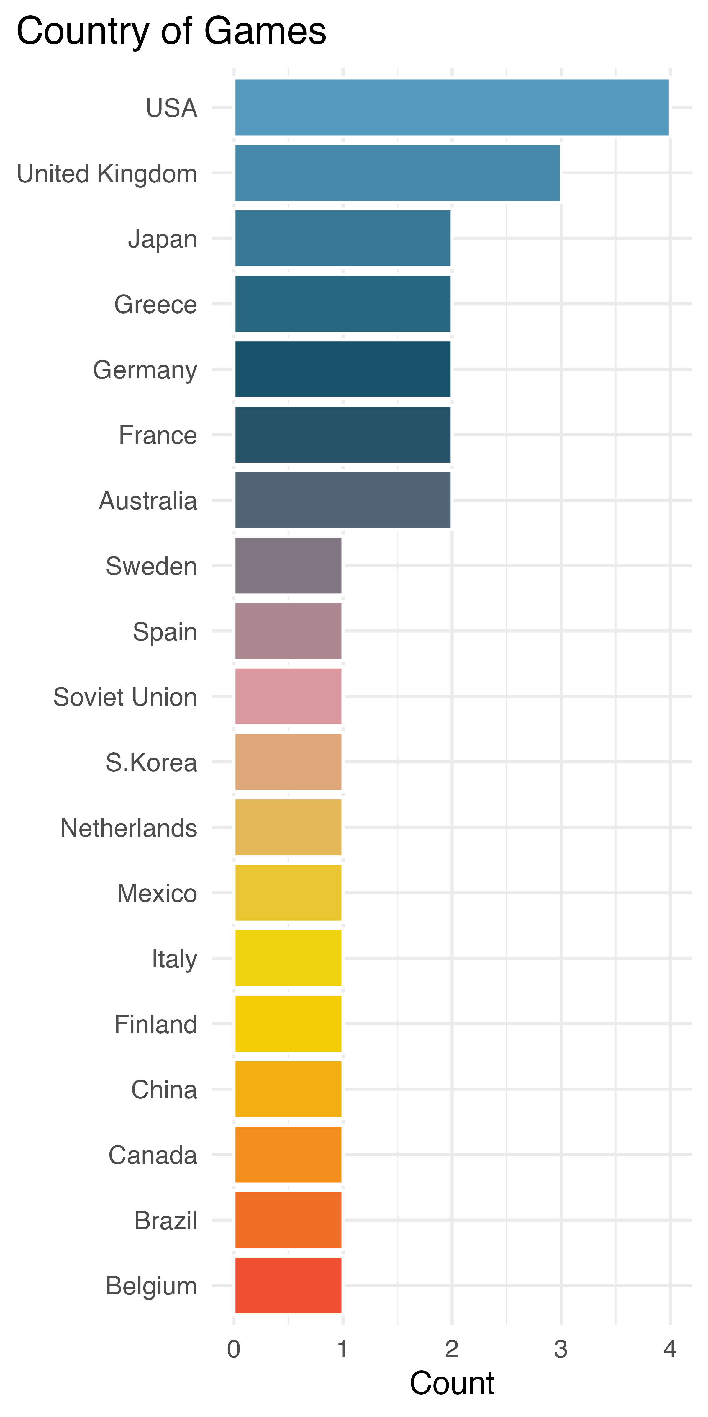
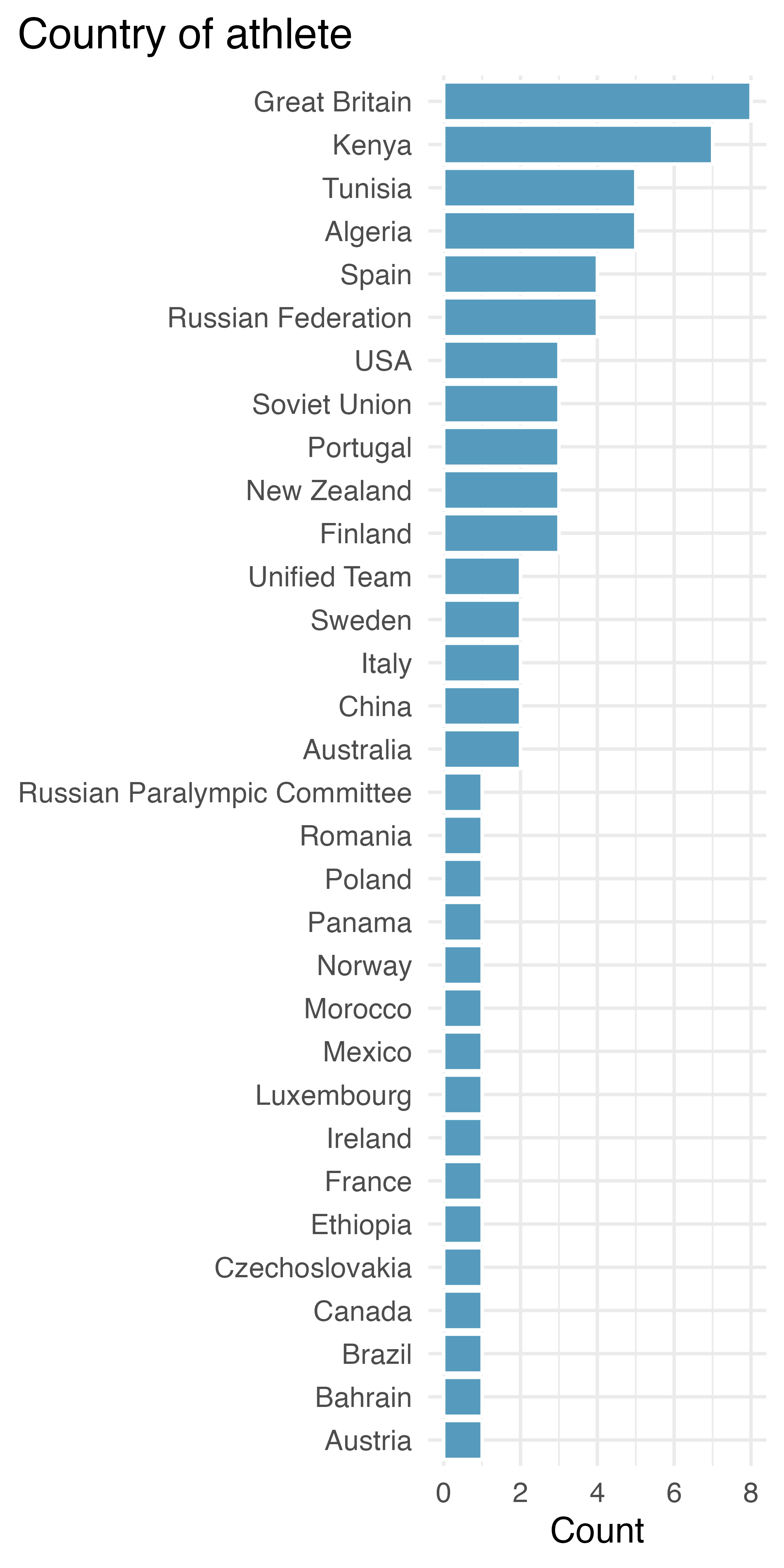
Next, let’s try to get to know each variable a little bit better. For categorical variables, this involves figuring out what their levels are and how commonly represented they are in the data. Figure 3.1 shows the distributions of two of the categorical variables in this dataset. We can see that the United States has hosted the Games most often, but runners from Great Britain and Kenya have won the 1500m most often. There are a large number of countries who have had a single gold medal winner of the 1500m. Similarly, there are a large number of countries who have hosted the Games only once. Over the last century, the name describing the country for athletes from one particular region has changed and includes Russian Federation, Unified Team, and Russian Paralympic Committee. Both of the visualizations are bar plots, which you will learn more about in Chapter 4.
Similarly, we can examine the distributions of the numerical variables as well. We already know that the 1500m times are mostly between 3.5min and 4.5min, based on Table 3.1 and Table 3.2. We can break down the 1500m time by division and type of race. Table 3.4 shows the mean, minimum, and maximum 1500m times broken down by division and race type. Recall that the Men’s Olympic division has taken place since 1896, whereas the Men’s Paralympic division has happened only since 1960. The maximum race time, therefore, should be taken into context in terms of the year of the Games.
paralympic_1500 dataset.
| division | type | mean | min | max |
|---|---|---|---|---|
| Men | Olympic | 3.76 | 3.47 | 4.55 |
| Men | T11 | 4.14 | 3.96 | 4.31 |
| Men | T12 | 4.11 | 3.94 | 4.25 |
| Men | T13 | 3.98 | 3.81 | 4.24 |
| Women | Olympic | 4.02 | 3.88 | 4.18 |
| Women | T11 | 5.05 | 4.62 | 5.63 |
| Women | T12 | 4.88 | 4.61 | 5.57 |
| Women | T13 | 4.55 | 4.23 | 5.24 |
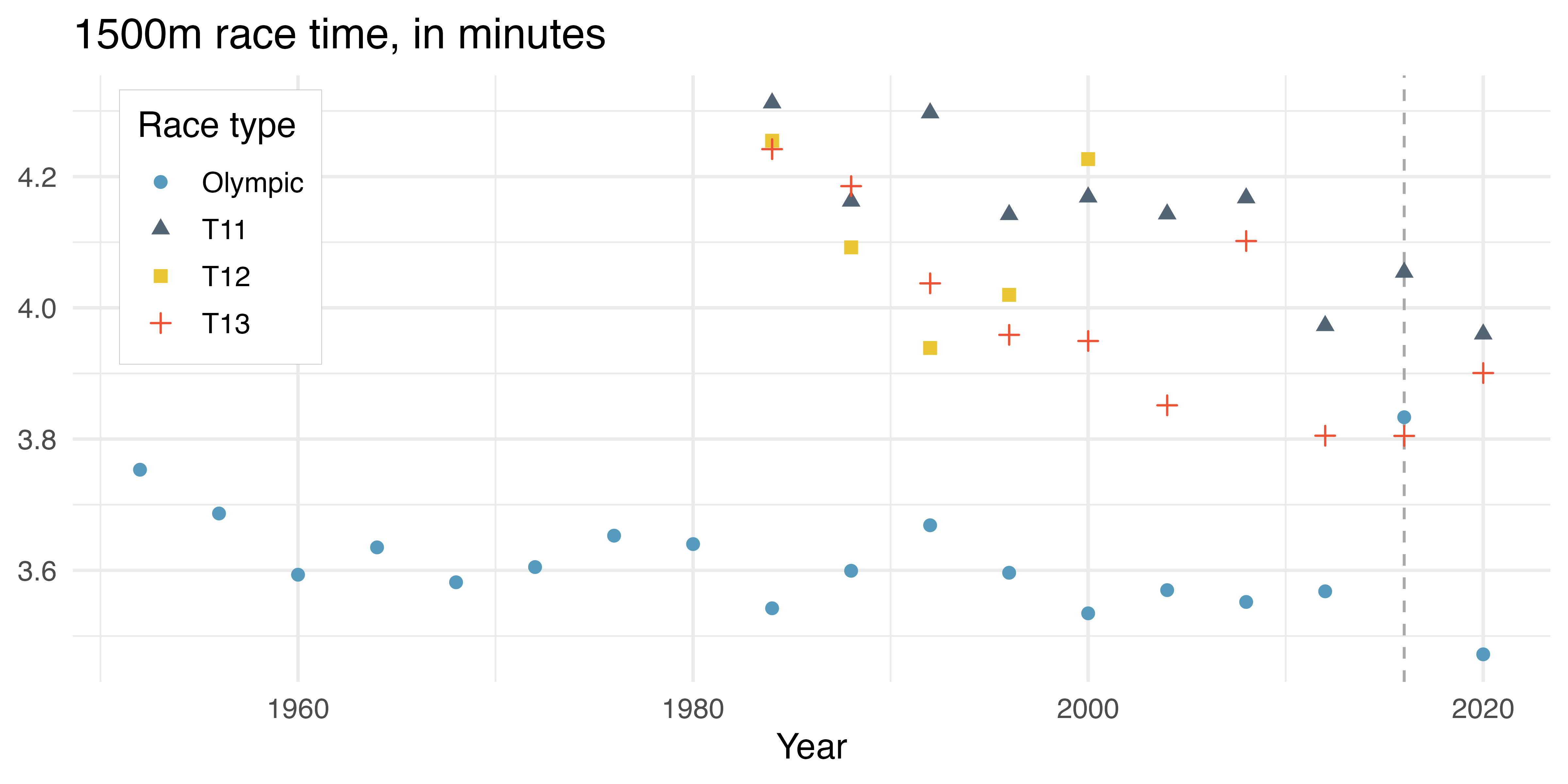
Fun fact! Sometimes playing around with the dataset will uncover interesting elements about the context in which the data were collected. A scatterplot of the Men’s 1500m broken down by race type shows that, in each given year, the Olympic runner is substantially faster than the Paralympic runners, with one exception. In the Rio de Janeiro 2016 Games, the T13 gold medal athlete ran faster (3:48.29) than the Olympic gold medal athlete (3:50.00) (see Figure 3.2). In fact, some internet sleuthing tells you that the top four T13 finishers all finished the 1500m under 3:50.00!
So far we examined aspects of some of the individual variables, and we have broken down the 1500m race times in terms of division and race type. You might have already wondered how the race times vary across year. The paralymic_1500 dataset will provide us with an ability to explore an important statistical concept, Simpson’s paradox.
3.2 Simpson’s paradox
Simpson’s paradox is a description of three (or more) variables. The paradox happens when a third variable reverses the relationship between the first two variables.
Let’s start by considering how the 1500m gold medal race times have changed over year. Figure 3.3 shows a scatterplot describing 1500m race times and year for Men’s Olympic and Paralympic (T11) athletes with a line of best fit (to the entire dataset) superimposed (see Chapter 7 where we will present fitting a line to a scatterplot). Notice that the line of best fit shows a positive relationship between race time and year. That is, for later years, the predicted gold medal time is higher than in earlier years.
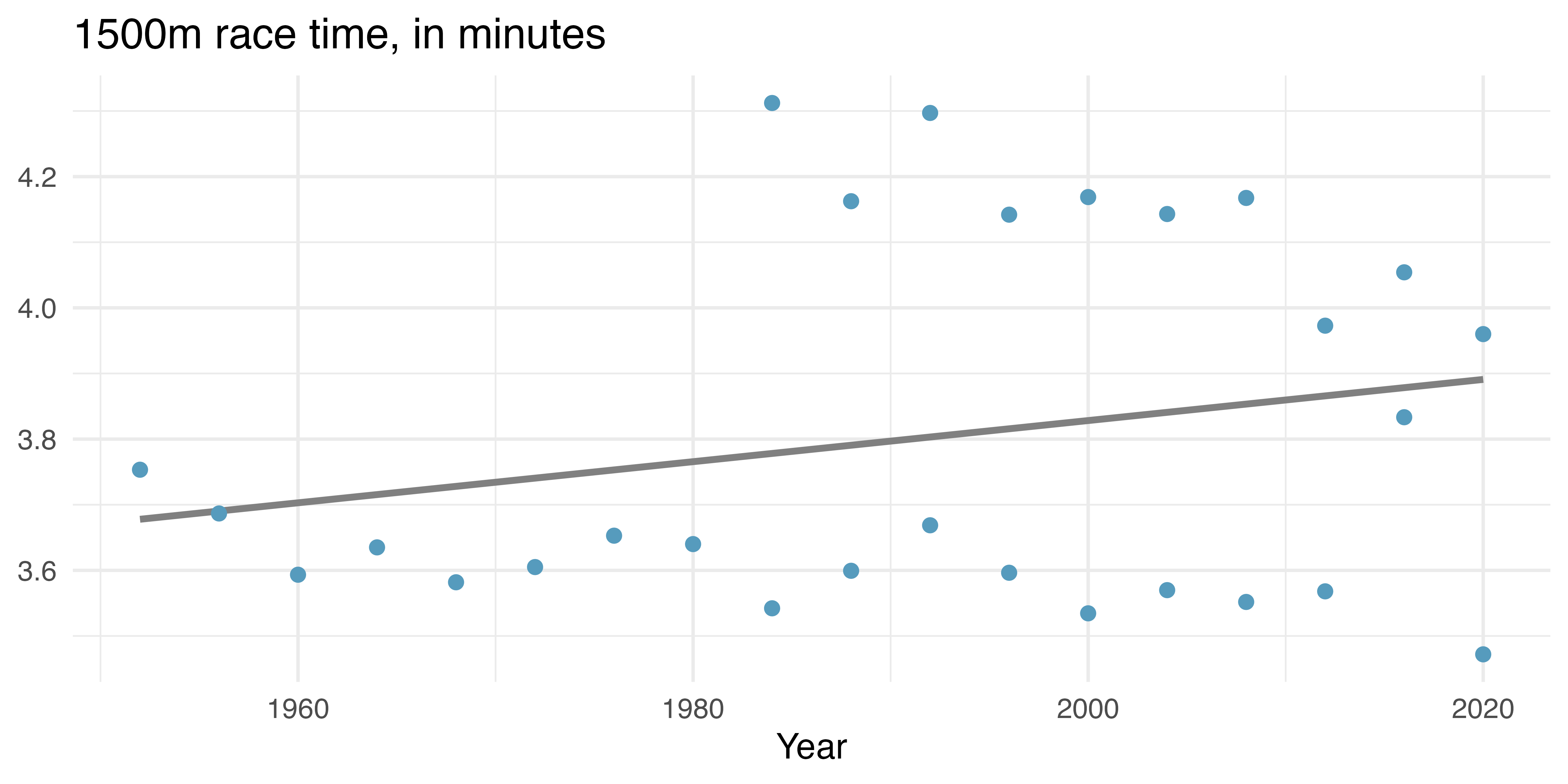
Of course, both your eye and your intuition are likely telling you that it wouldn’t make any sense to try to model all of the athletes together. Instead, a separate model should be run for each of the two types of Games: Olympic and Paralympic (T11). Figure 3.4 shows a scatterplot describing 1500m race times and year for Men’s Olympic and Paralympic (T11) athletes with a line of best fit superimposed separately for each of the two types of races. Notice that within each type of race, the relationship between 1500m race time and year is now negative.
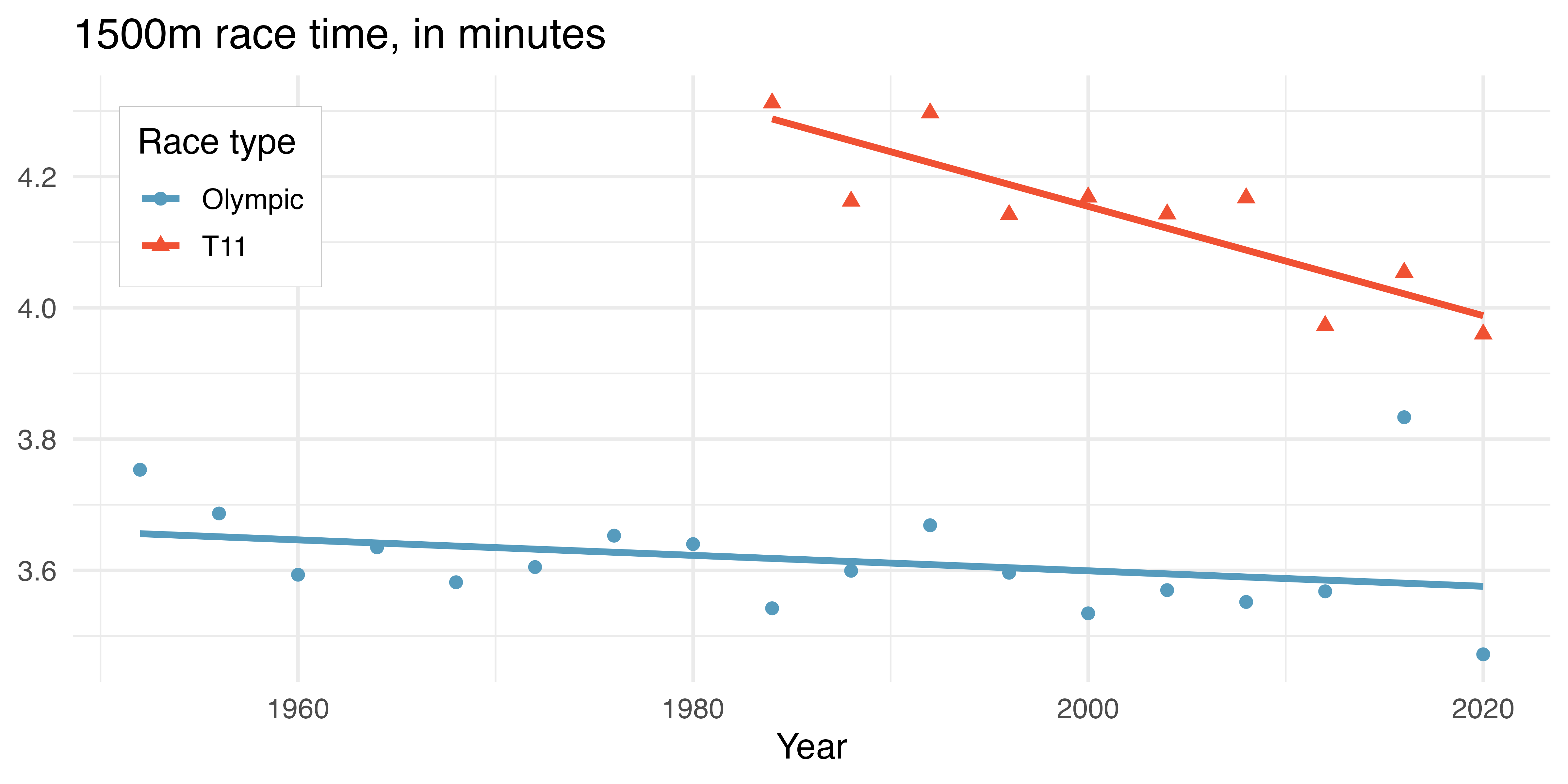
Simpson’s paradox.
Simpson’s paradox happens when an association or relationship between two variables in one direction (e.g., positive) reverses (e.g., becomes negative) when a third variable is considered.
Simpson’s paradox was seen in the 1500m race data because the aggregate data showed a positive relationship (positive slope) between year and race time but a negative relationship (negative slope) between year and race time when broken down by the type of race.
Simpson’s paradox is observed with categorical data and with numeric data. Often the paradox happens because the third variable (here, race type) is imbalanced. There are either more observations in one group or the observations happen at different intervals across the two groups. In the 1500m data, we saw that the T11 runners had fewer observations and their times were both generally slower and more recent than the Olympic runners.
In the 1500m analysis, it would be most prudent to report the trends separately for the Olympic and the T11 athletes. However, in other situations, it might be better to aggregate the data and report the overall trend. Many additional examples of Simpson’s paradox and a further exploration is given in Witmer (2021).
In this case study, we introduced you to the very first steps a data scientist takes when they start working with a new dataset. In the next few chapters, we will introduce exploratory data analysis, and you’ll learn more about the various types of data visualizations and summary statistics you can make to get to know your data better.
Before you move on, we encourage you to think about whether the following questions can be answered with this dataset, and if yes, how you might go about answering them? It’s okay if your answer is “I’m not sure”, we simply want to get your exploratory juices flowing to prime you for what’s to come!
- Has there ever been a year when a visually impaired Paralympic gold medal athlete beat the Olympic gold medal athlete?
- When comparing the Paralympic and Olympic 1500m gold medal athletes, does Simpson’s paradox hold in the Women’s division?
- Is there a biological boundary which establishes a time under which no human could run 1500m?
3.3 Interactive R tutorials
Navigate the concepts you’ve learned in this part in R using the following self-paced tutorials. All you need is your browser to get started!
You can also access the full list of tutorials supporting this book here.
3.4 R labs
Further apply the concepts you’ve learned in this part in R with computational labs that walk you through a data analysis case study.
You can also access the full list of labs supporting this book here.